Gamut — where it appears
Named by 47 essays across 9 fields — each of them below, with the objects they name alongside it.
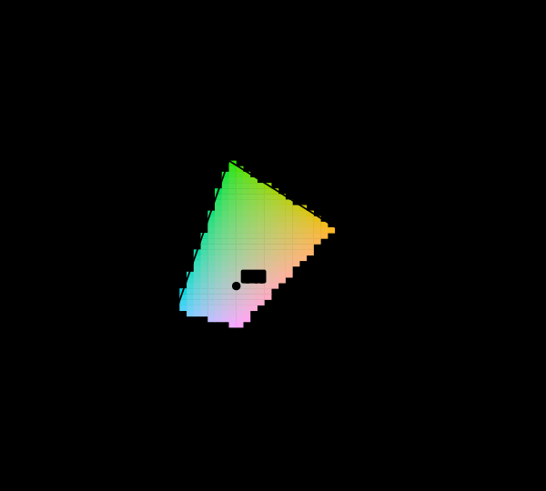
Most of this diagram cannot be shown
The chromaticity horseshoe is the canonical illustration of colour science, and nearly every printed copy is filled edge to edge with colours the page cannot produce. The honest version marks them, and the marking covers most of the picture.
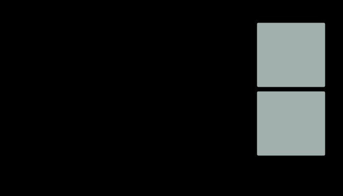
Two spectra, one colour
Metamerism is usually described and almost never demonstrated. It does not have to be — the metameric black space is enormous, so a matching pair can be constructed to order, verified, and then made to come apart by changing the light.
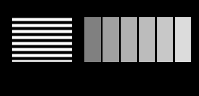
The display is an unknown
This site is displayed on the very apparatus it is about, and it knows almost nothing about that apparatus. Two figures here stop assuming and ask instead — a probe for the transfer function and a probe for the gamut.
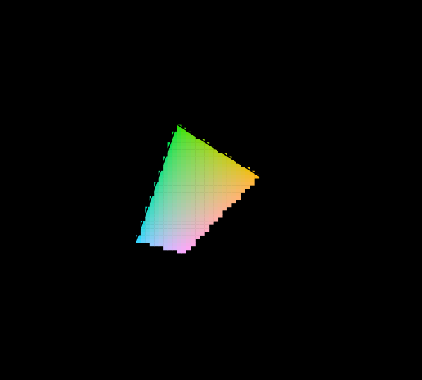
What a gamut costs
Three primaries reach a triangle and the visible region is not a triangle, so something has to give. Widening the primaries helps, has a price in precision and compatibility, and runs into a limit that is geometric rather than technological.

Why colour is exactly three-dimensional
Matching every wavelength with three primaries requires, for some wavelengths, a negative amount of one of them. That physical awkwardness is why the colour-matching functions were transformed into XYZ, and why the horseshoe is curved.

A hex code is not a colour
Six hexadecimal digits identify three numbers. Turning three numbers into a colour needs a colour space, a transfer function, a white point and a display, and leaving any of them unstated is the everyday version of every confusion in colour management.

Whose eyes
The standard observer is an average over seventeen people, and no reader is it. What that costs was small when displays were broad and grows every time the primaries get narrower.
The diagram was replaced in 1976
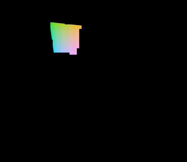
The CIE knew the 1931 diagram was badly distorted and published a better one. Half a century later almost every chromaticity plot in print is still the old one, and both are still printed filled edge to edge with colours no display can show.
Not every colour has a wavelength
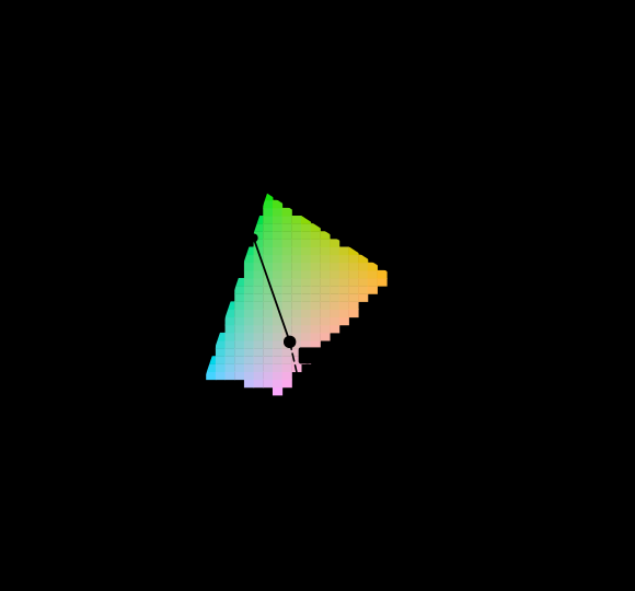
The question every reader arrives with is which wavelength a colour is. For close to a third of the directions on the chromaticity diagram the honest answer is that there is none, and the construction colorimetry offers instead is a statement about a diagram rather than about light.

The triangle is a shadow
A display's gamut is drawn as a triangle on the chromaticity diagram, and coverage is quoted as a percentage of that triangle's area. Chromaticity has luminance divided out, so the triangle is a projection along the axis the eye cares most about — and the ratios computed on the solid are not the ratios computed on its shadow.
Six numbers make a space
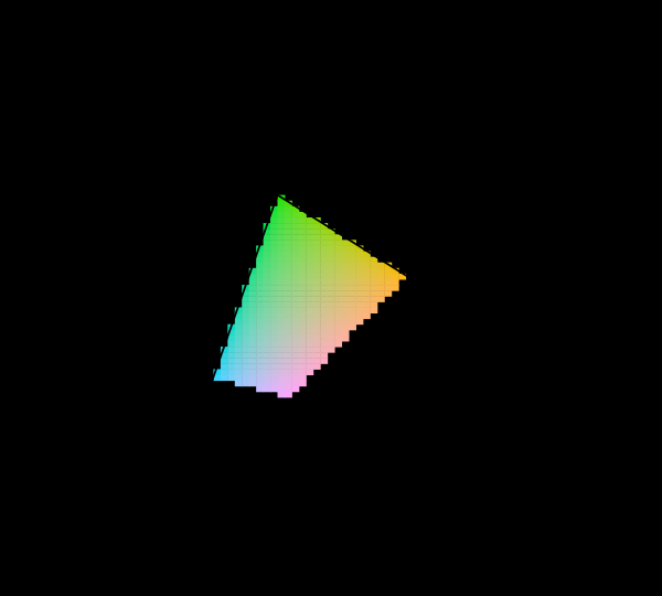
An RGB colour space is eight numbers — three primary chromaticities, a white point, and a transfer function — and everything else about it is derived. Deriving it rather than copying the matrix is the difference between having a colour space and having a table somebody else computed.

How many colours are there
Sixteen point seven million counts code values in a file format. Ten million distinguishable colours is a volume divided by the size of a just-noticeable difference — and the two difference formulae this site implements disagree about that size by a factor of nearly five.

No surface can be that colourful
There is a hard bound on object colour that no pigment will ever move, and it follows from a reflectance being at most 1. Its boundary is generated by two numbers, it shrinks by a factor of eleven from dark to light — and measured against it properly, sRGB reaches 40% of what a surface could be at mid lightness while Rec. 2020 reaches 106%.

No matrix is right everywhere
The best three-by-three this sensor admits, fitted and tested on the same twenty-four surfaces, leaves a worst case of ΔE00 2.85. A control sensor built to satisfy Luther's condition reaches ten to the minus seven under the identical computation, which is what makes the first number a measurement.

Neither gamut contains the other
Converting a picture to CMYK is described everywhere as a reduction, as though the press were a smaller version of the screen. Measured as solids, the press reaches eleven per cent of its volume outside sRGB while sRGB reaches fifty-four per cent of its volume outside the press — and in the cyans the press wins by seventy per cent of chroma.

The fourth ink is not for colour
Black is in every process set and it extends the gamut by more than a third — and at every lightness above about forty it extends the chroma boundary by exactly nothing. What it buys is depth at the bottom, a neutral that holds its hue when the press drifts, and a way to put a full-strength dark on a sheet that could not carry three inks' worth of it.
A black that is not black
The deepest colour a four-colour press can make is L* 2.4, and against its own paper that is a contrast of about 320 to 1 — less than a cheap display manages in a dark room. Everything a printed picture does in the shadows is done inside that range, and the two ways of fitting a picture into it destroy different things.
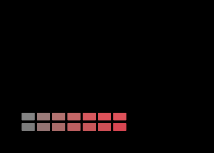
No mapping preserves everything
More than half the sRGB solid is outside a press's gamut, so something has to be done with it, and there are two things that can be done. One leaves every reproducible colour exactly where it was and delivers a gradient as a flat area. The other keeps the gradient and moves every colour that needed no help by about three.
A brand colour is an ink
A named colour is a jar of pigment with a spectrum, and a four-colour build of it is three inks arranged to integrate to the same three numbers. Of 156 constructed single-pigment inks, 15 can be matched at all — and those fifteen drift by a median of 3.8 colour differences under a tungsten lamp, because the match was never a match.

The fifth ink buys a corner
Orange, green and violet are sold as the answer to a four-colour press's gamut, and each one adds seven to nine per cent of volume. All three together add 23 per cent — almost exactly the sum, with no interaction — and every bit of it lands in the region of the ink that was added, at lightnesses where that ink is dark.
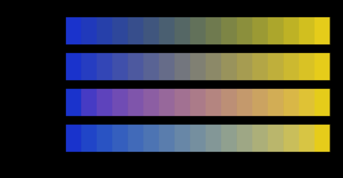
A gradient is a path
Two colours fix the ends of a blend and nothing else. The middle is decided by the space the interpolation happens in, and four spaces in daily use put the halfway point of one ordinary gradient as much as thirty-seven units of colour difference apart.
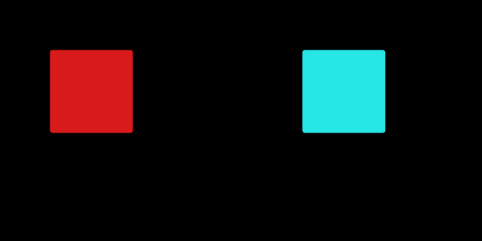
An afterimage is an adaptation
The demonstration everybody gives is an inverted image, which is a statement about a file format. Running the receptoral arithmetic instead puts the afterimage of a saturated red sixty degrees of hue away from the inverse — and outside what any display can show.

The gamut shrinks in the dark
Every gamut number here is a property of a device and of nothing else, which is why the same display has the same gamut in a studio and in a cinema. It does not. Turn the room down four decades and the solid loses a fifth of its reach and two thirds of its volume, with the signal unchanged.

A screen is a poor lamp
A display's white is a light. Shone on a surface it renders colour worse than a fluorescent tube — and the wider the gamut, the worse it gets, because the narrow primaries that buy a large triangle are exactly the ones that leave holes in the spectrum.

A display in a room is a smaller display
Two results here turn the room's light in opposite directions and neither knows about the other. A room has one light level and does both at once — so there is a brightness at which a display delivers the most colour, it is not at either end, and it scales with the panel.
A colour has a name
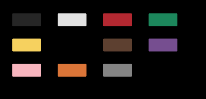
Every quantity here is a number, and the question a reader arrives with is what colour something is called. The eleven basic terms of English divide the space into territories that differ by a factor of five, the metric accounts for fifteen per cent of that, and one of the eleven focal colours cannot be shown on this page at all.
A catalogue is not a vocabulary
A colour order system is a regular lattice, because a person has to be able to find a page. Sorted by what its chips would be called, that lattice comes apart into piles differing by a factor of three — and a fifth of all one-step moves in it change the name.
There is no word for that colour
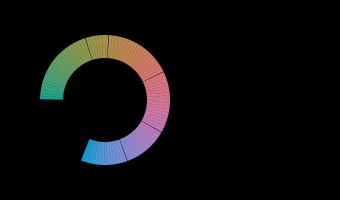
The naming model built this phase gives a saturated cyan the name green, calls part of a chromatic ring grey, and puts one of the eleven focal colours outside what a display can show. Each failure is a measurement rather than a disclaimer, and together they say what a vocabulary is that eleven points and a distance are not.

A fourth primary is a design
A display's fourth emitter is sold as more colour. Optimised instead against how far apart two hundred eyes are about its white — with the gamut held fixed so it cannot cheat — it buys agreement, and two and a half times closer together than three primaries reaching the same area, and the wavelengths it chooses are not the ones anybody would pick.

A gamut has a population
Whether a display can reproduce a paint is a fact about somebody's cones, so the boundary of a gamut is not a curve but a band. On a laser projector, ten of twenty-eight boundary surfaces are ones the standard observer calls displayable and some real people cannot see — and the wider the gamut, the wider the band.

A proof cannot glow
A proof is a different sheet of paper pretending to be the production one, and the pretence works by adding ink until the two agree. It cannot work for a brightened stock, because the direction the proof has to travel is towards more blue at the same lightness and every ink a proofer owns moves it towards less light instead.

A white that is not a reflectance
The object-colour solid is the hardest boundary in colorimetry — the set of tristimulus values any reflecting surface can produce, with no assumption about pigments in it at all. A coated press stock under a measurement standard's own lamp sits 1.5 per cent outside it, and a heavily brightened one 4.0, and with the ultraviolet removed both come back inside.

The diagram has no area
A chromaticity diagram is a projective picture of a three-dimensional space, and the freedom colour matching leaves in the observer acts on it as a projective map. Straight lines and mixture ratios survive that; area, distance and angle do not — so half of what the diagram is used to say is a statement about the paper.

Two thirds is not a property of the eye
It has been said from the beginning here that about two thirds of the chromaticity diagram cannot be shown on a screen. The figure is right, on the diagram it was measured on, and across twelve published diagrams the same triangle covers anything from 8.5 to 38.4 per cent of the same locus. Counting stimuli instead gives an answer that does not move.

Which of these is a convention
Nine ordinary sentences from this collection, put through one test — do they mean the same thing after the observer's three curves are replaced by a nonsingular combination of themselves? Five survive and four do not, and none of the four is wrong, because each is a statement about a set of coordinates being read as a statement about an eye.

The gamut race chose the basis
Twenty years of arguing about how much of the diagram a display should cover has produced primaries whose inverse is a better adaptation basis than any transform ever fitted to corresponding-colour data. On the invariant count of what those displays can actually show, the same twenty years produced nothing at all.

A tolerance is a region
How far a display's red primary can move before its adaptation behaviour costs anything is not a distance. It is a closed region on the chromaticity diagram, fifteen times longer one way than another, and about half of it lies outside the area a real primary can occupy — where the objective does not rise and the primary cannot go.

A primary is chosen for four things
A display's primaries have to adapt well, cover the diagram, hold the surfaces anybody photographs, and be colours a light can actually have. Drawing all four tolerance regions around one primary shows that no single requirement decides where it can go, and that one of the four never decides anything.

A tolerance in the wrong coordinates
A display primary's tolerance is written as a region in chromaticity, because that is where the colorimetry lives. Nobody has a knob for chromaticity. What a maker of an emitter sets is a peak wavelength and a bandwidth, and the map between the two is so anisotropic that on the red primary its condition number is over eleven thousand.

An appearance is not always a stimulus
CIECAM16's inverse is a closed form that returns three numbers for every lightness, chroma and hue it is handed. Whether those three numbers are a light it does not ask, and over a lattice spanning the space a specification is written in, 10.8 per cent of them are not — one tristimulus value negative, or a relative luminance above the white's. Only 43.8 per cent are colours a display could show at all.

A third of the appearance box is no surface
An appearance specification is written as a lightness, a chroma and a hue, and the model's inverse turns any such triple into three numbers. A tenth of the space turns into something that is not a light at all. A further quarter turns into a light no reflecting surface can return, because a surface cannot give back more than all the light at any wavelength. So a third of the space a paint, a print or a dye is specified in cannot be made from paint, print or dye, and at lightness 90 nearly two thirds cannot.
The straight line is not the shortest gradient
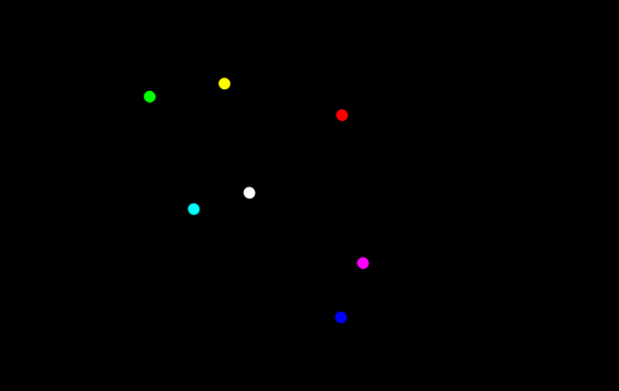
A colour difference formula says what a small step costs at every colour, and that is enough to ask which path between two colours is shortest. It is not the straight line: between red and green the shortest path bows thirteen CIELAB units away, saves four per cent — and stays inside sRGB on every step where the straight line leaves it. The formula's own answer for the two endpoints, meanwhile, is neither length.

The limits assume a pigment that switches instantly
The hardest boundary in colorimetry is reached by reflectances that jump between nought and one at a wavelength, and no material does that. Constrain the jump to take twenty nanometres — a sharp dye — and the median direction of the object-colour solid loses under half a per cent of its reach. Constrain it to eighty, an ordinary pigment, and the median loses five per cent, the tenth percentile nearly a quarter, and seven directions in ten lose more than one. The cost is in a corner only for chemistry sharper than paint.

A gamut charges a gradient nothing
On red to green the shortest path happened to stay inside sRGB where the straight line did not, and that was called a coincidence of mechanism. Made into a measurement it is not a coincidence: constraining a path to stay inside the gamut costs less of the metric's own length than the relaxation's own noise, on every gradient tested — including the ones whose free shortest path is outside at fifteen of its twenty-one steps. The gamut's boundary and the metric's cheap region point the same way, and the price of the constraint is nothing.

A press makes the cheap route a search
Holding a gradient inside a display's gamut cost nothing measurable, and the essay that found it credited the gamut's convexity. A press's gamut is not convex: 216 of 630 straight lines between colours on its own hue ring leave it. Holding gradients inside the press still costs little at best, a median of a tenth of a per cent. But the best route depends on where the relaxation starts, the free path is the best start on one gradient of ten, and on half of them some start is trapped at more than twice the free length. On the display no start is trapped.

A projection has no reason to detour
Holding a gradient inside a press by penalising the excursion turned the gamut's price from a number into a search: on five of ten crossing gradients some starting point leaves the relaxation trapped at more than twice the free length, and the spread across six starts runs to 271 per cent of the free path. Replacing the penalty with a projection — take the free step, then move each point to the nearest printable colour — leaves no trap on any gradient and a spread of 0.06 to 2.4 per cent.

A margin costs a press its corners
A gradient held inside a coated press by projection was predicted to tear if the press were first shrunk by a safety margin, at any pinch narrow enough for the shrinking to cut. The press has no such pinch: shrunk by any margin up to thirty CIELAB units it stays in one piece, and projected routes on it are neither trapped nor torn. What a margin costs is concentrated at the corners — the solid yellow moves nearly four times the margin to get inside, like the tip of a 31-degree spike.
Named alongside it
The objects these essays reach for when they reach for this one.
SpecificationDisplay gamutPrimariesCIELABStandard observerChromaticitySpectral locusColour managementGamut mappingObject-colour solidToleranceCIEDE2000