The fifth ink buys a corner
Assumes Neither gamut contains the other and The fourth ink is not for colour.
The four-colour set has a shape, and the shape has dents. Magenta’s unwanted absorption in the blue-violet takes out the violets; the cyan-plus-yellow overprint falls short of a pure green; the reds are respectable and the oranges are not. Adding a fifth ink chosen to sit in one of those dents is the obvious repair, and presses with seven units exist to do it.
The question is what each additional unit is worth, and the answer has an unusual property: the inks do not help each other.

The claim
Each additional chromatic ink adds seven to nine per cent of gamut volume, the additions are very nearly additive, and every one of them lands in the hue region of the ink added, at the lightnesses where that ink is dark.
Measured, with everything else held identical:
| ink set | volume | gain over four |
|---|---|---|
| CMYK | 404,800 | — |
| + orange | 433,000 | 7.0% |
| + green | 440,700 | 8.9% |
| + violet | 439,100 | 8.5% |
| + orange and green | 467,800 | 15.6% |
| + green and violet | 472,800 | 16.8% |
| + all three | 500,000 | 23.5% |
Seven plus 8.9 plus 8.5 is 24.4, against a measured 23.5 for all three at once. The interaction term is small and negative — which is the interesting part, and it is a consequence of what these inks do.
Why the gains do not compound
A conventional intuition about adding primaries comes from displays, where it is wrong here. Adding a fourth emissive primary enlarges a triangle to a quadrilateral, and every new colour is a mixture involving the new primary and the old ones together — the gain is genuinely cooperative.
Subtractive inks do not work that way. An additional ink is used instead of a combination of the existing ones, not alongside them: an orange region of a separation is printed with orange ink and a little of something else, and the cyan is turned off entirely, because cyan in an orange is nothing but a reduction of chroma. The separation rule this model imposes — no more than three chromatic inks at once — reflects that practice, and it means each new ink extends the solid in its own neighbourhood only.
Two inks whose neighbourhoods do not overlap therefore add independently, and the small negative interaction is the overlap where they do.
The interaction decomposes, and it does not order by hue
The table carries two of the three pairs as well as the triple, which is enough to take the interaction apart — and taking it apart withdraws the explanation just given.
Working in volume rather than in percentages, so the terms add:
| set | volume added | interaction |
|---|---|---|
| orange | 28,200 | — |
| green | 35,900 | — |
| violet | 34,300 | — |
| orange + green | 63,000 | −1,100 |
| green + violet | 68,000 | −2,200 |
| all three | 95,200 | −3,200 |
| ⇒ orange + violet, implied | — | +100 |
The three pairwise terms must sum to the triple’s if there is no genuine three-way effect, and that forces the unmeasured pair to about zero.
Now put the hue separations beside them. Orange sits at 45°, green at 135°, violet at 315°. So orange–green and orange–violet are both 90° apart, and green–violet are 180° apart — as far apart as two hues can be.
| pair | hue separation | interaction |
|---|---|---|
| green + violet | 180° | −2,200 |
| orange + green | 90° | −1,100 |
| orange + violet | 90° | ≈ 0 |
The pair whose neighbourhoods cannot overlap has the largest interaction, and one of the two pairs that are equally close has none at all. If the deficit were the overlap between two inks’ regions, that column would be ordered the other way round and the two 90° pairs would agree with each other. Neither is true.
So the sentence above — the small negative interaction is the overlap where they do — is a plausible account of a number that turns out not to behave the way it requires. It is withdrawn rather than repaired, because nothing in this model identifies what replaces it.
Three candidates, and the data does not choose between them. The ink limit is the obvious one: seven inks generate far more combinations over 320 per cent than five do, so the constraint bites harder on a larger set and would produce a deficit unrelated to hue. The lattice is a second — the same eleven steps per ink cover a larger space more coarsely as inks are added, and a coarser covering of a boundary loses volume. And the three-chromatic-ink rule is a third: with three extra inks present, more of the lattice is excluded by it than with one.
All three predict a deficit that grows with the number of inks and has nothing to do with where they sit, which is consistent with everything in the table and with each other.
What would settle it is one more run. Measuring orange with violet directly turns the implied +100 into a measurement, and a value near zero would confirm the decomposition while a value near −1,000 would say there is a genuine three-way term the pairwise reading has been hiding. That is one lattice sweep with the machinery already written, and it is the cheapest open question in this essay.
None of which touches the headline. The gains are additive to within 3.3 per cent of their own sum, so the inks do not help each other stands exactly as measured. What has gone is the explanation of the residual, and it is worth losing: a 3.3 per cent deficit attributed to hue overlap invites a reader to predict that two inks placed closer together would interact more, and this essay’s own numbers say they would not.

Where each ink lands
Maximum chroma at a stated lightness and hue, four inks against seven:
| lightness | 45° | 135° | 180° | 315° |
|---|---|---|---|---|
| 70 | 40 → 40 | 40 → 40 | 26 → 26 | 23 → 23 |
| 55 | 76 → 76 | 54 → 65 | 54 → 54 | 34 → 34 |
| 40 | 62 → 76 | 45 → 54 | 54 → 66 | 42 → 42 |
| 20 | — | — | — | 37 → 62 |
Three things fall out of that table and all three are worth having.
Nothing changes at L* 70. A light colour has little ink on the sheet, so the boundary there is set by how much chroma a small amount of any ink can produce, and a better-chosen ink does not help.
The gains are at mid and low lightness, where an ink is being asked for at or near full strength and its own spectral shape is what limits the result.
And the violet ink’s contribution is entirely below L* 30 — from 37 to 62 at lightness 20, a two-thirds increase, and nothing at all at 40 or above. Violet is a dark colour: the pigment that reaches it absorbs most of the band, so the region it extends is a dark one, and a press buying a violet unit is buying deep blue-violets rather than lavender.

What was computed, and how
Every volume is measured the same way and the method is the one the gamut essay states in full: a lattice over the separation space with the ink limit and the three-chromatic-inks rule applied as exclusions, each lattice cell’s image filled with sub-samples, occupied CIELAB cells counted at two cell sizes and extrapolated to the limit.
Two aspects are specific to this comparison and both were chosen to keep it honest.
All the sets are measured at the same lattice resolution, eleven steps per chromatic ink and seven black levels, so a seven-ink set is sampled on a lattice with the same spacing as a four-ink one — coarser in total coverage of its own space, and identical in the property that matters, which is how far apart adjacent samples land in CIELAB.
And the same ink limit applies to all of them. That is a substantive constraint on the extended sets: seven inks give many more ways to exceed 320 per cent, and every one of them is excluded. Relaxing the limit for the extended sets would flatter them.

What it is actually bought for
Volume is the wrong figure of merit for most of the presses that carry these inks, and it is worth saying what the right one is.
An extended set is bought to print several jobs’ spot colours without changing ink. A packaging plant running seven fixed inks can reproduce a large fraction of a brand catalogue as a process build — no wash-up, no make-ready, several jobs ganged on one sheet — and the saving is in press time rather than in colour.
Measured against that purpose, the question is not the volume but which named colours come inside, and the answer follows directly from the spot-colour measurement: the inks that were unreachable were unreachable because a single pigment beats a build, and an extended set is a build with more and better-placed pigments. It moves the fraction substantially and does not move it to one, because a single pigment at full strength is still more selective than any combination.
The second thing it buys is a shorter route. A colour reachable by both sets is reached by the extended set with fewer inks and less total coverage, which is more stable on press for the same reason a black-only grey is more stable than a three-ink one: fewer numbers to hold.

The comparison a printer would rather have
Volume answers the question how much more, and the question on the shop floor is which jobs. The two are related by a step this model can make explicitly.
Take the family of single-pigment inks from the spot-colour measurement — 156 constructed pigments spanning the hue circle at several widths and densities — and ask how many of them a set can reach. That is a count over a catalogue rather than a volume, and it is the number an extended-gamut press is bought on: every named colour that comes inside is a job that no longer needs its own ink, its own plate and its own wash-up.
The mechanism that decides the count is the one the previous rung established. A build is duller than a pigment at the same lightness because every ink brings its unwanted absorptions along; adding a better-placed ink means fewer inks are needed for a given hue, so fewer unwanted bands are stacked, so the build is less dull. The extended set does not change the physics — it reduces how much of it applies.
And the count is what the volume conceals. A 23 per cent gain in volume sounds modest; if it moves a third of a brand catalogue from unreachable to reachable, it changes what the press is for.

The ink limit gets in the way
One constraint deserves its own note, because it bites harder on an extended set than anywhere else in this field.
The total-area-coverage limit is a property of the sheet, not of the ink set, so seven inks share the same 320 per cent that four inks did. A separation using orange and green and black in a dark region is spending the same budget three inks would have spent, and the exclusions in the sample above are not decorative: a substantial part of the seven-ink lattice is over the limit and is dropped.
The practical effect is that the extended set’s gains are largest exactly where the limit is least binding, which is the mid-lightness saturated region — and smallest in the deep shadows, where the limit already decides everything and an extra chromatic ink has nowhere to go.
Where this model stops
The extra inks are constructed, and their placement is the whole result. An orange chosen ten nanometres either side of the one modelled here would give a slightly different gain, and a badly chosen extra ink can add almost nothing. The measurement is what an ink in that region is worth, not what a particular manufacturer’s ink is worth.
The three-chromatic-ink rule is a stated modelling choice. It reflects how separations are actually made and it excludes combinations a full search would include — orange with cyan, say, which is a legitimate if unusual thing to print. Relaxing it would raise every extended volume slightly and would spend most of the lattice on combinations no separation program produces.
Nothing here models the separation problem the extra inks create. With seven inks and three numbers to match there are four degrees of freedom rather than one, so the family of separations reproducing a colour becomes a four-parameter manifold, and everything that essay says about metamerism gets worse. An extended-gamut press generates more metamers, not fewer.
And registration is a real constraint that no colour measurement sees. Seven plates have to align, and the hue transitions where two chromatic inks change over are where misregistration shows most.
What it does not buy
Two things worth stating, because an extended set is often sold as though it bought them.
It does not make the press a display. Seven inks reach 60 per cent of the sRGB solid against four inks’ 49, and the light saturated region — every colour above about L* 70 with real chroma — is unreached by both, for the reason the chroma table gives: a light printed colour has almost no ink on the sheet, and no choice of ink changes that.
And it does not remove the mapping decision. A picture prepared on a screen still has colours the extended press cannot make, so an intent still has to be chosen and still pays one of the two costs. What changes is how much of the picture is affected, which is a matter of degree rather than of kind.
The generalisation
When a system’s controls are used exclusively rather than jointly, additional controls add rather than multiply.
A display’s primaries are used jointly — every colour is a mixture of all three — so adding a primary enlarges the reachable set multiplicatively and the gain is hard to attribute to the new primary alone. An extended-gamut press’s inks are used exclusively: a separation picks the two or three inks nearest the target hue and turns the others off, so each ink owns a neighbourhood and the total is a sum over neighbourhoods.
The diagnostic is the interaction term, and it is worth computing whenever something is added to a system. Here it is negative and small: 24.4 per cent predicted by summing single-ink gains, 23.5 measured with all three present. What that establishes is the additivity; what it does not establish is any story about the residual, as the decomposition above found out by trying to tell one.
A near-zero interaction term is a strong hint that the controls are not cooperating, and if the reason is a rule imposed on the separation rather than a fact about the inks, it is worth asking what a full search would buy. Here the rule reflects practice, so the answer is: something, and nobody prints that way.
Who found it, and when
Printing with more than four inks is old — nineteenth-century chromolithography routinely used a dozen stones, and the reduction to four was an economising move made possible by photographic separation rather than a discovery about colour.
The modern version dates from the 1990s. Pantone’s Hexachrome, published in 1994, added orange and green to a modified four-colour set and was the first widely marketed extended-gamut system; it was discontinued in 2008, having been used mostly for high-end reproduction rather than for its intended purpose.
What revived the idea was digital presses and the economics of packaging, where the saving is not gamut but make-ready: a fixed seven-colour ink set that never changes lets several jobs be ganged, and the gamut is a side effect of the ink choice rather than its purpose. That is why the current name for it in the trade is expanded gamut or fixed palette printing, and why the second name is the more accurate one.
Where the ladder goes next
This rung sits on the gamut comparison, which supplies the method and the shape being extended, and on the fourth ink, which is the previous case of adding a unit for reasons that are not chroma.
Beside it, a brand colour is an ink is the other answer to the same commercial problem: one ink for one colour rather than three inks for a region.
Above and to the side, everything the extra units add is subject to the same second-illuminant problem the four-colour set has, and rather more of it — the lamp in the shop decides applies to a seven-ink separation with four free parameters instead of one.
Where this goes next
 Neither gamut contains the other
Converting a picture to CMYK is described everywhere as a reduction, as though the press were a smaller version of the screen. Measured as solids, the press reaches eleven per cent of its volume outside sRGB while sRGB reaches fifty-four per cent of its volume outside the press — and in the cyans the press wins by seventy per cent of chroma.
Neither gamut contains the other
Converting a picture to CMYK is described everywhere as a reduction, as though the press were a smaller version of the screen. Measured as solids, the press reaches eleven per cent of its volume outside sRGB while sRGB reaches fifty-four per cent of its volume outside the press — and in the cyans the press wins by seventy per cent of chroma.
 A brand colour is an ink
A named colour is a jar of pigment with a spectrum, and a four-colour build of it is three inks arranged to integrate to the same three numbers. Of 156 constructed single-pigment inks, 15 can be matched at all — and those fifteen drift by a median of 3.8 colour differences under a tungsten lamp, because the match was never a match.
A brand colour is an ink
A named colour is a jar of pigment with a spectrum, and a four-colour build of it is three inks arranged to integrate to the same three numbers. Of 156 constructed single-pigment inks, 15 can be matched at all — and those fifteen drift by a median of 3.8 colour differences under a tungsten lamp, because the match was never a match.
 What a gamut costs
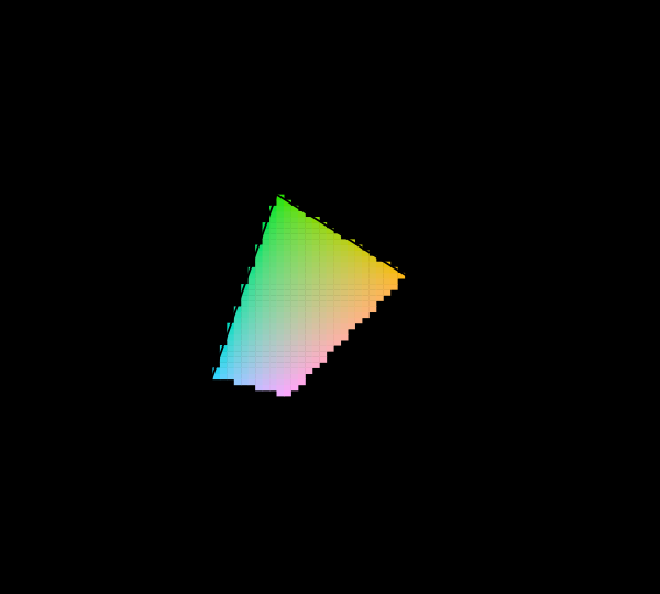
Three primaries reach a triangle and the visible region is not a triangle, so something has to give. Widening the primaries helps, has a price in precision and compatibility, and runs into a limit that is geometric rather than technological.
What a gamut costs
Three primaries reach a triangle and the visible region is not a triangle, so something has to give. Widening the primaries helps, has a price in precision and compatibility, and runs into a limit that is geometric rather than technological.
Named alongside this one
Essays reaching for the same objects. Nobody chose these; they are what the index of named objects makes visible.
- A profile is a table halftone · quality control · separation · specification
- A brand colour for a population process inks · quality control · specification
- A catalogue is not a vocabulary gamut · quality control · specification
- A dot is larger than it was asked to be halftone · process inks · quality control
- A fourth primary is a design display gamut · gamut · specification
- A lamp has a waveform display gamut · quality control · specification
What links here
The 8 essays that link to this one and share the most of its objects, of 9 that link here.
The objects this essay names
Each one links to every other essay that touches it.
Display gamutExtended gamutGamutHalftoneInk limitProcess inksQuality controlSeparationSpecificationSubtractive mixture