Display gamut — where it appears
Named by 31 essays across 7 fields — each of them below, with the objects they name alongside it.
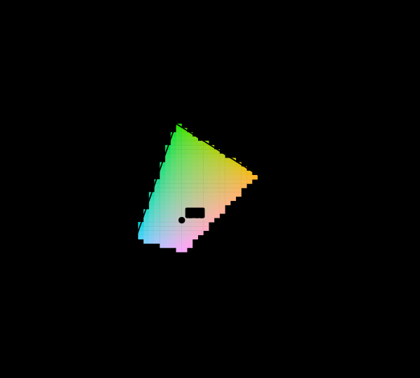
Most of this diagram cannot be shown
The chromaticity horseshoe is the canonical illustration of colour science, and nearly every printed copy is filled edge to edge with colours the page cannot produce. The honest version marks them, and the marking covers most of the picture.
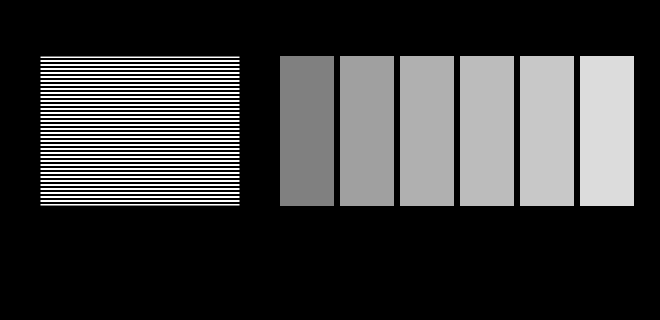
The display is an unknown
This site is displayed on the very apparatus it is about, and it knows almost nothing about that apparatus. Two figures here stop assuming and ask instead — a probe for the transfer function and a probe for the gamut.
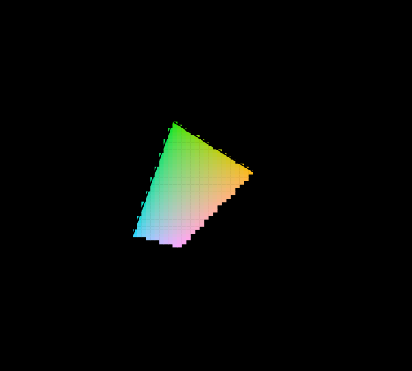
What a gamut costs
Three primaries reach a triangle and the visible region is not a triangle, so something has to give. Widening the primaries helps, has a price in precision and compatibility, and runs into a limit that is geometric rather than technological.
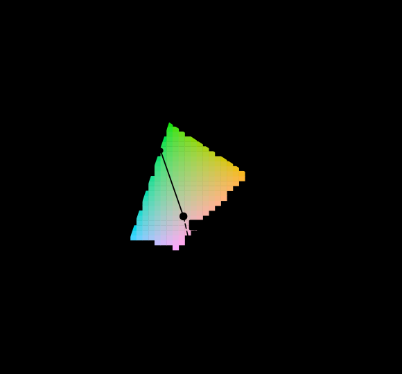
Not every colour has a wavelength
The question every reader arrives with is which wavelength a colour is. For close to a third of the directions on the chromaticity diagram the honest answer is that there is none, and the construction colorimetry offers instead is a statement about a diagram rather than about light.

The triangle is a shadow
A display's gamut is drawn as a triangle on the chromaticity diagram, and coverage is quoted as a percentage of that triangle's area. Chromaticity has luminance divided out, so the triangle is a projection along the axis the eye cares most about — and the ratios computed on the solid are not the ratios computed on its shadow.

No surface can be that colourful
There is a hard bound on object colour that no pigment will ever move, and it follows from a reflectance being at most 1. Its boundary is generated by two numbers, it shrinks by a factor of eleven from dark to light — and measured against it properly, sRGB reaches 40% of what a surface could be at mid lightness while Rec. 2020 reaches 106%.

Neither gamut contains the other
Converting a picture to CMYK is described everywhere as a reduction, as though the press were a smaller version of the screen. Measured as solids, the press reaches eleven per cent of its volume outside sRGB while sRGB reaches fifty-four per cent of its volume outside the press — and in the cyans the press wins by seventy per cent of chroma.

The fifth ink buys a corner
Orange, green and violet are sold as the answer to a four-colour press's gamut, and each one adds seven to nine per cent of volume. All three together add 23 per cent — almost exactly the sum, with no interaction — and every bit of it lands in the region of the ink that was added, at lightnesses where that ink is dark.

The screen is not the room
A thousand-to-one display in an ordinary office is a hundred-and-thirty-seven-to-one display, and the signal value that means black comes out at the lightness of a dark grey card. Nothing is wrong with the panel. Light falls on the screen and comes back off it, and the two per cent it returns is added to every pixel — most of all to the ones with nothing else in them.

The gamut shrinks in the dark
Every gamut number here is a property of a device and of nothing else, which is why the same display has the same gamut in a studio and in a cinema. It does not. Turn the room down four decades and the solid loses a fifth of its reach and two thirds of its volume, with the signal unchanged.

The eye has a shutter
An isoluminant flicker fuses at fifteen hertz and a luminance one at sixty, so a light whose colour changes forty times a second is a steady light of a colour it never emits. And the frequency at which flicker stops being visible is not a property of the eye — it moves twelve and a half hertz for every decade of light.

A lamp has a waveform
A lamp modulating a thousand times a second is a hundred times past the frequency at which flicker fuses, and it is plainly visible — as a dotted trail, during any glance across the room. The reason is not a new measurement; it is the spatial contrast sensitivity function, arriving from an unfamiliar direction.

A screen is a poor lamp
A display's white is a light. Shone on a surface it renders colour worse than a fluorescent tube — and the wider the gamut, the worse it gets, because the narrow primaries that buy a large triangle are exactly the ones that leave holes in the spectrum.

A display in a room is a smaller display
Two results here turn the room's light in opposite directions and neither knows about the other. A room has one light level and does both at once — so there is a brightness at which a display delivers the most colour, it is not at either end, and it scales with the panel.

Every threshold was measured with a grating
An earlier essay here claimed that the model cannot explain why dither works, and named two missing pieces. One of them was real and worth thirteen times the guess; the other was not needed. The piece nobody named was the detector — and reading the same model two ways changes the answer by a factor of fifty.

Four primaries have a choice
Three primaries matching three numbers have one answer. Four have a family of them, every member exact to floating point for the observer they were solved for — and the members are not equally good for anybody else, so a display with a fourth primary has a setting that is robust to who is looking at it and a setting that is not.

A fourth primary is a design
A display's fourth emitter is sold as more colour. Optimised instead against how far apart two hundred eyes are about its white — with the gamut held fixed so it cannot cheat — it buys agreement, and two and a half times closer together than three primaries reaching the same area, and the wavelengths it chooses are not the ones anybody would pick.

A gamut has a population
Whether a display can reproduce a paint is a fact about somebody's cones, so the boundary of a gamut is not a curve but a band. On a laser projector, ten of twenty-eight boundary surfaces are ones the standard observer calls displayable and some real people cannot see — and the wider the gamut, the wider the band.

Only one of these devices adapts
An eye, a camera, a display and a press all meet the same changes of light, and each has at most one thing it can do about them. The press has nothing at all, so its column is the whole change; and this collection's sensor built to satisfy the Luther condition exactly is the one that adapts worst.

Two thirds is not a property of the eye
It has been said from the beginning here that about two thirds of the chromaticity diagram cannot be shown on a screen. The figure is right, on the diagram it was measured on, and across twelve published diagrams the same triangle covers anything from 8.5 to 38.4 per cent of the same locus. Counting stimuli instead gives an answer that does not move.

Primaries chosen for their inverse
Moving a display's white point is a gain on its R, G and B, so a display adapts in the inverse of its own primary matrix — a basis chosen by committees for gamut coverage and phosphor availability. Pose the design problem properly and the answer costs one per cent of the gamut argument and reaches within two per cent of the best basis there is.

The gamut race chose the basis
Twenty years of arguing about how much of the diagram a display should cover has produced primaries whose inverse is a better adaptation basis than any transform ever fitted to corresponding-colour data. On the invariant count of what those displays can actually show, the same twenty years produced nothing at all.

One wavelength is everyone's colour
A stimulus with a single wavelength in it produces the same relative cone excitations for every observer, exactly, whatever their age or field size. A display made of three such stimuli is where observers disagree most. Both statements are consequences of the same algebra, and the second is why laser projection has an observer problem.

The peaks move the flanks
Shifting a cone's peak wavelength by three nanometres changes its sensitivity at its own maximum by almost nothing and on its flanks by several per cent, because a maximum is flat and a flank is steep. Every display primary sits on a flank, which is why a pigment polymorphism is worth 3.60 ΔE₀₀ under a laser projector.

A narrow primary buys a disagreement
The observer audit decomposes what a display costs a population. Narrowing the primaries raises the pigment-peak departure monotonically, moving one raises or lowers the macular departure, and the two respond to different design variables — so a wide gamut and an observer-robust display are bought with the same money.

The mixture line bows
Grassmann's second law says an additive mixture is exactly linear in tristimulus values, and tested here it is exact to floating point. Nothing downstream of the three numbers preserves it. The physical half-and-half mixture of two colours sits a median of 5.5 colour differences from the midpoint of their two readings and up to thirty; on a green and a blue display primary it is twenty-one, which is a quarter of the distance between them.

An intent is not a function of the colour
A rendering intent is chosen per job and applied per pixel, which suggests it is a function of the colour. The colorimetric ones are, exactly — the same colour from two documents comes out identical to the floating-point floor. The perceptual one is not — it compresses the whole source solid into the destination, so the same colour delivered from a wide document and from a muted one lands 2.6 colour differences apart, on colours the destination could hold either way.

Which mixture bows most depends on the ruler
The physical half-and-half mixture of two lights misses the midpoint of their two readings in any unit a person is shown, and the share it misses by is about the same in ΔE₀₀ and in the appearance model's own space — 12.8 and 14.6 per cent at the median. Which mixtures miss most is not. The rank correlation between the two units is 0.57, a display's blue and yellow is the worst pair in one and the mildest in the other, and the smaller number usually quoted for the appearance model is its power correction rather than a straighter line.

A third of the appearance box is no surface
An appearance specification is written as a lightness, a chroma and a hue, and the model's inverse turns any such triple into three numbers. A tenth of the space turns into something that is not a light at all. A further quarter turns into a light no reflecting surface can return, because a surface cannot give back more than all the light at any wavelength. So a third of the space a paint, a print or a dye is specified in cannot be made from paint, print or dye, and at lightness 90 nearly two thirds cannot.

A name moves with the reader
Three earlier essays have moved a colour's name by changing the distance function, the room and the space. All three held the observer fixed. Handed the same light from the same display, sixty observers rename between 3.5 and 13.1 per cent of the gamut against the standard observer, a quarter of its colours have a dissenter in twenty, and the narrower the display's primaries the worse it gets.

A gamut charges a gradient nothing
On red to green the shortest path happened to stay inside sRGB where the straight line did not, and that was called a coincidence of mechanism. Made into a measurement it is not a coincidence: constraining a path to stay inside the gamut costs less of the metric's own length than the relaxation's own noise, on every gradient tested — including the ones whose free shortest path is outside at fifteen of its twenty-one steps. The gamut's boundary and the metric's cheap region point the same way, and the price of the constraint is nothing.
Named alongside it
The objects these essays reach for when they reach for this one.
PrimariesGamutSpecificationChromaticityStandard observerIndividual variationObserver metamerismColour managementLuminanceNarrow band displaysObject-colour solidWhite point