The mixture line bows
Assumes A lattice has no derivative, A gradient is a path and The laws that make colour add up.
Of everything colorimetry guarantees, one guarantee does the most work: mixtures are linear. Turn two lights on together and the tristimulus values of the result are the sum of the two — not approximately, not for well-behaved spectra, but identically, because the integral that defines a tristimulus value is linear in the light. It is the reason a chromaticity diagram has straight mixture lines on it and the reason three primaries can reach a triangle.

The claim
The one exactly straight line in colour science does not arrive straight at the reader, and the deviation is a quarter of the distance between the two colours being mixed.
- The half-and-half mixture of two colours sits a median of 5.5 ΔE₀₀ from the midpoint of their two readings, over 1,450 random pairs at least ten differences apart, and up to 30.4.
- As a share of the pair’s own separation that is 15 per cent at the median and 49 at the worst.
- On a display’s green and blue primaries it is 21.1, on its blue and yellow 23.2, and on its red and green 8.2.
- The furthest departure is not at the midpoint. On red and blue it is at twenty per cent of the way along, and reaches 13.6.
The law, and what it does not cover
Grassmann’s laws are exact for a linear observer and this collection has checked them to floating point, along with the band of light levels over which the eye actually behaves like one. The second law — that a mixture’s tristimulus values are the sum of its parts’ — is the one everything else rests on.
The law is a statement about the three numbers. It says nothing about any function of them, and every quantity a person is actually shown is a function of them: a lightness, a chroma, a hue angle, a colour difference, a code value, a swatch on a page.
A nonlinear function does not take midpoints to midpoints. That is not a subtlety; it is the definition of nonlinear, and it applies to the cube root at the heart of CIELAB as inescapably as to anything else. What is worth measuring is not whether the mixture line bends but how much, because the answer decides whether the straight-line intuition is a good approximation or a wrong one.

How far it bends
The measurement walks the physical mixture in twenty steps and, beside it, the straight line between the two endpoints’ readings. Both start and end at the same two places by construction; everything between is the discrepancy.
On sRGB’s own primaries the half-and-half mixtures land 8.2, 21.1 and 9.7 colour differences from the midpoints for red-green, green-blue and red-blue. Blue against a yellow — which is blue against the sum of red and green — gives 23.2 across a separation of 103.4.

The red-and-blue pair is the one that shows the shape of the problem rather than only its size. Its worst departure is at twenty per cent along, not at fifty, so a designer checking the midpoint and finding it acceptable has checked the wrong point. The bow is asymmetric because the two endpoints have very different luminances, and the compression’s slope varies fastest at the dark end of the run.

Changing the primaries is the obvious control and it settles what the effect belongs to. On Display P3 the red-green half-mixture’s departure falls from 8.2 to 4.7 and the green-blue from 21.1 to 16.0, while blue-yellow stays at 23.0 against 23.2. The numbers move; the phenomenon does not. A wider gamut does not straighten a mixture line, because the curvature is in the function that reads the light rather than in the light.
Over a thousand pairs
Four primary pairs is an anecdote. The general statement needs the whole cube.

The median miss is 5.5 colour differences and the ninetieth percentile is 14.1. Expressed as a share of the pair’s own separation — the form that transfers, since a bigger gap has more room to bend across — it is fifteen per cent at the median and forty-nine at the worst.
Half of all pairs have their physical midpoint misplaced by more than a seventh of the distance between them. The maximum departure anywhere along the line is larger still: a median of 6.4 and a worst of 38.7.
Where the miss is, and it is usually not the middle
A designer who suspects the problem checks the halfway point, and the halfway point is not where the trouble is on three quarters of pairs.
Over the census the position of the largest departure has a median at exactly half, which is what symmetry would give, and a spread from a tenth to nine tenths. Only 24 per cent of pairs have their worst point within five per cent of the middle. On the display’s red and blue it sits at a fifth of the way along; on white against black it sits at 0.65.
The asymmetry comes from lightness. A run between two colours of very different luminance spends most of its length in the dark half, because luminance interpolates linearly and lightness does not — so the reading crawls through the shadows and then sprints, and the largest gap between the two lines opens where the crawling is.
Checking a blend at its midpoint is therefore a check of the one point where the two lines are closest to being as far apart as they get on a symmetric pair, and no check at all on an asymmetric one.
The special case with one light switched off
The simplest mixture has one of its two components at zero, and it is the one every reader meets daily.
Fading a colour to black is an additive mixture between that colour and nothing, so it is a straight line through the origin in tristimulus values — which is also what a dimmer does and what a scalar exposure change does. Its endpoints are the colour and black.
Measured on white against black the half-and-half point sits 22.0 colour differences from the midpoint of the two readings, across a separation of exactly 100. On a saturated red against black it is 11.3 across 46.3, with the worst departure at 0.95 — almost at the black end, where the compression is steepest.
So a fifty per cent grey is not halfway between white and black in anything a person reads, and everyone knows that; the number is that it is twenty-two units out of a hundred, which is the same size as the departures this essay is about and arrives from the most familiar case there is.
That case is also the dimming experiment this round opened with, read as a mixture. The deviation from white to a dimmed white is exactly proportional to the dimming and the lightness is not, which is the two-factor separation, and the bow is what the separation looks like drawn along a path rather than tabulated at five points.
What this is not
It is not the argument that a gradient is a path, although the two are close enough that the difference has to be stated.
That essay is about a choice: two colours fix the ends of a blend and the space the interpolation happens in decides the middle, and four spaces in daily use put the halfway point of one ordinary gradient as much as thirty-seven units apart. The subject there is a designer’s decision, and the correct response is to make it deliberately.
This is about a fact. Nobody chose the physical mixture; it is what two lights do when they are both switched on, and it is the one thing colorimetry can compute exactly. The gap measured here is between a physical event and its own reading, and it is not available to be decided differently. A designer interpolating in CIELAB is choosing the open points; two lamps in a room produce the filled ones, and there is no interpolation space in which those coincide.
Where the bow matters
Three places, and in each the straight-line intuition is doing real work.
A chromaticity diagram’s mixture lines are straight and its distances are not. The diagram’s lines survive its projective distortion and its areas do not — that is an earlier rung of this ladder, and it is the two-dimensional shadow of the same fact. Straightness is a projective invariant; the metric is not projective at all.
A dimmer is not a mixture and a mixture is not a dimmer. A dimmer is exactly a gain, which is a scalar multiplication in tristimulus values, and a scalar multiplication is a straight line through the origin. That line bows too, and the bowing is exactly what the dimming experiment at the start of this round measured.

And a display’s own arithmetic assumes the straightness. Every framebuffer operation that averages — a resize, an antialiased edge, a transparency composite, or the chroma a video format throws away — is an additive mixture performed in whatever variable the framebuffer holds, and the reading of the result is what the viewer sees. That is the delivery chain’s version of this problem and it is a larger subject than this rung.

What straightness is still worth
None of this weakens the law, and it is worth being precise about which operations remain exact, because the list is longer than the failures.
A match is exact. Two stimuli with the same tristimulus values match for the observer those values were computed through, whatever mixtures produced them, and the mixture arithmetic that constructed them is linear. Everything this collection does with metamers rests on that and none of it is touched.
A gamut is exact. Three primaries reach the triangle whose corners they are, and the triangle’s straight edges are mixtures. The horseshoe’s straight chords are the same fact.
A white balance is exact. A gain applied to three channels is a linear map, and the composition of a mixture with a gain is a mixture.
And a spectral integral is exact, which is the whole of the previous round’s method.
What fails is anything that reads a mixture rather than constructing one. A blend’s midpoint, a gradient’s evenness, a swatch chosen halfway between two brand colours, an average of several colours, the mean of a set of measurements — all of those are readings, all are performed on the numbers a person has in front of them, and all inherit the bow.
The dividing line is whether the operation happens before or after the compression, and it is a line most workflows cross several times without recording where.
The green-and-blue case, in coordinates
One worked case makes the shape concrete. The half-and-half mixture of a display’s green and blue primaries reads L* 69.0, a* −38.2, b* −11.2. The midpoint of the two readings is L* 60.0, a* −3.5, b* −12.3.
The lightness is nine units out and the a* is thirty-five. The mixture is far greener than the midpoint of the two readings, because green’s luminance is six times blue’s, so half the light of each is a mixture dominated by green — and the reading, which compresses luminance, does not undo that.
That is the whole mechanism in one line: the mixture is linear in light, and the two lights being mixed are wildly unequal in the quantity the reader’s coordinates are built from. Any pair whose luminances are within a factor of two of each other bows much less, and the primaries of a display are never within a factor of two of each other, because the eye’s own luminous efficiency puts green six times above blue.
What was computed, and how
The mixture is formed in tristimulus values by linear interpolation, which is exactly what two lights at complementary drive levels produce — no spectra are needed, because the law that says so is the one under examination and is not in doubt.
The census draws pairs uniformly in the linear sRGB cube with a stated seed, keeps those at least ten colour differences apart so that the share statistic is meaningful, and reports both the midpoint miss and the maximum over twenty interior points. Raising the floor from ten to thirty raises the median miss to 8.6 and lowers the median share slightly — the same sensitivity to a declared set this collection has found in its own means — which is the expected behaviour of a ratio whose denominator is being bounded from below.

The primary pairs are the corners of each space’s own cube, so blue and yellow means the blue primary against the sum of red and green at full drive, which is the mixture a real display makes and not an abstraction.
Why the diagram keeps its straight lines and the space does not
The chromaticity diagram is the one picture in colour science where the straightness survives, and understanding why says exactly which properties are safe.
A chromaticity diagram is a projective picture: divide two of the three tristimulus values by their sum. Projection preserves straight lines and incidence — a point on a line stays on it — and destroys everything metric. That is why mixture lines on the horseshoe are straight, why the mixture ratio along one is recoverable by the lever rule, and why the diagram has no area that means anything.
CIELAB is not a projection. It is a compression applied to each of three ratios and then a difference of the results, and a compression preserves nothing about lines at all. So the two pictures fail in complementary ways: the diagram keeps the straightness and loses the distances, and the space keeps a usable distance and loses the straightness.
There is no third picture with both, and there cannot be. A space in which additive mixtures were straight and equal distances were equally visible would be a space in which the eye’s response to light was linear, which is the one thing a century of measurement has ruled out.
So a reader has two diagrams and must know which question each answers, and the questions do not overlap. What proportion of these two lights makes that colour is the diagram’s. How different do these two colours look is the space’s. Asking either of the wrong one gives an answer that is confidently wrong rather than noisy.
Where the model stops
The bow is measured in ΔE₀₀ and every difference formula gives a different number for the same geometry. ΔE*ab gives smaller values because it has no chroma weighting. CAM16-UCS gives smaller ones again with its power correction and larger ones without it, and which mixture bows most depends on the ruler found that the smaller number measures the correction rather than a straighter space — and that the two units rank the pairs differently. None gives anything near zero, because all of them contain a compression.
Nothing here says which of the two lines a viewer’s judgement follows. That is an appearance question rather than a matching one and the answer is neither: a viewer looking at a real mixture is adapted to a real surround, and an appearance model takes the stimulus and the situation rather than a colour difference.
And the whole of this is additive mixture. Subtractive mixture — two inks, two filters, two paints — is not linear in tristimulus values either, and is not linear in anything simpler; a halftone is an area average of four spectra and a glaze is a product of transmittances. Those are different subjects with different arithmetic and none of this transfers to them.
The generalisation
The habit is about an exact law stated in coordinates nobody reads.
A conservation law, a superposition principle, an additivity result — the strong statements in any measured subject tend to be stated in the variable the physics is linear in, and that variable is almost never the one a person is shown. Between the two sits a monitor, a scale, a decibel, a magnitude, a perceptual space: a compression, chosen because the raw variable spans too many orders of magnitude to read.
The move is to say which side of the compression a claim lives on. It costs a clause. Additive in tristimulus values is a different statement from additive, and only one of them is true.
The failure mode is that the exactness travels and the coordinates do not. A reader who has been told mixtures are exactly linear will apply it to the numbers in front of them, which are lightnesses and chromas and hue angles, and the error they make is not small — it is a seventh of the distance between the two things being mixed, at the median, and half of it at the worst.
Who found it, and when
Grassmann stated his laws in 1853 and their exactness for a linear observer has never been in dispute; the boundaries of the linear regime are a twentieth-century subject and this collection has measured them.
That CIELAB does not preserve additivity is not a discovery — it is immediate from the definition and is stated in every textbook that bothers to say the space is nonlinear. What is not usually done is to measure it, so the size of the departure is not a number most practitioners carry, and the straight-line intuition survives in exactly the places where the numbers are largest: display primaries, wide separations, and blends that cross a lot of lightness.
Where the ladder goes next
Six rungs have taken the machinery that reads a colour apart and found the same thing in each: the arithmetic changes underfoot and nothing says so. The natural next object is the machinery that reads a colour and a room, because its compression is steeper, its inverse is not a formula, and everything this round measured happens before it is called.
Where this goes next
 A gradient is a path
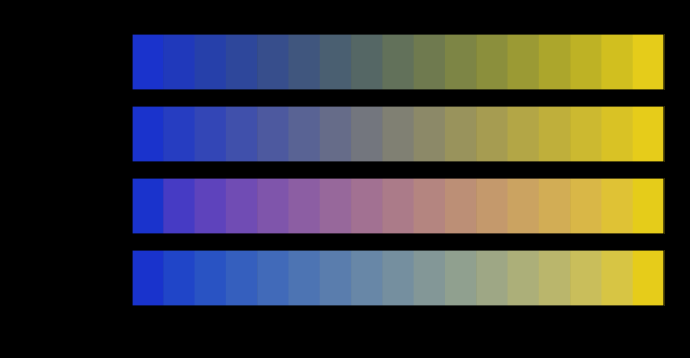
Two colours fix the ends of a blend and nothing else. The middle is decided by the space the interpolation happens in, and four spaces in daily use put the halfway point of one ordinary gradient as much as thirty-seven units of colour difference apart.
A gradient is a path
Two colours fix the ends of a blend and nothing else. The middle is decided by the space the interpolation happens in, and four spaces in daily use put the halfway point of one ordinary gradient as much as thirty-seven units of colour difference apart.
 The laws that make colour add up
Colorimetry is an integral, and an integral assumes matching is linear. Grassmann's four laws are exact for a linear observer, to floating point — and they fail at both ends of the light range, by two different mechanisms, leaving colorimetry an operating band of three and a bit decades that no standard states.
The laws that make colour add up
Colorimetry is an integral, and an integral assumes matching is linear. Grassmann's four laws are exact for a linear observer, to floating point — and they fail at both ends of the light range, by two different mechanisms, leaving colorimetry an operating band of three and a bit decades that no standard states.
 A lattice has no derivative
Every departure priced here was priced by perturbing something and reading the answer, which requires the thing being perturbed to have a derivative. A file written on a code lattice does not have one — its output is flat almost everywhere and jumps on a set of measure zero — so quantisation can be bounded and never propagated. The bound is 1.15 colour differences at eight bits per channel against a mean of 0.19, and it is worst where the encoding spends fewest codes.
A lattice has no derivative
Every departure priced here was priced by perturbing something and reading the answer, which requires the thing being perturbed to have a derivative. A file written on a code lattice does not have one — its output is flat almost everywhere and jumps on a set of measure zero — so quantisation can be bounded and never propagated. The bound is 1.15 colour differences at eight bits per channel against a mean of 0.19, and it is worst where the encoding spends fewest codes.
What this makes readable
Essays that name this one as a prerequisite.
Named alongside this one
Essays reaching for the same objects. Nobody chose these; they are what the index of named objects makes visible.
- A fourth primary is a design chromaticity · colour-matching · display gamut · primaries
- A gamut charges a gradient nothing cielab · colour difference · display gamut · gradient
- A third space breaks the tie only once cielab · colour difference · gradient · interpolation
- The straight line is not the shortest gradient cielab · colour difference · gradient · interpolation
- The triangle is a shadow chromaticity · cielab · display gamut · primaries
- Two uniform spaces disagree about between cielab · colour difference · gradient · interpolation
What links here
Every essay whose body links to this one.
The objects this essay names
Each one links to every other essay that touches it.
Additive mixtureChromaticityCIELABColour differenceColour-matchingDisplay gamutGradientInterpolationPrimariesTristimulus