A viewing condition is an argument
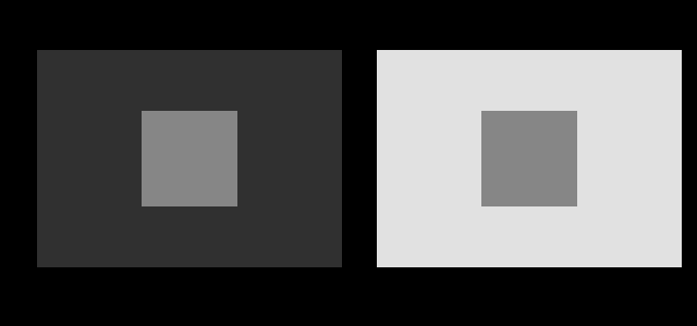
Assumes Matching is not appearance and These two patches are identical.
Colorimetry takes one argument. Hand it a stimulus and it returns coordinates, and the coordinates predict when two lights will match side by side under identical conditions. That is a strong claim, it is exactly true, and it is silent about what either light looks like.
An appearance model takes two. The second is the situation the stimulus is seen in, and the whole of what follows turns on the fact that it cannot be dropped.
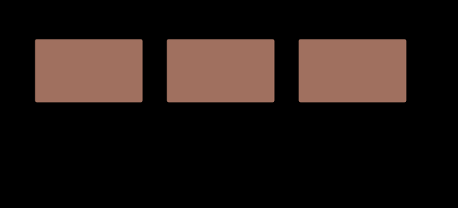
The three rooms are one setting of two other arguments, and both of those move the answer too.
The background is the second of the room’s four numbers, and it moves the same correlates by a comparable amount on its own.

Both dials go further than that, and the model keeps answering.
A dark background at the original level is the fourth corner of the same square, and the model answers there too.
What the second argument contains
CIECAM16 wants four things about the situation, and each of them is doing a different job.
The adapting white. The XYZ of whatever the observer’s visual system has taken as white. Everything chromatic is measured against it, and the model’s first step is to move the stimulus into a cone-like space and scale each channel by the ratio of that white to a reference. This is the arithmetic of colour constancy, and the model does it with a degree of adaptation rather than completely.
The adapting luminance, in candelas per square metre. Not a ratio — an absolute quantity, and the only absolute quantity anywhere in colour measurement. It enters through a factor that controls the compressive nonlinearity, and it is the reason the model can distinguish a scene at noon from the same scene at dusk.
The background luminance, relative to the white. What immediately surrounds the stimulus. It sets the exponent that lightness is raised to, which makes it the parameter behind every simultaneous-contrast effect the model can predict.
The surround, as one of three names: average, dim or dark. Not a number, because the experiments were run in three arrangements and nothing between them was measured. Average is a print sample on a desk in a lit room; dim is a television in a living room; dark is a projection in a darkened one.
The last of these is the most revealing about how the model was built. A parameter given as one of three words rather than as a continuous quantity is a parameter that has been fitted rather than derived, and the model does not pretend otherwise.
What comes out, and why there are six of them
The output is six correlates, and reading them as six ways of saying three things is the commonest error in using the model.
Lightness (J) and brightness (Q) are not the same. J is relative to the white — how light something looks for this white — and Q is absolute. A white page in sunlight and the same page indoors have identical J and enormously different Q. Ordinary speech has one word for both and colour science needs two.
Chroma © and colourfulness (M) divide the same way. C is relative, M is absolute, and the entire Hunt effect lives in the gap between them: raise the light level and M climbs steeply while C barely moves.
Saturation (s) is colourfulness relative to brightness, which is a third thing again — a dim red and a bright red of the same saturation look very different and are equally red.
Hue (h) is an angle, with a companion called hue quadrature that redistributes the circle so that equal steps are perceptually equal. That redistribution exists because the four unique hues are not evenly spaced, which is one of the most stubborn facts in the subject.
What the model changed on this site
The foundation phase stopped at the colorimetric layer deliberately and said so on every page. The cost was visible: three essays here — matching is not appearance, these two patches are identical, constancy is the default — described appearance phenomena where every other essay on the site computed its claims.
That has changed, and the change is narrower than it sounds. The essays now carry numbers where they carried adjectives. What they cannot do, and what nothing on this site will ever do, is show the reader an appearance.
The temptation the figures refuse
Given a model that says what a colour looks like under stated conditions, the obvious figure is a row of swatches showing how it looks under each. That figure is not drawn anywhere on this site, and the reason is worth stating plainly because it is the reason the model is useful at all.
A patch rendered to show what the model predicts under a dark surround will be displayed on a page in an unknown room. The page is the surround. Producing a swatch that claims to show a dark-surround appearance and then presenting it under whatever the reader’s conditions happen to be is not a demonstration of the model — it is a demonstration that the author did not believe it.
So the figures here draw the stimulus identically and print the number beside it. A reader can see that the panels are the same, and read what the model says about them. The alternative would look far more persuasive and would be showing something nobody has ever seen, which is the argument made at length about simulating colour vision deficiency arriving in a new field.
What was computed, and how
CIECAM16 is implemented here in full: the forward model, the inverse, hue quadrature, and CAM16-UCS on top. Three properties are asserted and each is asserted in the direction that can fail.
The round trip. Forward then inverse must return the stimulus it started from. Run over the whole sRGB cube, under all three surrounds, at five adapting luminances spanning four decades — 1,860 cases — the worst discrepancy is under 4 × 10⁻¹³. That matters more than it sounds: every constant in the forward direction appears again in the inverse, and a digit wrong in either copy shows up here at the scale of the error itself.
A fully adapted neutral has exactly zero chroma. Under complete adaptation, a grey seen under its own adapting white must come out with no chroma at all, whatever that white is. The test uses three whites including illuminant A, which is nothing like D65, so an implementation with D65 quietly hardcoded anywhere in the adaptation step fails.
And a partly adapted one does not. This is the substantive half. With the degree of adaptation where the model puts it — 0.94 at an ordinary indoor level — a neutral keeps a trace of its illuminant, which is what everybody’s experience of a tungsten-lit room reports. Checking only the first property would pass an implementation that had thrown the degree of adaptation away.
The constant that was wrong, and what caught it
The first version of this implementation added 0.305 to the denominator of the quantity chroma is built from, copying the constant from the achromatic response two lines above. It is a natural mistake: nearly every neighbouring expression in the model ends in ±0.305.
Every structural check passed. Lightness, hue and brightness were exact against the published test vector to four decimal places. Only chroma was wrong, by about 1%.
A 1% chroma error is not visible in any figure this site draws. What found it was the round trip, because the published inverse’s algebra pins the forward denominator exactly — and the round trip reported a discrepancy of four XYZ units rather than four in the thirteenth decimal place. The lesson is the site’s own habit stated once more: an assertion that cannot fail proves nothing, and the assertion that caught this one was the one comparing two independent derivations rather than the one comparing a number to a table.
Where the model stops
Three limits, and the third is the largest.
It has no size parameter. A wall and the paint chip it was chosen from are the same stimulus and look different, and CIECAM16 returns the same numbers for both. The CIE’s answer to field size is a different observer — the 1964 ten-degree functions — rather than a term in the appearance model, so the honest computation for the size effect is a change of observer and belongs in a different essay.
It is a model of a patch, not of a scene. The background is one number. Real scenes have structure, and the visual system’s parse of that structure is exactly what the checker-shadow figure exploits. A model that took a single background luminance can say nothing about a figure whose whole content is that the background is interpreted.
The surround is three words. Between a dim room and a dark one there is no defined position, and a great many real viewing situations sit there.
What it predicts, and what it turns out not to
The phase that built this model set out to turn two described effects into computed ones. It managed one of them.
The Hunt effect — colourfulness rising with absolute light level — is squarely in the model. Across four decades of adapting luminance, predicted colourfulness rises by a factor of 2.24, monotonically.
The Stevens effect — apparent contrast rising with light level — is not. Hold the stimuli at fixed fractions of the white, raise the adapting luminance through the same four decades, and the exponent of the lightness curve moves by 2%, in the wrong direction.
What does move apparent contrast is the surround, and by an order of magnitude more. That finding is taken up properly elsewhere; what belongs here is that it was found by computing something the phase plan had assumed, and that the assumption was recorded as withdrawn rather than quietly dropped.
The tone curve, which is where contrast lives
The surround enters as an exponent, which is why it does so much.
This is the model’s most practically consequential prediction and the one with the clearest engineering consequence. Cinema projection uses a higher system gamma than television, television uses a higher one than a computer display, and the ordering is the ordering of the surrounds. That was empirical practice for decades before there was a model that produced it.
Against CIELAB, which it does not replace
A fair question is what CIELAB was doing wrong that needed this. The answer is: less than the existence of a successor suggests.
CIELAB gets the ordering exactly right, which is most of what a lightness scale is for, and it does so without needing any of CIECAM16’s four extra arguments. What it cannot do is say that the same sample looks lighter in a dark room. It is a colorimetric space with a perceptual metric attached, and the description is not a criticism — it is a statement of which layer it belongs to.
The hue comparison is where the received account fares worse. The idea that a* is the red-green axis and b* the yellow-blue one is repeated constantly, and if it were true the four unique hues would sit at 0°, 90°, 180° and 270°. Unique red sits some 25° off.
A bright surround with a light background is the office case, and it is where the three panels are closest together.

Six numbers are not a difference
An appearance model returns correlates. It does not, on its own, say how far apart two appearances are, and the gap is larger than it looks: knowing that the lightness changed by eight and the chroma by three does not say whether the change is small.
The answer is a uniform space built on top of the model. CAM16-UCS compresses lightness and colourfulness through two fitted functions, lays the result out on Cartesian axes, and defines a distance. Only then does a difference between two appearances have a number, and only then can a claim like “these two lamps render this surface differently” be given a magnitude rather than an adjective.
This is the same move CIELAB made on top of XYZ, one layer higher, and it inherits the same caution. The uniformity is fitted, the fit has a residual, and a distance in CAM16-UCS is a good estimate of perceptual difference rather than a measurement of one. Every ΔE′ quoted on this site — in the rendering comparisons, in the fidelity figures — is a number from that space, and it is worth knowing which of the two layers it came from.
A dim room with a dark background is the cinema case, and it is where the same stimulus is furthest from itself.
What the model is actually for
It is easy to read all of this as a refinement of colour measurement, and it is not. Colorimetry is exact at what it does and an appearance model does not improve on it. What the model does is answer questions colorimetry has to decline.
Will this look right on that screen, in that room? A question with a room in it, and therefore not colorimetric. The model takes the room and returns an answer.
How much should the image be adjusted for a darker viewing environment? The tone curve above, read backwards. This is the calculation behind every reference-white and system-gamma convention in broadcast and cinema, and it was empirical practice long before it was computed.
Do these two lamps render this surface the same way? Both lamps have their own white, so the comparison requires adapting each to its own before anything is compared — which is an appearance calculation whether or not anybody calls it one. Every modern colour rendering index is built this way.
Is this grey neutral? Colorimetrically, yes, if it matches the white point. In appearance terms it depends on how completely the observer is adapted, and the answer under a tungsten lamp is no.
The pattern across all four is the same. Each is a question somebody actually wanted answered, each has been answered badly for decades by quoting a colorimetric number, and each turns out to have the viewing situation in it. The extra argument is not a complication the model imposes. It was in the question the whole time.
Who found it, and when
The distinction between measuring a match and predicting an appearance is older than colorimetry. Hering argued in the nineteenth century that appearance depends on context in ways a receptor-level account could not capture; Helmholtz took the more reductive position; both turned out to describe real stages of a two-stage system.
Robert Hunt spent much of the twentieth century assembling the phenomena an appearance model would have to predict, and the effect that carries his name was published in 1952. Mark Fairchild’s Color Appearance Models, first published in 1998, established the field as a distinct layer with its own literature.
CIECAM97s appeared in 1997 as the first widely adopted model, revised as CIECAM02 in 2002 and again as CIECAM16 in 2016. The 2016 revision was not a change of theory. CIECAM02’s chromatic adaptation transform could produce negative tristimulus values for saturated colours in some viewing conditions, which broke real software; CAT16 replaced it and the surrounding structure was simplified in the same pass.
What the pictures cannot show
The central limitation is unavoidable and has been stated in every section above, because every figure here runs into it.
Demonstrating that appearance depends on viewing conditions requires controlling the viewing conditions, and this page controls none of them. The reader’s screen brightness, ambient light, distance and surround are unknown, and every one of them is an input the model needs.
So what is on this page is arithmetic. The model says a patch on a dark background should read some units lighter than the same patch on a light one; whether it does, for this reader, in this room, is not a question the page can ask. The gap between a prediction and a demonstration is the whole of what an appearance model is for, and it is also the reason no figure here will ever claim to have closed it.
Where this goes next
The two effects the model predicts and the one it does not are brighter looks more colourful. The adaptation step, compared against its alternatives, is four ways to move a white point. The unique hue anchors that hue quadrature is built from are why there are four unique hues. And the layer below all of it, which none of this replaces, is matching is not appearance.
Where this goes next
 Matching is not appearance
CIE XYZ predicts when two lights will look the same under identical viewing conditions. It was never a model of how anything looks, and most of the confusion in applied colour comes from using it as one.
Matching is not appearance
CIE XYZ predicts when two lights will look the same under identical viewing conditions. It was never a model of how anything looks, and most of the confusion in applied colour comes from using it as one.
 Brighter looks more colourful
Colourfulness rises with light level and the model predicts it. Apparent contrast is supposed to rise too, and the model does not — which turns out to be right, because the thing that actually carries contrast is the surround.
Brighter looks more colourful
Colourfulness rises with light level and the model predicts it. Apparent contrast is supposed to rise too, and the model does not — which turns out to be right, because the thing that actually carries contrast is the surround.
 Constancy is the default
A sheet of paper looks white in daylight and white under a tungsten lamp, although the light reaching the eye differs enormously. The visual system is solving one equation with two unknowns, and it solves it by assumption.
Constancy is the default
A sheet of paper looks white in daylight and white under a tungsten lamp, although the light reaching the eye differs enormously. The visual system is solving one equation with two unknowns, and it solves it by assumption.
What this makes readable
Essays that name this one as a prerequisite.
- A brighter white still looks white
- A name moves with the room
- A patch is not a scene
- A viewing condition is a moment
- Brighter looks more colourful
- Brightness is not luminance
- The model has no clock
- The proof is a different object
- Why there are four unique hues
- The surround is three rows of a table
- A dial has a price
- The appearance model takes XYZ
- An appearance is not always a stimulus
- The model has a hue shift it was never given
- A room with two lights has no white
- A dark background moves every difference and no match
- Two rooms with one lightness scale
- The reversals have a straight edge
- The cancellation is exact and cheap to lose
- What an adapted viewer loses is set by the wall
Named alongside this one
Essays reaching for the same objects. Nobody chose these; they are what the index of named objects makes visible.
- A display in a room is a smaller display adaptation · ciecam16 · colour appearance · surround · viewing condition
- A name in the model's own words ciecam16 · cielab · colour appearance · surround · viewing condition
- The appearance model has no straight piece ciecam16 · cielab · lightness · surround · viewing condition
- There is no brown light ciecam16 · colour appearance · lightness · surround · viewing condition
- Two rooms with one lightness scale ciecam16 · colour appearance · lightness · surround · viewing condition
- Where the model's curve does not matter adaptation · ciecam16 · colour appearance · luminance · viewing condition
What links here
The 8 essays that link to this one and share the most of its objects, of 44 that link here.
The objects this essay names
Each one links to every other essay that touches it.
AdaptationCIECAM16CIELABColorimetryColour appearanceLightnessLuminanceSurroundViewing condition