There is no brown light
Assumes A patch is not a scene and Brightness is not luminance.
No lamp is brown. No star is brown, no laser is brown, no pixel on a black screen in a dark room is brown. Brown is one of the eleven basic colour terms of English, it names a very large region of the space of surface colours, and it cannot be a light.
That is not a curiosity of language. It is a consequence of a structural division inside every appearance model, and this essay computes it.
The claim
Appearance attributes come in two families, and brown lives entirely in one of them.
- Absolute: brightness and colourfulness. How much light is arriving, and how colourful it looks in its own right. These need no reference.
- Relative: lightness and chroma. How much light is arriving compared with the white in the field. These are ratios, and a ratio needs a denominator.
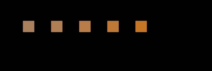
Brown is a low-lightness orange. Low lightness means “much darker than the white”, so a stimulus with nothing brighter beside it has no lightness to be low — it sits at the top of the scale whatever its luminance, and it looks like a dim orange light rather than a brown one.
The measurement
The construction is the cleanest possible: hold the stimulus fixed in XYZ, and change only what it is being judged against.
| white | lightness J | brightness Q | colourfulness M |
|---|---|---|---|
| 12 cd/m² | 152 | 68 | 28 |
| 25 | 101 | 81 | 29 |
| 50 | 69 | 97 | 31 |
| 100 | 48 | 118 | 33 |
| 200 | 33 | 146 | 35 |
| 400 | 23 | 182 | 37 |
| 800 | 16 | 229 | 39 |
Lightness falls by a factor of 9.4 across that sweep. Brightness rises by 3.35 — it rises because raising the room’s light level raises the model’s adapting luminance, which is a real change in the situation, not an artefact.
The two moving in opposite directions is the whole point. The stimulus is unchanged; what changes is which question is being asked about it. “How much light is that?” gets one answer. “How light is that?” gets another, and the second is the one with a name attached.
By a stated criterion — orange hue, lightness below 45 — the stimulus is brown in the bottom three rows and not in the top four. The criterion is crude and it is a criterion, not a measurement: nothing in any colour space marks where brown begins.

The same construction can be read as a sweep of chroma rather than of surround, and the two together say which of the model’s correlates the word is tracking.
How much of the fall is the reference, and how much the observer
The sweep changes two things on purpose — the white rises and the room’s adapting luminance rises with it — and the section on method says so. What it does not do is separate them, and the separation is available for nothing, because this site carries a space that has a reference and no adapting luminance at all.
CIELAB’s lightness is a ratio to a white and nothing else. Running the identical stimulus against the identical seven whites through it:
| white | CIECAM16 J | CIELAB L* |
|---|---|---|
| 12 cd/m² | 152 | 132.2 |
| 25 | 101 | 100.0 |
| 100 | 48 | 57.1 |
| 400 | 23 | 30.0 |
| 800 | 16 | 20.5 |
| fall over the sweep | ×9.50 | ×6.43 |
Five sixths of the effect is the reference moving and one sixth is the observer adapting. In logarithms — the right way to split a product of two factors — the ratio account carries 83 per cent of the fall and the residual ×1.48 is what CIECAM16 adds by knowing how bright the room got.
Two things follow, and they pull in opposite directions.
The claim survives, and comfortably. The essay’s argument is that brown is a relative attribute, and the relative account alone takes the stimulus from L* 132 to L* 20 — straight through any plausible brown boundary, without a single term that knows what a room is. A model with no adapting luminance in it reproduces the whole phenomenon.
And the two effects are not the same kind of thing. The reference is arithmetic: a ratio has a denominator and the denominator changed. The adaptation is physiology: the observer’s own gains moved because the room got brighter, and they would have moved for a stimulus with no white beside it at all. So the second sixth is not more of the first — it is the absolute half of the model leaking into the relative half, which is exactly the boundary this essay is drawing.
That leak is worth naming rather than tidying away, because it qualifies the two-family division the claim rests on. Lightness is relative and colourfulness is absolute, and CIECAM16’s lightness still moves a little when only the light level changes, because its whole apparatus sits downstream of an adaptation stage that every correlate inherits. The division is between what the attributes are about, not between which parts of the model they touch — and a reader who took “relative” to mean “unaffected by the light level” would be reading a cleaner claim than the model supports.
The per-doubling figures make the same point compactly. Across the sweep lightness falls by 1.455 per doubling of the white, brightness rises by 1.224, and colourfulness rises by 1.057. Only the last of those is small enough to call a side effect; the middle one is the absolute attribute doing precisely what it should, and the first is both effects at once.
Why a light cannot get there
A self-luminous stimulus viewed against a dark field is the top row of that table, taken to its limit. There is nothing brighter in the field, so the model’s white is the stimulus, and the relative attributes collapse: lightness goes to the top of its scale by construction, and stays there however the luminance is changed.
Turn a brown-looking lamp down and it does not become browner. It becomes a dimmer orange light — brightness falls, lightness does not, because lightness had nowhere to fall from. That is the everyday demonstration, and it is available to anyone with a dimmer and a dark room.
The formal version is the assertion the appearance library carries: at the top of the sweep, where the stimulus is brighter than its own white, the model returns a lightness above 90; at the bottom it returns one below the brown criterion; and the lightness range must exceed the brightness range, because the argument is that the relative attribute is the one the surround moves.
Brown is therefore the clearest everyday evidence that colour appearance is not a property of a stimulus. It is a whole named category that exists only in the presence of something else.
The rest of the family
Brown is the famous case and it is not alone. Every colour name that means “dark version of something” has the same property:
- Olive is dark yellow. There is no olive light.
- Navy is dark blue, maroon dark red, and neither can be emitted.
- Grey is dark white — and a “grey light” is simply a dim white one.
Meanwhile the categories that are not darkness-defined — red, yellow, blue, green, pink, orange, purple — all have self-luminous versions, and every one of them can be a lamp.
That split runs straight down the middle of the English colour vocabulary, and it is not a fact about English: the same division appears wherever basic colour terms have been surveyed, because it is a fact about which regions of appearance space require a reference.
How a screen shows brown at all
A display is an array of light sources, and this essay has just argued that a light cannot be brown. Screens show brown constantly. The resolution is the whole argument restated: a pixel is not viewed alone.
The brown on a screen is brown because the rest of the screen is brighter. The white of a page, the surround of a photograph, the bright parts of the same image — all of them are in the field, and the visual system takes its reference from them. Reduce the field to one lit pixel in a dark room and the colour goes with it: what remains is a dim orange light, and no amount of adjusting the pixel’s own value brings brown back.
That has a practical consequence which display engineers meet constantly and rarely state in these terms. A dark image on a bright screen and the same image on a dark screen are different stimuli, because the reference has moved; the surround is not a viewing preference but an argument to the appearance model. It is the same argument a soft proof loses to a room, arriving at the level of a single named colour.
What the pictures cannot show
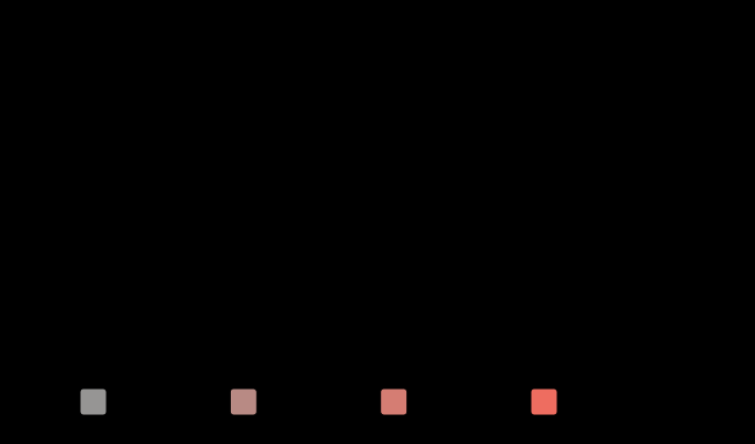
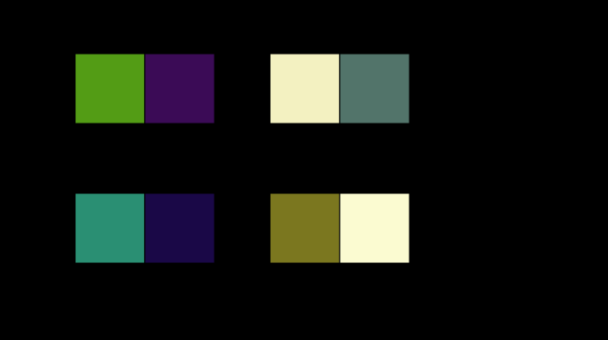
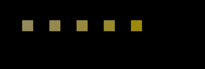
They cannot show the effect at full strength. Every swatch on this page sits on a page whose own background is fixed, and the “surround” in each cell is a drawn rectangle rather than a room. The model’s sweep runs over a factor of sixty-six in the white’s luminance; a page can draw a factor of maybe twenty in reflectance and cannot change the reader’s adaptation at all. So the figures illustrate an arithmetic the reader’s own screen is actively working against.
And the categorical half is not drawn anywhere. Where “orange” stops and “brown” starts is a boundary in a person’s judgement; the dashed line on the sweep is a criterion stated in code. A figure that showed the real boundary would need naming data.
The same fact in the print shop
Printing has known this for as long as it has had a white point, and states it differently: the paper is the lightest thing on the sheet, so every colour on it is judged against the stock.
That makes a printed brown easy and an emitted one impossible, and it makes the paper the white point rather than a colour among others. Change the stock and every colour on the page moves, not because the ink changed but because the denominator did — the identical arithmetic as the sweep above, performed by a substrate rather than by a lamp.
It also settles a question that sounds like a paradox. A printed brown reflects more light than a printed black, obviously; but a printed white under a dim lamp reflects less light than a brown under a bright one, and neither of them changes name. Lightness is a ratio, both ratios are preserved, and the absolute quantities that differ by orders of magnitude are exactly the ones nobody is judging.
What was computed, and how
The stimulus is specified by hue and chroma in CIECAM16 and solved so that its luminance is exactly 25 cd/m² — by iterating the model’s inverse on lightness until lands, checked to a billionth on every row. That is what “fixed in XYZ” means here: the same three numbers arriving at the eye in every row of the table.
The room changes in two ways at once, and deliberately: the white’s luminance rises, and the adapting luminance rises with it at a fifth of the white, which is what an ordinary scene does. Holding the adapting luminance fixed while raising the white would be a different and stranger experiment — a bright white in a dark room — and would separate the two curves further.
The background is set to a fifth of the white rather than to a fixed number, because a room’s grey card is a fraction of its white; viewingConditions refuses a background brighter than the white it is a fraction of, and the first version of this sweep hit exactly that refusal.
And the naming criterion is stated once, in code: hue between 40 and 90 degrees, lightness below 45. Every use of the word “brown” in this essay resolves to that, so a reader who disagrees with the boundary can see precisely what was assumed.
The whole solid moves with the room, not only its most colourful corner, and the volume is the reading that says so.

Where the model stops
No naming data. The criterion is a line drawn for the purpose, not a measurement of where English speakers put the boundary. Real naming boundaries are fuzzy, vary between observers and languages, and depend on the surround as well — the very effect being demonstrated.
One hue at a time. The brown region is a volume in appearance space with hue, chroma and lightness extent; two hues are drawn here.
No memory colour and no object recognition. A great deal of what makes something look brown in a photograph is knowing it is a piece of wood, and none of that is in an appearance model. This site computes stimuli in situations.
The CIELAB comparison is not a control, it is a second model. Splitting the fall between reference and adaptation assumes CIELAB’s lightness is the pure ratio account, and CIELAB’s lightness is itself a fitted curve with an offset and a linear toe in it — the ×6.43 it reports is not a cube root of anything, and a different relative space would apportion the split differently. What the comparison does establish is a bound: a space with no light level in it produces most of the effect, so the effect is not an artefact of having modelled the room.
And the surround is a uniform field. Real scenes have structure, and what counts as “the white in the field” in a complex scene is an estimation problem rather than a parameter — which is where this argument stops being clean and becomes the constancy problem.
A cyan is the hue where the model’s brightness moves the wrong way with chroma, which is the sharpest form of what it cannot say.

The generalisation
The useful form of this is a question to ask about any colour claim: is this attribute relative or absolute?
The answer decides what a measurement of it can mean. An absolute attribute can be reported for a stimulus alone — a photometer can do it, a spectroradiometer can do it, a file can carry it. A relative attribute cannot be reported at all without saying what the reference is, and a number that omits the reference is not wrong so much as incomplete.
Several of this site’s standing arguments are instances of the same division:
- A hex code is not a colour partly because it is relative to a display’s white and does not say which.
- Lightness scales differ between viewing conditions because lightness is relative and the conditions supply the denominator.
- A paper’s white is the reference for every printed colour, which is why the same ink on two stocks is two colours.
- And a gamut in the dark is smaller in its absolute attributes while its relative ones do not move at all — the same split, measured at the other end.
The one-line version: a dark colour is a claim about two things, and only one of them is in the file.
Who found it, and when
That brown requires a surround was established by the classic work on colour naming and surface-colour appearance in the twentieth century, and the demonstration usually credited is Evans’s: an orange light in a dark surround, with a white brought up beside it until the orange turns brown, which happens smoothly and at a definite place.
Berlin and Kay’s survey of basic colour terms across languages, in 1969, made the categorical half visible — that brown is a basic term in a great many languages and appears at a specific stage in their sequence, always after the terms that have self-luminous versions.
The appearance-model half is later and is what makes it computable. CIECAM-class models were built with the relative and absolute correlates as separate outputs, precisely because the earlier practice of reporting one number for “how light” had no way to say which question it answered.
Where the ladder goes next
The immediate continuation is the one this essay’s criterion exposes: naming as a measurement. Where the brown boundary actually sits, for real observers, is data this site does not hold, and a version of this argument with a measured boundary rather than a stated one would be a much stronger claim — and would let the sharpness of the boundary be measured, which is the interesting question about categorical perception.
The second is the scene. Everything here has one patch and one uniform white. A real photograph has many candidate whites, and choosing one is the constancy problem — so whether something in a picture looks brown depends on an estimate the visual system makes and the camera makes differently. That is where this argument meets the imaging field, and neither side has computed the join.
Where this goes next
 Brightness is not luminance
Photometry is additive because the CIE defined it that way. Brightness is not, and a saturated colour looks as bright as a neutral of one and a half times its luminance — an effect this site's appearance model moves by two per cent, in a direction that depends on the hue.
Brightness is not luminance
Photometry is additive because the CIE defined it that way. Brightness is not, and a saturated colour looks as bright as a neutral of one and a half times its luminance — an effect this site's appearance model moves by two per cent, in a direction that depends on the hue.
 A patch is not a scene
A paint chip is the wrong size, on the wrong background, at the wrong luminance, in the wrong surround. Every one of those is a term in an appearance model, and the model says how much each of them moves the answer — which is the difference between a caution and a prediction.
A patch is not a scene
A paint chip is the wrong size, on the wrong background, at the wrong luminance, in the wrong surround. Every one of those is a term in an appearance model, and the model says how much each of them moves the answer — which is the difference between a caution and a prediction.
 Brightness is inferred from edges
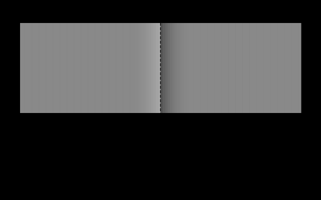
The Cornsweet effect makes two identical regions look different by altering nothing except a narrow band at the boundary between them. Cover the boundary and the difference vanishes, which says the visual system is reconstructing surfaces rather than reading off intensities.
Brightness is inferred from edges
The Cornsweet effect makes two identical regions look different by altering nothing except a narrow band at the boundary between them. Cover the boundary and the difference vanishes, which says the visual system is reconstructing surfaces rather than reading off intensities.
Named alongside this one
Essays reaching for the same objects. Nobody chose these; they are what the index of named objects makes visible.
- The proof is a different object ciecam16 · colour appearance · colourfulness · lightness · surround · viewing condition
- A dark background moves every difference and no match ciecam16 · colour appearance · lightness · simultaneous contrast · viewing condition
- A gain has a time constant ciecam16 · colour appearance · colour constancy · surround · viewing condition
- A model judged in another model's unit ciecam16 · colourfulness · lightness · surround · viewing condition
- A name in the model's own words ciecam16 · colour appearance · naming · surround · viewing condition
- A name moves with the room ciecam16 · colour appearance · naming · surround · viewing condition
What links here
Every essay whose body links to this one.
The objects this essay names
Each one links to every other essay that touches it.
BrightnessCIECAM16Colour appearanceColour constancyColourfulnessLightnessNamingSimultaneous contrastSurroundViewing condition