Brightness is inferred from edges
Assumes These two patches are identical.
Two large regions of identical luminance, joined by a narrow band in which one side ramps up and the other ramps down. The whole left region looks lighter than the whole right region. Cover the band with a finger and the two halves become obviously identical.
The edge is the only thing carrying the effect, and that is a claim with a dial on it.
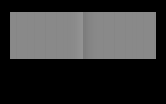
Driving the amplitude the other way is the same experiment and the answer moves with it, which is what a mechanism looks like from outside.
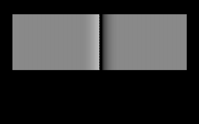
The level the whole figure sits at is a separate dial, and it is the one an account in terms of luminance would have to depend on.
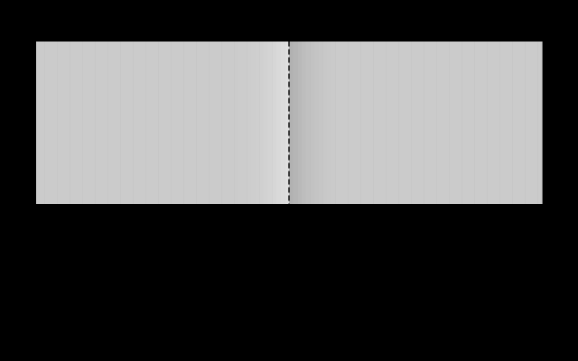
Two more settings fill in the middle of both dials, and between the five of them the plateaux have never once carried the difference.
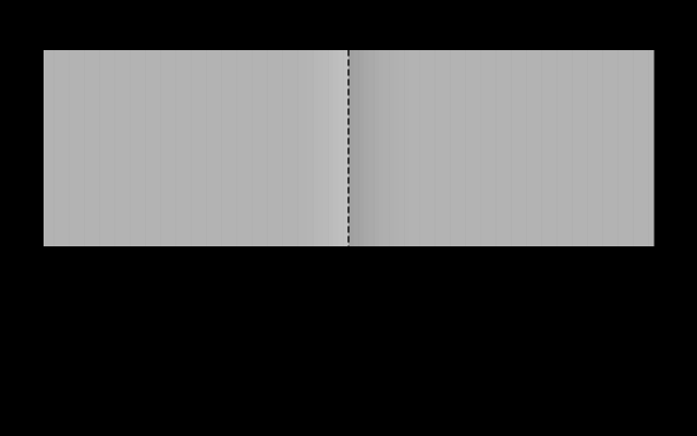

This is a stronger demonstration than simultaneous contrast, and the reason is worth being precise about. In simultaneous contrast the two patches have different surrounds, so something in the neighbourhood really does differ. Here, the two plateaux are identical and so is everything near them. The only difference in the entire figure is confined to a band neither region touches.
What the effect implies
If the visual system reported luminance region by region, the two plateaux would look the same, because they are the same. They do not, so it does not.
What appears to happen instead is that the system detects edges — places where the signal changes rapidly — and then reconstructs the surfaces between them by, in effect, integrating outward from the edges. The Cornsweet profile contains a step-like edge at the centre; the reconstruction propagates that step across both plateaux; and the gradual ramps either side of it, being gradual, are discounted as illumination rather than as changes in the surface.
That last part is the important half. The visual system is not merely detecting edges; it is deciding which changes are the object and which are the lighting. Sharp changes are usually where one surface meets another. Gradual changes are usually a shadow or a falloff in illumination. The system treats them differently on purpose, and the Cornsweet stimulus is constructed so that its gradual part gets discounted and its sharp part gets believed.
Why this is a good design
It is worth resisting the framing in which these effects are errors.
The problem the visual system is solving is to recover the properties of surfaces — how reflective they are — from a signal that confounds reflectance with illumination. A surface’s reflectance is a stable, useful thing to know: it identifies materials, it stays constant as the light changes, it is what “the colour of” an object means. The luminance arriving at the eye is the product of that reflectance with an illumination that varies by orders of magnitude and carries little useful information.
Separating the two from a single measurement is formally impossible — one equation, two unknowns. The system solves it with assumptions, and the assumptions are sound ones about the world: illumination usually varies smoothly, surfaces usually have sharp boundaries, and the brightest thing in view is usually white.
Every figure in this essay is a stimulus engineered to violate one of those assumptions. The results are then called illusions, which is a slightly unfair name for a system giving the right answer to the question it was designed for.
The checkerboard
The most famous version puts the assumption about illumination on display directly.
The appearance is not close. The two squares look plainly different, and no amount of staring resolves it. What the visual system has done is entirely reasonable: it has identified a shadow, discounted the illumination inside it, and reported the reflectances — and as reflectances the two squares genuinely are different. One is a dark square and one is a light square. The report is correct about the world and wrong about the image.
Because this figure is generated rather than reproduced from a bitmap, the bar that destroys the illusion can be drawn from the same coordinates as the squares:
The bar works by defeating the parsing. A continuous region of one value cannot be two surfaces at different illuminations, so the scene interpretation that produced the effect is no longer available, and the raw equality comes through.
White’s illusion, again
The stripe figure belongs here too, because it is the cleanest evidence that local mechanisms are insufficient.
Lateral inhibition predicts that a patch with more black around it should look lighter. Measure the adjacency and the bar in the dark stripe has more black neighbours; it looks darker. Whatever the visual system is doing, it is not counting adjacent luminances.
The leading account is that the bar is grouped with the stripe it lies along — treated as part of that stripe’s surface — and its lightness is judged relative to that grouping rather than to everything it touches. Which is a claim about mid-level vision, about how the scene is carved into objects, and not about retinal filtering at all.
What no filter can produce
The account above says the visual system integrates outward from edges, and there is a sharper way to put the same claim: no linear filter of any scale produces the effect at all.
Build the Cornsweet profile with a cusp of half-width 0.15 degrees on plateaux at 0.25, high-pass it with a Gaussian of each scale in turn, and read the two plateaux three degrees out on either side:
| filter scale | plateau difference | cusp amplitude |
|---|---|---|
| 0.1° | 1.6 × 10⁻¹⁰ | 0.171 |
| 0.25° | 2.0 × 10⁻⁹ | 0.218 |
| 0.5° | 1.3 × 10⁻⁷ | 0.226 |
| 1.0° | 2.2 × 10⁻⁴ | 0.228 |
| 2.0° | 7.0 × 10⁻⁴ | 0.228 |
The cusp survives at full strength and the plateaux stay identical, at every scale from a tenth of a degree to two. The residual difference is the filter’s own reach touching a point three degrees away, and it never rises above seven parts in ten thousand of a signal whose cusp is 0.228.
That is not a limitation of the particular filter. It is what linearity means: two points carrying the same value go in, and any linear operator returns two values differing only by however much the operator’s tails see of what is between them. To make the plateaux differ, something has to carry the edge’s value outward and hold it there — which is an integration with a boundary condition rather than a convolution.
So the effect is a proof that the reconstruction stage exists, and not merely evidence for it. Any account of the Cornsweet edge as a band-pass filter, of which there are several, has to be an account in which the filter’s output is subsequently integrated — and the integration is the part doing the work the illusion is named for.
Anchoring: what counts as white
There is one more ingredient, and it is the piece that makes the whole system work.
Ratios alone do not determine lightness. Knowing that patch A is twice patch B does not say whether they are white and grey or grey and black. Something has to anchor the scale, and the evidence is that the visual system anchors it roughly to the highest luminance in the scene, which it treats as white.
This is why a photograph of a dimly lit room looks like a dimly lit room rather than like a set of dark surfaces, and why the same photograph brightened looks like a normally lit room. It is also why a projected image can contain convincing blacks despite the projector emitting light everywhere — the black is the darkest thing available, and it anchors accordingly.
Anchoring is what makes lightness a relative quantity in a way brightness is not, and it is where a good deal of the current disagreement in the field sits — scenes with several illumination regions can have several anchors, and how the system chooses between them is not settled.
The same logic in colour
Everything above concerns lightness, and the chromatic version behaves the same way.
That the shift runs along opponent axes rather than arbitrary directions is evidence for the opponent recoding sitting between the cones and everything downstream. A red surround does not make a patch look yellow or blue; it makes it look green, because red and green are the two ends of one channel.
The chromatic and achromatic effects are usually treated together because they appear to share a mechanism: local normalisation against an estimate of the surround, computed separately on each opponent channel.
What this does to specification
The practical consequence runs through the whole of applied colour.
A colour cannot be specified in isolation and expected to behave, because appearance is a function of the arrangement. A palette assessed as a row of swatches has been assessed in a configuration it will never appear in — swatches beside one another influence each other, and the same swatches separated by white space do not.
This is why colorimetry stops where it does, and why colour appearance models take the viewing situation as an argument rather than deriving it. It is also why this site’s page chrome is exactly neutral: coloured furniture would shift every swatch on every page, by an amount depending on where in the layout it happened to sit.
What was computed here
Every figure in this family is generated from parameters, and every identity claim is asserted.
The Cornsweet construction carries an additional check the others do not need. Its caption depends on the plateaux being genuinely flat and genuinely equal — if the ramp leaked even slightly into them, the figure would be an ordinary brightness difference in disguise. So the assertion measures the spread of luminance across each plateau separately and requires it to be zero, and then requires the two plateaux to be equal to each other. Both come out exactly zero rather than merely small, because the profile is constructed piecewise with the cusp confined to a stated interval.
All the greys are specified by relative luminance rather than code value, since these figures are about luminance relationships and the transfer function is not linear.
Every grey here is specified by relative luminance and converted through the sRGB transfer function, because these figures are about luminance relationships and the code value is not the luminance. Specifying them by code value would have made the captions wrong in a way no amount of looking would reveal.
Why the generated version is weaker, and better
There is a trade-off in building these figures from code rather than reproducing photographs, and it runs against the illusions.
Adelson’s original checkerboard is a rendered three-dimensional scene with a cylinder casting the shadow, depth cues, a soft penumbra and consistent perspective. All of that strengthens the illumination interpretation, and the illusion is correspondingly stronger. The version here is flat rectangles with a plausible shadow region, and it works less well.
It is nonetheless the version this site draws, because every value in it is known, computed and asserted. The photograph is more convincing and the reader has to take its claim on trust; the generated figure is less convincing and its claim is checked. Given that the entire point of the exercise is that the identity cannot be verified by looking, the weaker and checkable version is the right trade.
The same reasoning applies across the fleet these sites belong to. A picture that is convincing and unverified is worth less than a picture that is plain and asserted, because the failures that matter have no visual signature.
Where the account is still unsettled
Edge integration and anchoring are well supported and they are not a complete theory, and it is worth marking the boundary.
Anchoring in scenes with several illumination regions is genuinely open — how the visual system decides which regions share an anchor, and what happens at the boundaries, remains a matter of competing models. White’s illusion has at least three current explanations, appealing to grouping, to filling-in and to spatial filtering at multiple scales, and the experimental evidence does not cleanly separate them.
So the mechanisms described here are the best available account rather than a settled one. What is settled is the data: the figures reproduce, the identities hold, and any theory has to accommodate them.
The reader as instrument
Every figure here is an experiment the reader runs rather than a result reported to them, which is unusual and worth naming.
The Cornsweet effect can be tested by covering the centre band with a finger. The checker-shadow can be tested by comparing the connected and unconnected versions. White’s illusion can be tested by cropping mentally to one stripe at a time. In each case the reader’s visual system is the measuring device, and the measurement is repeatable.
That is available on this subject and on very few others. It also carries the corresponding limitation: an instrument that cannot be calibrated, in conditions that cannot be controlled, reporting to the person operating it.
One consequence for anyone building figures of this kind: the more convincing the illusion, the more the reader is being asked to trust. A rendered scene with depth cues and soft shadows produces a much stronger effect than the flat construction here, and it also produces a claim the reader has no way to check. Between a compelling picture whose identity is promised and a plain one whose identity is asserted, the plain one is worth more, and this site takes that trade every time.
One more consequence, for anyone designing with contrast. Because lightness is inferred from edges rather than from areas, a boundary carries more perceptual weight than the regions either side of it. A thin dividing rule can separate two regions more effectively than a large difference in fill, and a soft boundary between two different fills can read as a single surface under uneven lighting. Both are the same mechanism doing what it does, and both are usable rather than merely avoidable.
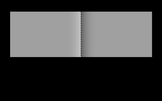
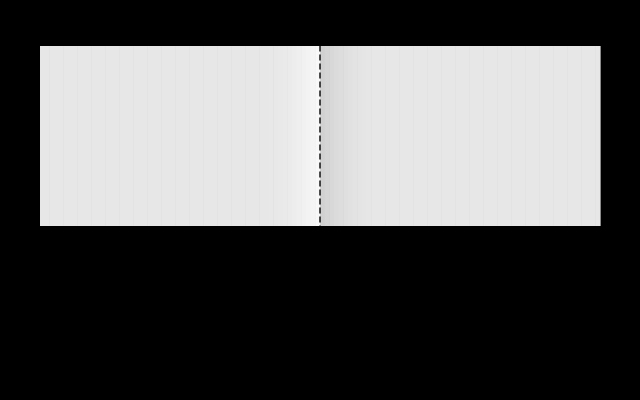
A lighter pair of plateaux with a stronger edge is where the illusion is easiest to see and hardest to disbelieve.
How large the inference is, in units
Everything above establishes that the visual system infers lightness from edges rather than reading it off. It does not say by how much, and until this phase the site had no machinery that could.
An appearance model takes the background as an argument. Hold a patch fixed, vary the relative luminance of what surrounds it, and CIECAM16 returns a different predicted lightness for each — not because the stimulus changed, but because the background is one of the model’s inputs and lightness is defined relative to it.
The number is worth treating with care in both directions. It is a real prediction, from a model fitted to a great deal of experimental data, and it is the first quantitative statement this site has been able to make about an effect it had previously only described. It is also a prediction about a viewing situation nobody here controls: the figure specifies backgrounds as fractions of an adapting white, and what surrounds the figure is a web page in an unknown room.
So the model says how much the appearance ought to shift, and the page cannot check whether it does. That gap is not a defect of the model — it is the same gap this essay opened with, arriving from the other side. The visual system infers lightness from context, and any page attempting to demonstrate the fact is itself part of the context it is trying to hold constant.
Near the top of the display’s range the same construction has much less room to work in, which is the case that says whether the effect is about contrast or about absolute level.
What the pictures cannot show
The effects vary considerably between viewers and viewing conditions. Screen brightness, ambient light, viewing distance and the physical size the figure renders at all matter, and the checker-shadow in particular is weaker at small sizes because the shadow reads less convincingly as a shadow.
More interestingly, none of these figures can show what the visual system is doing. They show its output under engineered conditions, and every mechanism described above is inferred from patterns of such outputs. The edge-integration account is a model with substantial evidence behind it, not something anyone has watched happen.
And there is a limit specific to a generated figure. The checkerboard here is a flat arrangement of rectangles with a plausible shadow region. A photograph of a real scene carries depth cues, texture gradients and shadow penumbrae that make the illumination interpretation far more compelling. The generated version is more honest — every value is known and asserted — and it is a weaker illusion for exactly that reason.
Who found it, and when
The luminance profile is named for Tom Cornsweet, who described it in his 1970 textbook, though related observations go back to Mach in the 1860s. The effect is sometimes called the Craik–O’Brien–Cornsweet illusion, after all three who worked on it independently.
The checkerboard is Edward Adelson’s, published in 1995, and has become the single most reproduced figure in visual perception. Adelson’s own commentary on it makes the point this essay is built around: the visual system is not a light meter, and judging it as a failed one is the wrong frame.
Alan Gilchrist’s work from the 1970s onward established the anchoring problem and much of what is known about how scenes with several illumination levels are handled.
Where this goes next
The purpose behind all of it is constancy is the default, which takes up the illumination-discounting directly. The measurement-versus-appearance distinction underneath is matching is not appearance. And the simpler starting case is these two patches are identical.
Where this goes next
 These two patches are identical
It is the most repeated and least checkable sentence in visual perception, because the whole point is that it does not look true. Every instance here is computed, and checked before the figure is drawn.
These two patches are identical
It is the most repeated and least checkable sentence in visual perception, because the whole point is that it does not look true. Every instance here is computed, and checked before the figure is drawn.
 Constancy is the default
A sheet of paper looks white in daylight and white under a tungsten lamp, although the light reaching the eye differs enormously. The visual system is solving one equation with two unknowns, and it solves it by assumption.
Constancy is the default
A sheet of paper looks white in daylight and white under a tungsten lamp, although the light reaching the eye differs enormously. The visual system is solving one equation with two unknowns, and it solves it by assumption.
 Matching is not appearance
CIE XYZ predicts when two lights will look the same under identical viewing conditions. It was never a model of how anything looks, and most of the confusion in applied colour comes from using it as one.
Matching is not appearance
CIE XYZ predicts when two lights will look the same under identical viewing conditions. It was never a model of how anything looks, and most of the confusion in applied colour comes from using it as one.
What this makes readable
Essays that name this one as a prerequisite.
Named alongside this one
Essays reaching for the same objects. Nobody chose these; they are what the index of named objects makes visible.
- A dark wall pays for a finish lightness · luminance · reflectance
- A viewing condition is an argument lightness · luminance · surround
- A lit room brings the units' medians together lightness · surround
- A model judged in another model's unit lightness · surround
- A stop is not a stop afterwards lightness · luminance
- An image does not determine the light reflectance · scene interpretation
What links here
The 8 essays that link to this one and share the most of its objects, of 12 that link here.
The objects this essay names
Each one links to every other essay that touches it.
AnchoringThe Cornsweet effectEdge integrationLightnessLightness constancyLuminanceReflectanceScene interpretationSurround