A patch is not a scene
Assumes A viewing condition is an argument and These two patches are identical.
Everybody who has ever painted a room knows the advice: buy the sample pot, paint a large patch, look at it at different times of day, and do not trust the chip in the shop. The advice is correct. The reasons usually given for it are vague, and the reasons that are actually operating are all terms in a model this site already has.
Each of those parameters is a dial, and turning them one at a time is what says how much of an appearance the stimulus decides.
Raising the background rather than the level moves a different subset of the correlates, which is what says the room’s four numbers are four arguments and not one.

Neither of those is an extreme setting of the model, and pushing each of them further is what says how much room there is between a set of coordinates and an appearance.
The background is the other dial, and pushing it the other way is what says the two are independent rather than one effect seen twice.
What a colorimetric value leaves out
A tristimulus value is a statement about a stimulus and nothing else. It says what mixture of primaries would match the sample, for a stated observer, and it is complete for that purpose — two patches with the same XYZ match, always, which is the whole foundation of colorimetry and is not in question here.
What it does not say is what the sample looks like, and the gap is not small. An appearance model closes it by taking four further arguments:
- the adapting white — what the visual system has normalised to;
- the background — the luminance factor of what immediately surrounds the patch;
- the absolute adapting luminance — how bright the whole scene is, in cd/m², which colorimetry discards entirely;
- the surround — whether the scene is average, dim or dark relative to the stimulus.
A paint chip in a shop and a painted wall at home differ in every one of the four. That is why the advice is correct, and the model says by how much.
The surround term is the largest
Of the four, the one that moves the most is the surround, and this site measured that in its expansion phase in the course of finding out that something else does not move at all.
The plan for that phase promised two effects, computed: the Hunt effect, in which colourfulness rises with luminance, and the Stevens effect, in which apparent contrast rises with luminance. The Hunt effect falls out of the model — colourfulness rises 2.24× over four decades of adapting luminance. The Stevens effect does not. Holding the stimuli at fixed fractions of the white and raising the adapting luminance through the same four decades moves the lightness exponent by 2.2%, in the wrong direction.
What actually carries apparent contrast is the surround, which moves the same exponent by 31%. Not the absolute light level — the ratio between the stimulus’s own field and everything around it.
That result is recorded rather than smoothed over, and the assertion guarding it is written so that the absence would break the build if a future revision started predicting the effect. An assertion that only fires when a claim is true is half an assertion.
For the paint problem this means the dominant variable is not how bright the shop is versus how bright the room is. It is whether the sample is a small bright thing against a dim background, or a large field that is the background.
That comparison is the cleanest statement of what an appearance model is for. Under a single fixed set of conditions an appearance model and a well-chosen uniform colour space say nearly the same thing, and the extra machinery buys almost nothing. The moment the conditions change, one of them can follow and the other cannot. CIELAB is not wrong about the second condition; it has no argument in which the second condition could be expressed.
Size, and why the chip is the wrong one
A chip is a few square centimetres. A wall is several square metres. The visual angle differs by more than an order of magnitude, and three separate things follow.
The first is the observer itself. A two-degree field and a ten-degree field are different observers with different colour-matching functions, and a wall is emphatically a large-field stimulus. The CIE’s own recommendation is that fields above about four degrees use the 1964 functions; a paint specification computed under the 2° observer is being applied to a stimulus the 2° observer does not describe.
The second is that a large field recruits more of the surround’s own machinery. A small patch is seen against something; a large one participates in setting what the adaptation is normalised to. Past some size the patch stops being a stimulus in a scene and starts being part of the scene, and the model’s own structure breaks down at that point — the background and the stimulus are no longer separable.
The third is the simplest and is usually the one people notice: a large area of colour reflects light onto everything near it, including the other walls and the observer. That is not an appearance effect at all; it is an illuminant change, and it means the light in a room painted a saturated colour is a different light from the light in the same room painted white.
What the model predicts for the chip
Putting the four terms together gives a prediction rather than a caution, and the prediction is testable against the reader’s own experience, which is unusual for anything on this site.
A chip viewed in a bright shop, small, against a card of other chips, in an average surround, will appear lighter and less colourful than the same paint on a wall in a dim room in the evening. Lighter, because the small patch’s background is a card of comparable lightness rather than the room’s shadowed corners. Less colourful, because the shop is brighter than the room — no, the other way: the Hunt effect says colourfulness rises with luminance, so the bright shop makes the chip look more colourful, and the dim room makes the wall look less so.
That is the direction the advice is usually given in, and it is the direction the model gives. A colour chosen in a shop tends to look duller and heavier at home, and the two dominant terms — the Hunt effect on colourfulness and the surround term on contrast — both point that way.
Incompleteness is the term that makes the paint problem worse rather than better, and it is the one most often assumed away. If adaptation were total, a colour chosen under one light would look the same under any other, and the entire difficulty would be an artefact of not waiting long enough. It is not total, it is never total, and the residual is a fixed fraction rather than something that decays to nothing — so a room that is warm-lit in the evening genuinely reads warmer than the same room at noon, permanently, and no amount of sitting in it fixes that.
Two numbers of two different kinds
The 31 per cent and the 2.2 per cent are set beside each other as though they were the same sort of measurement, and they are not.
The 31 per cent is a division. The lightness exponent is c·z, with z = 1.48 + √(Yb/Yw) and c
the surround’s impact — 0.69 for average, 0.59 for dim, 0.525 for dark. Between average and dark, z
cancels: the ratio is 0.69 / 0.525 = 1.3143, which is 31.4 per cent, and it does not depend on the
background, on the adapting luminance, or on the stimulus. It is two constants out of a three-row
table.
The 2.2 per cent is a computation. Nothing in c·z contains the adapting luminance at all, so the
exponent is formally fixed as the light level moves; what shifts is the post-adaptation nonlinearity,
which is not homogeneous, and the residue of that across four decades is the two per cent — in the
wrong direction, which is the finding.
So the comparison is between what the model was told and what the model does, and both halves of the original result survive with a sharper description. CIECAM16 has a surround effect on apparent contrast because somebody tabulated one; it has no Stevens effect because nothing in its algebra generates one and nobody put one in. Neither fact is evidence about vision, which is the same boundary this essay reaches later by a different route.
Colourfulness rises as the twelfth root
The Hunt effect’s 2.24× has a closed form worth having, because it turns a measured factor into a rule.
Colourfulness is M = C · F_L^0.25, and above about 10 cd/m² the luminance-adaptation factor is very
nearly F_L = 0.1 (5·L_a)^⅓. Composing the two exponents, M rises as the twelfth root of the
adapting luminance. Four decades give a rise of 10^⅓ = 2.154, and the reported 2.24 sits four per cent
above that — the residue being C’s own small rise, since chroma is not quite constant across the
sweep.
A twelfth root is a very flat law and it changes what the paint advice is worth. A bright shop at 500 cd/m² against a room at 5 in the evening is two decades, not four, so the modelled colourfulness difference is 10^⅙ — a factor of 1.47, not the several-fold change a hundredfold change in light suggests. The chip does look more colourful in the shop, and by about half again rather than by an order of anything.
The spread depends on both of the two numbers a room contributes, and it is worth reading at a brighter adapting field with a larger background.
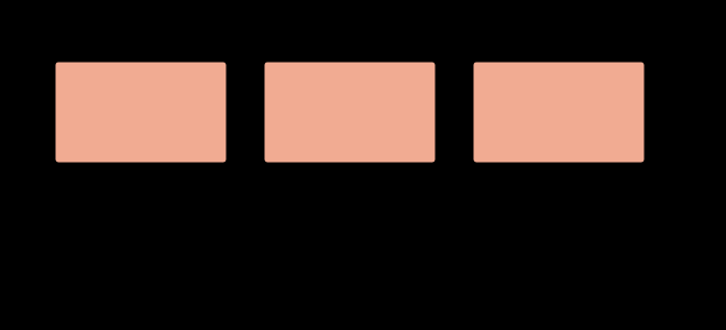
The two terms do not point the same way
The essay’s prediction is that a colour chosen in a shop looks duller and heavier at home, with both dominant terms said to point that way. One does. The other points the other way.
Taking a patch at half the achromatic response of the white and moving from an average surround to a dim one, the exponent falls from 1.3298 to 1.1370 and lightness rises from J 39.8 to J 45.5. The same move raises J at every level below white:
| A/Aw | J, average surround | J, dim | J, dark |
|---|---|---|---|
| 0.1 | 4.7 | 7.3 | 9.7 |
| 0.3 | 20.2 | 25.4 | 29.6 |
| 0.5 | 39.8 | 45.5 | 49.6 |
| 0.7 | 62.2 | 66.7 | 69.7 |
| 0.9 | 86.9 | 88.7 | 89.9 |
A dimmer surround makes every midtone lighter and compresses the range — the span from A/Aw 0.1 to 0.9 falls from 82.2 to 80.2 units between average and dark, while the bottom end rises by five. That is a loss of apparent contrast, which is the finding; it is not a shift towards heavier.
So the honest prediction is duller and flatter, not duller and heavier: the colour loses colourfulness by the twelfth-root law and loses contrast against its own surroundings by the surround term, and its midtones read lighter rather than darker. The everyday complaint that a chosen colour comes out darker than expected is therefore not either of these two terms, and the essay’s own list already contains the likelier cause — a wall’s interreflection changes the light in the room, which is an illuminant change and not an appearance effect at all.
What was computed, and how
Everything above runs through CIECAM16 — forward, inverse, hue quadrature and CAM16-UCS — checked against the published test vector to four significant figures in all six correlates, and round-tripping to 4 × 10⁻¹³ across the whole sRGB cube under three surrounds and five decades of adapting luminance.
That round trip is worth describing, because it caught something no structural check did. The first implementation added 0.305 to the denominator of the temporary quantity , copying the constant from the achromatic response two lines above. Lightness, hue and brightness were exact to four decimals against the published vector. Only chroma was wrong, by about one per cent. The round trip caught it because the published inverse’s algebra pins the forward denominator — two independent derivations disagreeing beats one number checked against a table, and a one per cent chroma error is invisible in every figure it would have appeared in.
The assertions the model carries: a round trip returns the starting tristimulus values; a neutral under the adapting white comes out with zero chroma; degenerate viewing conditions reduce to something close to CIELAB; adaptation is incomplete rather than total; the viewing situation demonstrably matters; the Hunt effect is present; and the Stevens effect is absent.
What the picture cannot show
Every figure in this essay is a picture of an appearance effect, displayed on an apparatus whose own viewing conditions are unknown and unknowable to the page.
That is a sharper problem here than anywhere else on this site. A chromaticity diagram is a diagram; it can be drawn correctly and read correctly on any screen. An appearance figure is a claim about how something looks, and how it looks depends on the reader’s adapting luminance, the reader’s surround, the size of the reader’s window, and whether the reader is in a dark room at night or on a train in daylight.
So the figures above are drawn at stated viewing conditions and the reader is in different ones. The numbers they carry are correct for the conditions named. The impression they produce is not under the site’s control, and the honest position is that an appearance model’s predictions can be reported here and cannot be demonstrated here — which is the same limit that makes the display an unknown, arriving one layer further out, at the room rather than at the screen.
Where the model stops
CIECAM16 takes a patch on a uniform background in a stated surround. A real scene is not that, and the gap is where most of the interesting perception lives.
It has no spatial structure. Brightness inferred from edges — the Cornsweet effect, anchoring, the whole business of the visual system integrating across boundaries rather than measuring locally — is invisible to it. Two scenes with identical local statistics and different edge structure get identical predictions and look different.
It has no time. Adaptation takes seconds to minutes, and the model describes a steady state that a person walking between rooms is never in.
It has no memory. A surface known to be white is judged differently from an identical surface of unknown provenance, and nothing in the model has a place to put that.
And the size term in particular is the weakest part of the whole apparatus. CIECAM16 has no explicit stimulus-size parameter at all; the size effect enters only through which observer is used and through what is called background. The paint industry’s rule of thumb — that a large area reads about one step lighter and more saturated than its chip — is an empirical correction that no appearance model derives.
Lowering both numbers together is the setting a domestic room actually sits at, and it is where the surround costs the most.
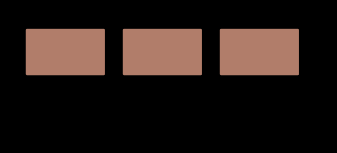
The advice, restated
The shop’s advice survives the analysis and acquires reasons.
Paint a large patch — because the stimulus is a large field, which means a different observer, a different relationship to the background, and interreflection the chip cannot produce.
Look at it at different times of day — because the adapting luminance moves through several decades between noon and evening, which moves colourfulness by a factor the Hunt effect quantifies, and because the illuminant’s own chromaticity moves along the daylight locus and adaptation does not fully discount it.
Look at it on the wall it will be on, not held up next to the window — because the background term is the second largest in the model, and a patch held against a bright window is being judged against a background nothing in the finished room will reproduce.
Do not choose between two chips side by side — because simultaneous contrast makes each shift away from the other, so the difference between them is exaggerated in exactly the comparison that is supposed to be deciding.
Every one of those is a term in the model, and none of them is in the specification the paint was sold under, which is a set of tristimulus values.
Who found it, and when
The Hunt effect is R. W. G. Hunt’s, from work in the 1950s on the appearance of colours at different light levels, and it is one of the effects that made it clear a matching model could not be an appearance model. The Stevens effect is S. S. Stevens’s, from the psychophysical power-law work of the same era, and its status here is the interesting one: the effect is real as Stevens measured it, and CIECAM16 does not predict it, which is a fact about the model rather than about vision.
The lineage from Hunt’s model through CIECAM97s to CIECAM02 and CIECAM16 is one of successive simplification — each version dropped parameters the previous one could not justify, which is why the current model has four viewing-condition arguments rather than a dozen. The simplification is why it can be implemented in a couple of hundred lines and checked exactly, and it is also why it has no room for size, structure or time.
Why this is the hardest thing on the site to gate
A figure that draws a spectrum can be checked against the spectrum. A figure that claims two patches are identical can be checked by comparing the emitted strings, which is what assertSame does and why the illusion figures on this site carry a stronger guarantee than the ones in most textbooks.
A figure that claims a patch looks lighter has no such check available. The model’s outputs can be verified — the round trip, the published vector, the neutral staying neutral — and those verify that the implementation is the model. Whether the model is right about a reader is a psychophysical question, settled by experiments on people, and the site can only cite them.
That is the boundary this ladder sits on, and it is worth being explicit that it is a different kind of boundary from the ones elsewhere here. Everywhere else, “computed rather than quoted” means the site can check its own claims. Here it means the site can check that it implemented somebody else’s claim faithfully. The gap between those two is the gap between colorimetry and perception, and no amount of code closes it.
Where this goes next
The surround result points at what a viewing condition actually is, which is the rung below this one, and at why brighter looks more colourful, which is the Hunt effect given a whole essay.
The size term points somewhere less comfortable: at the observer. A large field is a ten-degree stimulus and almost every colour specification in the world is computed for two degrees, which is a choice the whole site keeps arriving at from directions that have nothing to do with each other.
Where this goes next
 A viewing condition is an argument
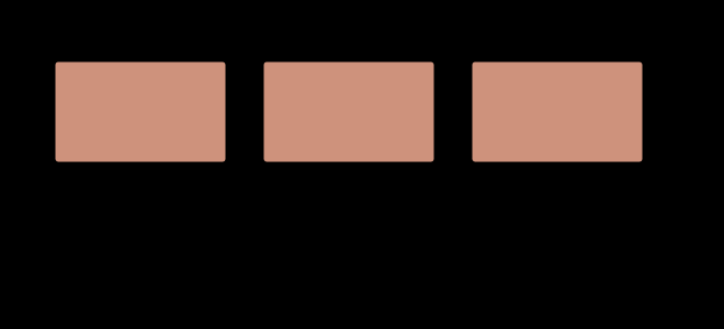
An appearance model takes a stimulus and a situation. The second argument is not a refinement of the first — it is the content of the claim, and a model that returns an appearance from a colour alone has assumed a room without saying which.
A viewing condition is an argument
An appearance model takes a stimulus and a situation. The second argument is not a refinement of the first — it is the content of the claim, and a model that returns an appearance from a colour alone has assumed a room without saying which.
 These two patches are identical
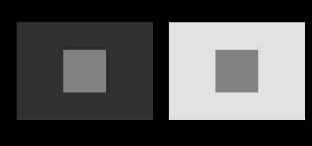
It is the most repeated and least checkable sentence in visual perception, because the whole point is that it does not look true. Every instance here is computed, and checked before the figure is drawn.
These two patches are identical
It is the most repeated and least checkable sentence in visual perception, because the whole point is that it does not look true. Every instance here is computed, and checked before the figure is drawn.
 Brighter looks more colourful
Colourfulness rises with light level and the model predicts it. Apparent contrast is supposed to rise too, and the model does not — which turns out to be right, because the thing that actually carries contrast is the surround.
Brighter looks more colourful
Colourfulness rises with light level and the model predicts it. Apparent contrast is supposed to rise too, and the model does not — which turns out to be right, because the thing that actually carries contrast is the surround.
What this makes readable
Essays that name this one as a prerequisite.
Named alongside this one
Essays reaching for the same objects. Nobody chose these; they are what the index of named objects makes visible.
- A dark background moves every difference and no match ciecam16 · colour appearance · lightness · simultaneous contrast · viewing condition
- A display in a room is a smaller display adaptation · ciecam16 · colour appearance · surround · viewing condition
- A gain has a time constant adaptation · ciecam16 · colour appearance · surround · viewing condition
- A viewing condition is a moment adaptation · ciecam16 · colour appearance · surround · viewing condition
- The gamut shrinks in the dark adaptation · ciecam16 · colour appearance · surround · viewing condition
- The proof is a different object ciecam16 · colour appearance · lightness · surround · viewing condition
What links here
The 8 essays that link to this one and share the most of its objects, of 13 that link here.
- There is no brown light
- The cancellation is exact and cheap to lose
- A room with two lights has no white
- A lit room brings the units' medians together
- A tolerance has no light level
- The model has a hue shift it was never given
- A corner moves both terms
- A gloss room looks less colourful than it measures
The objects this essay names
Each one links to every other essay that touches it.
AdaptationApparent contrastCIECAM16Colour appearanceLightnessLuminanceSimultaneous contrastStandard observerSurroundViewing condition