The proof is a different object
Assumes No mapping preserves everything and A viewing condition is an argument.
Soft proofing is the practice of judging on a screen what will come off a press. It is supported by every colour management system, it is used everywhere, and when it is set up properly the two objects agree colorimetrically to well under a colour difference.
They still do not look the same, and the reason is not a fault in the setup.
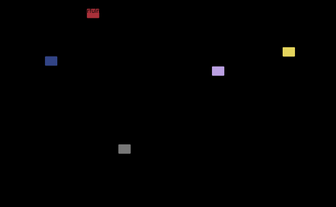
The claim
Two stimuli of identical colorimetry viewed under different adapting conditions have different appearances, and the difference between a print in a standard booth and a display in a dim room is larger than the errors the whole colour management chain is engineered to avoid.
This is the site’s own central caution — colorimetry predicts when two lights match under identical viewing conditions and was never a model of how anything looks — arriving at the one industrial process built entirely on ignoring it.
The two rooms
The conditions are specified by different standards for different reasons and they are not compatible.
A print is judged in a booth to ISO 3664, which requires D50 at 2,000 lux with a mid-grey surround. In the appearance model’s terms: an adapting luminance around 190 candelas per square metre and an average surround, because the walls of the booth are lit to about the same level as the sample.
A display is judged in a dim room, which is what the same standard requires for soft proofing and what anybody would do anyway, because a screen in a bright room loses most of its contrast. That gives an adapting luminance of perhaps 60 and a dim surround, since the wall behind the screen is much darker than the screen.
The model takes both as arguments, so the difference is a computation rather than a debate.
| colour | J, booth → screen | M, booth → screen | ΔE′ |
|---|---|---|---|
| mid grey | 39.8 → 45.4 | 0.2 → 1.4 | 4.23 |
| light blue | 62.4 → 66.7 | 37.1 → 30.4 | 3.96 |
| dark red | 32.2 → 37.8 | 64.3 → 57.4 | 4.72 |
| pale yellow | 79.5 → 82.1 | 46.1 → 39.7 | 3.24 |
| deep blue | 22.1 → 27.4 | 41.8 → 37.6 | 4.76 |
Every colour gets lighter, and every colour but one gets less colourful, and the effect is largest at the dark end. The exception is the grey, and it is the subject of a section below. That is not an accident of these five colours; it is what a dim surround does, and it is the single largest term in the whole comparison.

The surround does it, not the brightness
The obvious suspect is the luminance: 190 candelas against 60 is a factor of three, and brightness affects colourfulness by a measured amount this site has already computed. It turns out to be the smaller term.
Split the comparison in two by putting the display in a lit office — an average surround at 100 candelas — rather than a dim room:
| comparison | what changes | mean ΔE′ |
|---|---|---|
| booth → office | luminance only, 190 → 100 | 1.44 |
| office → screen | surround only, average → dim | 3.95 |
| booth → screen | both | 4.18 |
The surround carries nearly three times what the luminance does. Halving the adapting luminance moves the prediction by less than one and a half units; changing the surround category from average to dim moves it by four.
That is consistent with what this site measured when it built the appearance model: the surround moves the lightness exponent by 31 per cent while five decades of adapting luminance move it by two. The Hunt effect is real and is not the dominant term here; the surround is.
And the three rows are not three independent measurements — they are two and a check, and the check passes in a way that says something about the two.
Adding 1.44 and 3.95 gives 5.39, which is twenty-nine per cent above the 4.18 that was measured with both changes applied at once. Adding them in quadrature gives 4.20, which is above it by six parts in a thousand.
So the two effects are orthogonal in CAM16-UCS. The luminance change and the surround change move a colour in directions that are at right angles to each other, and the combined shift is the hypotenuse rather than the sum. That is not something the model was told to do and it is not obvious from the mechanisms: both changes act on the lightness response, and two changes acting on the same correlate would ordinarily be expected to partly align.
They do not, and the split is visible in the per-colour figures. The surround moves lightness and colourfulness together, raising the first and lowering the second — the diagonal the opening figure’s arrows all lie along. A change of adapting luminance moves colourfulness through the Hunt effect while leaving the lightness scale’s shape alone, because the surround sets the exponent and the luminance does not. Two changes, two nearly independent directions, and a combined effect that adds in quadrature to half a per cent.
That has a practical consequence for anybody trying to close the gap. The two terms cannot be traded against each other. Brightening the proofing display to match the booth’s luminance removes the 1.44 entirely and leaves 3.95 — a reduction of six per cent in the total, for a change that costs a much brighter screen. Matching the surround removes the 3.95 and leaves 1.44, a reduction of sixty-six per cent, for the price of a lamp behind the monitor. Orthogonality is why the cheap fix is worth eleven times the expensive one, and why the standard’s advice to view the print and the screen together is the whole of the remedy rather than half of it.
One of the five goes the other way
The claim under the table is that every colour gets lighter and less colourful. The first half holds on all five — the lightness rises by between 2.6 and 5.6 — and the second does not.
The mid grey’s colourfulness goes from 0.2 to 1.4, which is up rather than down, and up by a factor of seven. The other four fall by between 4.2 and 6.9 units, so the grey is not a small exception to a trend; it is the only member moving in the opposite direction.
The reason is a floor rather than a mechanism. Colourfulness cannot be negative, and a near-neutral sits against that floor with nowhere to fall — so any change of adaptation that introduces a small chromatic residue moves it up, whatever the surround is doing to everything else. The 1.2 units it gains are the residue, and the same residue is present in the other four rows and invisible there because it is a fiftieth of what the surround takes away.
Which is worth knowing rather than tidying away, because the grey is the row a proofing operator actually looks at. Neutrals are what a press is controlled on and what an eye is most sensitive to a cast in, and the model’s prediction for them is not the prediction the summary sentence gives: a grey on the soft proof is lighter and slightly more coloured than the same grey on the sheet. The direction of the second half is the opposite of what the essay’s own rule of thumb would lead an operator to expect, on the one colour where a small chromatic error matters most.
What a proof can and cannot be
The consequence is a boundary rather than a defect, and it is worth drawing carefully because soft proofing is genuinely useful.
A soft proof is reliable for questions about colorimetry. Is this colour inside the press’s gamut? Where will the mapping put it? Are these two colours going to separate on paper? All of those are answered by numbers the proof reproduces exactly, and answering them on a screen saves an enormous amount of paper.
It is unreliable for questions about appearance. Is this dark enough? Is the shadow detail there? Does this saturated area look right beside that one? Those depend on the adapting conditions, and the proof’s conditions differ from the print’s in a direction the model can state: everything will look lighter and less colourful on the screen than it will on paper.
The practice has an answer to this and it is a good one — put the booth beside the screen and compare them directly, which is what the standard’s soft-proofing section describes. What that arrangement achieves is to make both objects share a surround, at which point the comparison becomes fair and the model’s gap shrinks.
It also makes the screen’s own limits the binding constraint, because a screen bright enough to sit beside a 2,000 lux booth and match its white is an unusual screen.
What was computed, and how
CIECAM16, forward direction only, with the two conditions above as arguments and the same CIELAB coordinates converted to XYZ under D50 for both. The model is the one this site built and checked against the published test vector to four significant figures, and its correlates round-trip through the inverse to 4 × 10⁻¹³.
Differences are quoted in CAM16-UCS ΔE′, which is the model’s own uniform space — the one that makes “the lightness changed by 5 and the colourfulness by 7” into a single interpretable number. A ΔE′ is not a ΔE00 and the two should not be compared directly; as a rough guide, both are constructed so that a value near 1 is a small difference and both are least trustworthy at the extremes.
What the model does not do is predict what a person will say. It predicts correlates of appearance under stated conditions, and the claim here is a claim about those correlates: identical colorimetry gives different predicted lightness and colourfulness in the two rooms, and the size of the difference is four units. Whether a particular observer would call that a mismatch is a separate question the model does not answer.
What a soft proof is, as a chain
It is worth counting the transforms, because each has an error and the appearance gap above is only the last of them.
A picture destined for a press is held in some source space. To be soft-proofed it is converted into the press’s space through the output profile’s inverse table — an interpolation with a policy in it, including a black generation choice and, for colours outside the press, a rendering intent. It is then converted back out through the forward table to the connection space, and finally into the display’s space through the display profile, which needs a second gamut mapping because the press reaches cyans the display does not.
Four transforms, two of them gamut mappings running in opposite directions, and the result is displayed under conditions that differ from the print’s by four appearance units.
The remarkable thing is that it works at all, and it does: the round trip through the press’s profile is genuinely informative, because it shows what the press will do — that is the whole point, and the flattening of a saturated area on the screen is the flattening that will happen on paper. What the chain cannot deliver is an appearance match, and the two are routinely confused.
The hard proof, and why it survives
The alternative is a hard proof — an inkjet print made to simulate the press, on a stock chosen to resemble the production paper, using the absolute colorimetric intent so that the substrate is reproduced as a colour rather than as white.
Everything this essay says about surrounds disappears, because both objects are reflective prints in the same booth. The remaining differences are colorimetric: the proofer’s gamut against the press’s, the substrate simulation, and the fact that an inkjet’s inks are not the press’s, so a proof and a print that match under D50 are a metameric pair and come apart under a shop light like any other.
That is a smaller and much better-understood set of problems, which is why the contract proof is still a physical object in an industry that has been fully digital for twenty years. The signature goes on the thing that shares a room with the thing it predicts.
Where this model stops
A real display is not a perfect reproduction of the print’s colorimetry to begin with. It has its own gamut, which does not contain the press’s cyans, so a soft proof is already a gamut mapping of a gamut mapping — and that error is on top of everything measured here.
The white points are assumed matched. In practice a proofing display is set to D50 to match the booth, which is an unnatural white for a screen and looks yellow until the observer adapts. Adaptation to a display white is known to be incomplete, so a real comparison includes a partial adaptation term this essay’s arrangement does not model.
The surround categories are three discrete cases. CIECAM16 offers average, dim and dark with fixed parameters for each, and a real room is a continuum; the model interpolates nothing and the categories are a coarse instrument.
And nothing here is about the paper’s own appearance. A print is a reflective object with a surface, and a screen is a light source. Even with matched colorimetry and matched surrounds, one has a specular component that moves with the observer and the other does not, which is a difference no colorimetric or appearance model addresses.
A lit office against a dim room is the comparison a studio actually lives with, and neither end of it is the viewing booth.

Two things the model says that are worth carrying
The prediction has a direction as well as a size, and the direction is more useful than the number, because it survives every doubt about the model’s parameters.
Everything on the screen looks lighter than it will on paper. The dim surround flattens the model’s lightness response, so a shadow that reads as nearly black in a booth reads as a dark grey on a screen. Somebody judging shadow detail on a soft proof is judging it under the condition that makes it most visible, and will approve a file whose shadows close up on paper.
And everything chromatic on the screen looks less colourful than it will — with the neutrals going the other way, for the floor reason above. Colourfulness falls with the surround, so a saturated area that looks acceptable on the proof has more chroma in the print than the proof suggested. The two errors point in opposite aesthetic directions, which is part of why the discrepancy is so hard to characterise from experience: a proof is simultaneously too light and too dull, and the two are noticed as separate complaints.

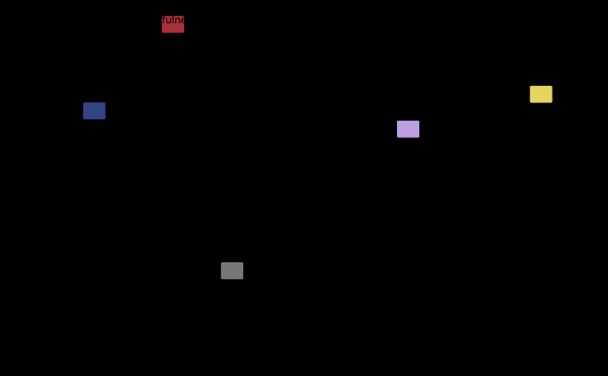
The same generator measures a gap of a quite different kind — between two ways of averaging one patch rather than between two rooms — and the two are worth having in one place.


The generalisation
Two devices can be made to agree on every number and still disagree, because the numbers were never a description of what anybody sees.
This is the site’s founding distinction, and this field is where it costs money. Colorimetry answers will these two stimuli match, side by side, under identical conditions — and it answers it extremely well, which is why the whole apparatus of colour management works as well as it does. It says nothing about how will this look, and every cross-medium comparison is a question of the second kind.
The general remedy is the one the standard reaches for: make the conditions identical rather than modelling the difference. An appearance model can tell what the gap is; matching the surround makes the gap zero, and it does so without needing anybody to trust a model.
Where that is impossible — a print judged in a shop, a screen judged on a train, a phone judged outdoors — the gap is real and the model is the only instrument available. The room the screen is in is where that becomes unavoidable.
Who found it, and when
Soft proofing became practical in the mid-1990s, when displays reached a quality where the proposition was arguable and colour management made it computable.
The viewing standard came first. ISO 3664 dates from 1975 in its original form, specifying D50 at 2,000 lux with a mid-grey surround for the graphic arts, and it did an unusual thing for a standard: it fixed the observer’s environment rather than the product’s. The 2009 revision added a section for displays, and it is careful — it asks for a dim room, a stated display luminance, and, for critical comparison, that the print and the screen be viewed together.
That the two conditions predict different appearances for identical colorimetry has been computable since CIECAM97s in 1997 and CIECAM02 in 2002, and it is not usually presented as the reason a soft proof disagrees with a print. The usual explanations are gamut, calibration and the display’s white point — all of which are also true, and all of which are colorimetric.
The appearance term is the one that survives fixing everything else, and it is a property of the arrangement rather than of the equipment.
Where the ladder goes next
This rung sits on no mapping preserves everything, because a proof shows the output of a mapping, and on a viewing condition is an argument, which is where this site built the model doing the predicting.
Beside it, the screen is not the room takes the same question from the other direction: not what the model predicts about two rooms, but what the room physically does to the light coming off the screen before any prediction applies.
Below, everything here rests on matching is not appearance, which is the caution this field spends its length demonstrating with money attached.
Where this goes next
 A viewing condition is an argument
An appearance model takes a stimulus and a situation. The second argument is not a refinement of the first — it is the content of the claim, and a model that returns an appearance from a colour alone has assumed a room without saying which.
A viewing condition is an argument
An appearance model takes a stimulus and a situation. The second argument is not a refinement of the first — it is the content of the claim, and a model that returns an appearance from a colour alone has assumed a room without saying which.
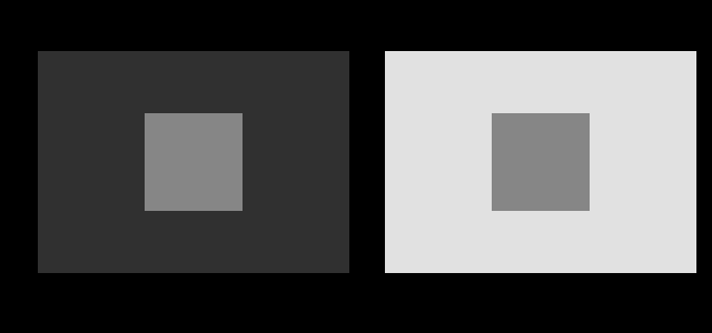 Matching is not appearance
CIE XYZ predicts when two lights will look the same under identical viewing conditions. It was never a model of how anything looks, and most of the confusion in applied colour comes from using it as one.
Matching is not appearance
CIE XYZ predicts when two lights will look the same under identical viewing conditions. It was never a model of how anything looks, and most of the confusion in applied colour comes from using it as one.
 No mapping preserves everything
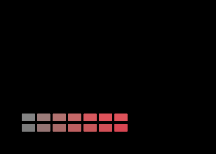
More than half the sRGB solid is outside a press's gamut, so something has to be done with it, and there are two things that can be done. One leaves every reproducible colour exactly where it was and delivers a gradient as a flat area. The other keeps the gradient and moves every colour that needed no help by about three.
No mapping preserves everything
More than half the sRGB solid is outside a press's gamut, so something has to be done with it, and there are two things that can be done. One leaves every reproducible colour exactly where it was and delivers a gradient as a flat area. The other keeps the gradient and moves every colour that needed no help by about three.
What this makes readable
Essays that name this one as a prerequisite.
Named alongside this one
Essays reaching for the same objects. Nobody chose these; they are what the index of named objects makes visible.
- The gamut shrinks in the dark ciecam16 · colour appearance · colourfulness · specification · surround · viewing condition
- The reversals have a straight edge ciecam16 · colour appearance · colourfulness · lightness · specification · viewing condition
- There is no brown light ciecam16 · colour appearance · colourfulness · lightness · surround · viewing condition
- Two rooms with one lightness scale ciecam16 · colour appearance · lightness · specification · surround · viewing condition
- A model judged in another model's unit ciecam16 · colourfulness · lightness · surround · viewing condition
- A patch is not a scene ciecam16 · colour appearance · lightness · surround · viewing condition
What links here
The 8 essays that link to this one and share the most of its objects, of 23 that link here.
The objects this essay names
Each one links to every other essay that touches it.
CIECAM16Colour appearanceColour managementColourfulnessThe ICC profileLightnessSoft-proofingSpecificationSurroundViewing condition