Colourfulness — where it appears
Named by 11 essays across 4 fields — each of them below, with the objects they name alongside it.

Brighter looks more colourful
Colourfulness rises with light level and the model predicts it. Apparent contrast is supposed to rise too, and the model does not — which turns out to be right, because the thing that actually carries contrast is the surround.
The proof is a different object
A soft proof can be made colorimetrically exact and still not match the print, because the print is in a booth at two thousand lux with an average surround and the screen is in a dim room at a fifth of the luminance. The appearance model puts four CAM16-UCS units between them, with no change of stimulus anywhere — larger than the error any rendering intent is arguing about.
Brightness is not luminance
Photometry is additive because the CIE defined it that way. Brightness is not, and a saturated colour looks as bright as a neutral of one and a half times its luminance — an effect this site's appearance model moves by two per cent, in a direction that depends on the hue.
There is no brown light
Brown is dark orange, dark is a ratio to a white, and a light in a dark room has no white to be dark against. The same stimulus, unchanged in XYZ, runs from lightness 152 to lightness 16 as the surround is raised — and only the bottom of that range has a name.

The gamut shrinks in the dark
Every gamut number here is a property of a device and of nothing else, which is why the same display has the same gamut in a studio and in a cinema. It does not. Turn the room down four decades and the solid loses a fifth of its reach and two thirds of its volume, with the signal unchanged.

A corner moves both terms
The interreflection essays compute what a corner does to a spectrum, which is one of the two things a corner does. It is also a brighter place with a differently coloured background — a viewing condition, not a stimulus — and adaptation removes most of the first and none of the second. At an enclosure of six tenths that is 63 per cent of seven units gone and a further unit arriving from the extra light alone.

A model judged in another model's unit
An appearance shift is a change in what an observer would report, not a change in a stimulus, so measuring one with a matching difference means first asking what stimulus a settled observer would need to be shown to give the same report. That step is not bookkeeping — it is the whole distinction the field rests on, and it costs a factor of 1.7 across the menu.

The average surface does not look average
Over a population of observers the appearance model is so nearly linear that the mean of its answers is its answer for the mean, to 1.4 per cent of the spread. Over the surfaces in a scene it is not. On 240 smooth reflectances the gap is 21 per cent of the spread, and the mean surface looks 4.2 units lighter than the surfaces look on average. The grey that matches the average light is a 47 per cent reflectance; the grey that matches the average look is a 43 per cent one.

A gloss room looks less colourful than it measures
A gloss finish takes 8.3 per cent of the chroma out of a green room's reflected light, and a viewer adapted to the room should discount a loss that affects everything alike. The appearance model says the opposite. Adaptation removes the colour the whole room shares, leaves the colour that differs from face to face, and the finish takes as large a share of that as of anything — so to a viewer standing in the room the faces lose 13.9 per cent of their chroma, not 8.6.

The reversals have a straight edge
Twenty-one of 276 pairs change places in chroma between a dark background and a light one, and the reason given was that chroma is a product of a term carrying the exponent and a term that does not. That is true and it is not a description of which pairs. Chroma at one background is a single common factor times a power of lightness at another, so a pair reverses exactly when its chroma ratio and its lightness ratio point opposite ways and the first is the smaller — a wedge with two straight edges, which names every reversal and nothing else.
White drains the blue last in every model
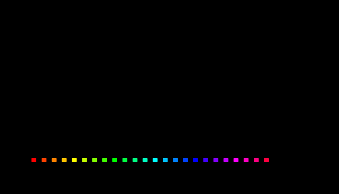
CIECAM16 says a dab of white costs a deep red wall four times the colour it costs a dark blue one, and the experiment proposed to test it asked whether observers lose colour in that hue order. Held at equal luminance and given equal doses of white, twenty-four display hues are ordered alike by CIECAM16, CIELAB and Oklab — an orange loses fastest and a blue slowest in all three. So the order cannot tell the models apart. What does is how much slower the blue is: CIECAM16 has it losing a sixteenth of what the orange loses, CIELAB and Oklab about a quarter. That ratio is the number an observer study has to measure.
Named alongside it
The objects these essays reach for when they reach for this one.
CIECAM16Viewing conditionColour appearanceLightnessSurroundColour constancyChromatic adaptationSpecificationAdaptationAppearance modelBrightnessChroma