Chroma — where it appears
Named by 42 essays across 8 fields — each of them below, with the objects they name alongside it.

A grey edge arrives coloured
A sensor site measures one channel and the other two are interpolated from neighbours that sat somewhere else. Across a black-and-white step that reconstruction gives an achromatic scene a chroma of 144 per cent of its own local mean, and nothing in the scene or the sensor was coloured.
No mapping preserves everything
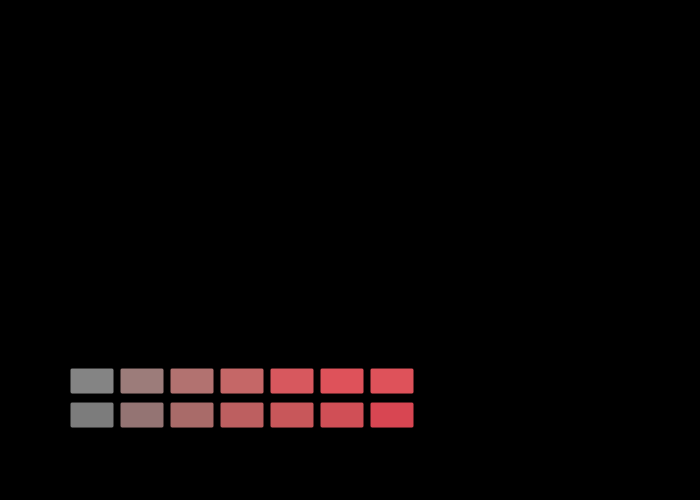
More than half the sRGB solid is outside a press's gamut, so something has to be done with it, and there are two things that can be done. One leaves every reproducible colour exactly where it was and delivers a gradient as a flat area. The other keeps the gradient and moves every colour that needed no help by about three.

How fine a colour edge can be
The eye resolves a lightness pattern to about fifty cycles per degree and a red–green one to twelve. Every colour difference here is quoted as though a patch had no size, and the same difference is plainly visible at one scale and gone at another.
A gradient is a path
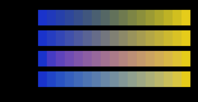
Two colours fix the ends of a blend and nothing else. The middle is decided by the space the interpolation happens in, and four spaces in daily use put the halfway point of one ordinary gradient as much as thirty-seven units of colour difference apart.

A catalogue is not a vocabulary
A colour order system is a regular lattice, because a person has to be able to find a page. Sorted by what its chips would be called, that lattice comes apart into piles differing by a factor of three — and a fifth of all one-step moves in it change the name.

Three constants nobody quotes
CIEDE2000 is defined with three parametric factors in it, the CIE leaves them to the industry using the formula, and the two settings in ordinary use differ by a factor of two in one of them. Twenty-nine per cent of acceptance decisions change between the two — a larger disagreement than any between the formulae themselves.
There is no word for that colour
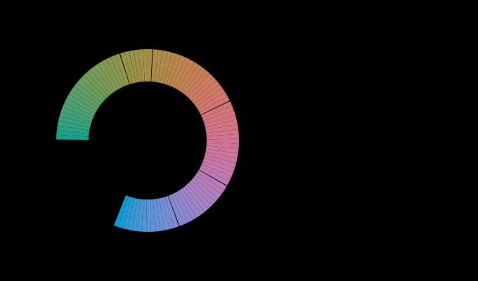
The naming model built this phase gives a saturated cyan the name green, calls part of a chromatic ring grey, and puts one of the eleven focal colours outside what a display can show. Each failure is a measurement rather than a disclaimer, and together they say what a vocabulary is that eleven points and a distance are not.

A brighter white still looks white
Colorimetry says a brightened sheet is nine units of b* from neutral, which sounds like a visible blue. An appearance model with the observer adapted to the room says it carries eleven units of chroma at a hue of 295 degrees — genuinely blue-violet — and that the number falls by nearly half between a bright room and a dark one. What it cannot say is why anybody calls the result white.

Saturation is nearly everything
The set of test surfaces has three numbers describing it, and only one of them matters. How saturated the surfaces are carries an elasticity of about 0.7 on every result computed over them; how bright they are carries 0.10. A test chart's chroma range decides its answer and its lightness range does not.
A chart decides what a camera scores
A camera profile's reported error changes by a factor of five when the test chart's saturation changes, with the camera and its matrix untouched. The elasticity is 0.67 — the same figure, to two per cent, that an entirely unrelated measurement over an entirely unrelated set of surfaces gives.

The weighting is the disagreement
Five colour-difference formulae, three decades and two committees, and the single property that predicts which of them agree is whether a chroma difference gets divided by the chroma it was measured at. It sorts the menu exactly, it cuts across the distinction between a matching difference and an appearance one, and it halves the census's largest sensitivity.

A dial through a discrete menu
ΔE*94 is ΔE*ab with two weighting constants in it, and at zero those constants make every weight exactly one — so the two ends of the oldest disagreement in colour difference are joined by a line rather than separated by a choice. Walking it gives a derivative where a menu gives only a spread, and the derivative says the published weighting is on the far side of the interesting part.

The disagreement is at the near end
Every colour-difference formula on the menu was fitted to threshold data, so the expectation is that they agree about pairs an observer can only just tell apart and diverge on large differences. They do the opposite. Proportionally the disagreement is largest at the near end, by a factor of six for the appearance unit, and the cause is an exponent of 0.63.

A unit rests on a space that was ranked
This collection ranks three colour spaces by how nearly they make MacAdam's ellipses circles, and CIELAB comes last. It then publishes every difference it computes in a formula built on CIELAB. Turning the same instrument on the formulae rather than the spaces shows the repair works — and that it buys roundness by paying in evenness.

A tolerance is a boundary through pairs
Twenty-four pairs of surfaces built to sit exactly on a ΔE2000 tolerance of one read from 0.69 to 1.93 in the other five units. A contract quoting "one unit" without naming the formula does not become slightly wrong in another; it accepts and rejects a different set of deliveries, and in one case rejects every single one.

The coincidence was a mechanism
Two sensitivities from two libraries with no shared code came out two per cent apart, and the claim made about them was that they share a mechanism rather than a number. That claim has a colour-difference formula inside it, so it can be tested by changing the formula — and both curves move together across the whole menu, from 0.5 to 1.15.

An aperture is a filter
A measuring aperture throws away the light that came back outside it, and the light that comes back furthest is the light at the wavelengths the sample absorbs least. So an aperture does not attenuate a translucent sample evenly — it attenuates its peaks more than its troughs, which is a filter whose transmission curve the sample itself decides.

The hue the hole decides
A piece of pale marble measured through a wide aperture is faintly yellow. Measured through a narrow one it is faintly blue, and between the two there is an aperture at which it is exactly neutral. Nothing about the stone changes; the aperture is a filter with a colour, and what decides that colour is the size of the particles rather than the pigment between them.

A departure is straight in the excitations
Walk a sample a quarter of the way from the light towards its own reflectance and exactly a quarter of the observer disagreement remains — in cone excitations, to two parts in a hundred. In ΔE₀₀ the same quarter leaves 0.347 where proportionality wants 0.428, and the discrepancy belongs entirely to the unit.

A lobe takes colour out of a bounce
A gloss wall sends more light to the floor and less colour. The extra light is a Fresnel reflection at the interface, it carries the lamp's spectrum rather than the paint's, and it arrives at the next surface white — so a green room in satin paint is less green than the same room in flat paint by nearly a colour difference of chroma.

Two ways to put a lobe on a wall
Take the interface's return out of the body term and a gloss wall makes the room less colourful. Add it beside the body term and the same wall makes the room more colourful. Same solver, same room, one line of energy accounting, and the two answers differ by nearly three units of chroma at the glossy end.

A tenth of the return arriving white
Nine per cent of what leaves a satin wall is a Fresnel reflection carrying no pigment. That nine per cent moves the room's colour by 4.89 ΔE₀₀ and its chroma by five per cent, because an interreflection multiplies and a small contribution with a different spectrum compounds into a large one.
A contrast control is three controls
A tone curve is a function of one number at a time and knows nothing about hue. Applied to each channel separately it rotates a hue circle by up to seventeen degrees, raises chroma by a factor of 1.27 at ordinary strength, and lifts lightness — so a photographer who moves a contrast slider has moved three things and the interface names one of them. All three scale with the curve's strength, monotonically, and the hue rotation depends on which hue it is.

A stop is not a stop afterwards
Doubling the light is exactly a factor of two in raw values and in tristimulus values, which is the one thing about exposure everybody is sure of. A stop taken after the tone curve is a factor of something else, and matching the two on an eighteen per cent grey leaves the rest of the frame between three and four colour differences apart at the mean and up to eleven at the worst patch. The gain that matches one stop is 2.47 rather than 2.

A second conversion is not a repeat
A colour converted to a device and back is described as lossy where the device cannot hold it and exact where it can, which suggests that a colour surviving one round trip survives any number. One of the four intents is idempotent to the floating-point floor. The other two are not — a perceptual conversion moves a ramp 3.70 colour differences on its first pass and another 2.73 on its second, and after three passes it is still moving by 2.42.

A gloss finish takes colour out of the whole room
A gloss wall makes the floor's return less colourful seen from the front of a room and more colourful seen from the coloured walls, which leaves open whether the lobe removes colour or only moves it. A ledger of every flux between the room's faces answers it. At an eggshell finish the room's reflected light gains 16 per cent in quantity and loses 8.3 per cent of its chroma, and the loss is nearly the same for blue, green and orange walls while the walls' own losses range from 13 to 25 per cent. Only the painted walls receive light as colourful as before.

A tolerance has no light level
Twenty-three pairs built at exactly one colour difference stay at exactly one in every room, because the formula has no argument for the room. Read in the unit that does have one, the same pairs are 0.72 in a cinema, 1.04 in an office and 1.30 in direct sun — and inside any one room they spread by half again, so no single conversion between the two units exists at all.

A difference has no rate
A colour difference formula answers for two patches that are both there and stay. Alternate the same two colours and the difference is not scaled but taken apart: the colour half is gone by fifteen hertz and the lightness half is four times louder at eight, so twenty-three pairs the formula calls identical run over a factor of six at the rate the eye is best at, and are worth nothing at all above sixty.

The reversals have a straight edge
Twenty-one of 276 pairs change places in chroma between a dark background and a light one, and the reason given was that chroma is a product of a term carrying the exponent and a term that does not. That is true and it is not a description of which pairs. Chroma at one background is a single common factor times a power of lightness at another, so a pair reverses exactly when its chroma ratio and its lightness ratio point opposite ways and the first is the smaller — a wedge with two straight edges, which names every reversal and nothing else.

Two rooms with one lightness scale
CIECAM16's surround and its background both reach lightness, and they reach it through one product. So the rooms fall into classes: a television in a lit living room against a mid grey returns exactly the lightness a print on a desk against a background of 2.8 does, for every sample, to the last bit of a double. It returns 0.76 of its chroma and 0.81 of its brightness. Two of the model's four viewing-condition parameters are one parameter, and only colour tells them apart.

A finish adds colour only to a daylight meter
Measured against daylight's white, a satin finish under six lamps and six wall colours takes anything from −6 to 42 per cent of a room's colour, and one room reads as more colourful glossy than matt. Measured against the white of the lamp each room is actually lit by, the same thirty-six rooms lose between 7.7 and 12.9 per cent and none gains. The whole spread was the lamp's own colour, and the finish does one simple thing to every room: it pulls the room's colour a tenth of the way towards the lamp's white.

What an adapted viewer loses is set by the wall
A satin finish takes about a tenth of a room's colour, measured on the room's light against its lamp's white. Read through an appearance model by a viewer adapted to the room, the same thirty-six rooms lose between 12.8 and 30.9 per cent — 1.4 to 2.4 times as much — and the wall colour decides the multiplier: a deep red room loses twice what a green one does, under every lamp. A test on the bare wall predicts it. Add a little of the lamp's white to the wall's own colour and ask the model what that costs: the answer orders the thirty-six multipliers at 0.95.

A dark wall pays for a finish
A satin finish takes about a tenth of a room's colour, and the tenth varies. The natural explanation is that a weak colour loses a larger share of itself to the white light a glossy surface adds. Over seventy-two paints under one lamp that explanation orders nothing: the loss runs from 2.5 to 15.5 per cent, it follows how much light the wall returns at a rank correlation of −0.89, and it follows how colourful the wall is at −0.04. Two rooms equally colourful matt lose shares nearly six times apart, and the one that loses more is the darker.

White turns a hue, and the models part at blue
Mix a saturated light with white and its hue changes as well as its saturation — the Abney effect, and the reason lines of constant perceived hue curve in a chromaticity diagram. Asked what adding white does to the twenty-four most saturated colours a display makes, CIECAM16, CIELAB and Oklab all turn the hue. About reds they agree: CIECAM16 turns within a degree of Oklab, whose hue was fitted to observers' constant-hue judgements. About the display's blue they do not: Oklab turns sixteen degrees, CIECAM16 four, and CIELAB nine the other way.

A tint in paint turns the other way
A pale colour can be made two ways: by stirring white pigment into a coloured one, or by adding white light to it — which is what a halftone on white paper and a display both do. At the same luminance the two tints are not the same colour. For seven of eight pigments they turn the hue in opposite directions, an orange by +13.5 degrees in paint and −13.9 in light, and the paint tint is the more colourful of the two every time. The cause is in the reflectance: diluting a pigment moves its absorption edge, and adding light does not.

The finish adds the room's own colour
Among dark walls a more saturated paint loses a smaller share of its colour to a gloss finish, and among pale walls a larger one. The mechanism proposed for that reversal was spectral concentration — a narrow tall band — and the census that found it already contained four families of paints whose bands are all the same width. Holding lightness still, the band's width orders the losses at a rank correlation of 0.01. What does order them is that the light a finish adds has already bounced off the walls.

The units part by hue, not by light level
Two colour differences with a light level in them were compared on a display running from 5 to 5,000 cd/m², and a prediction was drawn from how each divided a difference between lightness and chroma. Built into pairs that differ in lightness alone and in chroma alone, both units say the same thing about light level: as a display brightens, chroma differences gain on lightness differences — ΔEITP by a tenth, CAM16-UCS by a quarter. Where they part is hue. The appearance model moves every colour's balance by the same factor; ΔEITP moves the violets, reds and cyan-blues the other way, and at nine of twelve base colours the two units disagree about the direction.

A strategy keeps the refit only where black prints
Refitting an inverse table's nodes against their own error halves it, and in a four-ink table the refit has to leave the separation strategy's choice of black alone. Held to the strategy, it keeps the whole of its gain wherever the strategy prints black and almost none of it where the strategy does not — and the share it keeps equals the share of the grey ramp printed with black, to within three hundredths. The start of black generation, predicted to be where the refit would fail, is where the table needs it least.

An open room hands over sooner
A gloss finish takes the least colour from a saturated dark wall and the most from a saturated pale one, and in a closed cube the sign changes at a wall returning about a third of the light. The prediction was that a less enclosed room would move that point up the lightness scale and that a room with a window would have no pale end. Opening one wall moves it down, from a luminance factor of 0.36 to 0.29, and opening a second to 0.24; stretching the room into a corridor or flattening it nudges it slightly up. The ambient does whiten, as predicted. A whiter ambient does not delay the colour term — it weakens it, so the other term takes over sooner.

A probe at the wall prices the finish
The light arriving at a painted wall from the rest of its room is what a gloss finish hands back, and a small probe held against the wall reads it. It lies on the line from the lamp's white to the wall's own colour, a fraction of the way along, and the fraction is set by how much light the wall returns, not by how colourful it is — as predicted. It is not the fixed fraction the prediction said: it runs from 2 to 46 per cent across seventy-two paints in one room. That variation is what makes it useful. Read in the matt room, it orders what a satin finish would cost more tightly than the paint's own lightness does, in every room tried.
White drains the blue last in every model
CIECAM16 says a dab of white costs a deep red wall four times the colour it costs a dark blue one, and the experiment proposed to test it asked whether observers lose colour in that hue order. Held at equal luminance and given equal doses of white, twenty-four display hues are ordered alike by CIECAM16, CIELAB and Oklab — an orange loses fastest and a blue slowest in all three. So the order cannot tell the models apart. What does is how much slower the blue is: CIECAM16 has it losing a sixteenth of what the orange loses, CIELAB and Oklab about a quarter. That ratio is the number an observer study has to measure.

A lit room brings the units' medians together
As a display brightens, CAM16-UCS says chroma differences gain a quarter on lightness differences and ΔEITP says a tenth. All of the appearance model's movement comes from what the viewer is adapted to, and every calculation had the viewer adapted to the display alone. Give the room its share of the adaptation and the model's movement shrinks at every step: with a 20 cd/m² room supplying two thirds of it, the two units' medians fall by the same amount. What does not shrink is their disagreement about direction. The model still moves every colour the same way, ΔEITP still moves violets, reds and cyan-blues the other way, and in a lit room that becomes the whole of what separates them.
Named alongside it
The objects these essays reach for when they reach for this one.
SpecificationLightnessCIEDE2000Colour differenceInterreflectionSpecularCIECAM16FresnelPerceptual uniformityRank correlationReflectanceAppearance model