How fine a colour edge can be
Assumes Three cones, two axes and Three numbers.
Everything else on this site treats a colour as a point. A reflectance is multiplied by an illuminant, integrated against three functions, and what comes out is three numbers — and three numbers have no size, no position and no neighbours. That is the object colorimetry was built for. It is not the object anything on a page actually is.

The claim
Spatial resolution is not a property of the eye. It is a property of the eye and a direction in colour space. A pattern carried by lightness survives to about fifty cycles per degree; the same pattern carried by a red–green difference is gone by twelve, and by a blue–yellow difference by eight.
That factor of four to six decides a great deal that is usually explained some other way: why image codecs throw away colour detail and not lightness detail, why a halftone screen works, why a colour difference measured patch-by-patch overstates what a picture shows, and why text is legible when its colour is wrong and illegible when its lightness is.
Three channels, and where they come from
The retina does not send three receptor signals to the brain. It sends a sum and two differences, and that recoding is where the three resolutions come from: the sum is carried by a dense mosaic with a small receptive field, and the differences are carried by comparisons across larger distances between cone classes that are not equally common.
The sensitivity functions are quoted rather than derived here — they are measurements of people, which this site quotes and does not compute — but only five numbers are quoted, and everything else is solved from them:
| what is quoted | value | reported range |
|---|---|---|
| luminance peak | 4 c/deg | 2–6 |
| luminance acuity limit | 50 c/deg | 40–60 |
| red–green limit | 12 c/deg | 8–14 |
| blue–yellow limit | 8 c/deg | 4–8 |
| depth of the low-frequency dip | 0.35 of peak | 0.2–0.5 |
| contrast at threshold, at the peak | 0.003 | 0.002–0.005 |
The luminance curve has three free constants and there are three landmark constraints, so the constants are the solution of a small nonlinear system rather than a curve drawn through the points by eye. The assertion that guards it requires the solved curve to reproduce all three landmarks to 10⁻⁹, which is the check that the solver solved rather than approximated.
The one structural difference between the channels is in the model rather than tuned into it. The luminance curve dips at low frequency and the chromatic ones do not, because that is what the isoluminant measurements report: a very wide chromatic edge is seen at full contrast, and a very wide luminance edge is not.
What it looks like at a real viewing distance
Cycles per degree becomes pixels only after somebody says how far away the reader is sitting, which is the one thing a stylesheet cannot know. At 60 cm from a display of about a hundred pixels to the inch, one degree of visual angle covers 41 pixels. From that:
| channel | cutoff | pixels per cycle at 41 px/° |
|---|---|---|
| luminance | 50 c/deg | 0.82 |
| red–green | 12 c/deg | 3.4 |
| blue–yellow | 8 c/deg | 5.2 |
The first row is below one pixel per cycle, which is a statement about the screen rather than the eye: at an ordinary desk the display runs out of luminance resolution before the eye does. The display’s own limit is 20.6 cycles per degree — half of 41, by sampling — and the eye’s luminance channel is good to fifty. The two chromatic channels are the other way round: they give out at 3.4 and 5.2 pixels per cycle, well inside what the screen can draw.
So an ordinary desktop arrangement sits exactly between the two: sharper than the eye’s colour vision and blunter than its lightness vision. Everything about how images are compressed, screened and dithered lives in that gap.
The measurement
Both strips above carry identical colorimetric amplitude, so what differs is only which direction the modulation is in. Passing each through its own channel’s filter:
| frequency | luminance kept | red–green kept | blue–yellow kept |
|---|---|---|---|
| 16 c/deg | 99.9% | 18.5% | 11.7% |
| 24 c/deg | 93.2% | 5.5% | 3.5% |
At sixteen cycles per degree the ratio between the first two columns is 5.4; at twenty-four it is 17. The rise is not a second effect — it is the same two curves diverging, since one of them is falling off a cliff and the other is not.
Two functions, two jobs
A contrast sensitivity function is a detection statement: a grating of this frequency needs this much contrast before anybody sees it. Using it as an image filter is the commonest misuse of it, and the reason is arithmetic — a band-pass function normalised to peak at one attenuates a uniform field by two thirds, and a uniform field is not attenuated by anything.
So this site keeps two objects and never confuses them.
Detection inverts the curve into a threshold contrast, anchored at the one absolute landmark: 0.003 at the peak. That is what says whether a pattern is visible.
Filtering uses the low-pass envelope, capped at unit gain, so a uniform field passes through every channel unchanged — asserted to 10⁻¹⁰, because every colour-difference measurement in the essay next door rests on it.


Two more readings of the same three functions say which of them the argument actually rests on, and in the units a detection claim is made in.


The reader’s distance is an argument, and this site does not know it
Every number on this page is wrong for a reader sitting somewhere else, and the size of the error is worth stating rather than apologising for.
| viewing distance | pixels per degree | the display’s own limit |
|---|---|---|
| 35 cm — a phone at reading distance | 24 | 12.0 c/deg |
| 60 cm — a desk | 41 | 20.6 c/deg |
| 1 m — a laptop on a table | 69 | 34.4 c/deg |
| 2.5 m — a television | 172 | 85.9 c/deg |
The right-hand column is the highest frequency the pixels can carry, which is half the sampling rate. Reading down it: on a phone held close, the display’s limit is at the red–green cutoff, so every chromatic pattern a phone can draw is at or below the eye’s colour resolution; on a television at 2.5 m the limit is far above the luminance cutoff, so the screen is finer than the eye in every direction and no pattern it draws is resolved at all.
That is why the caption strip on every figure in this family names a geometry instead of an observer. A sensitivity function is a statement about angles, and it is the same function under either set of colour-matching functions — what it is not the same under is a viewing distance.

And the person matters as well as the geometry. The quoted ranges are wide — the luminance limit is reported between 40 and 60 cycles per degree — because acuity varies with age, with pupil size, with the optics of the eye in question and with how the measurement was made. Every ratio on this page inherits those ranges, and a claim that depended on the third digit of any of them would be a claim about a number nobody has measured that precisely.
Three distances, one per channel
The table above is usually read for its middle column. The column that carries an argument is the right-hand one, and the way to read it is backwards: instead of asking what a display can draw at a given distance, ask how far back a reader has to sit before the display stops being the limiting element.
One degree subtends of length at distance , so a screen of pitch delivers pixels per degree, and it can carry a pattern up to half that. Setting the half equal to each channel’s cutoff gives a distance apiece:
| channel | cutoff | pixels/degree needed | at 0.254 mm pitch | at 0.06 mm pitch |
|---|---|---|---|---|
| blue–yellow | 8 c/deg | 16 | 23 cm | 5.5 cm |
| red–green | 12 c/deg | 24 | 35 cm | 8.3 cm |
| luminance | 50 c/deg | 100 | 1.46 m | 34 cm |
Two things fall out that the middle column does not show.
The phone row was not a coincidence. At a hundred pixels to the inch, the distance at which a screen catches the red–green channel is 35 cm, which is where a phone is held. That is not the eye meeting the display by chance; it is the number the display was specified against, and the specification is older than any of the panels it is written for.
And the gap between the first two rows and the third is the whole subject. A screen catches the eye’s colour vision at arm’s length and its lightness vision at a metre and a half, so there is a stretch of about a metre — which contains essentially every desk anybody works at — where the display is finer than the reader’s colour vision and coarser than their lightness vision at the same moment. Every argument on this page lives in that metre.
It also prices the word “retina”. A pitch of 0.06 mm moves the luminance crossing in to 34 cm, which is reading distance, so a modern phone is the first ordinary display to have caught the eye in all three channels rather than only the coarse two. What that buys is exactly one thing — luminance detail, the channel the older screens were losing — and it buys nothing at all in colour, because the colour channels were already outrun by a screen four times blunter.
Where the model stops
It is one-dimensional. Every profile here is a function of one spatial coordinate, which is right for a grating, a step and a line screen, and wrong for anything with orientation structure — the oblique effect, the diagonal of a halftone screen, and the two-dimensional spread of a dither mask are all outside it. That last one has a consequence recorded honestly in the machinery: this model does not reproduce the advantage of dither, and the assertion that says so is written to fail if a future revision starts predicting it.
It has no time in it. Flicker, motion and the fact that the chromatic channels are also slower than the luminance one are absent.
It is linear, so masking is absent: a pattern beside another pattern is harder to see, and nothing here can express that.
The distances assume a flat screen square to the eye. A degree is not a constant number of pixels across a panel the reader is not perpendicular to, and the three crossing distances above are each about ten per cent optimistic at the edge of a wide display.
And the landmarks are photopic. Every number above is for a well-lit page. In dim light all six move, and the chromatic channels move first — which is the next rung of this ladder and is arithmetic about photons rather than about frequencies.
What was computed, and how
The five landmarks are quoted with their ranges. Everything else is solved.
The luminance curve is , whose three constants are found by damped Newton iteration on three residuals: the peak sits at 4 c/deg, the value at zero is 0.35 of the peak, and the value at 50 c/deg is five per cent of it. The exponent 1.2 is chosen rather than solved, and every quantity in the file was checked to move by under a per cent as it varies over 1.0 to 1.5.
The chromatic curves are with one constant each, fixed in closed form by the same five-per-cent criterion at the quoted cutoff. Applying one criterion to all three is what makes the three cutoffs commensurable, and a different criterion moves all three together and leaves every ratio on this page unchanged.
The filtering is a real discrete transform of the mirrored profile — mirrored rather than wrapped, because a strip has ends and a circular convolution would fold one onto the other and produce a bright fringe at both.
And the colour is computed the way everything else here is: each row of samples is converted to cone excitations, decomposed into a sum and two differences, filtered channel by channel, recomposed, and taken back to XYZ. The opponent transform is inverted algebraically rather than approximately, and the round trip is asserted to 10⁻¹².
The ratio is a licence the codecs do not spend
The factor between the luminance cutoff and the red–green one is 50/12, or 4.2, and it is a ratio of resolutions — so it licenses a saving in each spatial dimension independently. Sampling the chromatic planes four times more coarsely in each direction would put their Nyquist limit at 12.5 cycles per degree, which is the red–green cutoff to within the width of its own quoted range. That is one chromatic sample for every sixteen luminance samples.
Nothing does this. Chroma subsampling in practice stops at half in each direction — one chromatic sample per four — and has done since 1954. So the model says the codecs could take four times more than they take, and are being conservative by exactly that factor.
The interesting part is that the reasons are all recorded in this essay’s own list of what the model leaves out, which makes them a prediction rather than an excuse.
A cutoff is not a wall. Both chromatic curves reach five per cent of peak at their quoted limit, not zero, and the criterion that fixed them says so. Sampling right up to a five-per-cent point leaves the residue to alias, and an alias is a low-frequency pattern that the channel passes perfectly.
An edge is not a grating. Every number here is measured with a single frequency, and the things codecs are judged on — a caption, a logo, a red object against a green one — have energy at every frequency including the ones well below cutoff. A grating at 24 c/deg loses 94.5 per cent of its red–green modulation; an edge at the same scale loses only the part of itself that sits above the cutoff, which is a fraction of its contrast rather than all of it.
And nothing here is two-dimensional. Subsampling by four in each direction is not the same experiment twice; it is a two-dimensional operation whose worst case is diagonal, and the model is a function of one spatial coordinate.
That is the honest reading of the ratio: it is a bound on what could be discarded under the conditions the sensitivity functions were measured in, and every step away from those conditions costs some of it. Four of the licensed sixteen is what survives contact with pictures, and this model can say why without being able to compute the number.
The generalisation
The useful form of this is not a number but a question to ask of any colour claim: at what size?
A colour difference formula answers a question about two large uniform patches seen side by side, because that is the experiment it was fitted to. Nothing in it carries an extent. So a ΔE of 2 between two patches means one thing when the patches are cards on a table and something entirely different when they are alternate pixels of a texture, and only one of those is the situation the formula was calibrated in.
The same question reorganises several arguments already on this site. Chroma subsampling is not a compromise, it is a measurement of this ratio turned into a codec. A halftone is a pattern that becomes a colour at a stated distance and is a pattern again through a magnifier. And a gamut quoted as a percentage is a statement about large patches: the colours a display cannot reach at a small size are a different and smaller set, because most of the difference is invisible there anyway.
Who found it, and when
Spatial contrast sensitivity as a measured function is Schade’s, in the 1950s, and Campbell and Robson’s in 1968 — the paper that established the visual system as a set of spatial-frequency channels rather than as a single blur.
The chromatic half is Mullen’s, in 1985, measuring isoluminant red–green and blue–yellow gratings and finding both low-pass and both far coarser than the luminance channel. The result was not obvious in advance: an eye with three cone classes in a fine mosaic might have been expected to resolve colour nearly as well as lightness, and the reason it does not is that the chromatic signals are differences taken across the mosaic rather than sums taken within it.
The engineering had run ahead of the measurement, as it usually does. Colour television subsampled chroma from its first broadcast in 1954, on the empirical grounds that it looked acceptable, and the number that made it acceptable is the one Mullen measured thirty years later.
Where the ladder goes next
Three directions, and each is a separate essay.
Downward, into the photons. All six landmarks here are for a lit page. What sets them in the dark is the number of photons a cone catches, and that arithmetic says the chromatic channels fail first there too, for an entirely different reason.
Sideways, into measurement. If the same colorimetric difference is visible at one scale and not another, then a colour difference formula quoted without a size is incomplete — which is what the difference field does with this machinery.
And upward, into delivery. A gradient quantised into bands, a dither mask, a subsampled edge and a halftone screen are all patterns whose visibility this model decides, and the bit-depth question turns out not to be about bits at all.
Where this goes next
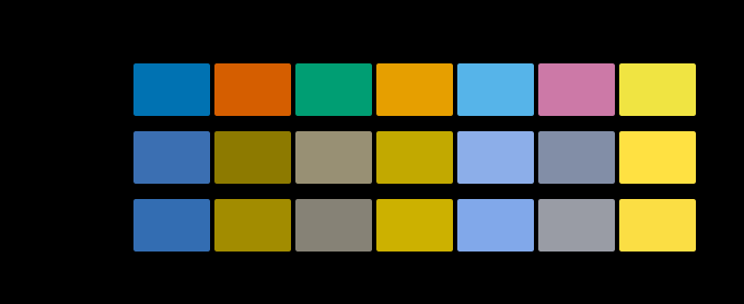 Three cones, two axes
The retina does not send three receptor signals down the optic nerve. It sends a sum and two differences, and the reason falls out of the statistics of natural light rather than out of anything the eye intended.
Three cones, two axes
The retina does not send three receptor signals down the optic nerve. It sends a sum and two differences, and the reason falls out of the statistics of natural light rather than out of anything the eye intended.
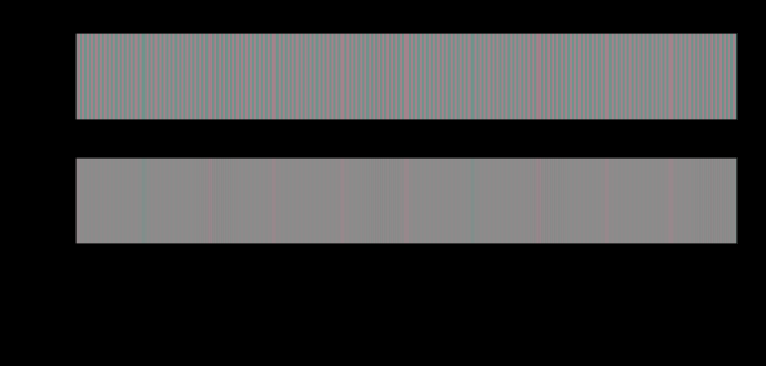 A difference has no size
A colour difference formula answers a question about two large patches seen side by side. Applied to a pattern, it reports fourteen units where the eye is left with less than one — and the ratio depends on nothing but how finely the difference is spread.
A difference has no size
A colour difference formula answers a question about two large patches seen side by side. Applied to a pattern, it reports fourteen units where the eye is left with less than one — and the ratio depends on nothing but how finely the difference is spread.
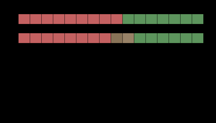 Colour thrown away on purpose
Every video format in use discards three quarters of its colour information and keeps all of its luminance, because the eye resolves fine colour detail badly. On an edge that carries luminance the loss is exactly zero. On an edge of nearly equal luminance it is a colour difference of forty-three, and the two edges are the same edge to the codec.
Colour thrown away on purpose
Every video format in use discards three quarters of its colour information and keeps all of its luminance, because the eye resolves fine colour detail badly. On an edge that carries luminance the loss is exactly zero. On an edge of nearly equal luminance it is a colour difference of forty-three, and the two edges are the same edge to the codec.
What this makes readable
Essays that name this one as a prerequisite.
Named alongside this one
Essays reaching for the same objects. Nobody chose these; they are what the index of named objects makes visible.
- A tint at the edge of a page contrast sensitivity · image difference · sampling · spatial frequency · viewing distance
- Sharpened type errs on its dark side contrast sensitivity · image difference · opponent processing · spatial frequency · viewing distance
- The drift is a luminance mechanism contrast sensitivity · individual variation · opponent processing · second stage · spatial frequency
- The eye keeps the lightness errors contrast sensitivity · image difference · opponent processing · spatial frequency · viewing distance
- A grey edge arrives coloured chroma · luminance · sampling · spatial frequency
- The list nobody made contrast sensitivity · image difference · sampling · spatial frequency
What links here
The 8 essays that link to this one and share the most of its objects, of 19 that link here.
The objects this essay names
Each one links to every other essay that touches it.
AcuityChromaContrast sensitivityImage differenceIndividual variationLuminanceOpponent processingSamplingSecond stageSpatial frequencyViewing distance