A pattern has a direction
Assumes How fine a colour edge can be and A halftone is not a mixture.
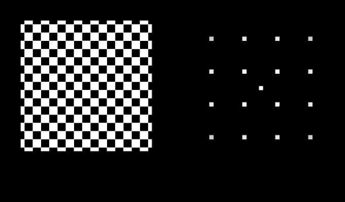
A halftone screen is set at forty-five degrees. Every printer knows it, every prepress manual says it, and the reason given is that the diagonal is less obtrusive. That is a statement about a person, it has never been given a number in anything this site has read, and it is exactly the kind of sentence a model ought to be able to settle.
It settles at 1.995, and the whole of it is one measurement nobody made about halftones.
The claim
Contrast sensitivity is a function of two spatial frequencies rather than one, and the second one is a direction. A pattern turned onto the diagonals of the visual field is harder to see than the same pattern on the cardinal axes, by a factor of about two at fine detail and by nothing at all at coarse. Nothing about the radial part of the eye’s filter can express that, so every spatial claim this site had made before this one is a claim about a profile.
Three consequences, and none of them is a matter of taste:
- A screen is quietest at 45°, by 1.995× against 0°, with the ruling, the coverage, the ink and the paper all unchanged.
- Three screens can be thirty degrees apart and four cannot, because a square screen is unchanged by a quarter turn, so screen angles live on a circle of ninety degrees rather than three hundred and sixty.
- Two screens at exactly the same angle beat not at all — the best arrangement available and the most fragile in the subject, because a one per cent error in one ruling puts a beat at 0.26 cycles per degree, which is coarse, slow, and about five times over threshold.
The one thing that is quoted
Everything above comes out of the radial sensitivity function this site already had plus a single new measurement: the oblique effect. Gratings at 45° need more contrast than gratings at 0° or 90°, by a factor repeatedly reported between 1.6 and 3 at high spatial frequency and reported absent below about five cycles per degree.
The value used is 0.3 log units — a factor of 1.995 — ramped in from five cycles per degree to twenty. Two things follow from stating it that way rather than fitting a surface.
The screen result is the landmark. The 1.995 in the opening paragraph is not a discovery about halftones; it is the oblique effect, carried through a rotation, arriving at the number a printer’s rule of thumb has been standing on since the 1890s. What the arithmetic adds is that the rule has a size, that the size is a measurement of people rather than of ink, and that it is the same measurement whatever the ruling.
And the effect is applied to the luminance channel only. The orientation anisotropy is reported weak or absent for isoluminant chromatic gratings, so the model has none. That is a prediction rather than a convenience, and it is one no printer believes: in this model a chromatic screen has no best angle, and the flat lower curve in the sweep below says so.

Why a rotation changes anything at all
A rotation moves a pattern’s energy around a circle of constant radius. Every radially symmetric filter is therefore blind to it, by construction, and the profile model this site had was radially symmetric in the only sense available to it: it had one frequency and no angle.
What makes the diagonal quiet is that a square screen has two orthogonal fundamentals. At 0° they sit on the horizontal and vertical axes, where the eye is best. At 45° both land on the diagonals, where it is worst. There is no arrangement in which one is favoured and the other is not, and no intermediate angle does better than 45° — which is why the sweep is a smooth curve with a single minimum rather than a comb.
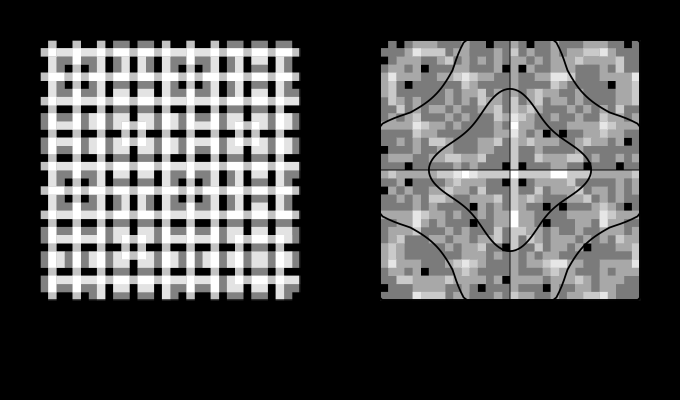
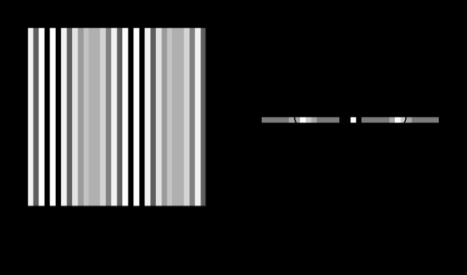
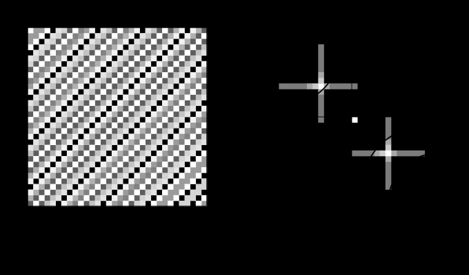
A plain grating is the same object with one frequency in it rather than a lattice, and turning it moves its two points around the same circle.
The second consequence: why three inks and not four
Two screens printed over one another multiply, because ink is a transmittance and stacked transmittances multiply. A product of two patterns contains the sums and differences of their frequencies — the same multiplication that makes a separation a family rather than a value, so two lattices produce energy at every difference of a harmonic of one and a harmonic of the other. That set of difference vectors is the moiré, and choosing screen angles is choosing where it lands.
The measurement is a search over the difference vectors of the two screens’ harmonics, weighted by each harmonic’s own amplitude and by the eye’s sensitivity where the difference falls. Swept over the angle between two 26 cycle-per-degree screens, it gives:
| angle apart | shortest beat | loudest beat, × threshold |
|---|---|---|
| 0° | — | 0.91 |
| 8° | 3.6 c/deg | 13.58 |
| 15° | 2.9 | 12.19 |
| 30° | 7.0 | 7.69 |
| 45° | 8.2 | 4.06 |
Two things in that table are not what a first guess predicts.
The worst separation is not the smallest one. A beat at 8° apart is louder than one at 2°, because a very coarse beat sits in the eye’s own low-frequency dip. The maximum sits at just under nine degrees of separation — 13.65 at 9.0° — and the whole trade is downhill from there.
And zero is the quietest of all, because two identical lattices at the same angle differ by exactly the zero vector, which is the tint itself and not a pattern. That is why single-colour work and duotones can print two screens in register, and it is why the arrangement is never used across four inks: the beat frequency is proportional to the error, and a one per cent difference in ruling puts it at 0.26 cycles per degree — a slow, broad, unmistakable swell, five times over threshold.

So four inks cannot all be well separated. Three angles evenly spaced on a ninety-degree circle are 30° apart, and 15°, 45° and 75° is that solution. A fourth cannot be added without cutting the smallest gap to 22.5°, and the trade the industry actually made is different, and better in a way the spatial arithmetic on its own does not show: put the fourth ink at 0° or 90°, accept a 15° gap for two of its pairs, and give that gap to yellow — the ink whose contrast against paper is smallest, and which is not there for colour anyway and whose moiré is therefore the least visible. The arithmetic here says how much worse the close pair is (12.19 against 7.69, a factor of 1.58) and says nothing about how visible yellow is, which is a colorimetric question and not a spatial one.
The industry’s arrangement is not the quiet one
Taken on the spatial measures alone, 15/45/75 with yellow on the axis is the louder of the two arrangements, and both statistics say so. Every number below is computed at the exact angle rather than read off a two-degree sweep, which matters here: the shortest beat at exactly fifteen degrees is 2.9 cycles per degree and at fourteen it is 5.1, because the shortest difference vector changes which harmonics it joins.
Moiré. Scoring all six pairs of an evenly spaced set at 0°, 22.5°, 45° and 67.5°: four pairs sit 22.5° apart at 9.90 times threshold and two sit 45° apart at 4.06, for a worst pair of 9.90 and a total of 47.70. The industry’s set has two pairs 15° apart at 12.19, three at 30° apart at 7.69 and one at 45° at 4.06 — a worst pair of 12.19 and a total of 51.51. The even spacing is 19 per cent quieter in its worst pair and 7 per cent quieter across all six.
And the individual screens. A screen’s own loudness runs 18.98 on a cardinal axis, 15.97 fifteen degrees off it, 13.44 at twenty-two and a half, and 9.51 on the diagonal. Both arrangements put one ink on a cardinal axis and one on the diagonal, so the difference is the other two, and the even set places those further from the axes. Summed over four inks: 55.37 evenly spaced against 60.43 as the trade places them.
So the trade is not a spatial one. Calling the industry’s answer better needs the other half of the argument, and the other half is not about how large the cost is.
What the arrangement actually buys
It is about where the cost is put, and it is put in one place.
Yellow takes the cardinal angle — 90°, the single loudest position on the circle at 18.98 — and it is also the ink in both of the 15° pairs, at 12.19 each. The three worst positions available all go to yellow. What is left is the three chromatic inks at 15°, 45° and 75°, mutually thirty degrees apart, whose worst pair is 7.69.
An even spacing has nowhere to put anything. Every ink sits 22.5° from two others, so the worst pair among the three inks that carry the colour is 9.90 — 29 per cent louder than the industry’s 7.69 — and one full share of the cardinal-axis loudness lands on whichever ink happens to occupy zero degrees, which will be a chromatic one.
That is the whole trade, and it takes two measurements rather than one. The counting result says a four-ink arrangement must give something up: three angles fit thirty degrees apart on a ninety-degree circle and four fit twenty-two and a half. The spatial arithmetic says the even answer gives up less in total. And the arrangement the trade settled on gives up more in total, in exchange for giving up almost nothing anywhere a reader can see it — which is a colorimetric judgement that none of this essay’s arithmetic could have reached.
The ordering is worth noticing for the same reason the 45° screen’s is. Press operators arrived at an arrangement that is worse by every measure this page can compute and better by the one it cannot, half a century before either measure existed.
What was computed, and how
The transform is a fast one, and that is unusual here. Every other transform on this site is the naive sum, on the grounds that a build step is not worth a second thing to verify. A 128-square field is 128 × 128² per direction and four directions in one filter, which is a few hundred million operations for one figure — so this file carries a radix-2 transform and two assertions that it is one: forward-and-back returns the field to 6.7 × 10⁻¹⁶, and a grating on the axis filters in the plane to exactly what the profile model gives it, to 3 × 10⁻¹⁴. That second assertion is what makes the two files one model rather than two.
The screen’s harmonics are taken once and rotated afterwards. Rasterising a screen at 17° and transforming the raster confounds two things — what the screen contains, and what the pixel grid did to it — because a lattice at 17° does not fit on a square grid and the aliases move with the angle. So the harmonics are taken on a grid the lattice fits exactly, at 832 samples per degree, and the harmonic vectors are rotated. The amplitudes are then a property of the spot function and the coverage, and the angle enters only where it physically does.
The first version did rasterise, and its sweep was visibly ragged: it reported the minimum at 45° correctly and the maximum at 10° rather than 0°, with a gain of 1.22 instead of 1.995. Every one of those defects was the pixel grid.
And the beat uses amplitudes rather than counting vectors. A first version took the shortest non-zero difference vector and asked how sensitive the eye was there. That reported almost the same loudness at every separation, because with enough harmonics some difference lands near four cycles per degree whatever the angle. Weighting each difference by the product of the two harmonics’ amplitudes — which is what the multiplication of two inks actually produces — recovers a curve with a shape.
Where the model stops
The oblique effect’s size is the least certain thing here. It is reported between 1.6 and 3, and the screen ratio is exactly that number: pick 3 and the 45° screen is three times quieter. What does not move is the shape — the minimum at 45°, the mirror symmetry, the flat chromatic curve — because those come from the square symmetry of the screen rather than from the size of the anisotropy.
The model has no segmentation. A screen is treated as a texture whose energy is somewhere in a plane. A reader looking at a printed page sees objects, and the visibility of a screen inside a face is not the visibility of the same screen on a flat tint. Nothing here has an object in it, which is the same gap the dot-gain measurement leaves in the other direction.
And there is no masking. The filter is linear, so a screen printed over a photograph is as visible as the same screen on white paper, which is false and is why the numbers here are worst cases.
The chromatic prediction is untested. The claim that a chromatic screen has no best angle follows from setting one landmark to zero, and setting a landmark to zero is a modelling decision rather than a measurement. It is stated here so that it can be wrong.
The generalisation
The sentence worth carrying is: a spatial claim without a direction in it is half a claim.
Every quantity on this site that has a spatial frequency in it inherits the gap. A colour difference spread as a pattern was measured on a line screen at one orientation and would come out a factor of two different on another. Banding in a gradient is measured on a ramp that runs one way across the page, and a ramp running diagonally bands less. Chroma subsampling discards samples along rows and columns, which is the worst possible arrangement by exactly this argument and is what every codec does.
The surprising connection is with the fourth ink. The reason yellow gets the bad angle is usually given as “yellow is light”, which is a colorimetric statement. The arithmetic here says the trade is forced — three angles fit on a ninety-degree circle and four do not, as a matter of counting — and that the industry’s answer is to spend the unavoidable cost on the ink whose spatial contrast is lowest. Two different fields of measurement, one decision, and neither of them can be made without the other.
Who found it, and when
The oblique effect has been measured since the 1950s and is one of the more robust findings in spatial vision: acuity and contrast sensitivity are best for horizontal and vertical gratings, worst at 45°, in humans and in several other species with fronted eyes. It is usually explained by the distribution of orientation preferences in the visual cortex, which is itself measurable and is not needed here — what this essay uses is the psychophysics, on the same principle that the cone mosaic’s variability is left out of a matching claim it does not enter.
The screen angles are older than the measurement. Rotating a halftone screen to 45° was standard practice by the turn of the twentieth century, and the 15/45/75 arrangement for three chromatic inks with yellow at 90° was settled well before anybody had drawn a contrast sensitivity function. That ordering is worth noticing: the trade found the answer by looking at printed sheets, and the psychophysics arrived half a century later and agreed.
Moiré as vector subtraction is the one part with a clean derivation, and it is old too — the same arithmetic as the beat between two tuning forks, in two dimensions instead of one.
What the pictures cannot show
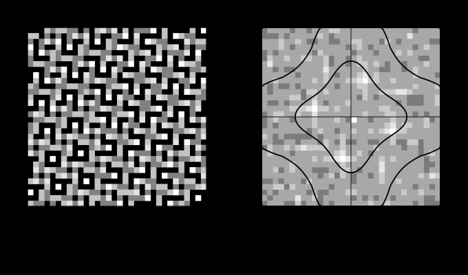
They cannot be turned. Every figure here is drawn at whatever angle the page is at, and a reader tilting a phone forty-five degrees turns every one of them into its own counter-example. That is not a joke: the oblique effect is defined against the retinal vertical, which follows the head rather than the picture, and a reader lying down reads a different figure from the one that was drawn. It is the same difficulty the observer’s own field size creates in every other family here, arriving from a direction a stylesheet cannot reach either.
And they cannot show the ruling that matters. A real halftone screen is at 150 lines to the inch or finer, which at ordinary reading distance is thirty cycles per degree or more — at or past the eye’s own limit. The screens in these figures are drawn coarse enough to be representable on a page at all, and the caption strip states the ruling each one assumes. Every claim here is about where energy sits, and the figures are diagrams of that rather than samples of it.
Where the ladder goes next
The nearest unfinished piece is the chromatic anisotropy, and it is unfinished because it was set to zero. Measuring it would settle whether a chromatic screen has a best angle, which is a question with an industrial answer already: chromatic screens are rotated in practice, and if the reason is moiré alone then the model is right and the practice has no orientation content in it.
The second is the interaction with the dot shape. Everything here uses a square-dot spot function, whose harmonics sit on a square lattice. A round dot, an elliptical dot and a line screen have different harmonic sets, and a line screen in particular has all its energy on one axis — which by this argument should make its angle matter twice as much. That is a one-line change to the spot function and a real prediction.
And the third is the one the next essay in this phase takes up: this model reads a pattern as a set of components, which is the form every threshold underneath it was measured in, and reading it any other way turns out to change the answer by a factor of twenty.
Where this goes next
 How fine a colour edge can be
The eye resolves a lightness pattern to about fifty cycles per degree and a red–green one to twelve. Every colour difference here is quoted as though a patch had no size, and the same difference is plainly visible at one scale and gone at another.
How fine a colour edge can be
The eye resolves a lightness pattern to about fifty cycles per degree and a red–green one to twelve. Every colour difference here is quoted as though a patch had no size, and the same difference is plainly visible at one scale and gone at another.
 A halftone is not a mixture
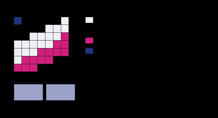
Forty per cent cyan and thirty per cent magenta are not stirred together anywhere. They are laid down as dots, and the sheet is a mosaic of four fully-inked regions in proportions the two coverages fix — which is why the colour is an area average of four spectra rather than a blend of two, and why it lands nowhere near where mixing would put it.
A halftone is not a mixture
Forty per cent cyan and thirty per cent magenta are not stirred together anywhere. They are laid down as dots, and the sheet is a mosaic of four fully-inked regions in proportions the two coverages fix — which is why the colour is an area average of four spectra rather than a blend of two, and why it lands nowhere near where mixing would put it.
 A difference has no size
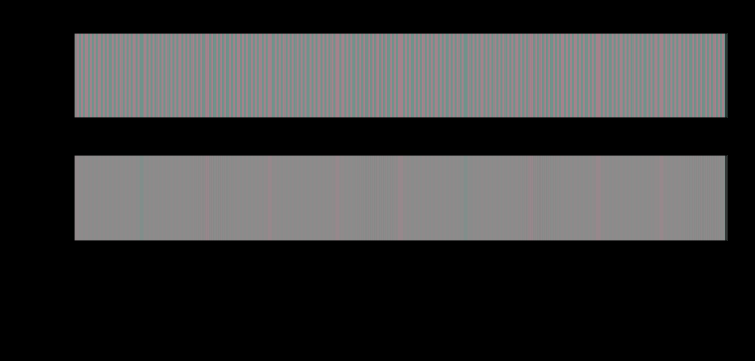
A colour difference formula answers a question about two large patches seen side by side. Applied to a pattern, it reports fourteen units where the eye is left with less than one — and the ratio depends on nothing but how finely the difference is spread.
A difference has no size
A colour difference formula answers a question about two large patches seen side by side. Applied to a pattern, it reports fourteen units where the eye is left with less than one — and the ratio depends on nothing but how finely the difference is spread.
What this makes readable
Essays that name this one as a prerequisite.
Named alongside this one
Essays reaching for the same objects. Nobody chose these; they are what the index of named objects makes visible.
- A halftone is a luminance object contrast sensitivity · halftone · moire · opponent processing · orientation · process inks · screen angle · spatial frequency · viewing distance
- Measured with an aperture, seen with an eye contrast sensitivity · halftone · process inks · spatial frequency · viewing distance
- The eye has a shutter contrast sensitivity · opponent processing · spatial frequency · standard observer
- The eye keeps the lightness errors contrast sensitivity · opponent processing · spatial frequency · viewing distance
- Two blurs before the eye's own contrast sensitivity · spatial frequency · viewing distance
- A grey edge arrives coloured sampling · spatial frequency
What links here
The 8 essays that link to this one and share the most of its objects, of 14 that link here.
The objects this essay names
Each one links to every other essay that touches it.
Contrast sensitivityDitherHalftoneMoireOpponent processingOrientationProcess inksSamplingScreen angleSpatial frequencyStandard observerViewing distance