Concept

Halftone — where it appears

A mosaic of full-strength dots whose areas rather than whose strengths carry the tint, so its colour is a spatial average. Its tone scale is not the area coverage, because the dot prints larger than it was asked to and light scatters sideways under the sheet.

Named by 19 essays across 5 fields — each of them below, with the objects they name alongside it.
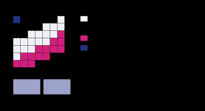
A halftone tint, its four regions, and what they average to. At 40% and 30% coverage the sheet is a mosaic of 4 fully-inked regions, not a mixture of anything. Their areas are the product of the coverages — Demichel's rule, which holds because the screens are rotated to make it hold — and the patch's reflectance is the area-weighted average of theirs, raised to the Yule–Nielsen exponent n = 1.8. Averaging the regions' CIELAB coordinates instead, which is what mixing means to almost everybody, lands ΔE00 = 0.76 away.

A halftone is not a mixture

Forty per cent cyan and thirty per cent magenta are not stirred together anywhere. They are laid down as dots, and the sheet is a mosaic of four fully-inked regions in proportions the two coverages fix — which is why the colour is an area average of four spectra rather than a blend of two, and why it lands nowhere near where mixing would put it.
applied · Delivery
Two mechanisms, one ramp, and the patch that separates them. A cyan ramp printed by a press with 10 per cent mechanical gain and a Yule–Nielsen exponent of 2.4. Fitting a mechanical gain at n = 1.0 gives 23 per cent and fitting one at n = 2.4 gives 10 per cent; both reproduce the ramp to under 0.66 of a lightness unit, and the curves lie on top of one another. The two-ink overprint below was in neither fit, and there they are ΔE00 = 3.20 apart.

A dot is larger than it was asked to be

Two quite different things make a printed midtone darker than its coverage says — ink spreading under pressure, and light scattering sideways inside the paper. Both bend the tone curve the same way and neither touches its ends, so the measurement every press is characterised by cannot say which happened. A patch that nobody measures can.

applied · Delivery
What a press and a display can reach at L* = 50. A slice through both solids at lightness 50, with the press dashed and the display solid. The boundaries cross: the press reaches past sRGB in 15 of 48 directions and falls inside it in 31. That is the shape of every conversion between them — colours are lost in one direction and gained in the other, and the picture cannot show the gained ones, because it is being displayed on the gamut that cannot reach them. Those are hatched.

Neither gamut contains the other

Converting a picture to CMYK is described everywhere as a reduction, as though the press were a smaller version of the screen. Measured as solids, the press reaches eleven per cent of its volume outside sRGB while sRGB reaches fifty-four per cent of its volume outside the press — and in the cyans the press wins by seventy per cent of chroma.

applied · Delivery
How wrong a profile is between its entries. A device profile is a lattice of measured patches and an interpolation. At every node of every grid drawn here the error is exactly zero, which is why a profile checked at its own patches always looks perfect. Sampled between the nodes, a 3-step grid is worst by ΔE00 = 2.93 and a 17-step grid by 0.30. Both are honest tables of the same press.

A profile is a table

An ICC profile does not contain a model of the device it describes. It contains a lattice of patches that were printed and measured, and everything between them is interpolation — which is exactly zero at every patch, so a profile checked against its own target reports perfection for ever.

applied · Delivery
The process inks as reflectance. Each ink is a sum of Gaussian absorbance bands with stated centres, widths and peak densities, and the reflectance shown is the substrate's times the square of the ink's transmittance, because light crosses the film going down and coming back. The first band of each ink is what it is for; the rest are what is wrong with it. Magenta's unwanted absorption in the blue-violet reaches an optical density of 0.46 against 0.95 for the band it exists to have — 48 per cent of its own strength, absorbing exactly where a saturated blue needs light to survive.

The paper is the white point

A printed colour is reported against the sheet it sits on rather than against the light in the room, and the choice is a switch in every colour engine. Flipped one way, the same separation on coated stock and on newsprint is a 3.04 colour difference; flipped the other, it is 0.13 — and the two answers are about different questions.

applied · Delivery
The solids, by volume. CIELAB volume, all measured by the same cell count with the same extrapolation, and quoted against sRGB because that is the comparison the estimator supports. The four-colour press reaches 49 per cent of the sRGB solid's volume — and contains colours sRGB does not, which is why "half the gamut" is the wrong summary of a ratio of one half.

The fourth ink is not for colour

Black is in every process set and it extends the gamut by more than a third — and at every lightness above about forty it extends the chroma boundary by exactly nothing. What it buys is depth at the bottom, a neutral that holds its hue when the press drifts, and a way to put a full-strength dark on a sheet that could not carry three inks' worth of it.

applied · Delivery
What happens to a tone the destination cannot print. Source lightness along the bottom, destination lightness up the side, for a print whose black is L* = 8. Clipping is the flat segment on the left — 4 of 10 levels in the bottom twenty points of the scale arrive as the same number, and nothing downstream can recover them. Black point compensation is the straight line: all 10 levels survive as different numbers, and every tone in the picture has moved to pay for it.

A black that is not black

The deepest colour a four-colour press can make is L* 2.4, and against its own paper that is a contrast of about 320 to 1 — less than a cheap display manages in a dark room. Everything a printed picture does in the shadows is done inside that range, and the two ways of fitting a picture into it destroy different things.
applied · Delivery
What separates the separations, and under which light. 11 separations of a single colour, differing only in how much of it is carried by black rather than by the three chromatic inks. Under D50 they agree to ΔE00 = 0.00 — the solver was asked for that and delivered it. Under illuminant A they spread to 6.75. They are metamers of one another, and the whole family is invisible to any instrument reading a single illuminant.

The separation is not unique

A four-ink press has one more control than a colour has numbers, so most colours can be printed several ways. The alternatives agree to a hundredth of a colour difference under the light the match was made in — and they are metamers of one another, so under a tungsten lamp the same eleven separations of one colour spread by nearly seven.

applied · Delivery
The solids, by volume. CIELAB volume, all measured by the same cell count with the same extrapolation, and quoted against sRGB because that is the comparison the estimator supports. The four-colour press reaches 49 per cent of the sRGB solid's volume — and contains colours sRGB does not, which is why "half the gamut" is the wrong summary of a ratio of one half.

The fifth ink buys a corner

Orange, green and violet are sold as the answer to a four-colour press's gamut, and each one adds seven to nine per cent of volume. All three together add 23 per cent — almost exactly the sum, with no interaction — and every bit of it lands in the region of the ink that was added, at lightnesses where that ink is dark.
applied · Delivery
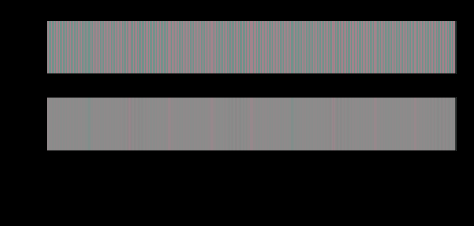
A chromatic line screen at 10.0 cycles per degree. The upper strip is the pattern as delivered and the lower one is the same pattern after each opponent channel has been low-passed at its own cutoff. Against a flat field of the same mean, the delivered pattern differs by up to ΔE00 14.22 and the filtered one by 7.77 — a ratio of 1.8. Every number quoted elsewhere for a difference of this kind is the first one.

A difference has no size

A colour difference formula answers a question about two large patches seen side by side. Applied to a pattern, it reports fourteen units where the eye is left with less than one — and the ratio depends on nothing but how finely the difference is spread.
difference · Metric
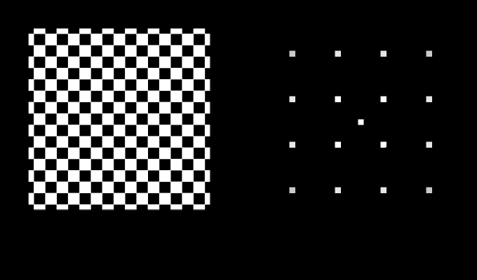
A screen at 45°, 8 c/°, and where its energy sits. Left, the pattern. Right, its power in the frequency plane with the zero frequency at the centre and the edges at the sampling limit of 23 cycles per degree, on a logarithmic scale over five decades. The closed curves are the visual system's own sensitivity at 5, 25, 60 per cent of its peak; they are not circles, because sensitivity is lower on the diagonals than on the cardinal axes by a factor of 2.0 at high frequency. Energy inside a curve is seen; energy outside it is not, whatever its size.

A pattern has a direction

Every spatial claim here is a claim about a frequency, and a frequency has no direction in it. Turning a printed screen forty-five degrees makes it exactly twice as quiet with nothing else changed — and the same rotation does nothing at all to a chromatic one.

eye · Cones
A halftone tint away from the centre of gaze, two ways. The upper curve raises the threshold by the E2 rule and leaves the filter alone, which is the multiplication the last phase guessed at. The lower one also moves the cutoff, because eccentricity magnifies the whole spatial scale — implemented as the substitution that makes it exact, a screen of ruling r seen through a filter whose cutoff has been divided by s being a screen of ruling r·s seen at the fovea. The horizontal line is threshold. The screen is visible where you are looking and gone by 3°, while the product prediction has it visible across the whole page.

A tint at the edge of a page

The last phase left this join open and guessed at its answer — how visible a halftone tint is away from the centre of gaze should be the product of two effects it had measured separately. It is not the product. At five degrees the guess is fifty-three times too generous, and by twenty it is out by eight orders of magnitude.

difference · Metric
Every filtered claim in these essays, read at a point and read as components. Each row is a comparison one of the essays makes. The bar is the ratio between the two readings — how many times larger the component answer is than the point answer, or the reverse — on a logarithmic scale. 5 of 7 disagree by more than half again, and 4 disagree about the direction of the effect rather than merely its size. The three marked as noisy are the ones with a noise field on one side of the comparison, and they are the three largest.

The list nobody made

The last phase found that reading a filtered signal at a point asks a question its thresholds were never fitted to, made it a standing rule, and admitted that nobody had gone back through the site to see which claims it touched. Here is the list. Every claim with noise on one side of it moves — and so do two that have no noise in them at all, which the rule said would not.

limits · Limits
How fine a screen each channel can see. A halftone screen at 35 per cent coverage, 45 degrees, seen by each of the eye's three spatial channels. The bar is the ruling at which it drops below that channel's own threshold. The luminance channel is still seeing it at 55 cycles per degree; the two chromatic ones have lost it by 15 and 10. The dashed line is an ordinary press ruling at reading distance, and only one channel is above it. A halftone is a luminance object, which is why the ink whose dots are nearly the lightness of the paper is the one nobody worries about.

A halftone is a luminance object

The eye's three spatial channels resolve a screen at 55, 15 and 10 cycles per degree, so at any ruling a press actually runs only one of them can see it at all. The corollary corrects a guess already published here — rotating a screen matters more to the chromatic channels, not less — but only at rulings so coarse that nobody prints there.

difference · Metric
What a halftone measures, against what it looks like. A 50 per cent screen, measured by an aperture that averages the patch and seen by an eye that blurs it first and compresses afterwards. At a coarse ruling the two disagree by ΔE00 11.1, and the patch looks 14.3 lightness units darker than it measures — the average of a concave function is below the function of the average, which is Jensen's inequality and not an illusion. The gap falls under a unit above 30 cycles per degree. That is a viewing distance, and the correction a press applies for dot gain has no distance in it anywhere.

Measured with an aperture, seen with an eye

A spectrophotometer averages a halftone patch and reports one reflectance. An eye blurs it first and compresses afterwards, and the average of a concave function is below the function of the average — so a resolvable screen looks darker than it measures, by fourteen lightness units at a coarse ruling and by nothing at a fine one. The correction a press applies is the same size and has no viewing distance in it.

applied · Delivery
The best possible 3×3, and the patches it makes worse. Each row is one patch printed on a brightened sheet, measured under both conditions. The pale bar is how far apart the two measurements are; the dark bar is what is left after the best least-squares 3×3 over the whole set has been applied. It leaves 23 per cent of the mean, and — the part a mean hides — it makes 4 patches worse than doing nothing. The solids are the ones it damages: the ink blocks the ultraviolet, so a solid barely disagrees between the two conditions and the correction has no business touching it. A matrix has no way to apply itself only where the paper is showing.

A tolerance cannot cross a condition

If two measurement conditions disagree by seven units, the obvious repair is a correction matrix fitted between them. The best least-squares 3×3 over seventeen printed patches leaves 23 per cent of the disagreement and makes five patches worse than doing nothing — because the term it is trying to remove is proportional to how much paper is showing, and no linear map on three numbers can express that.

difference · Metric
Which way a tint turns a pigment's hue, made in paint and made in light. For eight pigments tinted nineteen parts white to one of colour, the Oklab hue turn from the pure pigment: of the tint made in paint (upper bar) and of the additive mixture with white at the same luminance (lower bar). For seven of the eight the two point in opposite directions. The orange turns +13.5° in paint and −13.9° in light.

A tint in paint turns the other way

A pale colour can be made two ways: by stirring white pigment into a coloured one, or by adding white light to it — which is what a halftone on white paper and a display both do. At the same luminance the two tints are not the same colour. For seven of eight pigments they turn the hue in opposite directions, an orange by +13.5 degrees in paint and −13.9 in light, and the paint tint is the more colourful of the two every time. The cause is in the reflectance: diluting a pigment moves its absorption edge, and adding light does not.

brain · Appearance
A halftone tint, between the two ideals and nearer one of them. For each pigment, how far the hue turns when it is tinted to the same lightness three ways: mixed with white pigment, mixed with white light, and printed as a halftone at a Yule–Nielsen factor of two. Right is towards a longer wavelength. 7 of the eight pigments' two ideals turn the hue opposite ways. The halftone mark sits between them at every pigment and between 26 and 44 per cent of the way from the light ideal to the paint one — so it keeps the additive tint's direction and loses about a third of its size.

Printing does not change the sign

A tint mixed in paint and a tint mixed in light turn seven of eight pigments' hues opposite ways. A halftone sits between the two because light entering the paper between dots emerges under a dot, and the question was where. At the optical gain a coated sheet is fitted at, a halftone has travelled between 26 and 44 per cent of the way from the light ideal to the paint one — the same fraction for every ink — and only one pigment in eight changes direction.

brain · Appearance
An orange ink's tints on three papers: which way the hue turns. The hue of each tint of an orange ink, from the solid to a tenth coverage, against the solid on the same paper, in degrees of Oklab hue: on a coated sheet, an unbrightened uncoated sheet and a newsprint. Solid lines are read against daylight's white, as an instrument reads them; dashed lines against the paper's own white, as a reader adapted to the page. At a tenth coverage, read against daylight, the coated sheet's tint has turned -8.7 degrees and the newsprint's 21.8; read against each paper's white, -8.7 and -1.1.

Newsprint turns a tint with its colour, not its gain

A halftone tint turns its hue the way a mixture of light does, by less, because optical dot gain carries it part of the way towards a paint tint. The straight line through a coated sheet's gain predicted that an uncoated sheet's larger gain would carry the orange past the crossing at a factor of 3.2, so that the same ink would turn opposite ways on two papers. It does turn opposite ways — on newsprint the orange's pale tints swing 13 degrees one way where a coated sheet's swing 8 the other. But the gain is not what does it. The road towards paint bends and stops at 60 to 70 per cent of the way, the orange needs a factor of 5.4 to cross, and newsprint's reversal comes almost entirely from the paper being yellow. Read against the paper's own white, as a reader looking at the page is adapted, it goes away.

brain · Appearance

Named alongside it

The objects these essays reach for when they reach for this one.

Process inksQuality controlSpecificationContrast sensitivitySpatial frequencySubstrateSubtractive mixtureViewing distanceGamutInk limitReflectanceSampling

All concepts