Theme

The thread: Say which colour

A swatch is a set of coordinates in a space, under an observer, on a display with a gamut. Every colour drawn here carries all four, because a hex code on its own does not identify a colour at all.
Four standard illuminants, and how little they have in common. Spectral power distributions for A, D50, D65, E, on one scale. Illuminant A rises steeply toward the red; the daylight illuminants carry the atmosphere's absorption structure; E is flat by definition. All four are ordinarily called white. What light is

A spectrum is not a colour

What arrives at the eye is a function of wavelength. What the eye reports is three numbers. Keeping the two apart is the single most useful habit in the subject, and almost every confusion in applied colour comes from letting them merge.
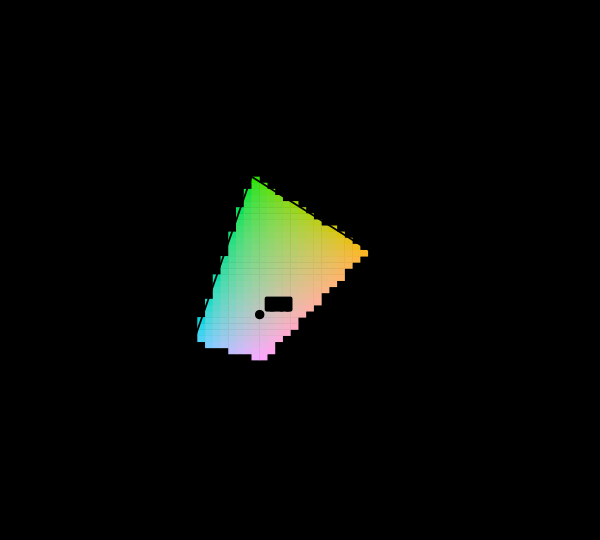
The CIE 1931 chromaticity diagram with its unreachable region marked. The spectral locus encloses every chromaticity a human eye can see. Cells inside the sRGB triangle are drawn in their own colour; the 85 per cent outside it are hatched, because no value this display accepts is the colour belonging there. Matching and measuring

Most of this diagram cannot be shown

The chromaticity horseshoe is the canonical illustration of colour science, and nearly every printed copy is filled edge to edge with colours the page cannot produce. The honest version marks them, and the marking covers most of the picture.

The CIE 1931 colour-matching functions. The three functions that turn a spectrum into three numbers. They are all positive, which is why XYZ exists — the RGB functions they were derived from are not. ȳ is by construction the luminous efficiency function, which is why luminance comes out of Y. Where the model breaks

Seventeen observers in 1931

The standard observer that governs every colour specification in industrial use is an average over seventeen young British men, measured with equipment from the 1920s. It is known to be wrong in the blue, the correction has existed since 1951, and it has never been adopted.

Blackbody spectra from Planck's law, 2000 to 10000 K. Each curve is computed from Planck's law and normalised to its own peak. The peak moves toward shorter wavelengths as temperature rises. Only two of these radiators peak inside the visible band at all — a 2000 K source peaks at 1449 nm, far into the infrared, and merely rises toward the red across everything shown here. What light is

Blackbody and the colour of temperature

Heat something and it glows, in a colour fixed by its temperature alone. Planck's law gives the whole spectrum from one number, and the Planckian locus is the only curve in colour science derived from physics rather than from measurements of people.

MacAdam's discrimination ellipses, drawn 10 times actual size. Twenty-five ellipses of colours indistinguishable from their centres. They are drawn at 10× because at true scale most are thinner than a line. Their areas vary by a factor of 74, which is the whole result: a step of the same size in xy means very different things in different places. Difference and uniformity

MacAdam measured it

In a perceptually uniform space the just-noticeable-difference contours would be circles of equal size. MacAdam's ellipses are neither, by a factor of eighty — and transforming them into each candidate space settles which spaces improved matters and by how much.

Two identical grey patches on different surrounds. Both inner squares are #868686. The one on the dark field looks lighter. The values are checked to be equal before the figure is drawn, so the claim is a fact about the drawing rather than a promise. Matching and measuring

Matching is not appearance

CIE XYZ predicts when two lights will look the same under identical viewing conditions. It was never a model of how anything looks, and most of the confusion in applied colour comes from using it as one.
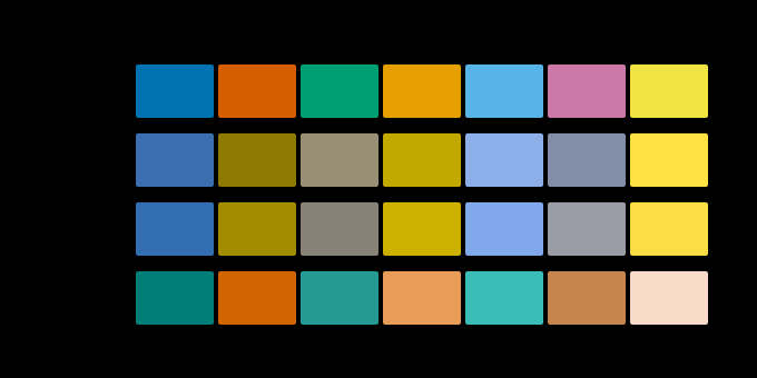
One palette under normal vision and three dichromacies. The same 7 colours simulated by the Brettel–Viénot–Mollon construction at severity 1.0. protanopia and deuteranopia collapse the red-green distinctions, and tritanopia leaves them and collapses blue against yellow instead. This shows which discriminations survive, not what anybody sees. Where the model breaks

Simulating what cannot be simulated

A colour-blindness simulation cannot show what anybody sees. What it can show is which discriminations survive, and that is a narrower claim, a checkable one, and the only one worth making.

Two different spectra that are the same colour. Two reflectance curves differing by 92 per cent RMS, and the two patches they produce under D65: identical to ΔE00 = 6.2e-14, which is arithmetic noise rather than a small number. Both patches are inside the sRGB gamut, so neither has been clipped into agreement. What the eye does

Two spectra, one colour

Metamerism is usually described and almost never demonstrated. It does not have to be — the metameric black space is enormous, so a matching pair can be constructed to order, verified, and then made to come apart by changing the light.
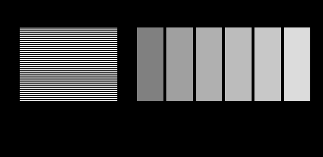
A gamma probe: which grey matches a half-white dither?. The striped block on the left is half white and half black, so it carries half the luminance of white. Stand back until the stripes blur and find the patch that matches it. On an sRGB display the answer is code 188, not 128 — code 128 has only 22 per cent of white's luminance. Where the model breaks

The display is an unknown

This site is displayed on the very apparatus it is about, and it knows almost nothing about that apparatus. Two figures here stop assuming and ask instead — a probe for the transfer function and a probe for the gamut.

One reflectance, two illuminants, two colours. A reflectance peaking near 610 nm, and the colours it produces under D65 and A. The object has not changed. The light has, and colour is a property of the pair. What light is

The illuminant is half the answer

An object has a reflectance, not a colour. The colour appears when a specified light falls on it, which is why two surfaces can match in a shop and clash outside, and why every serious matching standard names the light.

The sRGB transfer function, and the gamma 2.2 curve it is not. Code value against relative luminance. The sRGB function is piecewise — a short linear segment near black, then a 2.4 power law with an offset — and it is close to but not the same as a plain 2.2 power law. Half-way along the axis of stored values sits at 21 per cent luminance, and half the luminance of white is at code 188. Difference and uniformity

The midpoint is not half

Code 128 sits halfway along the sRGB scale and carries about a fifth of white's luminance. Half the luminance is code 188. Almost every gradient, blur and resize on the web gets this wrong, and the errors are visible once known.
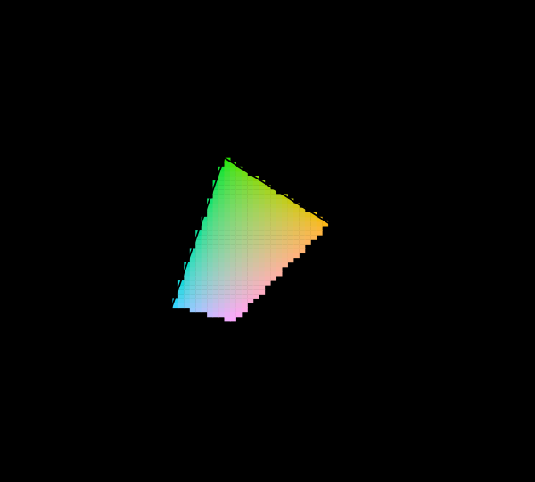
sRGB, Display P3 and Rec. 2020 compared on the chromaticity diagram. Three nested triangles inside the horseshoe. sRGB covers 74 per cent of the area P3 covers. Rec. 2020's red and green primaries sit on the spectral locus itself, within 0.000 and 0.002 of it, meaning they are monochromatic. Matching and measuring

What a gamut costs

Three primaries reach a triangle and the visible region is not a triangle, so something has to give. Widening the primaries helps, has a price in precision and compatibility, and runs into a limit that is geometric rather than technological.

The CIE 1931 colour-matching functions. The three functions that turn a spectrum into three numbers. They are all positive, which is why XYZ exists — the RGB functions they were derived from are not. ȳ is by construction the luminous efficiency function, which is why luminance comes out of Y. What the eye does

Why colour is exactly three-dimensional

Matching every wavelength with three primaries requires, for some wavelengths, a negative amount of one of them. That physical awkwardness is why the colour-matching functions were transformed into XYZ, and why the horseshoe is curved.

The sRGB transfer function, and the gamma 2.2 curve it is not. Code value against relative luminance. The sRGB function is piecewise — a short linear segment near black, then a 2.4 power law with an offset — and it is close to but not the same as a plain 2.2 power law. Half-way along the axis of stored values sits at 21 per cent luminance, and half the luminance of white is at code 188. Matching and measuring

A hex code is not a colour

Six hexadecimal digits identify three numbers. Turning three numbers into a colour needs a colour space, a transfer function, a white point and a display, and leaving any of them unstated is the everyday version of every confusion in colour management.

triphosphor fluorescent — three narrow phosphors plus the mercury lines, and the white it produces. The spectral power distribution of a triphosphor source, normalised to its own peak, and the colour a perfect white reflector takes under it: chromaticity (0.3379, 0.3389), correlated colour temperature 5258 K at Duv -0.0035. The white looks ordinary. The spectrum producing it does not. What light is

A lamp is not a blackbody

A fluorescent tube puts a third of its light into four mercury lines. A white LED is a blue spike with a hole beside it. Both are sold by a colour temperature, and a colour temperature says nothing about either.

A box tolerance and a ΔE tolerance around the same colour. A slice through CIELAB at L* 50, with the ΔE2000 = 1 contour traced point by point and a ±1 component box drawn over it. The contour is 2.1 times longer in one direction than the other, and the box is square. Of every sample either rule accepts, the two disagree about 74% — accepted by one specification and rejected by the other, on the same measurement. Difference and uniformity

A tolerance is a shape

A total colour difference below one, or every component within one — the two sound like the same requirement stated twice. They are different shapes, they disagree about most of what either accepts, and which one a supplier is held to is worth money.

Three ways to spend a thousand code values. Normalised code value against luminance, for PQ, HLG and a conventional gamma curve, all covering 0.001 to 10000 cd/m². PQ spends 51% of its range below 100 cd/m² — roughly where a picture lives — and the gamma curve spends 15%, leaving the rest for highlights. A PQ code is the only one of the three that names a luminance rather than a fraction of whatever the display can manage. Where the model breaks

How bright is white

An sRGB value says a pixel is some fraction of whatever the display can manage. A PQ value says it is two hundred candelas. The change is the largest in display encoding since gamma, and what it removed was the honest admission that nobody knew.

A sample with two reflectance curves, and neither below one. The apparent reflectance of an optically brightened sample, measured under D65 and A. It exceeds 1 — the shaded band — which no reflector can do: more light leaves at these wavelengths than arrives at them, because the sample absorbs in the violet and re-emits in the blue. And the two curves differ, so the sample has no single reflectance to store. The effect drawn here is a floor: most of the excitation band lies below 380 nm, outside the range computed here. What light is

Some paper is brighter than white

The reflectance model assumes light leaving at a wavelength arrived at that wavelength. A fluorescent sample breaks the assumption, has no reflectance curve at all, and is in almost every sheet of white paper sold.
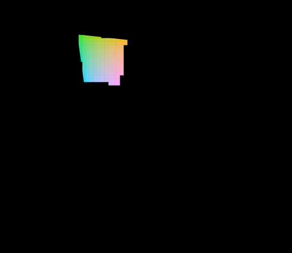
The 1976 uniform chromaticity diagram, with the unreachable region marked. The u′v′ diagram: the same spectral locus and the same sRGB primaries as the 1931 picture, projectively transformed. Straight lines stay straight, so mixtures and the gamut triangle survive; what changes is the distribution of area, and the green region that dominates the 1931 diagram is much reduced. 8% of the cells sampled inside the locus are reachable at Y = 0.55; the rest are hatched. Matching and measuring

The diagram was replaced in 1976

The CIE knew the 1931 diagram was badly distorted and published a better one. Half a century later almost every chromaticity plot in print is still the old one, and both are still printed filled edge to edge with colours no display can show.

Three lightness scales, seventy years apart. Munsell value, CIELAB's L* and CIECAM16's J against luminance, all rescaled to run 0 to 100. Each is somebody's answer to how evenly spaced lightness steps map onto light. They put the midpoint of the scale at 19.8%, 18.4% and 28.0% of the white's luminance respectively — close enough to be three measurements of one thing, far enough apart to be three measurements rather than one restated twice. Matching and measuring

Colour by catalogue

A colour order system arranges physical samples on a regular lattice so a person can find one and name it. The space it samples is not regular, and everything interesting about such systems is what happens at that mismatch.

Four adaptation transforms, measured against CAT16 (D65 to D50). Twenty-seven colours moved from D65 to D50 by each transform, compared with the current recommendation. Bars are the worst disagreement in CIELAB, the number beside each is the mean. Plain XYZ scaling — still shipping, still called von Kries by people who have not read von Kries — misses by up to ΔE 13.7, which is many times any tolerance a supplier would be held to. What the brain does

Four ways to move a white point

Every chromatic adaptation transform is the same three lines with a different matrix. The matrices disagree by more than any tolerance a supplier is held to, and the oldest one — still shipping, still called von Kries — is not a cone basis at all.

A 20 nm bandpass, and what it does to the sample. The true reflectance, the same reflectance as a 20 nm instrument reporting every 20 nm returns it, and the slit function responsible, drawn at its own scale around 550 nm. The reconstruction is what every calculation downstream will use, and it differs from the truth by ΔE 2.97 under D65. Nothing in the file the instrument writes marks which values were measured and which were interpolated. Matching and measuring

What the instrument reports

A spectrophotometer sees a sample through a slit of finite width, at a finite number of wavelengths. What it writes down is the truth convolved with its own bandpass, and nothing in the file says which values were measured and which were invented.

Luminous efficacy of a monochromatic source, under the 2° observer. Lumens per watt against wavelength. The curve is the luminous efficiency function scaled by 683, which is what luminous efficacy of radiation is — the 1979 redefinition of the candela fixed 555 nm at exactly 683 lm/W and everything else follows. Marked at 450 nm (26 lm/W), 500 nm (221 lm/W), 555 nm (683 lm/W), 600 nm (431 lm/W), 650 nm (73 lm/W). Under this observer the peak reaches 683 lm/W. What light is

What a lamp cannot give back

Six hundred and eighty-three lumens per watt is not a measurement of anything. It is the definition of the candela, it is a ceiling no white light can approach, and the distance between a lamp and that ceiling is mostly the price of being able to see what colour things are.
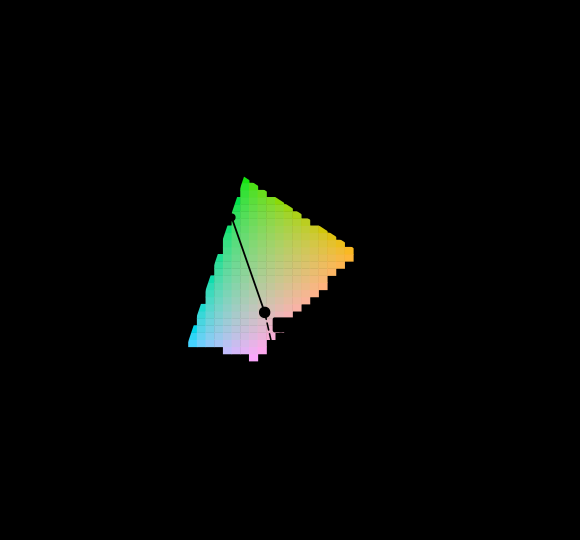
Dominant wavelength as a construction on the diagram, against equal-energy E. A ray is drawn from the white point through each sample and continued until it leaves the diagram. The sample at (0.28, 0.52) leaves through the spectral locus at 537 nm, at excitation purity 0.43. The sample at (0.36, 0.19) leaves through the line of purples, so it has no dominant wavelength at all and is written 544c nm — the crossing on the opposite side, marked with a c. The hatched region is colour this display cannot show and is not drawn as though it could. Matching and measuring

Not every colour has a wavelength

The question every reader arrives with is which wavelength a colour is. For close to a third of the directions on the chromaticity diagram the honest answer is that there is none, and the construction colorimetry offers instead is a statement about a diagram rather than about light.

167 essays on this thread, page 1 of 7 · all threads · all essays