A hex code is not a colour
Assumes Most of this diagram cannot be shown.
#E63946 identifies three integers: 230, 57, 70. It does not identify a colour, and the gap between those two statements is where most practical colour trouble originates.
To turn three numbers into a colour, four things have to be known, and in ordinary use none of them is stated.
The four missing pieces
Which primaries. The three numbers are amounts of three primaries, and the primaries differ between colour spaces. The same triple means a noticeably different colour in sRGB and in Display P3 — more saturated in P3, because the primaries are further out. Most images on the web carry no indication, and are assumed to be sRGB by convention.
Which transfer function. The mapping from code value to light is a curve, and different spaces use different curves. sRGB’s is piecewise with a linear toe; some spaces use a plain power law; linear working spaces use none. A number with no transfer function does not specify an amount of light.
Which white point. Colour spaces are defined relative to a white, and D65 and D50 are both in common use — D65 for displays and D50 for print. A value transferred between them without adaptation shifts.
Which display. Even with all three specified, what the screen does with the resulting signal is unknown. Calibration state, ambient light and any active filter all intervene.
Only when all four are pinned does a triple identify a colour. In ordinary use they are pinned by convention — sRGB, sRGB transfer, D65, assume the display behaves — and the convention is right often enough that the shorthand survives.
The second of the four is the one a reader can be shown rather than told, because the curve between a code value and an amount of light is drawable and the other three are conventions.

Where the convention breaks
Four situations where the assumptions fail, all common.
Wide-gamut displays. An sRGB value shown unmanaged on a P3 display is interpreted against the wrong primaries and comes out oversaturated. This is the commonest visible colour bug of the last decade, and the symptom — everything slightly too vivid — reads as a display characteristic rather than as an error.
Print. Print uses D50 and a subtractive ink gamut that intersects rather than contains sRGB. A hex code has no meaning in print until it has been converted through a profile, and the conversion is lossy in both directions.
Blending and compositing. Arithmetic on code values is arithmetic in a non-linear space, so averaging two values does not average the light. Every gradient, blur, resize and alpha composite that skips linearisation is computing in the wrong space.
Any colour outside the space. A value in a wide space converted to a narrow one may not exist there, and something gets substituted silently.
How wrong the commonest bug is
An sRGB value shown unmanaged on a P3 display is named above as the commonest visible colour bug of the last decade, and it has a size.
Interpreting every code triple on an eleven-cubed lattice against P3’s primaries instead of sRGB’s, and comparing against what the value meant: the mean difference is 3.12 ΔE00, the worst is 6.88 at a saturated red-orange, 80.4 per cent of the cube is more than two units wrong, and 6.0 per cent is more than five.
The shape of it is why the bug is so durable. Every neutral is exactly right. A mid grey reads 0.00 and so does white, because the two spaces share a white point and a neutral is that white scaled — so nothing in an interface’s chrome, nothing in its text, and no grey in a photograph shows the slightest error.
What moves is the saturated end, and it always moves outward: red by 6.83, yellow by 5.38, green by 5.33, cyan by 4.78, magenta by 2.91 and blue by 1.37. The picture is right everywhere a reader would check it and wrong everywhere a reader would enjoy it.
A defect that is exactly zero on greys and nearly seven units on a red does not read as a defect. It reads as a display with punchy colour, which is what the panel was sold as — and being perfect on every neutral is exactly what carries it through review.
Blue is the smallest of the six at 1.37, which is the other half of why it hides. P3 and sRGB share very nearly the same blue primary, so the one channel whose shift a viewer might read as wrong rather than as vivid is the one that barely moves at all.
What CSS did about it
Modern CSS has taken the unusual step of making the missing pieces expressible.
color(display-p3 1 0 0) names its space. color(srgb-linear ...) names a linear working space. oklch(70% 0.15 30) uses a perceptual space where the three numbers are lightness, chroma and hue rather than primary amounts. And color-mix(in oklab, ...) states which space the mixing happens in, which is precisely the parameter that determines whether a blend is correct.
That last one is the most significant, because it makes the blending question explicit rather than implicit. color-mix(in srgb, black, white) and color-mix(in oklab, black, white) give different midpoints, and having to name the space means having to think about which is wanted.
The perceptual spaces have a second advantage worth noting. Adjusting lightness in a perceptual space changes lightness; adjusting the same thing in sRGB changes hue and saturation as well, which is why a palette generated by scaling RGB values drifts in hue as it darkens. Blues are the worst case — CIELAB’s known failure is that blues shift toward purple as they darken, and Oklab was fitted specifically to fix it.
What “the same colour” means
The phrase has at least four meanings, and confusing them causes trouble.
Same code value. Two elements with #E63946. Says nothing about appearance until the four pieces above are fixed — and even then, surround changes appearance.
Same colorimetry. Same XYZ. Means they will match under identical viewing conditions for the standard observer. This is the strongest statement colorimetry supports.
Same appearance. Means they look the same to a particular observer in a particular situation. Requires an appearance model, and can hold between different colorimetries or fail between identical ones.
Same spectrum. Physically identical light. Much stronger than needed for a match, and rarely the case for two things that match.
Most everyday disputes about whether two things are the same colour are disagreements about which of these is meant.
Named colours, and their arbitrariness
CSS defines 148 named colours, and their provenance is worth knowing because it illustrates the general point.
They descend from the X11 colour list, which was assembled informally at MIT in the 1980s, partly from a Sinclair paint catalogue. They are not perceptually spaced, they are not systematically named, and they contain well-known oddities — darkgray is lighter than gray, and there are four slightly different greens with confusingly similar names.
They are, in short, a list somebody made, standardised because it was already widely used. Treating them as a canonical vocabulary of colour is a mistake of the same kind as treating a hex code as a colour: the name identifies a triple, and the triple needs the same four pieces of context as any other.
The same triple in three spaces
The clearest way to see that a triple is not a colour is to hold the triple fixed and change the space.
Interpreted against sRGB primaries, #E63946 is a particular red. Interpreted against Display P3 primaries — same three numbers, different corners of the triangle — it is a visibly more saturated red, because P3’s primaries sit further out and the same fractional amounts therefore reach further. Interpreted against Rec. 2020 it is more saturated still.
Nothing in the six hex digits indicates which reading is intended. The convention is sRGB, the convention is usually right, and when it is wrong the failure looks like a display characteristic rather than a misinterpretation.
The two useful kinds of colour space
Spaces divide into two families with different purposes, and choosing the wrong family is a common source of poor results.
Device spaces describe what some hardware can do. sRGB, Display P3, Rec. 2020, and any printer’s ink space. Their axes are amounts of primaries, their gamuts are the reachable set, and arithmetic in them corresponds to nothing perceptual. They are the right choice for saying what a device should emit.
Perceptual spaces are built so that distance means something. CIELAB, CIELUV, Oklab, and their polar forms. Their axes are lightness, chroma and hue, they have no gamut of their own — they can express colours no device can produce — and arithmetic in them corresponds roughly to perceptual operations. They are the right choice for generating a palette, interpolating a gradient, or measuring a difference.
The practical rule follows directly: choose colours in a perceptual space, deliver them in a device space, and check the conversion for anything that fell outside.
Why sRGB became the default of everything
It is worth understanding, because the answer explains why a 1990s specification governs current work.
sRGB was designed to describe a typical CRT of its era, and its value was that it gave untagged content a defined meaning. Before it, a file with no profile meant whatever the display happened to do. After it, the assumption was written down, so at least everyone was wrong in the same direction.
That succeeded almost too well. Because untagged content is assumed to be sRGB, and because most content is untagged, sRGB became the effective universal space — and its characteristics, chosen to match display hardware that no longer exists, are baked into essentially every image on the web. Its transfer function is still the one browsers apply, and its primaries are still the ones a hex code is read against.
What was computed here
The two figures on this page compute the transfer function directly from its piecewise definition and assert the round trip returns to its starting point within .
The blend figure computes both ramps from the same endpoints and asserts that the naive midpoint is at least 1.7 times darker than the linear-light one. That assertion is what would catch a build in which the linearisation had been accidentally dropped, which would otherwise produce two identical ramps and a caption claiming they differ.
More broadly, this essay is the statement of a rule the whole site follows: no figure contains a hardcoded hex code. Every colour begins as a spectral power distribution, is integrated against a named observer, converted through a stated space, and tested against the display gamut before being drawn. The rule exists because a hex code in a figure would be a colour whose four missing pieces were unstated, in a site about the consequences of leaving them unstated.
The two exceptions are deliberate and both are documented in the code. The illusion figures specify greys directly in sRGB, because there the exact delivered value is the content and any conversion would risk rounding two patches differently. And the wide-gamut probe specifies a P3 colour in CSS, because its whole purpose is to be resolved by the browser rather than by the build.
A worked example of the whole chain
Following one value end to end makes the number of assumptions visible.
An author writes #E63946 in a stylesheet. The browser reads three integers and, finding no colour space named, applies the sRGB assumption. It divides each by 255 and applies the sRGB transfer function to get linear-light amounts of the sRGB primaries. It multiplies by the matrix derived from those primaries to get XYZ, which is now a device-independent description.
If the display profile says the panel is sRGB, the conversion back out is the identity and the original numbers are sent. If the panel is P3, the compositor converts XYZ into P3 primaries — different numbers, same colour. If there is no profile, the original numbers are sent regardless, and on a P3 panel they are read against the wrong primaries and come out oversaturated.
Six steps, four assumptions, and one visible failure mode. The author wrote three integers and every step after that was inferred.
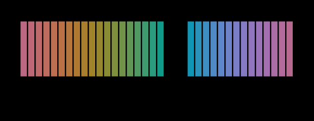
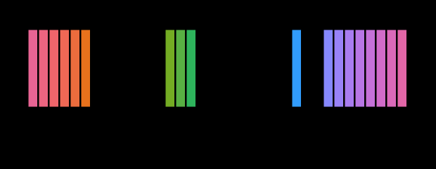
How much of a hue circle a triple can name is a function of where the circle is, and two more settings make the shape of that dependence visible.
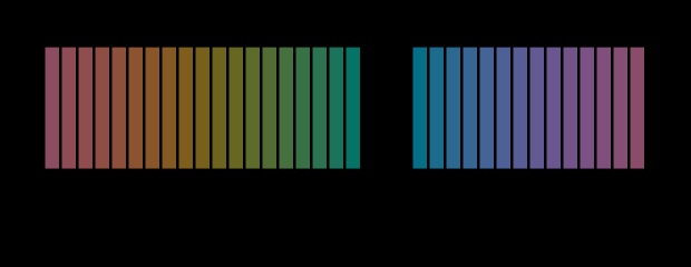
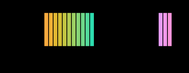
A strongly saturated circle at mid lightness is where a designer actually picks a brand colour, and it is the least well served of the four.
Two more circles complete the picture, and one of them is where a designer picks a brand colour from.
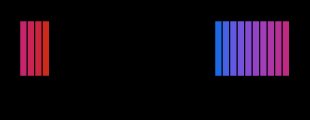
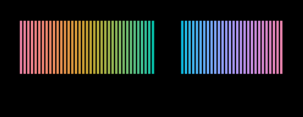
How finely the circle is sampled is the last free argument, and it decides nothing at all about which arcs have a triple.
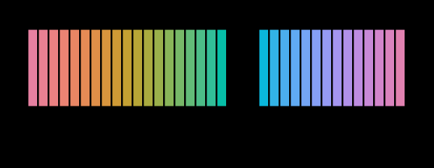
Sampling the same circle twice as finely says whether the unreachable arcs are a property of the gamut or of how many hues were asked for.
The habit worth acquiring
One question resolves most of the confusion in practice: what would have to be true for these three numbers to name a colour?
A space, a transfer function, a white point and a device. Where all four are known the numbers name something. Where any is missing they name a position in an unspecified system, and the disagreements that follow — between two applications, two displays, a screen and a print — are not mysterious. They are the missing pieces being filled in differently.
The scope of what a triple can name
A last way of putting it. The three numbers name a point in a triangle, and the triangle is a small part of what a person can see.
So even with all four missing pieces supplied, a hex code names a colour within a reachable set rather than a colour in general. That is a further restriction on top of the ambiguity, and it is why the vocabulary of hex codes cannot express a saturated cyan at all — not because of any encoding limit, but because the primaries do not reach it.
The deeper point is that the ambiguity is not a defect of hexadecimal notation. Any three numbers have the same problem, whatever the base and whatever the syntax, because three numbers are coordinates and coordinates need a system. Naming the system is the whole of the fix, and CSS has recently made it possible to do so — which is a change in what can be said rather than in what is true.
Except in one format, where it very nearly is
The argument above rests on a hex code being a ratio: 255 means whatever this display’s maximum happens to be. There is now a delivery format for which that is false, and it is the exception that shows what the rule was made of.
Under ST 2084 a code denotes an absolute luminance. The value at the middle of the range is 100 cd/m² on every conforming display, and nothing about the panel’s capability enters into it. A code in that format therefore does identify something physical without any of the qualifications this essay has spent its length insisting on — no reference white to assume, no display maximum to guess at.
Two qualifications survive, and they are the ones this essay’s title is really about. A code still says nothing about which colour without its primaries, and HDR formats are usually paired with wide primaries, so a triple carried between them is wrong in exactly the way described above. And a display that cannot reach the specified luminance has to do something else instead, undocumented and unstandardised.
So the exception narrows the claim rather than overturning it. What a hex code lacks is a space, a white point, a transfer function and a display. One format fixes the third and the fourth by decree, which leaves the first two — and those two were always the larger half.
Asking for more chroma at a slightly lower lightness is where the circle stops being mostly reachable.
What the pictures cannot show
The central limitation applies with particular force here. This page argues that a code value does not determine a colour, and it makes the argument using code values delivered to an unknown display. A reader whose display is uncalibrated, or whose browser is not managing colour, is seeing the argument demonstrated rather than illustrated — but has no way to tell which.
The blend figure is also showing its two ramps through the reader’s own transfer function, so a display that departs from sRGB will show the difference at the wrong magnitude. The direction is robust and the size is not.
Who found it, and when
The problem became acute with desktop publishing in the late 1980s, when the same file first had to produce consistent results across screens and presses from different manufacturers. The International Color Consortium was founded in 1993 and its profile format is still the mechanism by which the missing pieces travel with content.
sRGB was defined in 1996 specifically to make the unmanaged case predictable — if untagged content has an assumed meaning, at least the assumption is written down. It succeeded thoroughly enough to become the default of the web.
CSS Color Level 4, which introduced the explicit space syntax, has been under development since the mid-2010s and reached broad browser support around 2023. It is the first time the web platform has let an author say which space they meant.
Where this goes next
The transfer function in detail is the midpoint is not half. The display’s contribution is the display is an unknown. And what happens when a value falls outside the space is what a gamut costs.
Where this goes next
 The midpoint is not half
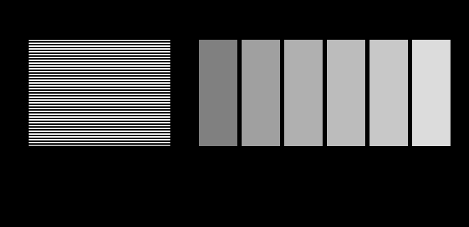
Code 128 sits halfway along the sRGB scale and carries about a fifth of white's luminance. Half the luminance is code 188. Almost every gradient, blur and resize on the web gets this wrong, and the errors are visible once known.
The midpoint is not half
Code 128 sits halfway along the sRGB scale and carries about a fifth of white's luminance. Half the luminance is code 188. Almost every gradient, blur and resize on the web gets this wrong, and the errors are visible once known.
 The display is an unknown
This site is displayed on the very apparatus it is about, and it knows almost nothing about that apparatus. Two figures here stop assuming and ask instead — a probe for the transfer function and a probe for the gamut.
The display is an unknown
This site is displayed on the very apparatus it is about, and it knows almost nothing about that apparatus. Two figures here stop assuming and ask instead — a probe for the transfer function and a probe for the gamut.
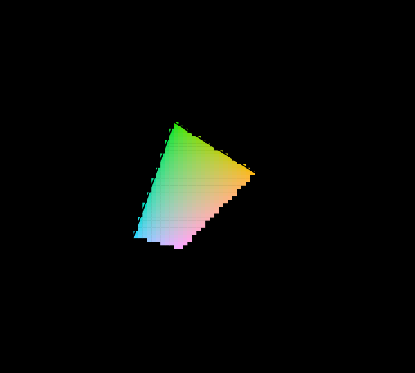 What a gamut costs
Three primaries reach a triangle and the visible region is not a triangle, so something has to give. Widening the primaries helps, has a price in precision and compatibility, and runs into a limit that is geometric rather than technological.
What a gamut costs
Three primaries reach a triangle and the visible region is not a triangle, so something has to give. Widening the primaries helps, has a price in precision and compatibility, and runs into a limit that is geometric rather than technological.
What this makes readable
Essays that name this one as a prerequisite.
Named alongside this one
Essays reaching for the same objects. Nobody chose these; they are what the index of named objects makes visible.
- A screen is a poor lamp colour management · gamut · primaries · white point
- The order is not in the documentation colour management · colour space · the icc profile · transfer function
- A display in a room is a smaller display colour management · gamut · white point
- A proof cannot glow colour management · gamut · the icc profile
- Best on the average, undefined at the edge colour management · the icc profile · white point
- Dividing by the paper colour management · the icc profile · white point
What links here
The 8 essays that link to this one and share the most of its objects, of 21 that link here.
The objects this essay names
Each one links to every other essay that touches it.
Colour managementColour spaceGamutThe ICC profilePrimariesTransfer functionWhite pointXYZ