The diagram was replaced in 1976
Assumes Most of this diagram cannot be shown and MacAdam measured it.
The horseshoe is the most reproduced picture in colour science. It is on the cover of textbooks, in every display manufacturer’s marketing, and in essentially every explanation of what a gamut is.
Its own committee replaced it in 1976, for reasons everybody agrees with, and almost nobody switched.
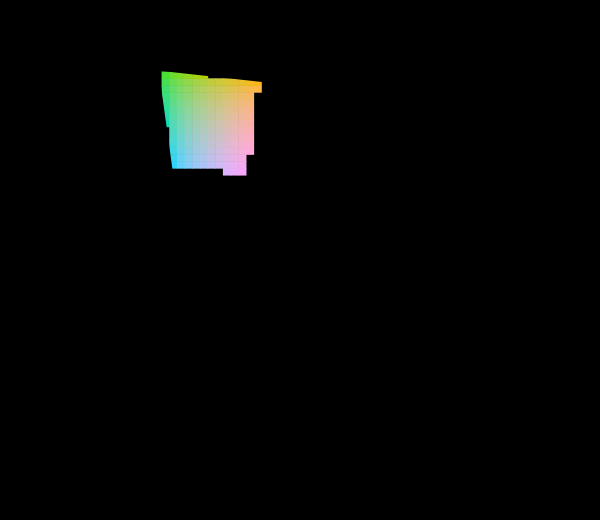
The diagram is drawn at one luminance factor and with one observer, and both are choices the replacement did not touch.
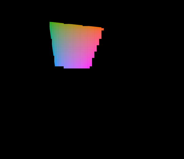
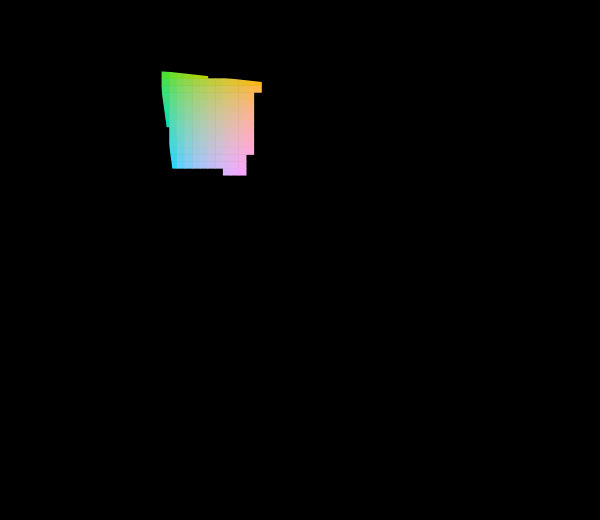
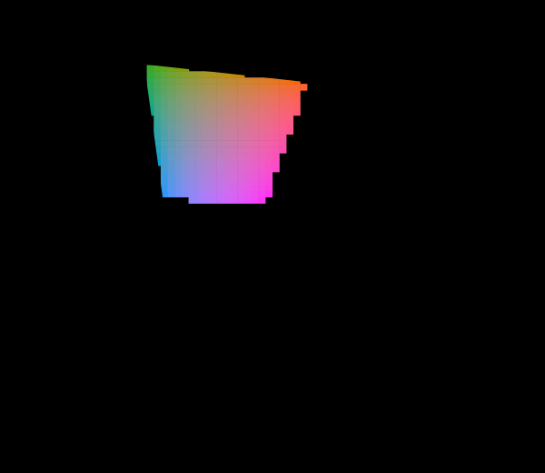
The two changes can be made together, which is the case a laboratory using the ten-degree observer at a high level actually works in.
What was wrong with the old one
The 1931 diagram is a projection of a three-dimensional space onto two dimensions by discarding brightness, and the projection chosen was the one that made the arithmetic convenient in 1931. Nothing about it was designed to make distances meaningful.
The consequence is that equal distances in it mean wildly unequal perceptual differences. The green region occupies an enormous fraction of the area and contains relatively few distinguishable colours; the blue-violet range is crushed into a corner and contains many. A step of 0.01 in chromaticity is a large change in one place and imperceptible in another.
MacAdam measured how unequal in 1942, and the answer is a factor of about eighty between the largest and smallest just-noticeable-difference contours. That is not a subtle distortion — it is the difference between a specification met and one missed eightyfold.
What the fix is, and what it preserves
The 1976 diagram is a projective transformation of the 1931 one. Every point maps to a point, the mapping is invertible, and — the property that makes it usable — every straight line stays straight.
That last is not decorative. The chromaticity diagram earns its place because of two geometric facts: an additive mixture of two lights lies on the straight line joining them, and the set of colours reachable from three primaries is the triangle they span. Both are consequences of straight lines mapping to straight lines, so both survive the transformation. A non-projective remapping that made the diagram perfectly uniform would destroy them, and would have destroyed the reason to draw a diagram at all.
What changes is how the area is distributed. The transformation stretches the crowded blue region and compresses the sparse green one, moving area to where the distinguishable colours are.
How much better, measured
The claim “uniform chromaticity scale” is testable with the data that motivated it.
The improvement is real and large. The residual is also real and large: the biggest remaining contour is several times the smallest, which is still the difference between a tolerance met and one missed severalfold.
So the name overstates the achievement, in the way names in this subject reliably do. “Uniform chromaticity scale” describes an intention. What was delivered is a diagram substantially less distorted than its predecessor, which is worth having and is not what the name says. The same pattern shows up in CIELAB’s claim to perceptual uniformity and in every colour difference formula: each is a fit, each has a residual, and the residual is almost never quoted beside the claim.
The improvement, in numbers
Real and large on both sides of that sentence is a summary, and the two sides turn out to be very different sizes.
Size. Take each of MacAdam’s twenty-five ellipses, sample its boundary, project every point, and measure the enclosed area. The ratio of the largest to the smallest is 74.2 in the 1931 diagram and 4.9 in the 1976 one — a fifteenfold improvement, leaving a residual of a factor of five where there was a factor of seventy-four. In linear terms, which is what a tolerance is written in, the ratio falls from 8.62 to 2.21.
Shape. The same ellipses’ elongation — longest radius over shortest, which is 1 for a circle — averages 2.946 in the old diagram and 2.432 in the new one. That is an improvement of 17 per cent. And the most elongated single contour gets slightly worse, from 5.00 to 5.43.
So the projection is excellent at one of the two things a uniform diagram would have to do and nearly useless at the other. It repairs how much the ellipses differ from one another, and barely touches how far each of them is from being round.
The split has a structural reason. A projective transformation is locally an affine map whose linear part varies smoothly across the plane, and rescaling twenty-five neighbourhoods by twenty-five different amounts sits comfortably inside that freedom. Making twenty-five differently oriented ellipses circular at once does not: the local linear part has four degrees of freedom at each point, and across the whole plane those are tied together by the projection’s own eight parameters.
Which is why the name describes an intention. A uniform chromaticity scale needs both repairs, and a projective map can deliver the first. Anything delivering the second would have to bend straight lines — and bending straight lines costs the two properties the diagram exists for in the first place.
Why nothing changed
Half a century on, the 1931 diagram is what gets printed. The reasons are worth listing because none of them is about colour science.
Recognition. The horseshoe shape is iconic. The 1976 version is a differently-shaped horseshoe, and a figure whose whole job is to be recognised loses by changing.
Inertia in tooling. Every plotting library, every measurement instrument’s software, every textbook figure was already drawn in xy. The default was set decades ago.
The numbers people quote are in xy. Primaries are specified as xy coordinates in every display standard — sRGB, P3, Rec. 2020 — so plotting them anywhere else requires a conversion, and a conversion is friction.
Nothing forced the issue. No standard requires the newer diagram and nothing breaks if the older one is used. A recommendation that costs effort and delivers a diffuse benefit does not get adopted.
The one place the switch did happen is where the distortion cost money. Display and lighting engineers plot in u′v′ routinely, because tolerances there are approximately circular and tolerances in xy are not, and a specification written in xy has to be an ellipse whose shape depends on where it is.
The problem the new diagram did not fix
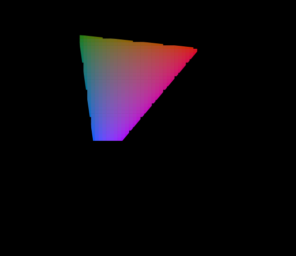
Every published copy of the 1976 diagram is filled edge to edge with colour, exactly as the 1931 one is.
The reason is identical and has nothing to do with the projection. A display can reach a triangle; the diagram shows a horseshoe; the region between them cannot be shown. Software clips to the nearest reachable value and prints the picture, so the colours along the boundary — the most saturated colours, the ones the picture is about — are not the colours labelled.
A better projection cannot help with this. Redistributing area changes how large the unreachable region looks and changes nothing about whether it can be shown. A projection that made the region small would be hiding the problem more effectively rather than solving it.
That is worth separating clearly, because the two complaints about the 1931 diagram are routinely conflated. Non-uniformity is a property of the mapping and was fixed by changing the mapping. Unreachability is a property of the display and no mapping touches it.
The third diagram, which exists for one purpose
There is a 1960 UCS as well, superseded by the 1976 one, and it is still required.
Correlated colour temperature is defined as the nearest point on the Planckian locus, “nearest” means perpendicular, and the isotemperature lines are perpendicular to the locus only in the 1960 diagram. The 1976 v′ is exactly 1.5 times the 1960 v, so the two differ by a stretch of one axis — and that stretch is enough to make perpendicularity fail.
So the field maintains three chromaticity diagrams: one that is wrong and universally used, one that is better and mostly ignored, and one that is obsolete and mandatory for a specific calculation. That is not a tidy situation and it is the actual situation, and knowing which diagram a number came from is a real requirement rather than pedantry.
What the diagram is genuinely good at
Criticising the chromaticity diagram is easy enough that it is worth stating what it does well, because the geometric properties it preserves are not trivial and no better picture has replaced it.
Additive mixture is a straight line. Two lights mixed in any proportion lie on the segment joining them, at a position given by their relative luminances. That single fact makes the diagram the right tool for anything involving mixing light — display primaries, stage lighting, the colour of a source built from several emitters.
A gamut is a polygon. Three primaries span a triangle, four span a quadrilateral, and the set of reachable chromaticities is exactly the convex hull. No other representation of colour makes gamut a matter of taking a hull.
The locus bounds what is visible. Everything a human can see is inside the horseshoe and nothing outside it exists as a stimulus, which turns questions about physical realisability into questions about containment.
Both replacements preserve all three, because a projective transformation preserves straight lines and convexity. So the argument between the 1931 and 1976 diagrams is entirely about area distribution, and neither is being asked to give up what the picture is for.
The habit that never changed
Both diagrams are printed filled to the edges, and the habit is worth examining as a habit rather than as an error.
Nobody decides to clip. What happens is that software converting a chromaticity to a display value has an out-of-range result and must produce something; the something is a clamped value; and the resulting picture is colourful, smooth and completely plausible. There is no error message, no visual artefact, and no place in the pipeline where anybody is asked to approve a substitution.
The alternative — testing every cell and marking the unreachable region — is what this site does, and it is not difficult. It requires deciding in advance that a hatched region is preferable to a wrong colour, which is a choice about what the picture is for.
The reason the choice usually goes the other way is that the filled version is prettier, and the picture’s most common use is decorative: it appears on marketing material to show that one display’s triangle is bigger than another’s, and a hatched surround would undercut the impression the triangle is meant to create.
What was computed here
The 1976 diagram here is drawn from the same machinery as the 1931 one and differs only in the projection. The locus is computed from the observer, not traced; the transformation is applied to the computed points rather than to a stored outline.
Every cell in the fill is tested for reachability before it is drawn, and the unreachable region is one hatched path rather than thousands of hatched cells — the locus with the gamut triangle punched out under the even-odd rule, which is both smaller and exactly right at the boundary rather than quantised to the mesh.
The uniformity comparison transforms MacAdam’s measured ellipses into the new diagram by sampling their boundaries and projecting each point, rather than transforming the ellipse parameters. That matters: a projective transformation does not map an ellipse to an ellipse with transformed parameters, and doing the algebra on the parameters would give a shape that is nearly right and not right.
Two assertions run. The 1976 diagram must be measurably more uniform than the 1931 one, in the direction the whole essay depends on. And it must still be a long way from uniform — asserted separately, because a check that only confirmed the improvement would let a claim of success through.
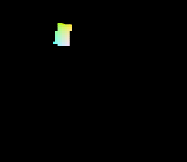
How much of the diagram a display can actually reach depends on the luminance it is asked at, and a dark reading is where the reachable region is largest.
Which diagram a number came from
The practical consequence of three coexisting diagrams is that a chromaticity is not a chromaticity until it says which.
The values look alike. All three are pairs of numbers between roughly 0 and 0.8, all three describe the same physical quantity, and none carries a label in the file formats that store them. A point at (0.31, 0.33) is D65 in the 1931 diagram and something else entirely in the other two.
The 1960 and 1976 diagrams are especially easy to confuse, because they differ only by a factor of 1.5 on one axis. A u′v′ value read as a uv value gives a point in the right region of the diagram, plausible, and wrong — and the error is exactly the kind that survives inspection because the answer looks reasonable.
There is no fix beyond stating it. This site’s figures name the diagram in the caption and the observer in the corner, and the reason is the same reason every swatch here names its space and its display: a pair of coordinates without a stated frame is not a measurement of anything.
Where the model stops
A chromaticity diagram of any projection has a limitation that no amount of reprojection addresses: it has thrown away a dimension.
Chromaticity is what survives when brightness is divided out. Two colours at the same point on any of these diagrams may be a dark brown and a bright orange, and there is no such thing as brown on a chromaticity diagram at all — brown is a dark orange, and darkness is the discarded coordinate.
That is the deeper reason gamut comparisons drawn as triangles are misleading. A display’s reachable set is a volume; the triangle is its shadow. Two displays with identical triangles can differ substantially in what they can actually show, because one may be much brighter or have a much better black. Every “wider gamut” comparison drawn as two triangles is comparing shadows.
The mesh in the figures here is drawn at a stated luminance for exactly this reason, and the fraction reachable changes if that luminance changes — which is another thing the usual printed diagram never mentions.
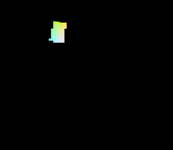
The projective transform is the same for either observer, so the check is whether the reachable share is too.
The one number that changed
Something did change with the newer diagram, quietly, and it is worth recording as a genuine success.
Display and lighting specifications increasingly quote white-point tolerances in u′v′ rather than in xy, and the reason is purely that a circular tolerance in u′v′ is approximately meaningful and a circular tolerance in xy is not. A manufacturer specifying a panel’s white to within a stated radius has to pick a diagram in which a radius means something, and only one of the three qualifies.
So the improvement was adopted exactly where it paid and nowhere else, which is how technical improvements are generally adopted. The picture on the marketing page is still the 1931 one.
What the pictures cannot show
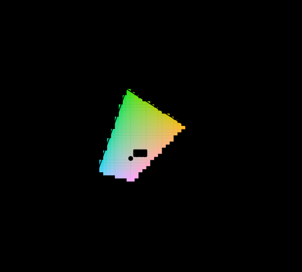
The central limitation is the site’s standing one and it applies with full force here: most of both diagrams is outside what this display can produce, and the hatching marks where.
There is also a subtler one about the comparison figure. Both diagrams are drawn at the same size on the page, which means the transformation’s effect on area is visible and its effect on scale is not. The 1976 diagram is not the 1931 diagram redrawn larger or smaller; it is a different projection, and comparing the two by eye at matched page size shows the redistribution while suppressing the fact that the axes mean different things.
And the ellipses are drawn at ten times actual size in both panels, because at true scale most are thinner than a line. That magnification is honest about being a magnification and it does mean the reader is looking at a picture of relative shapes rather than at anything at true size.
Who found it, and when
David MacAdam measured the discrimination ellipses in 1942, and the measurement is the reason a replacement diagram was pursued at all. His experiment used a single observer over many sessions, which is a limitation and does not affect the conclusion — the variation across the diagram is far larger than any plausible between-observer difference.
The 1960 UCS is Donald MacAdam’s transformation from 1937, adopted by the CIE in 1960. The 1976 version is a refinement of it, adopted alongside CIELUV and CIELAB in the same recommendation — which is why u′ and v′ appear inside the CIELUV definition and why that space is still used for emissive displays.
The reason the 1976 recommendation contained two spaces at once, CIELAB and CIELUV, is a committee compromise: the two camps could not agree, so both were standardised. CIELAB won in practice everywhere except display engineering, where CIELUV’s connection to the chromaticity diagram remains useful.
Where this goes next
What the diagram cannot show, in either projection, is most of this diagram cannot be shown. The measurement that motivated the replacement is MacAdam measured it. And the question of whether those measured ellipses are the right thing to build a metric on at all is a threshold is not a unit.
Where this goes next
 Most of this diagram cannot be shown
The chromaticity horseshoe is the canonical illustration of colour science, and nearly every printed copy is filled edge to edge with colours the page cannot produce. The honest version marks them, and the marking covers most of the picture.
Most of this diagram cannot be shown
The chromaticity horseshoe is the canonical illustration of colour science, and nearly every printed copy is filled edge to edge with colours the page cannot produce. The honest version marks them, and the marking covers most of the picture.
 MacAdam measured it
In a perceptually uniform space the just-noticeable-difference contours would be circles of equal size. MacAdam's ellipses are neither, by a factor of eighty — and transforming them into each candidate space settles which spaces improved matters and by how much.
MacAdam measured it
In a perceptually uniform space the just-noticeable-difference contours would be circles of equal size. MacAdam's ellipses are neither, by a factor of eighty — and transforming them into each candidate space settles which spaces improved matters and by how much.
 A threshold is not a unit
MacAdam measured the smallest difference anyone could detect. ΔE2000 was fitted to how far apart plainly different colours look. The two are quoted interchangeably, and the contours they produce are not even the same shape.
A threshold is not a unit
MacAdam measured the smallest difference anyone could detect. ΔE2000 was fitted to how far apart plainly different colours look. The two are quoted interchangeably, and the contours they produce are not even the same shape.
What this makes readable
Essays that name this one as a prerequisite.
Named alongside this one
Essays reaching for the same objects. Nobody chose these; they are what the index of named objects makes visible.
- How many colours are there cielab · gamut · macadam's ellipses · tolerance
- No diagram makes them circles cielab · macadam's ellipses · projective transformation · uniform chromaticity scale
- Which of these is a convention cielab · diagram conventions · gamut · projective transformation
- A compression goes below the floor cielab · macadam's ellipses · projective transformation
- A fourth primary is a design chromaticity · gamut · primaries
- A gamut has a population chromaticity · gamut · primaries
What links here
The 8 essays that link to this one and share the most of its objects, of 13 that link here.
The objects this essay names
Each one links to every other essay that touches it.
ChromaticityCIELABDiagram conventionsGamutMacAdam's ellipsesPrimariesProjective transformationToleranceUniform chromaticity scale