The triangle is a shadow
Assumes What a gamut costs and Most of this diagram cannot be shown.
Every specification sheet for every display quotes gamut coverage as a percentage, and nearly every one of them computes that percentage as an area on the CIE 1931 chromaticity diagram. “99% of sRGB.” “Covers 90% of DCI-P3.” The number is a ratio of two triangles.
Chromaticity is XYZ with luminance divided out. So a triangle on that diagram is a projection of a three-dimensional solid along the axis the eye is most sensitive to, and its area is the area of a shadow.

The two ratios are computed at one sampling and one set of spaces, and both of those can be moved.


Which spaces are in the comparison is the last free choice, and dropping the middle one shows that the gap is not an artefact of having three.

The two numbers are not the same number
P3 is 1.357 times sRGB by triangle area and 1.501 times by CIELAB volume. Rec. 2020 is 1.891 by area and 2.261 by volume.
Those gaps are 14 and 37 percentage points. They are not rounding, they are not a difference of convention, and they do not go in a consistent direction that could be corrected with a constant. They are two measurements of two different objects, one of which is a shadow of the other.
The direction is worth noting: the shadow understates. A wider gamut buys more than the triangle suggests, because the extra chromaticities it can reach are reachable across a range of lightnesses, and the triangle counts each chromaticity once regardless of how much of the lightness axis it survives.
That is a pleasant result for the display industry and it does not make the practice defensible. A number that understates by an amount which varies from 14 to 37 points between two comparisons is not a conservative estimate; it is an uncontrolled one.
Why the projection loses so much
The chromaticity diagram is two-dimensional because it divides through by . Every point on it stands for an entire ray in tristimulus space — all the colours of that chromaticity at every luminance from black upwards.
The gamut of a display is not a ray. For each chromaticity the display can reach, there is a range of luminances it can reach it at, and that range is different for every chromaticity. A display can produce its red primary at full luminance and can produce a desaturated pink at full luminance, but the pink can also be produced at a hundred intermediate luminances the saturated red cannot, because reaching a saturated red at low luminance requires the other two channels to go negative.
Slice the solid at a fixed lightness and the cross-sections are not similar figures. They differ in shape, in orientation, and in relative size. Slice at a different lightness and all three change again. A single triangle is the union of every slice, projected flat and counted once — which throws away the entire question of how much of the lightness axis each chromaticity survives, and that question is where the difference between two gamuts largely lives.
The triangle picture is not wrong about anything it claims. Those really are the chromaticities each space can reach, the containment really is strict, and reading off which space encloses which is exactly what the diagram is for. The error is entirely in what the area is then taken to mean.
There is a second, smaller distortion in the same picture, and it compounds the first. The 1931 diagram is not perceptually uniform — a given distance on it means very different amounts of visible difference in different regions, by a factor of tens — so even as a two-dimensional measure the area is weighting the green corner enormously and the blue corner hardly at all. The 1976 u′v′ diagram was introduced to fix precisely this, and coverage figures computed on it differ from the 1931 ones. Some specifications quote u′v′ coverage; most do not say which they used.
Two volumes, computed two ways
A single number computed one way is an assertion. This site’s standing discipline is two independent derivations, and it is what caught a one per cent chroma error in the CIECAM16 implementation that every structural check had passed.
The two methods here are wrong in completely different ways.
Tetrahedral decomposition subdivides the RGB cube into cells, maps every vertex into CIELAB, splits each cell into six tetrahedra by Kuhn’s decomposition — which tiles the cube exactly, with no gaps and no overlaps — and sums their volumes. It is exact for a linear map, convergent for this one, and biased low, because each cell’s image is bowed outward by the cube root in the CIELAB transfer and the flat-faced tetrahedra cut the corner.
Monte Carlo samples the CIELAB bounding box, inverts each sample back through the transfer function, and asks whether it is in gamut. It is unbiased and noisy.
They agree to 0.71%, against a Monte Carlo sampling noise of 0.54% at that sample count. The tolerance is bracketed rather than picked: below the noise floor the test would fire on a correct computation, and a real error — a transposed matrix, a wrong white point — moves the answer by tens of per cent. Three per cent sits between them.
The Monte Carlo is seeded, so the convergence curve is the same on every build. An unseeded stochastic figure churns the built output on every rebuild and buries every real diff in noise.
A third number, and why two of the four are one
Area and volume are two answers, and the quantity a coverage percentage stands in for is a third.
Counting distinguishable colours — the gamut solid divided into cells one just-noticeable difference across — gives P3 at 1.233 times sRGB and Rec. 2020 at 1.497, under ΔE00.
| ratio to sRGB | P3 | Rec. 2020 |
|---|---|---|
| triangle area | 1.357 | 1.891 |
| CIELAB volume | 1.501 | 2.261 |
| distinguishable colours | 1.233 | 1.497 |
So the shadow understates against the volume and overstates against the count — and the count is what anybody quoting a coverage figure believes they are quoting.
Two of the four numbers available here turn out to be one measurement, which is worth seeing. Counting the same solids under the 1976 formula instead of ΔE00 gives 1.500 and 2.273: the volume ratios, to within a tenth and a half of one per cent. That is not a coincidence. ΔE*ab is Euclidean distance in CIELAB, so its cells are spheres of a fixed size and counting them is measuring the volume. The CIELAB volume is a count of distinguishable colours taken under the assumption that CIELAB is uniform.
Which is what makes the third row the interesting one. Dropping that assumption — using a formula whose cells grow with chroma, which is what the measurements say they do — cuts the extra a wide gamut buys by more than half: Rec. 2020’s 2.261 becomes 1.497. The volume a wider gamut adds sits almost entirely at high chroma, and high chroma is exactly where a just-noticeable difference is largest, so the extra volume holds proportionally very few distinguishable colours in it.
So the honest summary is not that the triangle understates. It is that all three numbers differ, the ordering between them depends on which pair is being compared, and the one furthest from what a buyer means is the volume rather than the shadow.
Where the volume is also a choice
CIELAB volume is a better measure than chromaticity area and it is not a neutral one, and this needs saying plainly before the numbers above are quoted anywhere.
Volume in a colour space measures gamut size in the units that space provides, and those units are a claim about perceptual uniformity. CIELAB’s claim is known to be imperfect — its units are not equally sized everywhere, notably in the blues, so a volume computed in it weights some regions more than others without saying so.
Compute the same volumes in CIELUV, or Oklab, or CAM16-UCS, and the ratios move. Not as much as they move between the shadow and the solid, but they move, and the ordering between two closely-matched spaces can invert.
So the honest claim is not “volume is the right number and area is the wrong one”. It is: area is measuring the wrong object, and volume is measuring the right object in units that are themselves a model. The first is a category error and the second is an approximation, and those are different sizes of problem.
There is a further wrinkle nobody in the specifications addresses. Volume assumes every part of the solid is worth the same, and it is not: the region around the neutral axis contains the colours almost everything actually is, and the extreme corners contain colours that appear in laser light and nothing else. A gamut ratio weighted by the frequency of real surface colours would be a third number again, smaller than both, and would be the one a photographer should care about.
A slice is not a slice of the answer
There is a tempting middle course between the shadow and the solid: quote the area of one slice, at some sensible lightness, and call it representative. It is worth showing why that does not work either.
At L* = 50 the three cross-sections stand in one set of ratios. At L* = 25 they stand in another, because at low lightness the wide-gamut spaces retain saturated colours that sRGB has already run out of. At L* = 80 they stand in a third, because near white every gamut converges — all three spaces can produce very light colours of almost any chromaticity, so the ratios approach one.
That convergence at the ends is the structural reason no single slice is representative. A gamut solid is roughly a distorted cube standing on one corner: it is a point at black, a point at white, and widest somewhere in the middle. Any two such solids agree at both ends and differ in the middle, so a ratio taken anywhere is a ratio at that lightness and nowhere else. The volume integrates over all of them, which is the only reason it is a single defensible number.
The volume is a numerical integral, so the honest thing to do with it is to run the decomposition coarser and see whether the ratio moves.

Counting, which inherits everything
Once there is a volume there is a temptation to divide it by something and get a count of colours, and the temptation should be resisted in the form it usually takes.
“16.7 million colours” counts code values. It is the size of a 24-bit integer and says nothing whatever about vision — it is a fact about a file format.
“Ten million distinguishable colours” is the number usually offered instead, and it is a volume divided by the volume of a just-noticeable difference. It therefore inherits whatever the difference formula says a JND is, and the formulae disagree.
A factor of 4.68, from one solid, one lattice, and two opinions about what a just-noticeable difference is. The question “how many colours are there” turns out to be a question about a metric before it is a question about vision.
Both numbers assume perfect packing, which nothing achieves, so each is an upper bound rather than a count of anything. The local cell volume is taken from the metric tensor, estimated numerically from the site’s own ΔE2000 rather than by reading the formula’s weighting terms off by hand — which matters in the blues, where the hue rotation term tilts the difference ellipsoid and an axis-aligned estimate would multiply three semi-axes together while ignoring the tilt.
Dropping sRGB from the comparison leaves the two wide gamuts against each other, which is the comparison a specification actually makes when it offers one of them as an upgrade on the other.

What a coverage percentage should mean
Two different quantities get called coverage and the specifications rarely distinguish them.
The first is how much larger one gamut is than another — the ratio of sizes, which is what the figures above compute and what “P3 is 1.5× sRGB” means.
The second is how much of a target gamut a display can actually reproduce — the fraction of the target contained in the display’s own gamut. That is the quantity a colour-managed workflow cares about, because it is the fraction of the intended colours that will survive, and it is not a ratio of sizes at all: a display could be larger than the target overall and still miss part of it, if the two solids are differently shaped.
The two coincide only when one gamut strictly contains the other. sRGB is contained in P3 and in Rec. 2020, so for those particular pairs the distinction does not bite — which is precisely why the industry has been able to conflate them for two decades without anyone noticing. Introduce a printer, whose gamut is emphatically not a superset or a subset of any display’s, and the two numbers separate immediately, which is why the printing industry has used containment-based measures for far longer.
What a gamut costs takes up the containment question directly; what matters here is that a single percentage with no statement of which quantity it is cannot be checked.
What the picture cannot show
None of these figures can show a colour outside the reader’s own display, which is the entire subject.
The slice figure draws three outlines, and the two larger ones enclose chromaticities the screen rendering them cannot produce. Those regions are drawn as outlines rather than filled, precisely so that no pixel claims to be a colour it is not — but the consequence is that an essay about how much bigger a wide gamut is cannot show the reader any of the extra colours. The only honest options are to mark them, to outline them, or to lie, and this site does not take the third.
The hatching is doing more work in this essay than in most. Elsewhere on this site it marks a region of a diagram; here it marks the subject — the colours that are the entire reason a wide-gamut display exists are exactly the colours the reader is almost certainly not seeing. A reader on a P3 screen is seeing more of them than a reader on an sRGB one, and neither can be told which they are, because the display is an unknown and no page can interrogate it.
That is why the argument here is carried by numbers rather than by demonstration, and why the numbers are computed twice.
Who found it, and when
Gamut volume in a uniform space is not new — the idea appears in the colour-order literature well before displays mattered, because the same question arises for printing inks and for colour-order systems, where the physical sample collection has a shape and somebody has to say how large it is.
What is new is the stakes. Chromaticity-area coverage became the industry convention when the practical gamut question was “does this monitor cover sRGB”, between two spaces close enough in shape that the shadow and the solid nearly agreed. It survived into an era of P3 and Rec. 2020 displays, where they do not, because a number in a specification is very hard to dislodge once buyers have learned to compare it.
The ICC and several standards bodies have published volume-based coverage metrics; almost no consumer specification uses one. The 1976 supplementary diagrams were introduced for a related reason — that the 1931 diagram’s distances mislead — and the same institutional inertia kept the 1931 diagram in print for half a century afterwards.
The number that should be on the box
If a single figure has to go on a specification, volume ratio in a stated uniform space with the space named is the one that means something, and naming the space is not optional — the same three displays reorder slightly between CIELAB and CAM16-UCS.
A second figure would be worth more than a more precise first one: the fraction of the target gamut contained, which is the quantity a workflow depends on and the one that separates from the size ratio as soon as the two solids are not nested.
Neither is expensive to compute. The tetrahedral method above runs in a fraction of a second on a laptop at a resolution far beyond what a specification needs, and the containment fraction is the same lattice walk with a second membership test. The obstacle to better numbers on specification sheets has never been arithmetic; it is that the existing number is comparable across twenty years of products and a better one is not. That is a real cost and it is the same trade the CIE made when it kept a luminous efficiency function known to be wrong in the blue rather than invalidate every photometric measurement ever made.
Where this goes next
The counting result is the thread worth pulling: a number that changes by a factor of five depending on which difference formula is used is a number about the formula, and what a threshold actually is is the argument underneath it.
The other direction is what a wider gamut costs, which is the rung below this one — because the extra volume is not free, and the currency it is paid for in is quantisation, primaries that are harder to make, and content that has nowhere to go on the displays that do not have it.
Where this goes next
 What a gamut costs
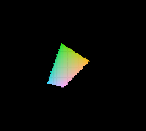
Three primaries reach a triangle and the visible region is not a triangle, so something has to give. Widening the primaries helps, has a price in precision and compatibility, and runs into a limit that is geometric rather than technological.
What a gamut costs
Three primaries reach a triangle and the visible region is not a triangle, so something has to give. Widening the primaries helps, has a price in precision and compatibility, and runs into a limit that is geometric rather than technological.
 Most of this diagram cannot be shown
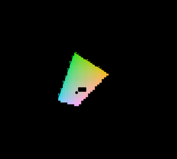
The chromaticity horseshoe is the canonical illustration of colour science, and nearly every printed copy is filled edge to edge with colours the page cannot produce. The honest version marks them, and the marking covers most of the picture.
Most of this diagram cannot be shown
The chromaticity horseshoe is the canonical illustration of colour science, and nearly every printed copy is filled edge to edge with colours the page cannot produce. The honest version marks them, and the marking covers most of the picture.
 The diagram was replaced in 1976
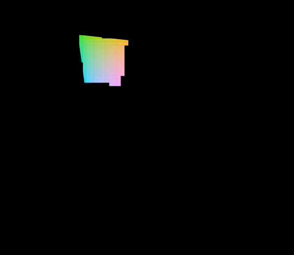
The CIE knew the 1931 diagram was badly distorted and published a better one. Half a century later almost every chromaticity plot in print is still the old one, and both are still printed filled edge to edge with colours no display can show.
The diagram was replaced in 1976
The CIE knew the 1931 diagram was badly distorted and published a better one. Half a century later almost every chromaticity plot in print is still the old one, and both are still printed filled edge to edge with colours no display can show.
What this makes readable
Essays that name this one as a prerequisite.
Named alongside this one
Essays reaching for the same objects. Nobody chose these; they are what the index of named objects makes visible.
- A gamut has a population chromaticity · display gamut · display p3 · gamut · primaries
- Not every colour has a wavelength chromaticity · display gamut · gamut · primaries · white point
- Six numbers make a space display p3 · gamut · primaries · rec. 2020 · white point
- A fourth primary is a design chromaticity · display gamut · gamut · primaries
- A gamut charges a gradient nothing cielab · display gamut · gamut · gamut mapping
- A screen is a poor lamp display gamut · gamut · primaries · white point
What links here
Every essay whose body links to this one.
The objects this essay names
Each one links to every other essay that touches it.
ChromaticityCIELABDisplay gamutDisplay P3GamutGamut mappingLuminancePrimariesRec. 2020White point