The diagram has no area
Assumes Most of this diagram cannot be shown, The matches do not name the cones and The diagram was replaced in 1976.
The chromaticity diagram is the most reproduced picture in colour science and one of the most misread. It is a projection: a three-dimensional space of tristimulus values, divided through by the sum of its coordinates so that brightness drops out and what is left can be printed flat.
Projections keep some things and lose others, and the list of which is which is short, exact and almost never stated.
The claim
A change of the observer’s basis acts on a chromaticity diagram as a projective transformation. Every claim of the form “these lights lie on a line” survives it exactly; every claim of the form “this region is this fraction of that one” does not. The second kind is what the diagram is mostly used for.
- Collinearity is exact. Additive mixtures of two lights stay on the segment joining them in every basis, to a relative residual of 10⁻¹⁴.
- Ratios along a line survive too, because a mixture’s position on the segment is fixed by the amounts mixed, and those are what the coordinates are linear in.
- Area does not survive. The sRGB triangle covers between 8.5 and 38.4 per cent of the enclosed visible region across twelve published coordinate systems — a factor of 4.5 — with the same observer and the same display throughout.
- Nor do distance and angle, which is why “these two colours are further apart than those two” is a sentence a chromaticity diagram cannot support and is asked to support constantly.
- And a projective map has eight parameters, so the freedom on the diagram is one smaller than the nine in the observer: an overall scale on the matrix cancels when the coordinates are divided through.
What a projective map is, and what it keeps
Every point of a chromaticity diagram stands for a ray through the origin of tristimulus space — a colour and all its brighter and dimmer versions. A change of basis is a linear map, which takes rays to rays, so it takes points of the diagram to points of the diagram. That is the whole definition of a projective transformation, and the properties follow from it without any further work.
Lines go to lines. A plane through the origin in tristimulus space appears in the diagram as a line, and a linear map takes planes through the origin to planes through the origin. Since an additive mixture of two lights is a sum of two tristimulus vectors, the set of mixtures of two lights is a plane through the origin, and therefore a line. That is why the diagram is drawn at all: it is the picture in which mixture is a straight line.
Incidence goes to incidence. Inside, outside and on the boundary are preserved, so whether a colour is inside a gamut is a projective fact and is the same in every basis.
Ratios along a line go to ratios along a line. The position of a mixture between its components is a cross-ratio and survives.
Everything else goes. Area, length, angle, perpendicularity, the midpoint of a segment, the centre of a region, whether two lines are parallel — all of them are affine or metric notions, and a projective map is neither.
The surviving ratio deserves a sentence of its own, because it is the one thing on the list that looks metric and is not. Four points on a line have a cross-ratio, a particular combination of the three distances between them, and it is the same number in every projective picture. That is what makes the mixture claim quantitative rather than merely qualitative: this light is two parts of that one to one part of the other is a statement about a cross-ratio and holds in every basis. What does not hold is the version with a ruler, in which the mixture is said to sit a third of the way along the segment as drawn.


The claims that do not survive
The list of things a chromaticity diagram is asked to do is short and most of it is on the wrong side of the line.
“A screen can show about a third of the visible colours.” This is an area ratio and is the subject of its own essay. It is true of the CIE xy diagram, false of five of the twelve coordinate systems in the census here, and not a statement about vision in any of them.
“Rec. 2020 is 1.9 times the size of sRGB.” Another area ratio, and the number changes with the diagram exactly as the previous one does.
“This colour is halfway between those two.” A midpoint is affine, not projective, and it moves. What survives is the mixture ratio — the amounts of the two lights that produce it — which is not generally the same as the visual halfway point and is not the same as the geometric midpoint on the page either.
“These two colours are further apart than those two.” A distance, and the whole reason the diagram was replaced in 1976: the 1976 revision is nothing but a different projective map, chosen so that this sentence is less wrong.
What was computed, and how
The invariance of collinearity is checked rather than assumed. Twenty-four additive mixtures of two sRGB primaries are computed in tristimulus space, mapped through forty random nonsingular matrices, and the area of the triangle formed by each mixture with its two components is measured — normalised by the squared distance between the components, so the answer is a shape rather than a scale. The largest such ratio is 9.8 × 10⁻¹⁵.
The area census is a shoelace ratio: the locus sampled at one nanometre and closed by the line of purples, the triangle from the three primaries, both in each of twelve coordinate systems, and the answer taken as a quotient of polygon areas. The twelve are published coordinate systems rather than arbitrary matrices, which matters — an arbitrary matrix could be made nearly singular and the ratio pushed anywhere, and that would be an argument about degenerate cases rather than about practice.
Closing the locus with the line of purples is itself a decision and it is the conventional one. The purples are not spectral lights; they are mixtures of the two ends of the spectrum, and the segment joining those ends is where they fall. Because it is a straight line in every basis — a consequence of the mixture property above — it closes the region consistently in all twelve diagrams, which is the property the census needs. An honest alternative would be to leave the region open, and no printed diagram does, because an open region has no area at all and the whole practice under examination here depends on there being one.
The sampling interval is worth one line as well. At five nanometres the locus is a polygon of sixty-five vertices and the shoelace area is systematically small, because a polygon inscribed in a convex curve is inside it. At one nanometre the deficit is below a tenth of a per cent of the area, which is two orders below the spread being reported, so the conclusion does not turn on it. That is the reason to state the interval rather than to tune it.

Where the model stops
A projective map is not the only thing that changes a diagram. Which observer, at what field size, decides the shape of the locus itself, and that is a measurement changing rather than coordinates changing. The two effects are easy to conflate and are entirely different: the 1964 ten-degree functions move the locus because they describe a different experiment.
The diagram also throws away luminance, and the loss is prior to everything here and is much the larger of the two. A gamut is a solid in three dimensions and its shadow on the chromaticity plane is not a faithful picture of it — two displays whose triangles are identical can have quite different volumes. Nothing in this essay recovers that.
And nothing here says the diagram is a bad picture. It is the correct picture for the questions it can answer, which are questions about mixture, membership and incidence. The failure is one of reading rather than of drawing.
There is a further subtlety in the census that is worth stating rather than hiding. The twelve coordinate systems are not equally natural: two of them put the display’s own primaries at the corners of a unit triangle, which makes the triangle small and the locus large, and it would be possible to argue that such a diagram is disqualified because it is built around the very device being measured. The argument does not survive contact with the numbers. Removing the three device-primary rows still leaves a range from 33.3 per cent to 38.4 across the nine that remain, and the 1931 report’s own r g coordinates — which are built around a bench, not a display — sit at 19.3. The spread is not an artefact of admitting a perverse diagram; it is what happens among ordinary ones — though not at the same size, which the section below had to be written to separate.
The factor of 4.5 is a gap between two groups, not a spread within one
The robustness paragraph above is doing more than it says, and reading its own numbers back turns the census from one range into two.
Nine of the twelve coordinate systems put the sRGB triangle between 33.3 and 38.4 per cent of the enclosed visible region. That is a spread of fifteen per cent — real, non-zero, and enough to prove the invariance claim, since a projective invariant would give the same number twelve times. It is not a factor of four and a half.
The three remaining systems are the device-referred ones, and they sit far below: 8.5 per cent for a diagram in the display’s own primaries, and 19.3 for the 1931 report’s coordinates on the bench primaries the matching experiment actually used. The headline factor of 4.5 is the distance from the bottom of that group to the top of the other one. It is a gap between two populations rather than the scatter inside either.
Saying so does not weaken the argument; it makes it a sharper one, because the two groups have a reason to be two groups. A diagram built around the observer places the triangle wherever the observer’s own functions put it, and the nine such systems differ from each other only in how those functions were normalised — which is a small projective adjustment, and produces a small spread. A diagram built around a device places the device’s primaries at the corners of the unit triangle by construction, which is a large projective adjustment made for a reason that has nothing to do with the region being measured, and it moves the answer by a factor of two to four.
So the invariance failure has structure, and the structure is the useful part. Among diagrams anybody would print in a colour-science context, the area ratio is stable to about fifteen per cent. Between those and diagrams built around whichever device is under discussion, it moves by a factor of several. Both facts belong in the claim, and quoting only the second overstates how badly the diagram behaves in ordinary use while understating how specific the condition for good behaviour is.
It also identifies which claims in the wild are exposed. A display specification quoting a percentage of the CIE xy diagram’s area is quoting a number from inside the tight group, and a second specification quoting a percentage of the same diagram is comparable with it to fifteen per cent — which is a real error and is not the disaster the factor of 4.5 implies. What is not comparable is a figure computed in one of the device-referred diagrams, and the device-referred diagrams are exactly the ones a manufacturer’s own tooling is most likely to be working in, because they are the coordinates in which that manufacturer’s primaries are the unit triangle.
The fifteen per cent is also the more useful number for anyone deciding whether to trust a published area. A factor of four and a half is easy to dismiss as a contrivance — nobody would print an rg-chromaticity diagram in a marketing document — and dismissing it leaves a reader with the impression that the area ratio is fine. Fifteen per cent is not dismissible and not alarming, which is what a residual uncertainty on a widely quoted number ought to look like: large enough that two figures a tenth apart are not distinguishable, small enough that the practice is not absurd.
None of which touches the argument’s logical form. Area is not a projective invariant, one counterexample establishes it, and the nine-system spread is nine counterexamples. What the decomposition changes is the size attached to the failure in ordinary practice, and the size is the part a reader carries away.
Who found it, and when
The projective structure of colour space was understood before the CIE diagram existed. Maxwell’s colour triangle of the 1850s is a projective picture and was drawn as one — barycentric coordinates on three primaries, with mixture as a straight line — and Schrödinger’s work in the 1920s set out the geometry explicitly. The 1931 committee knew perfectly well that XYZ was a choice of coordinates; the report says so.
There is a documented moment at which the caveat began to slip. The 1931 coordinates were chosen with several requirements in mind at once — that the matching functions be non-negative, that one of them be the luminous efficiency function exactly, that the equal-energy stimulus land at the centre — and every one of those is a statement about convenience. None of them is a statement about vision, and each of them constrains the picture’s shape. The diagram everybody knows is therefore the solution to a small optimisation problem in draughtsmanship, and it is an elegant one.
What was lost is not the knowledge but the caveat. The diagram escaped into engineering, marketing and teaching, where it is used as a map, and a map is a metric object. A display’s specification sheet quotes a percentage of a named diagram’s area — which at least names the diagram — and the number is then repeated without it.
The one number the picture does carry
It would be an over-correction to conclude that a chromaticity diagram supports nothing quantitative, and there is a class of question it answers exactly.
Anything phrased as a mixture is safe. How much of a display’s red and green a particular yellow needs; whether a lamp can be made from three narrow emitters and in what proportions; which two of a set of primaries a given colour lies between. All of these are read off lines and ratios along lines, and all of them hold in every diagram — which is why the picture became the working tool of the lighting and display industries and stayed there for ninety years.
Anything phrased as membership is safe. Whether a colour can be shown, whether one gamut contains another, which primaries would be needed to reach a stated set of colours. Where a gamut boundary actually falls is a hard question for other reasons, and none of them is the projection.
The line between the two classes is not subtle once it is drawn, and the useful habit is to ask what the sentence would become with the word area, distance or between removed. If nothing is left, the diagram was not the right instrument.
The generalisation
The pattern is a picture that supports one class of statement exactly and a neighbouring class not at all, with nothing in the picture to mark the boundary.
The test is mechanical wherever a group is acting: apply the group, and see what moves. A quantity that changes under a transformation the data cannot detect is not a measurement of the thing the data are about. It may still be useful, it may still be conventional, and it may still be the right thing to quote — but it has to be quoted with the convention attached, in exactly the way a measurement condition has to be quoted with a whiteness figure.
Where the ladder goes next
The obvious next question is what to say instead, since “how much colour can a screen show” is a reasonable thing to want to know. Counting stimuli rather than measuring area gives an invariant answer, and the answer is not a third.
The other direction is metric. If no projective map preserves distance, the question becomes which one comes closest — and there is a best diagram and it is not good enough, by a margin that turns out to be a fact about the eye rather than about anybody’s coordinates.

Two more planes and the invariant replacement complete the census, and the last of them is what a reader should be given instead of an area.


Where this goes next
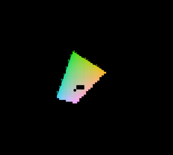 Most of this diagram cannot be shown
The chromaticity horseshoe is the canonical illustration of colour science, and nearly every printed copy is filled edge to edge with colours the page cannot produce. The honest version marks them, and the marking covers most of the picture.
Most of this diagram cannot be shown
The chromaticity horseshoe is the canonical illustration of colour science, and nearly every printed copy is filled edge to edge with colours the page cannot produce. The honest version marks them, and the marking covers most of the picture.
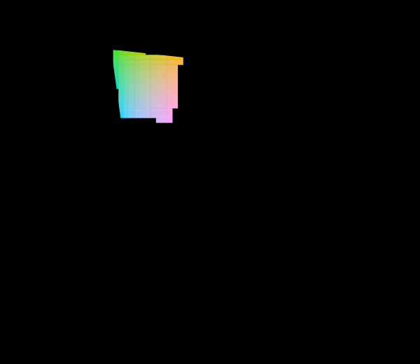 The diagram was replaced in 1976
The CIE knew the 1931 diagram was badly distorted and published a better one. Half a century later almost every chromaticity plot in print is still the old one, and both are still printed filled edge to edge with colours no display can show.
The diagram was replaced in 1976
The CIE knew the 1931 diagram was badly distorted and published a better one. Half a century later almost every chromaticity plot in print is still the old one, and both are still printed filled edge to edge with colours no display can show.
 The matches do not name the cones
Colour matching is the whole empirical basis of colorimetry, and it fixes the observer's three curves only up to a nonsingular 3×3 — nine numbers that no match, in any quantity, to any precision, can see. One particular choice of those nine is used throughout here, and it was made for a different purpose.
The matches do not name the cones
Colour matching is the whole empirical basis of colorimetry, and it fixes the observer's three curves only up to a nonsingular 3×3 — nine numbers that no match, in any quantity, to any precision, can see. One particular choice of those nine is used throughout here, and it was made for a different purpose.
What this makes readable
Essays that name this one as a prerequisite.
Named alongside this one
Essays reaching for the same objects. Nobody chose these; they are what the index of named objects makes visible.
- Which of these is a convention chromaticity plane · diagram conventions · gamut · identifiability · invariance · projective transformation
- An appearance is not always a stimulus gamut · imaginary primaries · invariance
- Not every colour has a wavelength chromaticity · gamut · spectral locus
- What a gamut costs chromaticity · gamut · spectral locus
- Why colour is exactly three-dimensional gamut · imaginary primaries · spectral locus
- A fourth primary is a design chromaticity · gamut
What links here
The 8 essays that link to this one and share the most of its objects, of 10 that link here.
The objects this essay names
Each one links to every other essay that touches it.
Additive mixtureChromaticityChromaticity planeDiagram conventionsGamutIdentifiabilityImaginary primariesInvarianceProjective transformationSpectral locusUniform chromaticity scale