Concept

Spectral locus — where it appears

The curve of single-wavelength lights on a chromaticity diagram, which bounds everything any light can be. Everything inside it is a mixture and nothing outside it exists, which is what makes the diagram's horseshoe shape a fact rather than a convention.

Named by 11 essays across 4 fields — each of them below, with the objects they name alongside it.
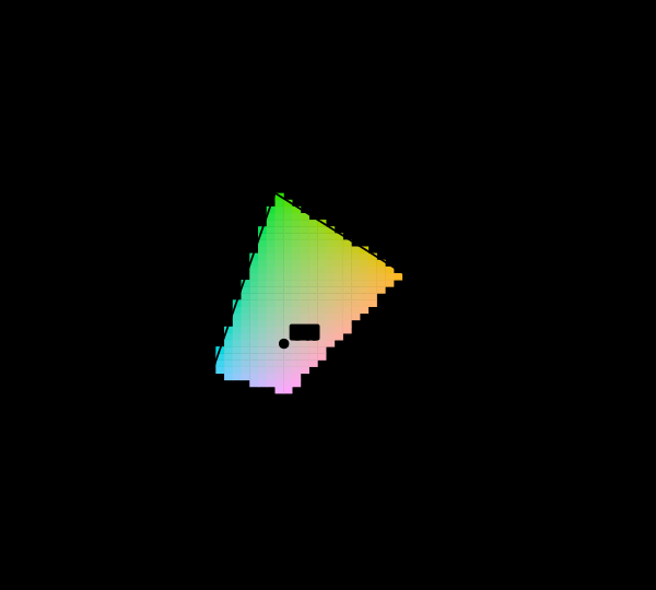
The CIE 1931 chromaticity diagram with its unreachable region marked. The spectral locus encloses every chromaticity a human eye can see. Cells inside the sRGB triangle are drawn in their own colour; the 85 per cent outside it are hatched, because no value this display accepts is the colour belonging there.

Most of this diagram cannot be shown

The chromaticity horseshoe is the canonical illustration of colour science, and nearly every printed copy is filled edge to edge with colours the page cannot produce. The honest version marks them, and the marking covers most of the picture.
matching · Gamut
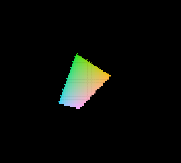
sRGB, Display P3 and Rec. 2020 compared on the chromaticity diagram. Three nested triangles inside the horseshoe. sRGB covers 74 per cent of the area P3 covers. Rec. 2020's red and green primaries sit on the spectral locus itself, within 0.000 and 0.002 of it, meaning they are monochromatic.

What a gamut costs

Three primaries reach a triangle and the visible region is not a triangle, so something has to give. Widening the primaries helps, has a price in precision and compatibility, and runs into a limit that is geometric rather than technological.

matching · Gamut
The CIE 1931 colour-matching functions. The three functions that turn a spectrum into three numbers. They are all positive, which is why XYZ exists — the RGB functions they were derived from are not. ȳ is by construction the luminous efficiency function, which is why luminance comes out of Y.

Why colour is exactly three-dimensional

Matching every wavelength with three primaries requires, for some wavelengths, a negative amount of one of them. That physical awkwardness is why the colour-matching functions were transformed into XYZ, and why the horseshoe is curved.
eye · Cones
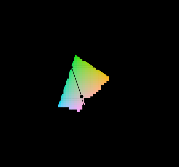
Dominant wavelength as a construction on the diagram, against equal-energy E. A ray is drawn from the white point through each sample and continued until it leaves the diagram. The sample at (0.28, 0.52) leaves through the spectral locus at 537 nm, at excitation purity 0.43. The sample at (0.36, 0.19) leaves through the line of purples, so it has no dominant wavelength at all and is written 544c nm — the crossing on the opposite side, marked with a c. The hatched region is colour this display cannot show and is not drawn as though it could.

Not every colour has a wavelength

The question every reader arrives with is which wavelength a colour is. For close to a third of the directions on the chromaticity diagram the honest answer is that there is none, and the construction colorimetry offers instead is a statement about a diagram rather than about light.

matching · Gamut
The locus and the triangle, drawn on one of the diagrams. The spectral locus and the sRGB triangle in CIE xy (1931) — the default of the discipline, and the default used here. The triangle covers 33.6% of the enclosed area here. Nothing about the observer or the display has changed between this picture and any other in the family; the coordinates have, and the coordinates are what an area is measured in.

The diagram has no area

A chromaticity diagram is a projective picture of a three-dimensional space, and the freedom colour matching leaves in the observer acts on it as a projective map. Straight lines and mixture ratios survive that; area, distance and angle do not — so half of what the diagram is used to say is a statement about the paper.

matching · Gamut
What share of the diagram the sRGB triangle covers, in twelve published coordinate systems. Each row is a chromaticity diagram somebody has printed, and each bar is the fraction of the enclosed visible area that the sRGB triangle covers in it. Every row describes exactly the same observer and exactly the same gamut. The answer runs from 8.5% to 38.4%, a factor of 4.52, because area is not preserved by the projective maps that carry one of these diagrams to another. The familiar "about a third" is a fact about CIE xy.

Two thirds is not a property of the eye

It has been said from the beginning here that about two thirds of the chromaticity diagram cannot be shown on a screen. The figure is right, on the diagram it was measured on, and across twelve published diagrams the same triangle covers anything from 8.5 to 38.4 per cent of the same locus. Counting stimuli instead gives an answer that does not move.

matching · Gamut
A primary's tolerance is a shape, and part of it is unreachable. The CIE chromaticity diagram with the spectral locus drawn, and three closed regions marking where each primary of a display designed for its own inverse can sit while the adaptation cost stays within 1 per cent of its best. None of them is round: the widest runs 15.1 times further one way than another, so a single tolerance figure for a primary is the average of a shape the shape never takes. 47 of the 144 boundary directions leave the region a real primary can occupy, which is a second constraint the objective knows nothing about — the cost does not rise there, and the primary cannot go there.

A tolerance is a region

How far a display's red primary can move before its adaptation behaviour costs anything is not a distance. It is a closed region on the chromaticity diagram, fifteen times longer one way than another, and about half of it lies outside the area a real primary can occupy — where the objective does not rise and the primary cannot go.

applied · Delivery
What a display's red primary is allowed to be, under four requirements at once. A close view of the chromaticity plane around one designed primary, 0.101 units across. Four outlines: the set of positions the primary can take before each of four requirements gets one per cent worse — how well a gain in the display's own basis undoes a change of light, how much of the diagram the three primaries enclose, how many real surfaces fall inside them, and whether a light of that colour exists at all. The shaded region is where all four hold. It is 5% of the smallest outline's area, because the outlines are long and thin and cross at an angle rather than nesting. adaptation holds 42% of its boundary, gamut holds 10% of its boundary, realisable holds 48% of its boundary.

A primary is chosen for four things

A display's primaries have to adapt well, cover the diagram, hold the surfaces anybody photographs, and be colours a light can actually have. Drawing all four tolerance regions around one primary shows that no single requirement decides where it can go, and that one of the four never decides anything.

matching · Gamut
The same tolerance, in the two numbers somebody actually sets. The plane a maker of a single-peak emitter works in: peak wavelength across, full width at half maximum up. Each marker is a candidate emitter whose chromaticity falls inside the colorimetric tolerance drawn for this display's green primary. They occupy a narrow band — peaks from 528 to 535 nanometres, a span of 7, against widths from 25 to 45 — so a tolerance stated as a region in chromaticity becomes ±3.5 nanometres of peak and a great deal of latitude in width. 2.0% of the 2501 candidates land inside at all: most of a region drawn in chromaticity is a colour no single-peak emitter makes.

A tolerance in the wrong coordinates

A display primary's tolerance is written as a region in chromaticity, because that is where the colorimetry lives. Nobody has a knob for chromaticity. What a maker of an emitter sets is a peak wavelength and a bandwidth, and the map between the two is so anisotropic that on the red primary its condition number is over eleven thousand.

matching · Gamut
What this collection's grid does to its own observer audit. Two bars per light: the mean departure of the observer computed on this collection's five-nanometre grid, and the same computation on a quarter-nanometre one. For five of the six lights the two agree to two decimal places, which is what a well-sampled spectrum looks like. For the laser projector the coarse answer is exactly zero and the fine one is 1.80 — the largest in the table. On a five-nanometre grid a three-line spectrum with lines at 465, 532 and 638 nanometres is a one-line spectrum, and a single wavelength is a stimulus every observer agrees about to the last bit. The two departures do not compound here; the first conceals the second.

One wavelength is everyone's colour

A stimulus with a single wavelength in it produces the same relative cone excitations for every observer, exactly, whatever their age or field size. A display made of three such stimuli is where observers disagree most. Both statements are consequences of the same algebra, and the second is why laser projection has an observer problem.

matching · Gamut
How far CIECAM16 moves a monochromatic hue when the light is brightened thirtyfold. A monochromatic stimulus at a relative luminance of 2 and of 60, read through CIECAM16 in one room, and the difference between its two hue angles. The model was never fitted to this effect and has it anyway: the shift is positive at the short end, negative through the greens, positive again in the yellows and reds, and crosses zero at 459, 495, 502, 570 nanometres. The marks are the invariant wavelengths the literature reports — 474, 506, 571.

The model has a hue shift it was never given

A monochromatic light changes hue as it is brightened, except at three wavelengths that do not move — an effect measured since the nineteenth century and not among the things CIECAM16 was fitted to. The model has it anyway: brightening a stimulus thirtyfold moves its hue angle, and the places where the movement crosses zero land at 459, 495, 502 and 570 nanometres against the reported 474, 506 and 571. The sizes are another matter.

brain · Appearance

Named alongside it

The objects these essays reach for when they reach for this one.

GamutPrimariesDisplay gamutChromaticityInvarianceToleranceAnisotropyChromatic adaptationChromaticity planeDeclared inputDiagram conventionsDisplay P3

All concepts