Theme

The thread: Outside the gamut
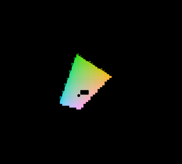
Most colours a human can see cannot be shown on this page. The usual response is to clip them silently and print the picture anyway. The response here is to mark them and say how far out they are.
The CIE 1931 chromaticity diagram with its unreachable region marked. The spectral locus encloses every chromaticity a human eye can see. Cells inside the sRGB triangle are drawn in their own colour; the 85 per cent outside it are hatched, because no value this display accepts is the colour belonging there. Matching and measuring

Most of this diagram cannot be shown

The chromaticity horseshoe is the canonical illustration of colour science, and nearly every printed copy is filled edge to edge with colours the page cannot produce. The honest version marks them, and the marking covers most of the picture.
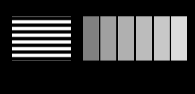
A gamma probe: which grey matches a half-white dither?. The striped block on the left is half white and half black, so it carries half the luminance of white. Stand back until the stripes blur and find the patch that matches it. On an sRGB display the answer is code 188, not 128 — code 128 has only 22 per cent of white's luminance. Where the model breaks

The display is an unknown

This site is displayed on the very apparatus it is about, and it knows almost nothing about that apparatus. Two figures here stop assuming and ask instead — a probe for the transfer function and a probe for the gamut.
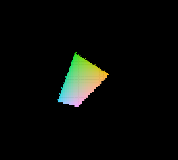
sRGB, Display P3 and Rec. 2020 compared on the chromaticity diagram. Three nested triangles inside the horseshoe. sRGB covers 74 per cent of the area P3 covers. Rec. 2020's red and green primaries sit on the spectral locus itself, within 0.000 and 0.002 of it, meaning they are monochromatic. Matching and measuring

What a gamut costs

Three primaries reach a triangle and the visible region is not a triangle, so something has to give. Widening the primaries helps, has a price in precision and compatibility, and runs into a limit that is geometric rather than technological.
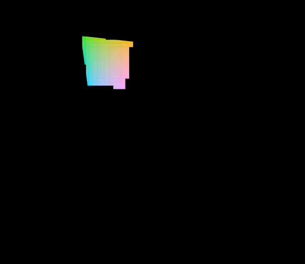
The 1976 uniform chromaticity diagram, with the unreachable region marked. The u′v′ diagram: the same spectral locus and the same sRGB primaries as the 1931 picture, projectively transformed. Straight lines stay straight, so mixtures and the gamut triangle survive; what changes is the distribution of area, and the green region that dominates the 1931 diagram is much reduced. 8% of the cells sampled inside the locus are reachable at Y = 0.55; the rest are hatched. Matching and measuring

The diagram was replaced in 1976

The CIE knew the 1931 diagram was badly distorted and published a better one. Half a century later almost every chromaticity plot in print is still the old one, and both are still printed filled edge to edge with colours no display can show.

Chromaticity-triangle area against CIELAB volume, both relative to sRGB. Two ratios for each space, both against sRGB. The upper bar is the area of the primary triangle on the CIE 1931 diagram; the lower is the volume of the gamut solid in CIELAB, computed by tetrahedral decomposition of the RGB cube at 24 cells per axis. Display P3 is 1.36× sRGB by area and 1.50× by volume; Rec. 2020 is 1.89× sRGB by area and 2.26× by volume. The chromaticity diagram divides luminance out, so its triangle is a projection along the axis the eye is most sensitive to — and a coverage percentage quoted on it is a statement about the shadow. Where the model breaks

The triangle is a shadow

A display's gamut is drawn as a triangle on the chromaticity diagram, and coverage is quoted as a percentage of that triangle's area. Chromaticity has luminance divided out, so the triangle is a projection along the axis the eye cares most about — and the ratios computed on the solid are not the ratios computed on its shadow.

Distinguishable colours in sRGB, counted under two difference formulae. The gamut volume divided by the volume of a ΔE = 1 ellipsoid, integrated over the solid because that ellipsoid changes size and orientation from place to place. Under the 1976 formula the answer is 195,720; under ΔE2000 it is 41,819 — 4.68 times fewer, from the same solid and the same lattice. Both assume perfect packing, which nothing achieves, so each is an upper bound rather than a count of anything. The gap between them is the result: "how many colours are there" is a question about a metric before it is a question about vision. Difference and uniformity

How many colours are there

Sixteen point seven million counts code values in a file format. Ten million distinguishable colours is a volume divided by the size of a just-noticeable difference — and the two difference formulae this site implements disagree about that size by a factor of nearly five.

What no surface can be more colourful than. The MacAdam limits at 4 lightnesses under D65, each computed by sweeping two-transition reflectances over the whole band and keeping those that land at the target luminance factor. This is a physical bound rather than a gamut: a reflectance above 1 is a surface that emits, so no pigment anybody invents will ever put an object colour outside these curves. The boundary shrinks steeply as the surface lightens, from 0.310 at Y = 0.1 to 0.028 at Y = 0.9 — a very light surface has almost no room to be colourful, and that is physics rather than pigment chemistry. Drawn against it is sRGB at the same luminance factor rather than as a primary triangle, because a triangle is what a display can reach at some luminance and the bound is what a surface can reach at one; matched properly, sRGB covers 36% at Y = 0.1, 40% at Y = 0.3, 40% at Y = 0.6, 21% at Y = 0.9. The faint triangle is the familiar figure, kept only to show how much it misleads. What a scene does

No surface can be that colourful

There is a hard bound on object colour that no pigment will ever move, and it follows from a reflectance being at most 1. Its boundary is generated by two numbers, it shrinks by a factor of eleven from dark to light — and measured against it properly, sRGB reaches 40% of what a surface could be at mid lightness while Rec. 2020 reaches 106%.

The best a camera profile can do on the surfaces it was fitted to. Per-surface ΔE00 after the best 3 × 3 from raw to XYZ, fitted on 12 surfaces at chroma 0.7 and tested on those same 12 surfaces — mean 1.45, worst 2.58. This is the most favourable measurement it is possible to make of a camera and it is the one usually published. What a camera does

No matrix is right everywhere

The best three-by-three this sensor admits, fitted and tested on the same twenty-four surfaces, leaves a worst case of ΔE00 2.85. A control sensor built to satisfy Luther's condition reaches ten to the minus seven under the identical computation, which is what makes the first number a measurement.
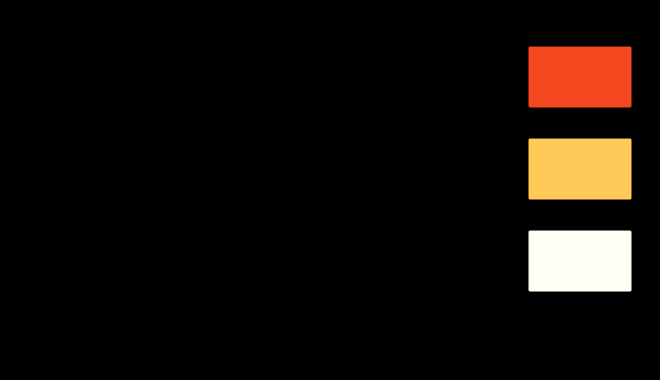
A clipped channel turns the hue of what is left. CIELAB hue shift against exposure for one saturated stimulus, measured against the same stimulus rendered without clipping. Nothing moves until the first channel reaches the ceiling at 0.25 stops; after that the recorded hue rotates by as much as 67 degrees, with nothing in the scene having changed colour. What a camera does

A blown highlight turns

An exposure that clips nothing changes no hue at all. Once one channel reaches the ceiling the recorded hue rotates by as much as sixty-seven degrees, with nothing in the scene having changed colour — and every response a converter can make to that is an invention.

What a press and a display can reach at L* = 50. A slice through both solids at lightness 50, with the press dashed and the display solid. The boundaries cross: the press reaches past sRGB in 15 of 48 directions and falls inside it in 31. That is the shape of every conversion between them — colours are lost in one direction and gained in the other, and the picture cannot show the gained ones, because it is being displayed on the gamut that cannot reach them. Those are hatched. What it takes to deliver it

Neither gamut contains the other

Converting a picture to CMYK is described everywhere as a reduction, as though the press were a smaller version of the screen. Measured as solids, the press reaches eleven per cent of its volume outside sRGB while sRGB reaches fifty-four per cent of its volume outside the press — and in the cyans the press wins by seventy per cent of chroma.
What happens to a tone the destination cannot print. Source lightness along the bottom, destination lightness up the side, for a print whose black is L* = 8. Clipping is the flat segment on the left — 4 of 10 levels in the bottom twenty points of the scale arrive as the same number, and nothing downstream can recover them. Black point compensation is the straight line: all 10 levels survive as different numbers, and every tone in the picture has moved to pay for it. What it takes to deliver it

A black that is not black

The deepest colour a four-colour press can make is L* 2.4, and against its own paper that is a contrast of about 320 to 1 — less than a cheap display manages in a dark room. Everything a printed picture does in the shadows is done inside that range, and the two ways of fitting a picture into it destroy different things.
A gradient of one hue, mapped into a press's gamut 2 ways. Chroma asked for along the bottom, chroma delivered up the side, for a ramp at lightness 55 and hue angle 25°. A colorimetric intent follows the diagonal until the press runs out and is flat afterwards — the flat part is a gradient arriving as a single colour. The perceptual intent is under the diagonal from the start, which is the price of never going flat. What it takes to deliver it

No mapping preserves everything

More than half the sRGB solid is outside a press's gamut, so something has to be done with it, and there are two things that can be done. One leaves every reproducible colour exactly where it was and delivers a gradient as a flat area. The other keeps the gradient and moves every colour that needed no help by about three.
A named ink, and the closest four-colour build of it. The ink is one pigment chosen for its own spectrum; the four-colour build is three chosen for everything. The four-colour build reaches it to ΔE00 = 0.37 under D50 and drifts to 4.46 under a tungsten lamp, because the match is metameric — the two curves cross 4 times rather than coinciding anywhere. What it takes to deliver it

A brand colour is an ink

A named colour is a jar of pigment with a spectrum, and a four-colour build of it is three inks arranged to integrate to the same three numbers. Of 156 constructed single-pigment inks, 15 can be matched at all — and those fifteen drift by a median of 3.8 colour differences under a tungsten lamp, because the match was never a match.

The solids, by volume. CIELAB volume, all measured by the same cell count with the same extrapolation, and quoted against sRGB because that is the comparison the estimator supports. The four-colour press reaches 49 per cent of the sRGB solid's volume — and contains colours sRGB does not, which is why "half the gamut" is the wrong summary of a ratio of one half. What it takes to deliver it

The fifth ink buys a corner

Orange, green and violet are sold as the answer to a four-colour press's gamut, and each one adds seven to nine per cent of volume. All three together add 23 per cent — almost exactly the sum, with no interaction — and every bit of it lands in the region of the ink that was added, at lightnesses where that ink is dark.
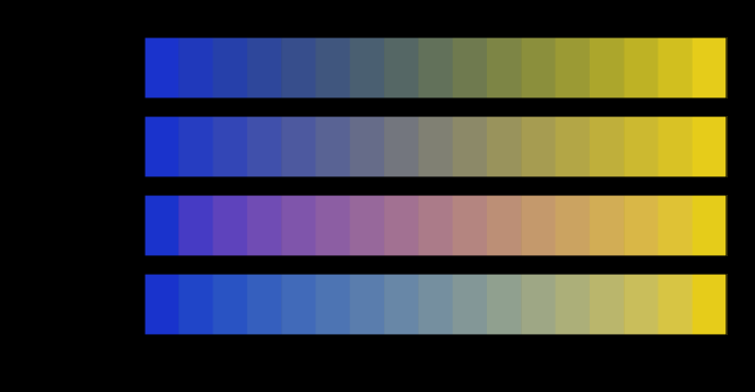
One pair of colours, blended in four spaces. Every row starts and ends at the same two colours and visits different ones in between. The chroma of the middle falls furthest in linear light, by 83 units below the straight line between the endpoints' chromas — the grey dead zone that every blue-to-yellow gradient has and that no endpoint mentions. Any colour a route visits that this display cannot show is hatched rather than clipped. Matching and measuring

A gradient is a path

Two colours fix the ends of a blend and nothing else. The middle is decided by the space the interpolation happens in, and four spaces in daily use put the halfway point of one ordinary gradient as much as thirty-seven units of colour difference apart.
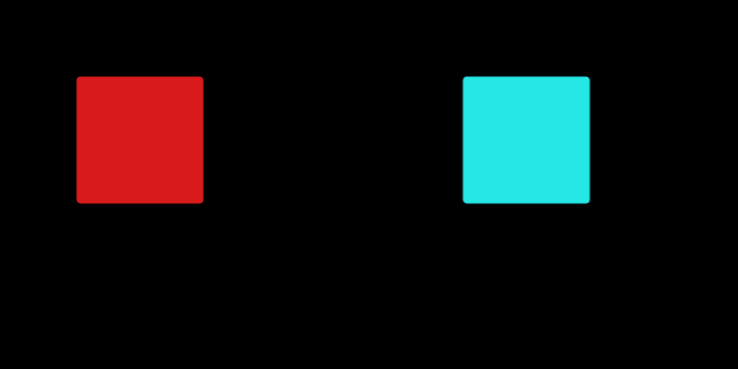
One adapting colour, two answers. The left patch is what was stared at. The middle is the afterimage the cone-gain arithmetic predicts at 15 per cent adaptation; the right is the inverted code values. They are 22.1 ΔE00 apart. The gains that produced the middle patch are 0.95, 1.06, 1.69 on the long, medium and short cone classes — the reciprocal of what each class had been receiving, taken 15 per cent of the way. What the brain does

An afterimage is an adaptation

The demonstration everybody gives is an inverted image, which is a statement about a file format. Running the receptoral arithmetic instead puts the afterimage of a saturated red sixty degrees of hue away from the inverse — and outside what any display can show.

The colourfulness the sRGB cube reaches, against the light in the room. The display is the same display throughout and the signal is the same signal. What moves is the adapting luminance, which enters the appearance model and nothing else. The furthest colourfulness the cube reaches falls from 131 to 57, a factor of 2.29. A gamut in CIELAB cannot show this at all, because CIELAB has no light level in it — which is why every gamut percentage in circulation is quoted without one. Where the model breaks

The gamut shrinks in the dark

Every gamut number here is a property of a device and of nothing else, which is why the same display has the same gamut in a studio and in a cinema. It does not. Turn the room down four decades and the solid loses a fifth of its reach and two thirds of its volume, with the signal unchanged.

Several sources on one scale. planck, led, narrowband, each normalised to its own peak and drawn on shared axes with the colour each produces beside it. Every one of these is sold as white light and every one is ordinarily described that way; what they have in common is a chromaticity, and very little else. What light is

A screen is a poor lamp

A display's white is a light. Shone on a surface it renders colour worse than a fluorescent tube — and the wider the gamut, the worse it gets, because the narrow primaries that buy a large triangle are exactly the ones that leave holes in the spectrum.

How much colour a display delivers, against how bright the room is. The appearance solid of the whole code cube, with the room's reflected light added to every code value and the surround ratio computed from the room's own white against the display's. A 300 cd/m² panel delivers most at 200 lux, and the curve falls on both sides: darker costs the surround, brighter costs the black. At the 32 lux the softproofing standards specify, the solid is 89 per cent of its best — which is not a criticism of the standard, since it is written for matching a screen to a print viewing booth rather than for delivering the most colour. Where the model breaks

A display in a room is a smaller display

Two results here turn the room's light in opposite directions and neither knows about the other. A room has one light level and does both at once — so there is a brightness at which a display delivers the most colour, it is not at either end, and it scales with the panel.
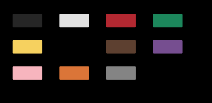
The eleven basic colour terms, at their quoted centroids. Each patch is the CIELAB centroid quoted for that term, converted to a stimulus and drawn — except blue, whose focal colour is outside the sRGB gamut and is therefore hatched rather than clipped, which is the rule for an unreachable colour everywhere else and applies here too. The centroids are rounded to 5 units in each coordinate, and moving them by that much either way leaves the same term outside. What the brain does

A colour has a name

Every quantity here is a number, and the question a reader arrives with is what colour something is called. The eleven basic terms of English divide the space into territories that differ by a factor of five, the metric accounts for fifteen per cent of that, and one of the eleven focal colours cannot be shown on this page at all.
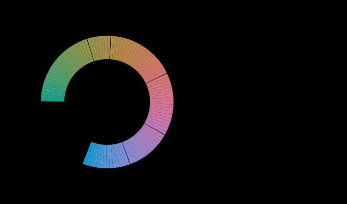
The hue circle cut into names, at L 60 and C 40. Left, the arcs each name claims, drawn at the colour of their midpoints; right, the same arcs measured in ΔE00 by integrating the difference along the ring rather than in degrees. The widest is 5.3 times the narrowest in degrees and 4.5 times in colour difference, so the metric accounts for 15 per cent of the inequality and no more. Only the eight chromatic terms compete on this ring: at this chroma the achromatic three would otherwise take the region where no basic English term sits, which is a defect of the model and is named in the essay. Where the model breaks

There is no word for that colour

The naming model built this phase gives a saturated cyan the name green, calls part of a chromatic ring grey, and puts one of the eleven focal colours outside what a display can show. Each failure is a measurement rather than a disclaimer, and together they say what a vocabulary is that eleven points and a distance are not.

What a fourth primary actually buys. All three displays are floating-point-exact matches for the reference observer, so no colorimeter can tell them apart. The bars are the 95th percentile of what two hundred other eyes report. Held to the same gamut floor of 1.4× sRGB, the four-primary design leaves the population 2.6 times closer together than the three-primary one. That is what the extra emitter is worth, and it is not more colour — the gamut is held fixed while it is measured. Matching and measuring

A fourth primary is a design

A display's fourth emitter is sold as more colour. Optimised instead against how far apart two hundred eyes are about its white — with the gamut held fixed so it cannot cheat — it buys agreement, and two and a half times closer together than three primaries reaching the same area, and the wavelengths it chooses are not the ones anybody would pick.

The same wall, applied once and applied twice. A room lit by light that has bounced off its own walls is a change of illumination like any other, and a corner is the same change applied twice. Squaring a reflectance sharpens it, a sharper change of light is further from being a gain, and the residual an adapted observer is left with therefore grows faster than the change does: the second bounce is 1.33 times the change and 1.96 times the residual. This is the adaptation half of what a corner does to a metameric match. What a scene does

The same wall applied twice

A bounce off a painted wall is a change of illumination, and adaptation handles it about as well as it handles a change of colour temperature. A corner applies the same reflectance twice, which sharpens it — and leaves an adapted observer with 1.96 times as much for a change only 1.33 times as large.

Which of these paints the display can show, and to how many people. Each row is a real surface under D65, and the bar is the share of 120 observers for whom a non-negative mixture of this display's three primaries reproduces it. The question has no observer-free answer: the paint is a reflectance, the primaries are emission spectra, and whether one matches the other is a fact about somebody's cones. A dot marks the rows the 1931 observer calls displayable. 2 of them are rows some real people cannot see, and 4 more go the other way. Matching and measuring

A gamut has a population

Whether a display can reproduce a paint is a fact about somebody's cones, so the boundary of a gamut is not a curve but a band. On a laser projector, ten of twenty-eight boundary surfaces are ones the standard observer calls displayable and some real people cannot see — and the wider the gamut, the wider the band.

55 essays on this thread, page 1 of 3 · all threads · all essays