Most of this diagram cannot be shown
There is one picture that appears in every introduction to colour science: a rounded, tongue-shaped outline, filled with a smooth wash running from violet at the bottom left through green at the top and round to red at the right. It is the CIE chromaticity diagram, it is eighty years old, and it is the standard way of showing the extent of human colour vision.
Nearly every printed copy of it is showing colours that are not the colours it claims.
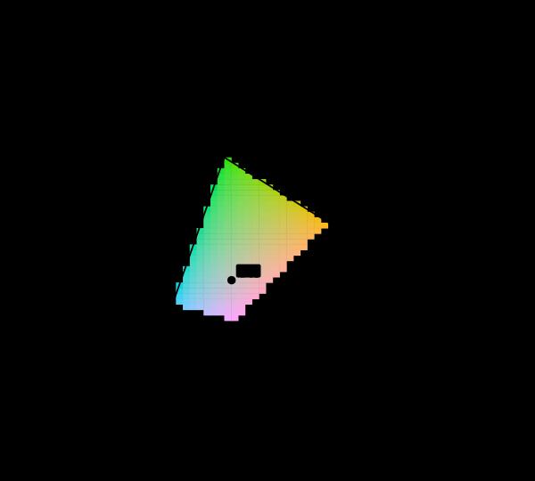
What is marked on it is a choice as well, and marking a different set moves the boundary between the honest and the dishonest parts of the same picture.
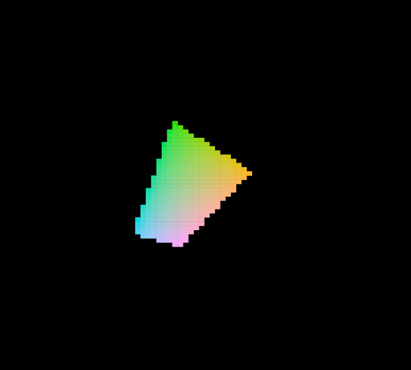
A wider display is the obvious answer to that and it is worth seeing how much of the region it actually removes.
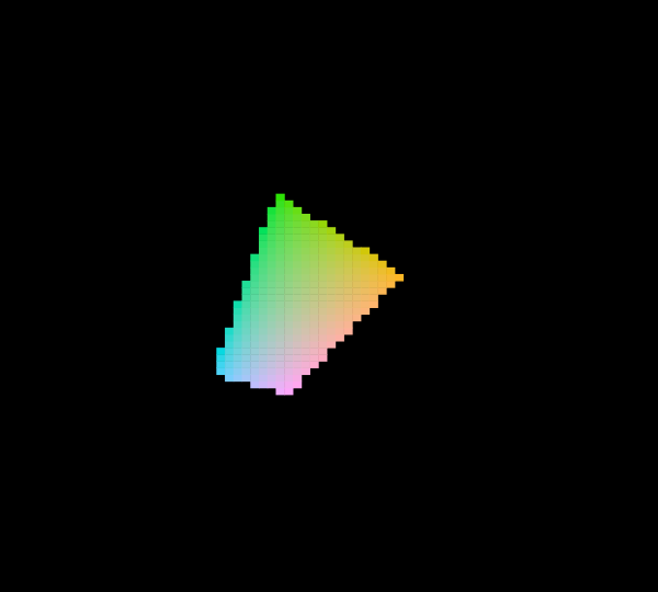
The observer is the other half of the same statement, and changing it redraws the boundary the triangles are being compared against.
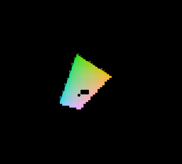
What the diagram is
Every colour a human can see arrives at the eye as a spectrum, and the eye reports three numbers. Discard the overall intensity from those three and two are left, which can be plotted on a plane. That plane is this diagram, and the two coordinates are conventionally called and .
The curved boundary is the spectral locus: the chromaticities of single wavelengths, from about 380 nm at the bottom to about 700 nm at the right. These are the most saturated stimuli that exist, because a single wavelength is as far from a mixture as it is possible to get. The straight line closing the shape along the bottom is the line of purples, which corresponds to no wavelength at all — purples are mixtures of the two ends of the spectrum and have no place on the locus.
Everything inside the outline is a chromaticity some real light can have. Everything outside it is not a colour at all, merely a pair of numbers.
The problem
A display makes colours by mixing three primaries. Mixing three fixed things in non-negative amounts reaches exactly the triangle whose corners are those three things — that is what mixing means. So the set of chromaticities a screen can produce is a triangle, and the set a person can see is a curved region that strictly contains it.
The triangle is smaller than most people expect. For the sRGB primaries that this page assumes, it covers a bit over a third of the diagram’s area.
That leaves the obvious question of what the ink or the pixels are doing in the other two thirds. The answer is that something was substituted. The usual something is the nearest colour the display can manage, which is a systematic distortion: everything near the boundary gets pulled inward, saturated colours get less saturated, and the gradient that ought to run from vivid to vivid instead flattens out. The spectral locus, the entire reason the diagram has the shape it has, is drawn in colours that are not remotely the colours it is labelled with.
None of this is stated. The caption says “the CIE chromaticity diagram” and the reader takes the colours to mean what they appear to mean.
What it looks like when the substitution is refused
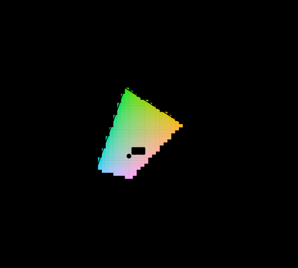
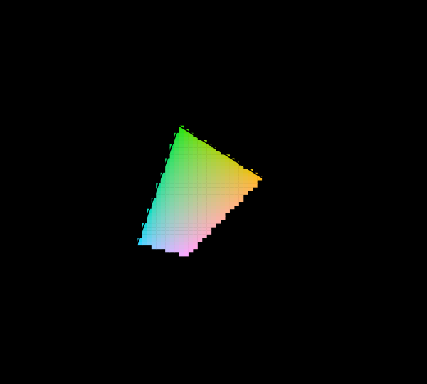
The hero figure above is what the diagram looks like when the machinery is required to check. Every cell is converted from its chromaticity to sRGB and tested; if the result falls outside the range a display can accept, the cell is not drawn at all and the region is hatched.
Hatching rather than a flat grey is deliberate. A solid fill still reads as this region is that colour, which is the confusion being avoided; diagonal lines read as absence, and go on reading that way in greyscale, in print, and for a reader with any form of colour vision deficiency.
The measurement that comes out is that about two thirds of the visible chromaticity plane cannot be shown here at all.
Which is a fraction of this plane. The same triangle inside the same locus covers between 8.5 and 38.4 per cent of the diagram across the twelve coordinate systems the discipline has published, because area is not something a chromaticity diagram preserves — so the two thirds belongs to CIE 1931 and not to the eye. The invariant version of the question counts stimuli rather than measuring a region, and gives 92 per cent of this collection’s constructed surfaces and none of the monochromatic lights. The hatching itself is unaffected: which cells are unreachable is a fact about tristimulus values and is the same on every diagram.
An honest complication: the fraction depends on the brightness
The number above is not a constant, and this is worth dwelling on because it is another thing the usual diagram never mentions.
Chromaticity throws away intensity. To draw a chromaticity, the machinery has to choose a luminance to realise it at, and the choice changes which colours are reachable. A very dark yellow is easy for a display; a very bright one is not. Two diagrams drawn at different luminances have differently sized honest regions, and neither is more correct than the other.
So a diagram of this kind is not merely incomplete — it is a two-dimensional slice through a three-dimensional situation, and the slice was chosen by whoever drew it. Every version of this figure on this site names its luminance in the corner for that reason.
The pure wavelengths, one at a time
The locus is the sharpest case, because every point on it is a single wavelength and not one of them is displayable.
This has a practical consequence that turns up constantly. A diagram of a laser, a sodium lamp, a diffraction pattern or a rainbow, captioned with wavelengths and printed with coloured swatches, is showing something other than what it says. The swatches may be a reasonable impression. They are not the stimulus, and the difference is large rather than marginal — the misses in that figure run from twenty to over ninety per cent of the channel range.
Why the primaries are where they are
Given all this, an obvious question is why displays do not simply use better primaries.
They can, and increasingly do — Display P3 is now common on laptops and phones. But the trend runs into a hard limit that the diagram makes visible. Rec. 2020, the ultra-high-definition standard, places its red and green primaries on the spectral locus, and the figure above confirms they are within a few thousandths of it. A primary on the locus is monochromatic, which means a Rec. 2020 display would need three lasers. Some do. Most cannot, and every one that cannot is showing a smaller gamut than the standard it claims.
Extending the triangle has a cost even when it works. The same number of code values now has to cover a larger region, so each step is a bigger jump; and any content authored for the smaller gamut is wrong on the larger one unless something explicitly converts it. Wider is not free.
What clipping actually does
It is worth being precise about the substitution, because “clipped” sounds like a small trim and it is not.
A colour arrives as three linear-light numbers, one per primary. Reachable means all three fall between zero and one. An unreachable colour has at least one that does not, and the failure is almost always a negative channel rather than one above one — the display is being asked for less than no red, which is a request to remove light that was never there.
Clamping that negative to zero adds light the colour did not have. The result is less saturated, and shifted in hue by an amount depending on which channel failed and by how much. Near the spectral locus the miss runs to most of the channel range, so what appears in place of a pure cyan is not a slightly duller cyan but a substantially different colour with the same name.
That figure is the practical version of the problem, and it catches people who never go near a chromaticity diagram. Generating a palette by stepping around a hue circle at fixed lightness and chroma is a standard and sensible-looking procedure. Fourteen of these thirty-six steps do not exist, and whatever tool produced them returned something else without comment.
How wrong the substituted colours are, and where
Saying the substitution is dishonest is a claim about a magnitude, so it is worth putting a number on it. Sampling the interior of the locus on a 0.0025 grid gives 53,305 chromaticities, of which 35,366 — 66.3 per cent — lie outside the sRGB triangle, which is the same measurement as the area fraction stated above arrived at from the other side.
For each of those, the honest colour and the printed one can be compared directly. Scale the chromaticity so that its largest primary sits exactly at full output, clip the negative primaries to zero, and the difference between the two is the error the page commits. The mean is 12.3 ΔE₀₀. Fifty-seven per cent of the unreachable area is substituted by a colour more than 10 ΔE₀₀ away, nineteen per cent by one more than 20, and the worst case reaches 29.3 near the short-wavelength end of the locus at x = 0.173, y = 0.005.
The error is not spread evenly, and its concentration is the useful part. Grouped into eight hue bands, the mean substitution error runs:
| hue band | mean ΔE₀₀ | share of the unreachable area |
|---|---|---|
| 0–45° | 7.1 | 8% |
| 45–90° | 4.7 | 4% |
| 90–135° | 4.8 | 7% |
| 135–180° | 14.6 | 45% |
| 180–225° | 16.0 | 16% |
| 225–270° | 13.1 | 4% |
| 270–315° | 6.5 | 3% |
| 315–360° | 10.0 | 14% |
The greens and cyans, from 135° to 225°, carry 61 per cent of all the unreachable area and the two largest errors in the table. The oranges and yellows carry a ninth of the area at a third of the error. So the diagram is not uniformly a little wrong: it is close to right around its warm edge and badly wrong across the whole green flank, which happens to be the largest region on the picture and the one a reader’s eye is drawn to first.
What the light was, before any of this
The diagram deals in chromaticities, which are already two steps removed from anything physical. What actually arrives is a spectrum.
Keeping that in view prevents a particular error. A point on the chromaticity diagram does not correspond to a light — it corresponds to an enormous family of lights, all of which happen to produce the same three cone responses. Two spectra can be wildly different and land on the same point, which is not a curiosity but the basis of all colour reproduction, since it is the only reason three primaries can stand in for anything at all.
What the diagram is still good for
None of this makes the diagram useless. Two things it does well:
It shows what mixing does. Mix two lights and the result lies on the straight line between them, at a position set by their relative intensities. That is a genuine geometric fact and the diagram displays it perfectly — which is why the reachable region really is a triangle, and why no arrangement of three primaries can ever reach a curved boundary.
It shows what cannot be done. The gap between the triangle and the curve is not an engineering problem awaiting a solution. It is a consequence of using three fixed primaries, and it closes only in the limit of primaries that are themselves monochromatic.
What the diagram does badly is anything to do with appearance, and the temptation to read it that way is strong, because it is a picture full of colours. Distances on it do not correspond to perceived differences, and the position of a colour on it says nothing about how light or dark it looks, since that information was discarded to make the plot two-dimensional.
Those ellipses are the reason every subsequent colour space exists. If the diagram were perceptually uniform they would all be circles of the same size, and the fact that they are neither is not a small correction — the largest is roughly eighty times the area of the smallest. Reading distances off this diagram is reading a map whose scale changes from place to place, and changes by two orders of magnitude.
There is a related trap in the geometry. The green region occupies an enormous share of the diagram’s area, which invites the conclusion that human vision is somehow mostly green. It is not; the area is an artefact of the projection, and it is precisely where the ellipses are largest, meaning that huge region contains rather few distinguishable colours.
What was computed here
Every cell of every diagram on this page was computed rather than sampled from an image. The chain runs: chromaticity, to XYZ at a stated luminance, to linear RGB through the matrix derived from the sRGB primaries, to a test of whether all three channels fall in , and only then to a fill. Cells failing the test are not drawn.
The machinery is checked in both directions, which matters more than the forward direction working. The sRGB primaries themselves must test as reachable, and a monochromatic 520 nm stimulus must test as unreachable and must miss by a wide margin — it misses by 0.93 of the channel range. A gamut test that quietly returned “yes” to everything would pass every other check on this site while making its entire premise void.
The habit worth taking away
Whenever a figure shows colours as data — a chromaticity diagram, a spectrum, a wavelength scale, a gamut comparison — the question worth asking is whether the colours shown are the colours meant, or the nearest the medium could manage.
Usually it is the second, and usually nothing says so.
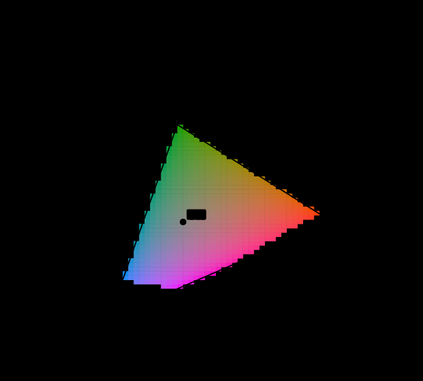
How much of the diagram a display reaches depends on the luminance the question is asked at, and a darker reading is the most favourable one.
The rule this site follows
Compute the colour, test whether the display can show it, and mark it when it cannot.
The diagram was replaced, and the problem was not
The 1931 diagram has a known defect independent of anything on this page: it is wildly non-uniform. Equal distances in it mean wildly unequal perceptual differences, the green region occupies an area out of all proportion to the number of greens anybody can distinguish, and the entire blue-violet range is crushed into a corner.
The CIE fixed this, or improved it, in 1976. The replacement is a projective transformation — every straight line stays straight, so mixtures and gamut triangles survive unchanged — and it distributes the area far more evenly.
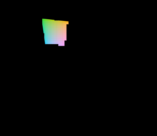
Almost every published copy of the newer diagram is filled edge to edge, exactly as the older one is, and for exactly the same reason: the file format has no way to say unreachable, so the software clips and the printer prints. Fifty years of knowing the projection was wrong produced a better projection and no change at all in the habit that makes both of them misleading.
This is worth being precise about, because the two defects are unrelated and are often conflated. Non-uniformity is a property of the mapping and was fixed by changing the mapping. Unreachability is a property of the display and cannot be fixed by any mapping whatsoever — a projection that made the missing region smaller would not make it reachable, and one that made it invisible would only be hiding it better.
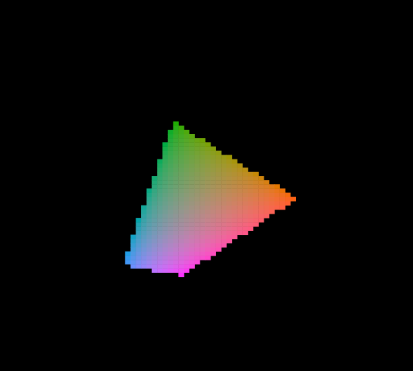
Marking the sRGB triangle rather than the reachable set separates the gamut’s boundary from the question of which cells inside it can actually be shown.
What the pictures cannot show
The obvious one: this page cannot show the reader what is missing. That is the point, and it is also the limitation. The hatched region is an absence, and no amount of design can turn an absence into an impression of vivid cyan.
The second is that the diagram assumes a specific observer. The 1931 functions are an average over seventeen people, and a different observer would put the boundary in a slightly different place. The horseshoe is not a property of light; it is a property of a particular tabulated model of human vision.
The third is the display itself. Everything here assumes sRGB primaries and the standard transfer function. A reader on a wide-gamut screen with correct colour management is seeing a slightly larger honest region than the figures claim, and the site has a probe for that — but nothing on this page can tell which case applies.
Who found it, and when
The 1931 CIE system was built to solve a specific industrial problem: given two lights, predict whether they will match. It does that well, and the diagram is a byproduct of the coordinate system chosen to make the arithmetic convenient.
David MacAdam’s work in the 1930s and 1940s established that the diagram is badly non-uniform, and the CIE has been issuing replacements ever since — the 1960 UCS diagram, the 1976 u′v′ diagram, CIELAB, and more recently spaces like Oklab. Every one of them is an attempt to fix a defect in the original that was understood almost immediately.
The filled-horseshoe illustration, meanwhile, has survived unchanged for ninety years, because it is beautiful and because nobody checks.
Where this goes next
The natural next step is why the eye reduces everything to three numbers in the first place, since the entire diagram is a consequence of that. From the practical direction, what a gamut costs takes up the engineering question this essay only gestures at. And a hex code is not a colour deals with the everyday version of the same confusion, which is more likely to bite anyone actually working with colour.
Where this goes next
 Three numbers
A spectrum has as many degrees of freedom as anyone cares to give it. The eye reports three. Everything colour science can do, and every way it fails, follows from that one collapse.
Three numbers
A spectrum has as many degrees of freedom as anyone cares to give it. The eye reports three. Everything colour science can do, and every way it fails, follows from that one collapse.
 What a gamut costs
Three primaries reach a triangle and the visible region is not a triangle, so something has to give. Widening the primaries helps, has a price in precision and compatibility, and runs into a limit that is geometric rather than technological.
What a gamut costs
Three primaries reach a triangle and the visible region is not a triangle, so something has to give. Widening the primaries helps, has a price in precision and compatibility, and runs into a limit that is geometric rather than technological.
 A hex code is not a colour
Six hexadecimal digits identify three numbers. Turning three numbers into a colour needs a colour space, a transfer function, a white point and a display, and leaving any of them unstated is the everyday version of every confusion in colour management.
A hex code is not a colour
Six hexadecimal digits identify three numbers. Turning three numbers into a colour needs a colour space, a transfer function, a white point and a display, and leaving any of them unstated is the everyday version of every confusion in colour management.
What this makes readable
Essays that name this one as a prerequisite.
Named alongside this one
Essays reaching for the same objects. Nobody chose these; they are what the index of named objects makes visible.
- The triangle is a shadow chromaticity · display gamut · gamut · luminance · primaries
- A gamut has a population chromaticity · display gamut · gamut · primaries
- A lamp has a waveform display gamut · luminance · primaries
- A primary is chosen for four things gamut · primaries · spectral locus
- A screen is a poor lamp display gamut · gamut · primaries
- A tolerance in the wrong coordinates gamut · primaries · spectral locus
What links here
The 8 essays that link to this one and share the most of its objects, of 41 that link here.
The objects this essay names
Each one links to every other essay that touches it.
ChromaticityClippingDisplay gamutGamutLuminancePrimariesSpectral locus