Primaries — where it appears
Named by 32 essays across 6 fields — each of them below, with the objects they name alongside it.
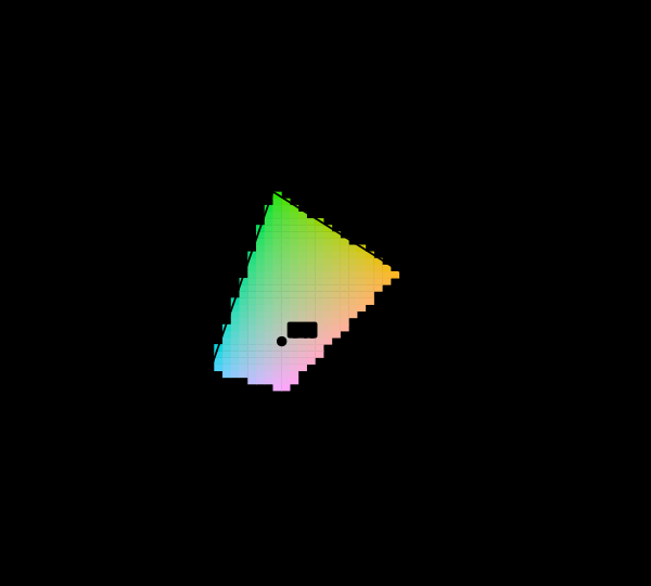
Most of this diagram cannot be shown
The chromaticity horseshoe is the canonical illustration of colour science, and nearly every printed copy is filled edge to edge with colours the page cannot produce. The honest version marks them, and the marking covers most of the picture.

Seventeen observers in 1931
The standard observer that governs every colour specification in industrial use is an average over seventeen young British men, measured with equipment from the 1920s. It is known to be wrong in the blue, the correction has existed since 1951, and it has never been adopted.

Three numbers
A spectrum has as many degrees of freedom as anyone cares to give it. The eye reports three. Everything colour science can do, and every way it fails, follows from that one collapse.
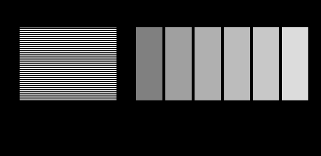
The display is an unknown
This site is displayed on the very apparatus it is about, and it knows almost nothing about that apparatus. Two figures here stop assuming and ask instead — a probe for the transfer function and a probe for the gamut.
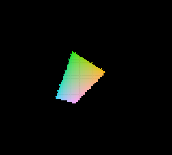
What a gamut costs
Three primaries reach a triangle and the visible region is not a triangle, so something has to give. Widening the primaries helps, has a price in precision and compatibility, and runs into a limit that is geometric rather than technological.
Why colour is exactly three-dimensional
Matching every wavelength with three primaries requires, for some wavelengths, a negative amount of one of them. That physical awkwardness is why the colour-matching functions were transformed into XYZ, and why the horseshoe is curved.

A hex code is not a colour
Six hexadecimal digits identify three numbers. Turning three numbers into a colour needs a colour space, a transfer function, a white point and a display, and leaving any of them unstated is the everyday version of every confusion in colour management.

Whose eyes
The standard observer is an average over seventeen people, and no reader is it. What that costs was small when displays were broad and grows every time the primaries get narrower.
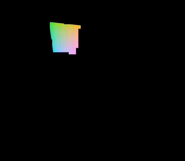
The diagram was replaced in 1976
The CIE knew the 1931 diagram was badly distorted and published a better one. Half a century later almost every chromaticity plot in print is still the old one, and both are still printed filled edge to edge with colours no display can show.
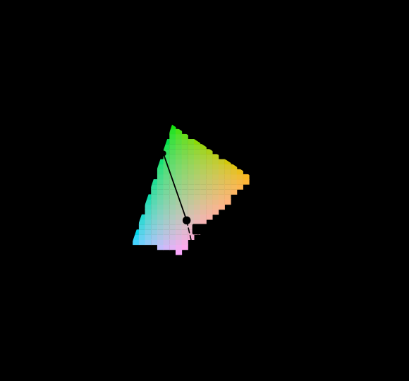
Not every colour has a wavelength
The question every reader arrives with is which wavelength a colour is. For close to a third of the directions on the chromaticity diagram the honest answer is that there is none, and the construction colorimetry offers instead is a statement about a diagram rather than about light.

The triangle is a shadow
A display's gamut is drawn as a triangle on the chromaticity diagram, and coverage is quoted as a percentage of that triangle's area. Chromaticity has luminance divided out, so the triangle is a projection along the axis the eye cares most about — and the ratios computed on the solid are not the ratios computed on its shadow.
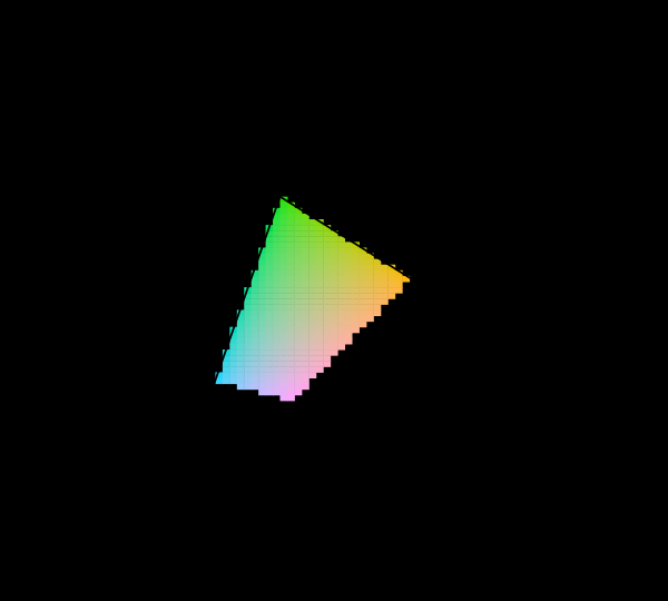
Six numbers make a space
An RGB colour space is eight numbers — three primary chromaticities, a white point, and a transfer function — and everything else about it is derived. Deriving it rather than copying the matrix is the difference between having a colour space and having a table somebody else computed.

Rendering in three numbers
Almost every renderer ever shipped bounces red, green and blue rather than a spectrum. The error that costs is exactly zero at the first product and grows at every one after it — because three numbers cannot carry a product they were never given the factors of, and each bounce is another product.

Why blue and yellow make green
The oldest fact in colour, and the usual explanations are wrong. It is not because green sits between blue and yellow, and it is not a fact about the eye at all — it is that the only band both pigments return is their overlap, and the overlap of a blue and a yellow reflectance is green. Computed, the mixing path bows away from the straight line by a measurable amount.

No surface can be that colourful
There is a hard bound on object colour that no pigment will ever move, and it follows from a reflectance being at most 1. Its boundary is generated by two numbers, it shrinks by a factor of eleven from dark to light — and measured against it properly, sRGB reaches 40% of what a surface could be at mid lightness while Rec. 2020 reaches 106%.

The eye has a shutter
An isoluminant flicker fuses at fifteen hertz and a luminance one at sixty, so a light whose colour changes forty times a second is a steady light of a colour it never emits. And the frequency at which flicker stops being visible is not a property of the eye — it moves twelve and a half hertz for every decade of light.

A lamp has a waveform
A lamp modulating a thousand times a second is a hundred times past the frequency at which flicker fuses, and it is plainly visible — as a dotted trail, during any glance across the room. The reason is not a new measurement; it is the spatial contrast sensitivity function, arriving from an unfamiliar direction.

A screen is a poor lamp
A display's white is a light. Shone on a surface it renders colour worse than a fluorescent tube — and the wider the gamut, the worse it gets, because the narrow primaries that buy a large triangle are exactly the ones that leave holes in the spectrum.

Four primaries have a choice
Three primaries matching three numbers have one answer. Four have a family of them, every member exact to floating point for the observer they were solved for — and the members are not equally good for anybody else, so a display with a fourth primary has a setting that is robust to who is looking at it and a setting that is not.

A fourth primary is a design
A display's fourth emitter is sold as more colour. Optimised instead against how far apart two hundred eyes are about its white — with the gamut held fixed so it cannot cheat — it buys agreement, and two and a half times closer together than three primaries reaching the same area, and the wavelengths it chooses are not the ones anybody would pick.

A gamut has a population
Whether a display can reproduce a paint is a fact about somebody's cones, so the boundary of a gamut is not a curve but a band. On a laser projector, ten of twenty-eight boundary surfaces are ones the standard observer calls displayable and some real people cannot see — and the wider the gamut, the wider the band.

Primaries chosen for their inverse
Moving a display's white point is a gain on its R, G and B, so a display adapts in the inverse of its own primary matrix — a basis chosen by committees for gamut coverage and phosphor availability. Pose the design problem properly and the answer costs one per cent of the gamut argument and reaches within two per cent of the best basis there is.

The gamut race chose the basis
Twenty years of arguing about how much of the diagram a display should cover has produced primaries whose inverse is a better adaptation basis than any transform ever fitted to corresponding-colour data. On the invariant count of what those displays can actually show, the same twenty years produced nothing at all.

A primary is chosen for four things
A display's primaries have to adapt well, cover the diagram, hold the surfaces anybody photographs, and be colours a light can actually have. Drawing all four tolerance regions around one primary shows that no single requirement decides where it can go, and that one of the four never decides anything.

A tolerance in the wrong coordinates
A display primary's tolerance is written as a region in chromaticity, because that is where the colorimetry lives. Nobody has a knob for chromaticity. What a maker of an emitter sets is a peak wavelength and a bandwidth, and the map between the two is so anisotropic that on the red primary its condition number is over eleven thousand.

One wavelength is everyone's colour
A stimulus with a single wavelength in it produces the same relative cone excitations for every observer, exactly, whatever their age or field size. A display made of three such stimuli is where observers disagree most. Both statements are consequences of the same algebra, and the second is why laser projection has an observer problem.

The peaks move the flanks
Shifting a cone's peak wavelength by three nanometres changes its sensitivity at its own maximum by almost nothing and on its flanks by several per cent, because a maximum is flat and a flank is steep. Every display primary sits on a flank, which is why a pigment polymorphism is worth 3.60 ΔE₀₀ under a laser projector.

A narrow primary buys a disagreement
The observer audit decomposes what a display costs a population. Narrowing the primaries raises the pigment-peak departure monotonically, moving one raises or lowers the macular departure, and the two respond to different design variables — so a wide gamut and an observer-robust display are bought with the same money.

The mixture line bows
Grassmann's second law says an additive mixture is exactly linear in tristimulus values, and tested here it is exact to floating point. Nothing downstream of the three numbers preserves it. The physical half-and-half mixture of two colours sits a median of 5.5 colour differences from the midpoint of their two readings and up to thirty; on a green and a blue display primary it is twenty-one, which is a quarter of the distance between them.

Which mixture bows most depends on the ruler
The physical half-and-half mixture of two lights misses the midpoint of their two readings in any unit a person is shown, and the share it misses by is about the same in ΔE₀₀ and in the appearance model's own space — 12.8 and 14.6 per cent at the median. Which mixtures miss most is not. The rank correlation between the two units is 0.57, a display's blue and yellow is the worst pair in one and the mildest in the other, and the smaller number usually quoted for the appearance model is its power correction rather than a straighter line.

A soft proof is exact for one reader
A display can be driven to match a printed patch exactly for the standard observer — three equations, three unknowns, agreement to fourteen decimal places. Two hundred observers drawn from a realistic population see the same screen and print a median of 2.1 colour differences apart on an OLED panel and 5.4 apart at the ninety-fifth percentile. On a laser projector the ninety-fifth percentile is 7.5. The patch that fails worst is unprinted paper, and in the chain's own unit the ninety-fifth percentile reader's stage is larger than every one of the four stages a delivery chain is budgeted for.

A proof cannot be tuned for readers who disagree
A soft proof matched exactly for the standard observer is five colour differences wrong for one reader in twenty. Giving up that exactness to tune the display's three drives for a population instead moves the ninety-fifth percentile reader by 4 to 14 per cent even when the tuning is done on the very readers it is scored against — because what readers see is mostly each other's disagreement, and three drives act on every reader at once.
Named alongside it
The objects these essays reach for when they reach for this one.
Display gamutGamutStandard observerChromaticityObserver metamerismIndividual variationColour managementMetamerismSpecificationWhite pointNarrow band displaysSpectral locus