What a gamut costs
Assumes Most of this diagram cannot be shown.
A display mixes three primaries in non-negative amounts, so it reaches the triangle those three span. The set of visible chromaticities is bounded by a curve. A triangle inscribed in a convex curve touches it at three points and misses everywhere else, and no amount of engineering changes that.
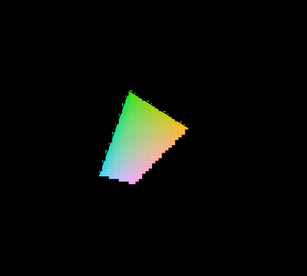
The comparison is taken at one luminance factor and one observer, and both of those decide how large the shortfall looks.
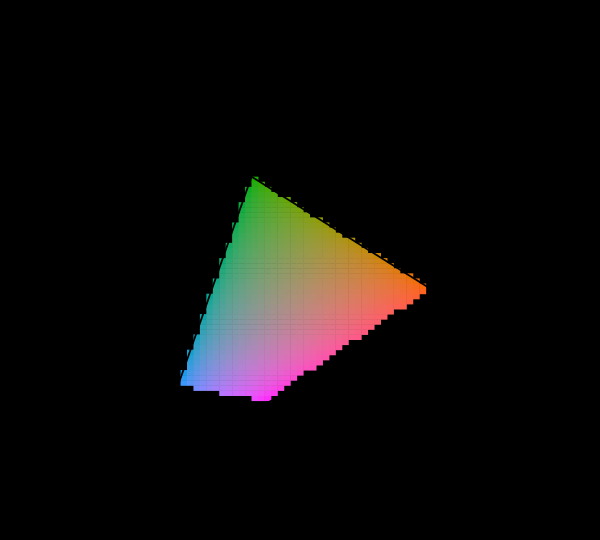
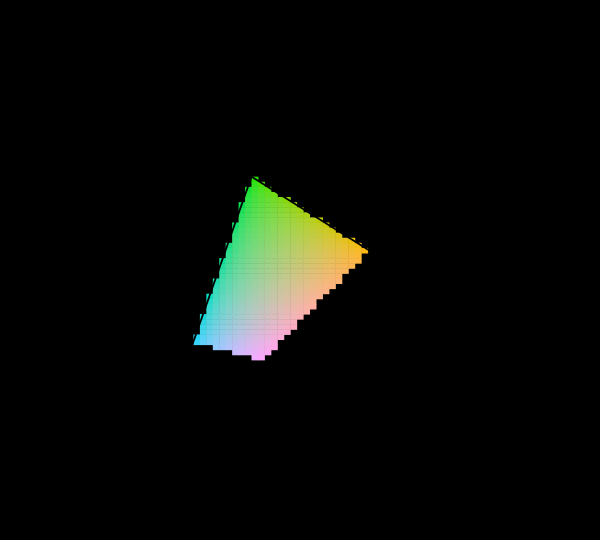
The two arguments can be moved together, and the corner of the square where both are extreme is where a coverage number is least meaningful.


The three standards in use
sRGB (1996) was defined to match the typical CRT of its era. It remains the default assumption for untagged web content, and its primaries are modest by current standards.
Display P3 (from the DCI-P3 cinema standard) keeps sRGB’s blue and pushes red and green outward, covering roughly a quarter more area. It arrived on consumer hardware around 2015 and is now common on phones and laptops.
Rec. 2020 is the ultra-high-definition television standard, and its primaries are dramatically wider. As the figure confirms by measurement, its red and green primaries lie on the spectral locus — which means they are monochromatic.
That last fact is the interesting one, because it converts a manufacturing question into a physical one. A primary on the locus is a single wavelength, so a display fully covering Rec. 2020 needs three lasers. Some exist. The overwhelming majority of displays sold as supporting the standard cover a fraction of it, and the standard is best understood as a container format that content can be encoded in rather than a description of hardware.
What widening costs
Extending the triangle is not free, and the costs are worth setting out because “wider is better” is the usual framing.
Precision. The same number of code values now spans a larger region, so each step is a bigger jump in colour. Eight bits per channel is marginal for sRGB and visibly insufficient for P3 — banding appears in gradients, particularly in dark blues where the eye is most sensitive to steps. Wide-gamut content essentially requires ten bits or more, which is why the transition to wider gamuts and the transition to higher bit depths happened together.
Compatibility. Content authored for a wide gamut and displayed on a narrow one must be converted, and content authored for a narrow gamut and displayed on a wide one must be left alone. Both require the content to be tagged and the pipeline to be managed. Where either fails, the classic symptom appears: sRGB content shown unmanaged on a P3 display, with everything oversaturated because the numbers were interpreted against the wrong primaries.
Nothing gained where nothing exists. A larger triangle helps only where the extra area contains colours worth having. The extension toward the green corner is enormous in diagram area and contains relatively few distinguishable colours, because that is exactly where discrimination is worst. Area on the chromaticity diagram is not a good measure of how much a gamut extension is worth.
What the precision costs, in units
Marginal for sRGB and visibly insufficient for P3 is a judgement, and it can be a number.
Taking the largest colour difference between two adjacent code values anywhere in the cube, at eight bits: 1.179 ΔE00 in sRGB, 1.392 in Display P3 and 1.706 in Rec. 2020. At ten bits the same quantity is 0.300, 0.355 and 0.438.
Three readings follow.
Eight bits is already over a unit in sRGB. A step of 1.179 is one a person can see side by side, which is the banding in dark gradients everybody has met — and it is there in the narrowest of the three gamuts, before any widening at all.
A wider gamut is a multiplier rather than a new failure. Rec. 2020 is 1.45 times sRGB on this measure and P3 is 1.18 times, and the worst step falls at the same place in all three: a dark near-neutral at about a thirteenth of full scale, in the green channel. Widening the primaries does not open a new region of trouble; it scales the one that was there.
And ten bits settles all three. Rec. 2020’s worst step at ten bits is 0.438 — still 45 per cent worse than sRGB’s, and comfortably under a unit everywhere. So the pairing of wide gamut with ten-bit encoding is not a coincidence of scheduling: eight bits fails on the narrowest gamut and ten succeeds on the widest, which leaves exactly one sensible place to put the boundary.
The green channel being the worst deserves its own sentence. Green carries most of the luminance in all three spaces, so a one-code change in green is the largest one-code change in lightness available — and lightness is what a difference formula weights most heavily near the neutral axis. The banding everybody sees in a dark gradient is a green-channel step wearing a grey’s clothes.
What gamut mapping actually does
When content contains a colour the display cannot reach, something must be substituted, and the choice of substitution is a real design decision with no correct answer.
Clipping sets each out-of-range channel to its limit. Cheap, and it destroys detail: everything beyond the boundary collapses onto it, so a gradient running out of gamut goes flat, and distinct colours become one colour.
Perceptual mapping compresses the whole gamut so out-of-range colours come inside and in-range colours also shift. Nothing collapses and everything changes slightly. This is the default for photographic content in most colour-managed pipelines.
Relative colorimetric mapping leaves in-range colours exactly alone and clips the rest. Better for content where specific colours must be exact — brand colours, spot colours — and it has the clipping problem for everything outside.
Saturation mapping preserves vividness at the expense of accuracy, intended for charts where distinctness matters more than fidelity.
Every one of these is a lossy transformation applied silently. A file specifying a colour outside the display’s gamut will produce something, and nothing in the interface indicates that a substitution took place. This is the same silence the chromaticity diagram exhibits, and it is why this site marks rather than maps.
That figure is the version of the problem most likely to be met in practice. Generating a palette by stepping around a hue circle at fixed lightness and chroma is standard and sensible-looking, and more than a third of these steps do not exist in sRGB. Whatever tool produced them returned something else.
Why not more primaries
Four, five and six-primary displays exist. They reach a polygon rather than a triangle, and a polygon inscribed in a convex curve does better than a triangle.
The obstacles are practical rather than fundamental:
Content has three channels. Every image format, every codec, every camera. Driving a six-primary display from three-channel content requires deciding how to distribute the signal, which is an underdetermined problem with no standard answer.
Cost and efficiency. More primaries means more emitters, more filters, more calibration, and generally lower efficiency.
Diminishing returns. Most content does not contain highly saturated colours. The gain is concentrated in a region of colour space that photographs, video and interfaces rarely visit.
And the limit remains. Any finite number of primaries reaches a polygon, and the locus is curved, so full coverage is unattainable with any finite set of non-monochromatic primaries. This is the geometric restatement of the negative lobes in the matching functions, and it is not going to be engineered away.
Print is a different problem
Everything above concerns additive mixing — emitters adding light. Print is subtractive: inks remove light from an illuminant, and the mathematics is entirely different.
The gamut of an ink set is not a triangle or any other simple shape. It is a lumpy volume determined by the inks’ spectra, how they overlay, the paper’s reflectance, and the illuminant used to view the result. Ink overlays are not linear — two inks together absorb differently from the sum of their separate absorptions — so the boundary has to be measured rather than derived.
Print gamuts are typically smaller than sRGB in the saturated blues and greens and larger in some yellows and oranges, which means the two gamuts intersect rather than nest. Neither can reproduce everything the other can, and converting between them loses something in both directions. This is why soft-proofing exists and why a print never quite matches a screen.
It also means a print gamut depends on the viewing light in a way a display gamut does not, since what a surface returns depends on what falls on it.
Where the extra area actually goes
Comparing gamuts by diagram area is convenient and misleading, and the reason is a result from elsewhere on this site.
So a gamut extension covering a large area in the greens buys less than the percentage suggests, and one extending toward the blues or the saturated reds buys more. Any comparison quoted as “covers 130 per cent of sRGB” is quoting an area in a space that is non-uniform by a factor of ten, and the number should be treated accordingly.
Volume comparisons in a perceptual space are better and are increasingly used, though they introduce their own choice of which space.
What sits outside every gamut
The colours no three-primary system reaches are not exotic. They cluster in specific, nameable regions.
Saturated cyans and turquoises. The largest single gap. The locus bulges out between the blue and green primaries and no triangle follows it, so vivid cyans are unreachable on every three-primary display.
Saturated violets. Near the short-wavelength end, and outside sRGB by a wide margin.
The most saturated greens. Reachable in P3 and Rec. 2020 to a degree, and never fully.
Anyone who has tried to reproduce a peacock feather, a tropical fish or certain fluorescent dyes has met the cyan gap directly. The reproduction is not slightly duller; it is a visibly different colour, because the substitution is large rather than marginal.
What was computed here
The three gamut triangles are computed from their published primary chromaticities, and their areas are measured rather than quoted — the assertion requires them to nest in the expected order, so a transposed primary would fail the build.
The claim that Rec. 2020’s red and green lie on the spectral locus is checked rather than repeated: the nearest point of the computed locus is found for each primary, and the distances come out at 0.003 and 0.007. A standard whose primaries were merely near the locus would fail that assertion at a tighter tolerance, and the numbers are quoted in the caption so the margin is visible.
The hue-circle figure walks Oklab at fixed lightness and chroma, converts each step to XYZ, and tests it. The count of reachable steps is asserted to be neither zero nor all thirty-six, since either would mean the gamut test had stopped discriminating.
The percentages quoted are areas on the CIE 1931 diagram, which is non-uniform by an order of magnitude, so they overstate the value of extensions toward the green corner and understate extensions toward the blue. Volume comparisons in a perceptual space are better and introduce their own choice of space.
Print, briefly
Everything above concerns additive mixing. Print is subtractive and the geometry is entirely different.
An ink set’s gamut is not a triangle or any simple shape. It is a lumpy volume determined by the inks’ spectra, how they overlay, the paper, and the light the result is viewed under — and ink overlays are not linear, so the boundary is measured rather than derived.
Print gamuts are typically smaller than sRGB in the saturated blues and greens and larger in some yellows and oranges, so the two intersect rather than nest. Neither reproduces everything the other can, conversion loses something in both directions, and a print never quite matches a screen for reasons that are structural rather than a failure of calibration.
A print gamut also depends on the viewing light in a way a display gamut does not, since what a surface returns depends on what falls on it.
The limit, restated
Three primaries reach a triangle; the locus is curved; a triangle inscribed in a convex curve touches at three points. More primaries give a polygon and the same conclusion.
What widening does not change
The shape of the problem. A wider gamut is a larger triangle inside the same curved region, and the gap that remains is the same kind of gap — largest in the cyans, present everywhere between the primaries, and closing only in the limit of monochromatic primaries.
So the progression from sRGB to P3 to Rec. 2020 is a quantitative improvement in a situation whose qualitative structure is fixed by geometry.
The honest summary for anyone choosing between standards: wider is better where the content contains saturated colours and worse where bit depth is constrained, and the difference matters far less than whether the pipeline is colour-managed at all. An sRGB image displayed correctly looks better than a P3 image displayed as though it were sRGB, and the second failure is considerably more common than the first opportunity.
One final observation about the direction of travel. Each widening of the gamut has been accompanied by a widening of the bit depth, and the two are not independent — a larger gamut spread over the same number of code values means coarser steps, so the second change is a precondition for the first rather than a coincidence of timing. Anyone evaluating a display specification should read the two numbers together, since a wide gamut at eight bits is a worse proposition than a narrow one.
It is worth closing on what the gap is not. It is not a failure of manufacturing, not a limitation waiting on better emitters, and not something a future standard will resolve. It is the consequence of building a colour system out of a small fixed number of primaries, and it was understood as such by Maxwell in the 1850s.
What has changed since is only the size of the triangle. The shape of the argument has not moved at all.
The cost does not go away in a better diagram
A fair objection to everything above is that the 1931 diagram exaggerates it. The diagram is famously non-uniform, it devotes an enormous share of its area to greens no observer can tell apart, and a fraction of area on a distorted map is a poor measure of anything.
The objection is correct and the CIE agreed with it in 1976. The replacement is a projective transformation of the same data: straight lines stay straight, so additive mixtures still lie on the line joining their endpoints and the gamut is still a triangle, but the area is redistributed and the green bulge is much reduced.
So the measurement can be repeated on the better map, and it should be. What it shows is that the fraction changes and the conclusion does not: most of what an observer can see is still outside the triangle, in either projection, at any luminance the comparison is made at.
That is worth having explicitly, because the usual defence of the sRGB gamut is precisely the objection above — that the missing region only looks large because the diagram is distorted. It does look larger than it is. It is also genuinely large, and the two facts are independent.
What the pictures cannot show
The obvious one, again: a page cannot demonstrate the benefit of a wider gamut on a display that does not have one. A reader on an sRGB screen sees the P3 and Rec. 2020 triangles as outlines around a hatched region, which is accurate and conveys nothing about what those colours look like.
The probe for the reader’s own display is the closest available substitute, and it can only report whether a difference exists rather than showing what the difference is.
Diagram area is also a poor proxy for value, and the figure inherits that flaw from the chromaticity diagram it is drawn on. The percentages quoted are areas in a non-uniform space, and a gamut extension covering a large area in the greens is worth less than the number suggests.
Who found it, and when
The triangle limitation was understood from Maxwell’s colour-mixing work in the 1850s, and is implicit in the CIE’s 1931 diagram. Nothing about it is recent or contested.
sRGB was standardised in 1999, DCI-P3 in 2007 for digital cinema, and Rec. 2020 in 2012. The consumer transition toward wider gamuts began around 2015 and remains incomplete, with the result that a great deal of current content is authored against sRGB and displayed on hardware that exceeds it.
Gamut mapping as a discipline grew out of the desktop publishing era, and the four rendering intents in the ICC specification date from the mid-1990s.
Where this goes next
The premise is most of this diagram cannot be shown. The reason three primaries can never suffice is why colour is exactly three-dimensional. And the question of which gamut the reader actually has is the display is an unknown.
Where this goes next
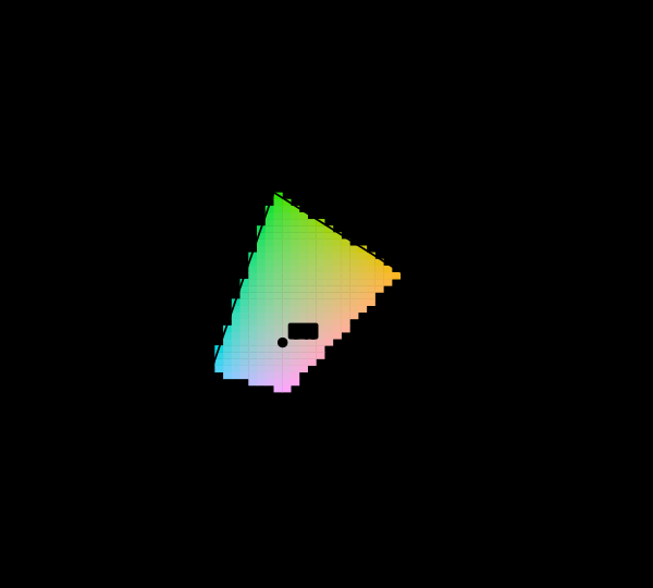 Most of this diagram cannot be shown
The chromaticity horseshoe is the canonical illustration of colour science, and nearly every printed copy is filled edge to edge with colours the page cannot produce. The honest version marks them, and the marking covers most of the picture.
Most of this diagram cannot be shown
The chromaticity horseshoe is the canonical illustration of colour science, and nearly every printed copy is filled edge to edge with colours the page cannot produce. The honest version marks them, and the marking covers most of the picture.
 Why colour is exactly three-dimensional
Matching every wavelength with three primaries requires, for some wavelengths, a negative amount of one of them. That physical awkwardness is why the colour-matching functions were transformed into XYZ, and why the horseshoe is curved.
Why colour is exactly three-dimensional
Matching every wavelength with three primaries requires, for some wavelengths, a negative amount of one of them. That physical awkwardness is why the colour-matching functions were transformed into XYZ, and why the horseshoe is curved.
 The display is an unknown
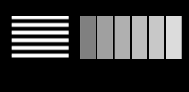
This site is displayed on the very apparatus it is about, and it knows almost nothing about that apparatus. Two figures here stop assuming and ask instead — a probe for the transfer function and a probe for the gamut.
The display is an unknown
This site is displayed on the very apparatus it is about, and it knows almost nothing about that apparatus. Two figures here stop assuming and ask instead — a probe for the transfer function and a probe for the gamut.
What this makes readable
Essays that name this one as a prerequisite.
Named alongside this one
Essays reaching for the same objects. Nobody chose these; they are what the index of named objects makes visible.
- A gamut has a population chromaticity · display gamut · display p3 · gamut · primaries
- Not every colour has a wavelength chromaticity · display gamut · gamut · primaries · spectral locus
- A primary is chosen for four things display p3 · gamut · primaries · spectral locus
- A tolerance in the wrong coordinates gamut · primaries · spectral locus
- One wavelength is everyone's colour display gamut · primaries · spectral locus
- Primaries chosen for their inverse chromaticity · display gamut · primaries
What links here
The 8 essays that link to this one and share the most of its objects, of 33 that link here.
The objects this essay names
Each one links to every other essay that touches it.
ChromaticityDisplay gamutDisplay P3GamutGamut mappingPrimariesRec. 2020Spectral locus