Matching is not appearance
Assumes Most of this diagram cannot be shown.
The CIE system answers one question, and answers it very well: given two lights, will an observer report that they match?
It does not answer the question everyone wants answered, which is what either of them looks like. The gap between those two is where most practical colour problems live, and the habit of treating a colorimetric value as a description of appearance is the single most productive source of confusion in the field.
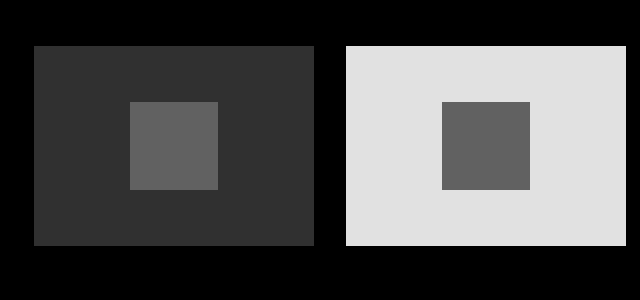
The demonstration has a dial in it, and turning it says what the effect depends on.

The level of the patches is the other dial, and moving it is what says the effect is not a statement about how much light they send.

Neither of those two dials has been driven to its end, and driving them further is what says the effect is not a small correction to a matching account.

What colorimetry was built for
The 1931 system was an industrial specification, and reading it as such explains most of its design.
The problem was that manufacturers needed to communicate colours without shipping physical samples, and needed to know whether a batch matched a standard. Both are matching questions. Whether the standard looked pleasant, or looked the same in a shop as in a warehouse, was outside the remit.
So the system was built to have exactly one property: two stimuli with the same XYZ match when viewed under identical conditions by the standard observer. That is a strong, testable, useful claim and it holds.
Every word of the qualification is doing work. Under identical conditions — same surround, same adaptation, same size, same background. The standard observer — an average over seventeen people, not any particular person. Match — appear the same when placed side by side, not appear the same in isolation.
The four things that change appearance without changing XYZ
Surround. The patch figure above. Identical stimulus, different neighbours, different lightness. The visual system reports something closer to a ratio than an absolute, and it does this for good reasons.
Adaptation state. A room lit by tungsten looks approximately white to somebody sitting in it and orange in a photograph. The stimulus is the same in both cases; what differs is what the observer’s visual system has normalised to.
Absolute luminance. Colours look more saturated and more contrasty as overall light level rises — the Hunt effect — and lighter colours gain contrast relative to dark ones as luminance increases, which is the Stevens effect. Neither is captured by XYZ, which is a relative quantity.
Size. A large patch and a small patch of identical stimulus do not look the same, which is why paint chips are notoriously misleading and why the CIE needed a ten-degree observer as well as a two-degree one.
None of these are failures of measurement. They are appearance phenomena, and the measurement never claimed to predict them.
The everyday version
The confusion shows up most often as three specific mistakes.
“These two greys have the same hex code, so they look the same.” Only if they have the same surround. Placed on different backgrounds they will not, and no amount of checking the code value will reveal it.
“The ΔE is under 1, so nobody can tell them apart.” ΔE thresholds are derived from side-by-side comparison under controlled conditions. Separated in space or time, or in different surrounds, much larger differences go unnoticed and much smaller ones become obvious.
“The colours are correct because the profile is correct.” Colour management ensures the stimulus is right. It has no control over the room, and a correctly managed image viewed under a tungsten lamp beside a window is being seen under conditions no profile knows about.
Where the boundary is drawn
Colour science handles this by having two layers, and being reasonably clear about which is which.
Colorimetry is the matching layer: XYZ, chromaticity, and the transformations of them. It is exact, it is standardised, and it is silent about appearance.
Colour appearance modelling is the layer above: CIECAM02, CIECAM16 and their relatives. These take a stimulus plus a specification of the viewing conditions — the adapting white, the background luminance, the surround type, the absolute luminance level — and predict appearance correlates such as lightness, chroma, colourfulness, hue and brightness.
The important structural point is that an appearance model needs inputs colorimetry does not. Feeding it a colour is not enough; it needs the situation. That is not a defect of the model, it is the content of the claim: appearance is a function of the whole viewing situation, so any model of it must take the situation as an argument.
This site’s foundation phase stopped at the colorimetric layer and said so. The expansion phase built the layer above it, so the figures here now come in two kinds and the difference between them is marked: a colorimetric figure takes a stimulus, and an appearance figure takes a stimulus and a viewing condition. The second kind carries the condition in its caption, because a prediction made without one would be the error this essay is about.
Where the two layers get confused in the standards
Two intermediate cases sit awkwardly between the layers and cause trouble in practice.
CIELAB is often described as perceptually uniform, which suggests it is an appearance space. It is not, quite. It incorporates a white point and a cube-root nonlinearity, so it carries some appearance-like structure, but it takes no account of surround, absolute luminance or background. It is best understood as a colorimetric space with a perceptual metric bolted on, and it is not very uniform anyway.
Colour difference formulae are fitted to perceptual judgements, so they are appearance-flavoured, and they inherit the viewing conditions of the experiments they were fitted to. A ΔE2000 value carries an implicit assumption of side-by-side comparison against a mid-grey background under a specified illuminant, and quoting it outside those conditions is quoting a number outside its domain.
Why this matters for design work
The practical upshot is that a colour cannot be specified in isolation and expected to behave.
A palette evaluated as a row of swatches is being evaluated in an arrangement it will never appear in. Swatches next to each other influence each other; the same swatches separated by white space do not. A palette that reads as well balanced in a strip can be badly unbalanced in use, and vice versa.
The same applies to accessibility checking. A contrast ratio is computed between a foreground and a background, which is correct as far as it goes — a ratio is exactly the kind of quantity the visual system cares about. But the ratio is computed from luminance, and the appearance also depends on what surrounds the pair, how large the text is, and the ambient light in the room. Meeting a ratio threshold is a necessary condition rather than a sufficient one.
This site’s own chrome is neutral for exactly this reason: any chroma in the page furniture would shift the appearance of every swatch, in a direction varying with position in the layout. That is enforced in the gate rather than left to discipline.
The failures in order of how much trouble they cause
Ranked by how often they cost somebody something.
Surround, in interface and print design. A grey specified by value will read lighter on a dark background than a light one. Any specification of the form “60% grey” fixes the stimulus and leaves the appearance open, which is why palettes have to be evaluated in the arrangement they will be used in rather than as a strip of swatches.
Adaptation, in photography and video. A camera records the stimulus; a person adapts. This is the entire reason white balance exists, and automatic white balance fails in exactly the situations the visual system’s own estimation fails in.
Size, in paint and materials. A colour chosen from a small chip looks different across a wall — generally more saturated and often lighter. The stimulus is identical and the appearance is not, which is why paint retailers sell large samples and why the CIE needed a ten-degree observer as well as a two-degree one.
Absolute level, in displays and print. Colours look more colourful and more contrasty as the light level rises. A design approved on a bright monitor will look flat in print under office lighting, and nothing in the colorimetry predicts it.
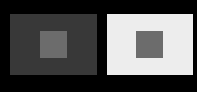
The effect does not depend on the patch being a mid grey, and it is worth checking against a much lighter one on a nearly-black and a nearly-white field.

What an appearance model needs that colorimetry does not
The structural point is worth stating precisely, because it explains why the two layers cannot be merged.
A colorimetric calculation takes a stimulus and returns coordinates. An appearance model takes a stimulus plus a specification of the viewing situation and returns appearance correlates. The extra arguments are the adapting white, the luminance of the background, the absolute luminance level, and a categorical description of the surround — average, dim or dark.
That is not a modelling inconvenience; it is the content of the claim. Appearance is a function of the situation, so a model of it must take the situation as input, and any system that returns an appearance from a colour alone has smuggled in an assumption about the situation.
CIECAM02 and CIECAM16 are the standard models. They are considerably more complicated than CIELAB, they require inputs nobody usually has, and they predict things colorimetry cannot touch — which is a reasonable summary of the trade.
What was computed here
The figures on this page are colorimetric. Every value is computed and asserted, and the identity claims are checked in code — the two patches in the hero figure are compared before drawing and a mismatch stops the build.
The appearance predictions are computed too, and by a different piece of machinery that takes different arguments. CIECAM16 is implemented here in full — forward, inverse, and checked against the published test vector to four significant figures in all six correlates — so where this essay says a surround shifts appearance it can now say by how much. What has not changed is the boundary: a figure that returns appearance correlates from a stimulus alone would be exactly the error this essay is about, so every one of them takes a viewing condition and prints it.
The neutrality of the page chrome is checked mechanically: every paper and ink token in the stylesheet is parsed and required to have equal red, green and blue channels. A token with any chroma in it fails the build.
The two-layer structure, stated once
It is worth writing down the division plainly, because most of the confusion in applied colour is a failure to notice which layer a question belongs to.
Colorimetry takes a stimulus and returns coordinates. It answers: will these two match, side by side, under identical conditions, for the standard observer? Exact, standardised, silent about appearance.
Appearance modelling takes a stimulus and a viewing situation and returns lightness, chroma, hue, colourfulness and brightness. It answers: what will this look like, here?
A question of the form “what colour is this” is a colorimetric question. A question of the form “will this look right” is an appearance question, and answering it from colorimetry alone requires assuming a viewing situation, usually without noticing that the assumption was made.
A dark patch on fields close to the ends is the last of the three settings, and it says the effect does not need a mid grey at all.
What this site does about it
Every figure names its observer, names its assumed display, and marks what cannot be shown. The appearance figures do one thing more: they name the room.
That is the visible form the two-layer structure takes here. A colorimetric figure’s caption ends with an observer, because that is the whole of what its claim depends on. An appearance figure’s ends with an adapting luminance, a background level and a surround category as well, because its claim depends on all of them and would be false stated without them. A reader can tell which layer a figure belongs to by reading its bottom-right corner.
The boundary has moved but it has not blurred. Building an appearance model does not make colorimetry an appearance model, and the commonest error in the field remains available in a new form: quoting a CIECAM16 lightness without the viewing condition it was computed under is the same mistake as quoting a CIELAB one and expecting it to describe appearance. The extra arguments are the content of the claim, and dropping them turns a prediction back into a number.
By how much, in the model’s own numbers
Saying that an appearance model can now say how much a surround shifts appearance is worth following with the amounts.
Surround. Take a mid grey — CIELAB L* 50 under D65 — and hand the identical stimulus to CIECAM16 in the three rooms the standard tabulates, at an adapting luminance of 100 and a background of 20. Its predicted lightness runs 39.74 in an average surround, 45.43 in a dim one and 49.55 in a dark one: the same light, a quarter lighter in the model’s own units, for no reason but the room. A dark yellow at L* 35 moves further, 26.08 to 35.96, which is thirty-eight per cent.
The direction is the one the standard’s exponent exists to produce. A darker surround compresses the lightness scale towards white, so a mid tone lifts and the range beneath it shrinks — which is the loss of perceived contrast that makes a print for a dark room need more contrast than a print for a lit one, arriving as a number instead of as a rule of thumb.
Chroma moves the other way and by less. The mid red’s chroma falls from 69.94 to 62.43 across those same three rooms and a light blue’s from 49.59 to 44.30 — about eleven per cent each. So on these stimuli the room’s effect on lightness is more than twice its effect on chroma.
Background. This is the model’s own version of the hero figure, and it is the closest an appearance model comes to the patch-on-a-patch demonstration. Holding the stimulus, the surround and the adapting luminance and moving only the background from 5 to 80 per cent, the mid grey’s predicted lightness runs from 44.23 to 32.08 — a spread of 12.15 units, a quarter of where it started. The mid red’s spread is 12.10, the same to three figures: the background’s effect on lightness barely depends on what colour the patch is.
Absolute level. The Hunt effect has a size as well. That same mid red at adapting luminances of 1, 10, 100, 1,000 and 10,000 candelas per square metre has a colourfulness of 44.1, 53.8, 66.0, 80.5 and 97.5 — a factor of 2.2 across four decades — while its brightness runs 60 to 405, a factor of 6.8. Colourfulness therefore rises with light level about as its cube root and brightness about as its square root, and neither is anywhere in a tristimulus value.
What those numbers are and are not
Every figure above is a model output rather than a measurement, and the distinction is the one this essay is about, moved one layer up.
CIECAM16’s correlates are fitted to visual data, and its surround categories are three tabulated triples — an F, a c and an Nc — rather than descriptions of rooms. Moving from average to dim changes c from 0.69 to 0.59, and that single change is the whole of the twenty-five per cent above. So the number is exact given the category, and the category is a judgement: a real room is not average, dim or dark. It is somewhere, and deciding which word to write down is an act with a quarter of the lightness scale attached to it.
That is the boundary restated at its new position. Colorimetry needed an observer; appearance modelling needs an observer and a room, and the room arrives as one of three words. Nothing in this collection chooses the word, and nothing in the standard says how.
And a patch dark enough to be near the bottom of the display’s range behaves the same way, which is what makes this a property of the surround rather than of any particular grey.

One more layer down
It is worth noting that even the matching layer is not simple. Discrimination varies enormously across the space, so “will these match” has a threshold that depends on where in the space the question is asked.
The practical test for which layer a question belongs to is short: does the answer change if the surroundings change? If yes, it is an appearance question and colorimetry alone cannot settle it. If no, colorimetry is sufficient and is exact. Most of the questions people actually want answered — will this look right, do these go together, is this readable — turn out to be in the first category, which explains why colorimetry so often disappoints the people using it.
What the pictures cannot show
The central limitation is unavoidable. Demonstrating that appearance depends on viewing conditions requires controlling the viewing conditions, and this page has control over exactly none of them. The reader’s screen brightness, ambient light, and distance are all unknown and all affect how strong every effect here appears.
There is also a self-referential problem. The figures are trying to show that identical stimuli look different, and they are doing so by presenting stimuli whose identity is guaranteed only in the file. What arrives at the reader’s eye has passed through a display with its own transfer function and its own uniformity errors, and a screen with a brightness gradient across it will make two identical patches genuinely different at the eye.
Nothing on this site can rule that out, and it is one of the reasons the display is treated as an unknown rather than as a specification.
Who found it, and when
The distinction is old. Hering argued in the nineteenth century that colour appearance depends on context in ways that a receptor-level account could not capture, against Helmholtz’s more reductive position, and both turned out to be describing real stages.
The CIE was explicit from the start that its system was a matching specification. The drift toward reading it as an appearance model happened later and largely outside colour science, as colorimetric values entered computing and design through file formats and colour pickers, where the qualifications did not travel with them.
CIECAM97s appeared in 1997 as the first widely adopted appearance model, revised as CIECAM02 and again as CIECAM16. Robert Hunt and Mark Fairchild are the names most associated with establishing appearance modelling as a distinct layer, and Fairchild’s Color Appearance Models remains the standard treatment.
Where this goes next
The mechanism behind the surround effects is these two patches are identical and brightness is inferred from edges. The adaptation half is constancy is the default. And for the metric that sits awkwardly between the two layers, how far apart are two colours.
Where this goes next
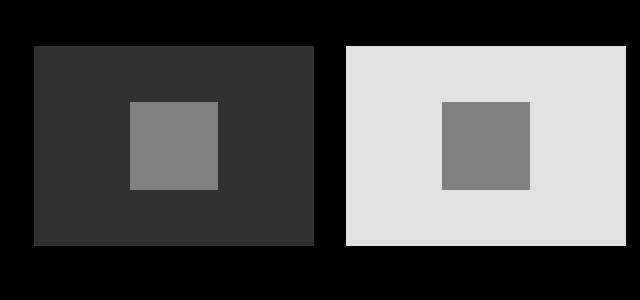 These two patches are identical
It is the most repeated and least checkable sentence in visual perception, because the whole point is that it does not look true. Every instance here is computed, and checked before the figure is drawn.
These two patches are identical
It is the most repeated and least checkable sentence in visual perception, because the whole point is that it does not look true. Every instance here is computed, and checked before the figure is drawn.
 Constancy is the default
A sheet of paper looks white in daylight and white under a tungsten lamp, although the light reaching the eye differs enormously. The visual system is solving one equation with two unknowns, and it solves it by assumption.
Constancy is the default
A sheet of paper looks white in daylight and white under a tungsten lamp, although the light reaching the eye differs enormously. The visual system is solving one equation with two unknowns, and it solves it by assumption.
 How far apart are two colours
ΔE is meant to be a distance with the property that the same number means the same perceived difference everywhere. Three successive formulae have tried, they disagree with each other by more than a just-noticeable difference, and the disagreement decides real matching questions.
How far apart are two colours
ΔE is meant to be a distance with the property that the same number means the same perceived difference everywhere. Three successive formulae have tried, they disagree with each other by more than a just-noticeable difference, and the disagreement decides real matching questions.
What this makes readable
Essays that name this one as a prerequisite.
Named alongside this one
Essays reaching for the same objects. Nobody chose these; they are what the index of named objects makes visible.
- A display in a room is a smaller display adaptation · ciecam16 · colour appearance · surround · viewing condition
- A gain has a time constant adaptation · ciecam16 · colour appearance · surround · viewing condition
- The gamut shrinks in the dark adaptation · ciecam16 · colour appearance · surround · viewing condition
- The surround is three rows of a table adaptation · ciecam16 · lightness · surround · viewing condition
- There is no brown light ciecam16 · colour appearance · lightness · surround · viewing condition
- Two rooms with one lightness scale ciecam16 · colour appearance · lightness · surround · viewing condition
What links here
The 8 essays that link to this one and share the most of its objects, of 41 that link here.
The objects this essay names
Each one links to every other essay that touches it.
AdaptationCIECAM16ColorimetryColour appearanceLightnessStandard observerSurroundViewing conditionXYZ