MacAdam measured it
Assumes How far apart are two colours.
In the late 1930s David MacAdam sat a single observer in front of a colorimeter and asked, for each of twenty-five reference colours, how far a second colour had to move before the difference became detectable. He repeated each setting enough times to get a standard deviation, and he did it in every direction.
The results are ellipses, they are on every serious discussion of colour spaces since, and they are the reason the chromaticity diagram cannot be used to measure anything.

The magnification is a drawing choice and it is worth seeing what it hides.

Going the other way makes the shapes legible at the cost of the impression, and it is the shapes that every space since has been built to argue with.

The diagram they are drawn on is a choice as well, and changing the observer changes the diagram without touching a single measurement.

Two more readings say that neither the magnification nor the observer changes the fact the field has been arguing with for eighty years.


What the picture says
Two things, and both are damaging to the diagram they are drawn on.
They are not circles. Discrimination is directionally dependent — a step of a given size in one direction is detectable while the same step at right angles is not. Most of the ellipses are elongated by a factor of two to four, and some more.
They are not the same size. This is the worse problem. The largest, in the green region, has roughly eighty times the area of the smallest, in the blue. A step of in and is a large, obvious change near the blue corner and an invisible one in the greens.
The consequence is that Euclidean distance on the chromaticity diagram is not a measure of anything perceptual. Two pairs of colours the same distance apart on the plot can be one obviously different and one indistinguishable. Any statement of the form “these colours are close together on the diagram” is, on its own, meaningless.
What the diagram’s shape hides
This also disposes of a common misreading of the horseshoe. The green region occupies a very large share of the diagram’s area, which invites the idea that human vision is somehow richest in green.
It is the opposite. The green region is large and its ellipses are the largest, which means it contains rather few distinguishable colours for its size. The blue corner is small and its ellipses are tiny, so it packs many distinguishable colours into little area. The apparent prominence of green is an artefact of the projection, and the projection was chosen in 1931 for computational convenience rather than for perceptual fidelity.
Where the eighty-fold variation lives
Largest in the green, smallest in the blue names two corners, and the twenty-five between them have a simpler structure than that suggests.
Ranking the ellipses by area and by position: the areas correlate with y at a Spearman coefficient of 0.904 and with x at −0.021. The variation is essentially one-dimensional. An ellipse’s size is set by how high on the diagram it sits, and is indifferent to where it sits across it.
The smallest, at (0.16, 0.06), has an area of 9.3 × 10⁻⁵; the largest, at (0.15, 0.68), has 6.9 × 10⁻³ — and those two share very nearly the same x. The eighty-fold range is a vertical gradient rather than a spread across a plane.
The distribution has one outlier, and it is at the bottom. Sorted and written as multiples of the smallest, the twenty-five run 1.0, 4.1, 4.2, 4.4, 5.8 and onwards to 44.8 and 74.2. The second-smallest is already four times the smallest, so excluding that one point the range is 4.1 to 74.2, a ratio of eighteen rather than seventy-four. The largest is 7.7 times the median and the median 9.7 times the smallest, which is a balanced spread with one point hanging below it.
And the two defects are correlated, in the direction that makes things worse. Elongation runs from 2.00 to 5.00 with a mean of 2.95, and it correlates with area at −0.348: the smaller ellipses are the more elongated ones. So the blue corner is not simply where a step of 0.01 is most visible. It is also where how visible a step is depends most on which way the step is taken.
Fixing it: two strategies
Everything since has been an attempt to deal with this, and the attempts fall into two camps.
Fix the space. Transform the coordinates so that the ellipses become more nearly circular and more nearly equal, then use plain Euclidean distance. CIELUV (1976), CIELAB (1976) and Oklab (2020) are all of this kind.
Fix the metric. Keep the space and weight the distance according to where in the space it is being measured. ΔE94 and ΔE2000 are of this kind, and they are what most industrial practice uses.
The second approach is an admission that the first did not fully succeed. If CIELAB were uniform, ΔE76 — plain Euclidean distance in it — would have been sufficient, and the CIE would not have issued two replacements.
Measuring how far the fixes got
The claim that a space is more uniform than another is testable, and the ellipses are the instrument. Transform each ellipse’s boundary into the candidate space, measure the distance from the transformed centre to each boundary point, and two numbers come out:
Anisotropy — the mean ratio of longest to shortest radius per ellipse. A perfect space gives 1, meaning every discrimination contour is a circle.
Spread — the largest mean radius across the twenty-five, divided by the smallest. A perfect space gives 1, meaning a step of a given size means the same thing everywhere.
Both are ratios, which matters: Lab, Luv and Oklab have natural magnitudes differing by more than an order of magnitude, so any absolute distance would just be measuring the scaling.
The measured result:
| space | spread | anisotropy |
|---|---|---|
| CIE 1931 xy | 10.42 | 2.95 |
| CIELAB | 3.24 | 3.42 |
| CIELUV | 2.21 | 2.37 |
| Oklab | 2.57 | 2.27 |
Three things in that table are worth dwelling on.
The perceptual spaces are a large improvement on raw chromaticity. Spread falls from 10.4 to between 2.2 and 3.2. This is real and is the reason the 1976 spaces exist.
None of them is uniform. A perfectly uniform space scores 1 on both columns. The best result here is 2.21, meaning a step of fixed size still means twice as much in one place as another. That residual non-uniformity is exactly what ΔE94 and ΔE2000 were built to patch.
CIELAB fixes the spread far better than the shape. Its spread improves from 10.4 to 3.2, while its anisotropy actually gets worse than raw chromaticity — 3.42 against 2.95. CIELAB equalises how big the ellipses are much more successfully than it makes them round.
That last finding is not one this site expected to produce, and it explains something about the ΔE2000 formula. Its most awkward features are the chroma and hue weighting terms and , which scale differences by where in the space they occur. Those terms are compensating for precisely this: shape errors that CIELAB left behind.
What is being quoted and what is being computed
The ellipse parameters themselves are quoted, and this is a case where quoting is correct. They are measurements — twenty-five centres with axis lengths and orientations, from an experiment nobody is going to repeat. This site’s rule is that measurements should be quoted and derivable results should not, and MacAdam’s table is squarely the first kind.
Everything downstream is computed. The transformation into each space, the radii, the anisotropy, the spread, the ranking — all done at build time from the ellipse parameters and the conversion functions, so the table above cannot drift out of agreement with the figures.
The experiment’s limits, which are real
MacAdam’s data is foundational and it is also narrow, and the caveats are usually omitted.
One observer. The published ellipses come from a single subject, identified as PGN. Later work with more observers found the general pattern holds and the details vary substantially between people.
One luminance, one surround. The measurements were made at fixed luminance against a uniform surround. Discrimination changes with both, so the ellipses are a slice through a situation with more dimensions than the diagram shows.
Threshold, not suprathreshold. They measure the smallest detectable difference. Whether differences ten times the threshold are judged proportionally is a separate question, and the evidence is that they are not — which is why colour-difference formulae for industrial tolerance are fitted to suprathreshold judgements rather than to MacAdam’s data.
Chromaticity only. Lightness differences were not part of the experiment, and lightness is where a good deal of practical colour difference lives.
So the ellipses are the right instrument for the specific question of whether a chromaticity space is uniform, and are not a general model of colour discrimination.
Reading the numbers back into practice
The uniformity measurement has consequences that show up well outside colour science.
A gradient stepped uniformly in will not look uniform. The steps will be invisible in the greens and obvious in the blues, which is the spread ratio of ten appearing directly. Generating a gradient in a perceptual space instead reduces the ratio to about two, which is not perfect and is five times better.
A tolerance specified in means different things in different places. Industrial standards do not specify tolerances that way, and the reason is exactly this measurement.
A palette spaced evenly on the chromaticity diagram will be badly unbalanced. Some pairs will be barely distinguishable and others obviously different.
What the ellipses do not measure
Four limits, all of them reasons not to over-read the numbers.
They are chromaticity only. Lightness differences were not part of the experiment, and a great deal of practical colour difference is lightness. A space could score perfectly on this measurement and still be badly non-uniform in lightness.
They are threshold measurements. Whether a difference ten times the threshold is judged ten times as large is a separate question, and the evidence says no. Colour-difference formulae for industrial tolerance are fitted to suprathreshold judgements rather than to MacAdam’s data, which is why ΔE2000 is not simply a metric derived from these ellipses.
One observer, one condition. A single subject, at one luminance, against one surround. Later work confirms the general pattern and finds substantial individual variation.
Discrimination is not appearance. These measure the smallest detectable difference, which is a different question from how different two clearly different colours look. The distinction runs through the whole subject.
What was computed here
The uniformity measurement transforms each ellipse boundary at sixty-four points, at a stated luminance, and records the extreme and mean radii in the target space. The two summary ratios are computed from those.
The check that keeps the measurement honest is a ranking assertion: raw chromaticity must come out less uniform than CIELAB, and its spread must exceed five. MacAdam’s entire result is that is badly non-uniform, so a measurement that failed to reproduce that would be measuring nothing, and the gate would catch it before any figure was drawn.
The ellipses are also drawn magnified, which the caption states, because at true scale they would be sub-pixel. The magnification is a stated parameter rather than a fudge, and the areas quoted are computed from the unmagnified parameters.
The magnification is a stated parameter rather than an adjustment: the areas quoted in the text are computed from the unmagnified table, and only the drawing is scaled. At true scale the whole set of twenty-five would be close to invisible, which is itself the most striking fact about human chromatic discrimination.
What the residual non-uniformity looks like
The summary numbers compress twenty-five measurements into two, so it is worth seeing the distribution.
The spread within a space matters as much as the spread between spaces. A space with a good average and a few very bad regions will behave unpredictably, and the bad regions are typically the saturated blues — which is exactly where CIELAB’s known hue-linearity failure lives and exactly what the ΔE2000 rotation term addresses.
What replaced the diagram
The direct descendant of MacAdam’s critique is the CIE 1976 diagram, which is a projective transformation of chosen to make the ellipses more nearly equal.
It is a genuine improvement and it is still a chromaticity diagram, so it inherits the deeper problem: it discards luminance, and discrimination depends on luminance. Any two-dimensional diagram is a slice, and the ellipses on it are the ellipses at one luminance.
That is the reason the modern answer is a three-dimensional space rather than a better diagram. CIELAB, CIELUV and Oklab all carry lightness as a coordinate, and none of them can be drawn as a plane without the same loss. The horseshoe survives in textbooks because it is a good picture of mixing, which it genuinely is, and it has not been a good picture of difference since 1942.
The through-line
MacAdam measured a defect in 1942. Every colour space and every difference formula since is a response to it, and none has removed it.
The experiment also stands as a model of how to settle an argument about a colour space. The claim “this space is perceptually uniform” is not a matter of taste or of design intent; it is a prediction about discrimination contours, and discrimination contours can be measured. Any new space arriving with a uniformity claim can be put through exactly this procedure, which is what makes the comparison on this page a measurement rather than a preference.
The historical shape of this is worth noticing too. A coordinate system was adopted in 1931 for computational convenience, a defect in it was measured in 1942, and the field has spent the eighty years since building corrections rather than replacing the foundation. That is not obviously the wrong choice — replacement would have invalidated the accumulated record — and it does mean the complexity of modern colour difference is inherited rather than intrinsic.
At true scale most of these ellipses are thinner than a printed line, so the magnification is a choice and it is worth seeing what a larger one shows.

The ellipses in the diagram built to fix them
The 1976 diagram exists because of these ellipses. It is a projective transformation of chromaticity chosen to make them more nearly equal, and the obvious thing to do with the data is to run the same measurement on the new map and see how far it got.
Two things are worth taking from the comparison, and they pull in opposite directions.
The improvement is genuine and substantial, and the diagram deserves more use than it gets. Almost every chromaticity plot published today is still the 1931 one, half a century after its own committee replaced it, largely because the 1931 shape is the one everybody recognises.
And the name promises more than the measurement delivers. “Uniform chromaticity scale” describes an intention. What the ellipses report is a diagram substantially less distorted than its predecessor and still a long way from the thing its name claims, which is the same conclusion the essay above reaches about CIELAB and by exactly the same method: take the space’s advertised property, find the data that tests it, and print the number.
The pattern is worth naming because it recurs throughout the subject. Every perceptually uniform space is a fit, every fit has a residual, and the residual is almost never quoted beside the claim.
What the pictures cannot show
The ellipses are drawn on a diagram whose colours are mostly unavailable, so the region where they are largest — the greens — is largely hatched. That is unavoidable and mildly ironic: the part of the diagram whose colours are hardest to display is also the part where discrimination is worst.
The magnification also makes them look like large regions when they are the opposite. At true scale the entire set would be almost invisible, which is the fact worth carrying away: human chromatic discrimination is extremely fine, and the diagram is enormous compared to any step anyone can see.
And a transformed ellipse is not shown as a shape anywhere here. The uniformity figures report the radii statistically rather than drawing the transformed contours, because the transformed shapes live in three dimensions and projecting them back to a plane would reintroduce exactly the kind of distortion being measured.
Who found it, and when
MacAdam published the ellipses in 1942, working at Kodak. The experiment was extraordinarily laborious — thousands of individual settings — and its conclusion was immediate and unwelcome: the coordinate system the CIE had adopted eleven years earlier was not fit for measuring differences.
Judd had already proposed uniform-chromaticity transformations in the 1930s, and the CIE adopted the UCS diagram in 1960 and the diagram and CIELAB in 1976. ΔE94 arrived in 1994 and CIEDE2000 in 2001, each patching residual errors in the previous.
Björn Ottosson’s Oklab, published in 2020, was fitted with attention to hue linearity specifically — CIELAB’s worst-known failure is that blues shift toward purple as they darken — and the measurement above suggests it succeeded on shape while not improving on CIELUV for spread.
Where this goes next
The formulae built to patch these residuals are how far apart are two colours. The diagram the ellipses are drawn on is most of this diagram cannot be shown. And the other place non-linearity bites is the midpoint is not half.
Where this goes next
 How far apart are two colours
ΔE is meant to be a distance with the property that the same number means the same perceived difference everywhere. Three successive formulae have tried, they disagree with each other by more than a just-noticeable difference, and the disagreement decides real matching questions.
How far apart are two colours
ΔE is meant to be a distance with the property that the same number means the same perceived difference everywhere. Three successive formulae have tried, they disagree with each other by more than a just-noticeable difference, and the disagreement decides real matching questions.
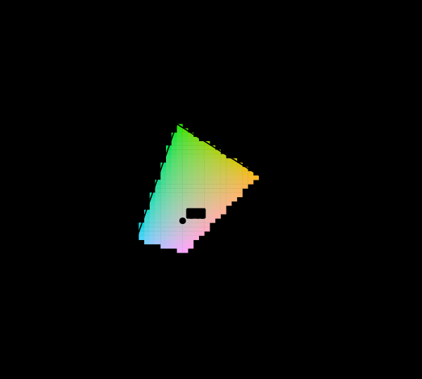 Most of this diagram cannot be shown
The chromaticity horseshoe is the canonical illustration of colour science, and nearly every printed copy is filled edge to edge with colours the page cannot produce. The honest version marks them, and the marking covers most of the picture.
Most of this diagram cannot be shown
The chromaticity horseshoe is the canonical illustration of colour science, and nearly every printed copy is filled edge to edge with colours the page cannot produce. The honest version marks them, and the marking covers most of the picture.
 The midpoint is not half
Code 128 sits halfway along the sRGB scale and carries about a fifth of white's luminance. Half the luminance is code 188. Almost every gradient, blur and resize on the web gets this wrong, and the errors are visible once known.
The midpoint is not half
Code 128 sits halfway along the sRGB scale and carries about a fifth of white's luminance. Half the luminance is code 188. Almost every gradient, blur and resize on the web gets this wrong, and the errors are visible once known.
What this makes readable
Essays that name this one as a prerequisite.
Named alongside this one
Essays reaching for the same objects. Nobody chose these; they are what the index of named objects makes visible.
- Which of two is worse cielab · δe · just-noticeable difference · macadam's ellipses · perceptual uniformity · threshold · tolerance
- A difference has no place cielab · δe · just-noticeable difference · threshold · tolerance
- A difference needs a basis too cielab · δe · macadam's ellipses · oklab · perceptual uniformity
- A name is not a threshold δe · just-noticeable difference · perceptual uniformity · threshold · tolerance
- No diagram makes them circles cielab · δe · just-noticeable difference · macadam's ellipses · perceptual uniformity
- A difference is not a distance cielab · δe · perceptual uniformity · tolerance
What links here
The 8 essays that link to this one and share the most of its objects, of 34 that link here.
The objects this essay names
Each one links to every other essay that touches it.
ChromaticityCIELABΔEJust-noticeable differenceMacAdam's ellipsesOklabPerceptual uniformityThresholdTolerance