The midpoint is not half
Assumes How far apart are two colours.
The number stored in an image file is not proportional to the light the display emits. The relationship is a curve, the curve is steep near black, and the consequence is that a great deal of routine colour arithmetic is performed in the wrong space and produces visibly wrong results.
Why the curve exists
Two reasons, and only one of them is usually given.
The historical reason is the cathode-ray tube. Beam current in a CRT varied with grid voltage as roughly a 2.2 power law, so encoding image data with the inverse curve meant the display’s own physics undid the encoding and the system was linear end to end. That is a coincidence of hardware, and it is the explanation most often offered.
The better reason is that it would have been worth doing anyway. Perceived lightness is not proportional to luminance — it follows something close to a cube root, which is why CIELAB has a cube root in it. A code space that is roughly perceptually uniform makes the best use of a limited number of levels, putting more of them where the eye can tell them apart. With eight bits per channel, linear encoding would show obvious banding in the darks while wasting codes in the highlights.
So the curve survives the technology that motivated it, and would have been reinvented if CRTs had never existed.
It is not gamma 2.2
The sRGB transfer function is piecewise: a short linear segment near black, then a 2.4 power law with an offset.

The linear toe exists because a pure power law has an infinite derivative at zero, which quantises badly in the darkest few codes and amplifies sensor noise. The 2.4 exponent combined with the offset gives a curve whose overall shape approximates a 2.2 power law, which is where the persistent confusion comes from.
The approximation is close but not equal, and the difference is largest in the shadows — exactly where the eye is most sensitive to differences and where banding shows first. Treating sRGB as a 2.2 power law is a common shortcut and it is wrong; the figure above plots both so the gap is visible.
What goes wrong: blending
The commonest practical consequence is that gradients, blurs, resizes and alpha compositing are almost always performed on code values, and code values are not proportional to light.
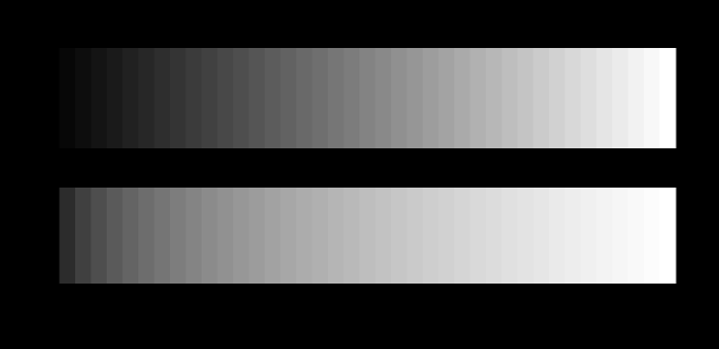
A neutral pair is the clearest case and the least interesting one, because both routes stay on the neutral axis and only the spacing differs. A coloured pair moves the hue as well.
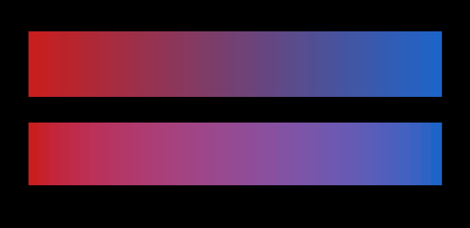
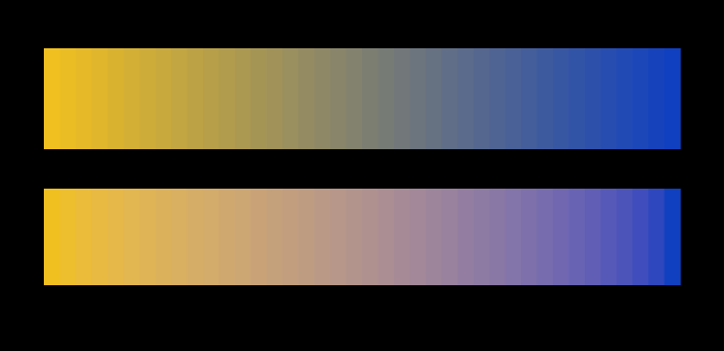
None of that is an artefact of how finely the ramp is sampled, which is worth showing rather than asserting, since a gradient drawn in twelve steps and one drawn in twenty-four are the same claim about the same path.
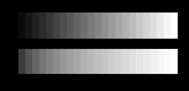
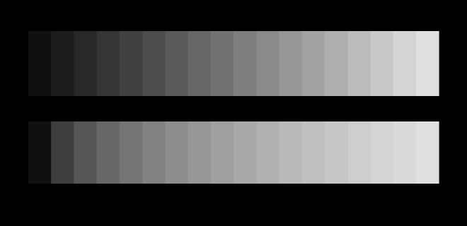
Averaging two code values does not average the light. Halfway between black and white in code space is code 128, which is a fifth of the light rather than half, so the whole middle of a naive gradient is too dark. The effect is strongest with high-contrast endpoints and is most obvious in black-to-white ramps.
The same arithmetic is inside every operation that averages pixels:
Resizing an image averages neighbouring pixels. Done on code values, a fine black-and-white pattern averages to something much darker than the pattern actually is. This is why a scaled-down checkerboard often darkens noticeably in tools that do not linearise first.
Blurring is a weighted average and has the same problem — the bright parts of a blurred highlight lose more energy than they should.
Alpha compositing at fifty per cent opacity should mix the light equally, and on code values it does not.
Antialiasing a light glyph on a dark background is where this is most visible in practice: text rendered without linearisation looks thinner and lighter than the same text on inverted colours, because the partial-coverage pixels are computed in the wrong space.
The fix in every case is to convert to linear light, do the arithmetic, and convert back. The cost is two function calls per channel, and the reason it is often skipped is that the results are wrong in a way that looks like a plausible aesthetic choice rather than like a bug.
A measurement the reader can make
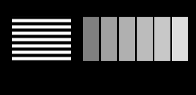
The transfer function of a real display can be checked without instruments.
The logic is that a pattern of equal black and white areas carries exactly half the luminance of white, whatever the transfer function does, because it is half white and half nothing. Finding the uniform grey that matches it therefore locates the half-luminance code directly.
A display behaving as sRGB specifies will match near 188. A match near 128 would indicate a linear display, which essentially none are. A match somewhere else indicates a transfer function that is neither, which is common enough — and is one of the few things about a reader’s hardware that this site can actually ask about.
What “relative luminance” means, and where it comes from
The vertical axis in the hero figure is relative luminance: light emitted relative to white, computed by linearising each channel and combining them with the coefficients
Those three numbers are not arbitrary and are not a design choice. They are the middle row of the matrix taking linear sRGB to XYZ, and that row is the colour-matching function — which is by construction the luminous efficiency function. Green dominates because the eye is far more sensitive there; blue contributes almost nothing to brightness, which is why blue text on black is hard to read and why the blue channel can be compressed harder than the others without visible loss.
This is the quantity behind accessibility contrast ratios, and the reason a contrast checker sometimes disagrees with intuition: it is comparing light, and intuition is comparing appearance.
Where the confusion is worst
Three specific claims that circulate and are wrong:
“Gamma is a display defect that modern screens have fixed.” No. It is an encoding, it is part of the sRGB specification, and every modern display implements it deliberately. A display that did not would show severe banding in the shadows.
“50% grey is #808080.” Only if “50%” means the code value. As a luminance it is #BCBCBC, and as a perceptual midpoint it is somewhere between the two, near L* = 50 in CIELAB, which lands close to code 119. Three different midpoints, all defensible, all different, and the word “50% grey” does not say which.
“Working in linear light is always correct.” Not for everything. Linear light is correct for anything that models the physics of light — blending, blurring, compositing, resizing. It is wrong for anything meant to be perceptually uniform, such as choosing evenly spaced steps in a palette, where a perceptual space is the right choice. The question is always which quantity the operation is supposed to be averaging.
Three midpoints, all defensible
The phrase “50% grey” has at least three meanings, and they are far apart.
Half the code value is #808080, code 128. This is what most tools produce and it carries 21.6 per cent of white’s luminance.
Half the luminance is code 188. This is the physically correct midpoint, and it is what a black-and-white dither averages to.
Half the perceptual lightness is in CIELAB, which lands near code 119 — slightly darker than the code midpoint, because the perceptual scale is closer to a cube root than to the transfer function’s power law.
Three answers, all correct, all different, and the phrase does not say which is meant. Any specification using it is ambiguous by a factor of more than two in luminance.
Where the linearisation belongs
The rule that resolves most practical questions is to ask what the operation is supposed to be averaging.
Averaging light — blending, blurring, resizing, compositing, antialiasing — must be done in linear light. These operations model what happens when photons from several sources arrive together, and photons add linearly.
Spacing perceptually — generating palette steps, choosing tick colours, building a sequential colour scale — should be done in a perceptual space. Here the goal is equal apparent steps, and linear light would bunch everything at the dark end.
Delivering to a device happens in the device space with its own transfer function, at the end.
Getting the first two the wrong way round is common and produces characteristic results: gradients that are too dark in the middle when linearisation was skipped, and palettes bunched at one end when it was applied where a perceptual space was wanted.
The accessibility connection
Contrast ratios for accessibility are computed from relative luminance, using the same linearisation and the same 0.2126 / 0.7152 / 0.0722 weighting.
This explains a result that often surprises people: two colours can look very different and have a poor contrast ratio. A saturated blue and a saturated red are far apart in hue and close in luminance, so they are a bad foreground-background pair despite being obviously distinguishable. Conversely two similar hues at different lightnesses can pass easily.
The ratio is measuring light, and legibility depends far more on luminance difference than on chromatic difference — the same asymmetry that makes a red-green encoding fail for a substantial fraction of readers while remaining perfectly legible.
What was computed here
The transfer function is implemented piecewise exactly as specified, and the round trip through it and back is asserted to return where it started to within — an inverted exponent or a dropped offset produces plausible pictures and fails here.
The two headline numbers are computed rather than quoted: linearising code 128 gives 0.2140, and inverting a luminance of 0.5 gives code 188. The gradient figure asserts that the naive midpoint is at least 1.7 times darker than the correct one, so a build in which the linearisation had been accidentally removed would fail rather than silently produce two identical ramps.
The luminance coefficients are checked against the matrix they come from rather than typed in: the middle row of the derived sRGB-to-XYZ matrix must equal 0.2126, 0.7152, 0.0722, and sRGB white must have exactly.
Where the encoding is going
Eight-bit sRGB is not the end of the story, and the successor formats change the terms.
High dynamic range encodings use transfer functions designed from perceptual data rather than from display physics — the PQ curve is fitted to contrast-sensitivity measurements, and HLG is designed to degrade gracefully on standard-range displays. Both encode absolute luminance rather than relative, which changes what a code value means: in sRGB the maximum is “as bright as the display goes”, and in PQ it is a specific number of candelas per square metre.
That is a genuine improvement in specification and it makes the assumptions harder to ignore rather than easier. A value that names an absolute luminance has to be reconciled with a display that may not reach it, which is another instance of the gamut problem in a different dimension.
The two axes together
The transfer function decides how much light a number means. The gamut decides which colours the numbers can name. Both have to be specified before three integers describe anything.
The practical habit is to ask, before any arithmetic on colour values, what is being averaged. If the answer is light, linearise first. If the answer is appearance, use a perceptual space. If the answer is unclear, the operation probably has not been thought through — and the resulting error will look like a stylistic choice rather than like a bug, which is what makes this class of mistake so persistent.
A fourth midpoint, and it depends on the room
Three midpoints were defensible above: half the code value, half the luminance, and half the lightness. There is a fourth, and it is the only one that takes account of where the reader is sitting.
An appearance model returns a lightness that depends on the viewing situation as well as the stimulus. CIECAM16’s J is anchored the same way L* is — the adapting white is 100 — but the curve joining 0 to 100 is not the same curve, and its exponent changes with the surround. In a lit room a sample at 2% of the white reads J = 11.7. In a darkened one the same sample reads 19.5. Neither number is wrong; they are answers to a question that has a room in it.
What this does to the midpoint question is worth stating carefully, because it is easy to over-read. It does not make L* wrong. CIELAB was built for a specific viewing condition and is exactly right about ordering; what it lacks is any way to say that the same sample looks lighter in a dark room, which it does.
So the honest answer to “what is half as light as white” has grown a qualification rather than changed. Half the luminance is a fact about the light. Half the lightness in CIELAB is a fact about a standard observer under reference conditions. Half the lightness in CIECAM16 is a fact about an observer in a stated room — and of the three, only the last is a claim about anybody’s actual experience of the page it is printed on.
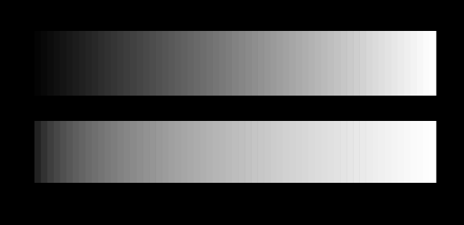
A very finely stepped ramp is the case where nothing can be blamed on the sampling, and it is worth drawing once.
How many steps the curve needs
The transfer function decides where the code values land, and how many of them are needed follows from the same argument.
Eight bits is enough for sRGB over its intended range because the curve is roughly perceptually uniform, so the steps are roughly equally visible everywhere. A linear encoding over the same range would need far more bits, because it would spend most of them on distinctions in the highlights that nobody can make and starve the shadows where the eye is sensitive to ratios.
That is the real justification for a nonlinear transfer function, and it is not the one usually given. The historical reason is that cathode-ray tubes had a power-law response and the encoding cancelled it; the perceptual near-uniformity was a happy accident. Modern displays have no such response and apply the curve deliberately, and the encodings designed against the observer from the start make the accident into a specification.
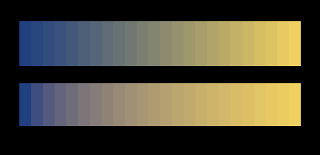
A blend between two chromatic endpoints is the case a gradient in a real design is, and the shortfall there is smaller and still large.
What the pictures cannot show
Everything here assumes the display implements sRGB. Many do approximately; some are calibrated to something else entirely; and a reader in a bright room has an effective transfer function altered by screen reflections, which raise the black level and compress the shadows.
The gamma probe is honest about being a measurement of the whole chain rather than of the display alone. What it locates is the half-luminance point as delivered — including the operating system’s colour management, any night-shift filter, and the ambient light. That is arguably the more useful quantity, and it is not the panel’s specification.
The blend figure has a subtler limitation: it is showing the difference between two ramps on the reader’s display, so a display with an unusual transfer function will show the difference at the wrong magnitude. The direction of the effect is robust; the size is not.
Who found it, and when
The CRT’s power-law response was characterised in the 1930s, and the practice of pre-correcting broadcast signals for it dates from early television. The term “gamma” comes from the exponent in the photographic density curves Hurter and Driffield had studied decades earlier.
sRGB was defined by Hewlett-Packard and Microsoft in 1996 and standardised as IEC 61966-2-1 in 1999. Its transfer function was chosen to match the typical CRT of the time while adding the linear segment for numerical reasons, and the specification’s continued dominance is the reason a curve designed around 1990s display hardware governs essentially every image on the web.
Charles Poynton has spent decades pointing out that this is widely misunderstood, and his writing remains the standard corrective.
Where this goes next
The question of what a stored number actually identifies is a hex code is not a colour. The perceptual side — which space to use when the goal is uniform steps rather than correct physics — is how far apart are two colours. And the reader’s own hardware is the display is an unknown.
Where this goes next
 A hex code is not a colour
Six hexadecimal digits identify three numbers. Turning three numbers into a colour needs a colour space, a transfer function, a white point and a display, and leaving any of them unstated is the everyday version of every confusion in colour management.
A hex code is not a colour
Six hexadecimal digits identify three numbers. Turning three numbers into a colour needs a colour space, a transfer function, a white point and a display, and leaving any of them unstated is the everyday version of every confusion in colour management.
 How far apart are two colours
ΔE is meant to be a distance with the property that the same number means the same perceived difference everywhere. Three successive formulae have tried, they disagree with each other by more than a just-noticeable difference, and the disagreement decides real matching questions.
How far apart are two colours
ΔE is meant to be a distance with the property that the same number means the same perceived difference everywhere. Three successive formulae have tried, they disagree with each other by more than a just-noticeable difference, and the disagreement decides real matching questions.
 The display is an unknown
This site is displayed on the very apparatus it is about, and it knows almost nothing about that apparatus. Two figures here stop assuming and ask instead — a probe for the transfer function and a probe for the gamut.
The display is an unknown
This site is displayed on the very apparatus it is about, and it knows almost nothing about that apparatus. Two figures here stop assuming and ask instead — a probe for the transfer function and a probe for the gamut.
What this makes readable
Essays that name this one as a prerequisite.
Named alongside this one
Essays reaching for the same objects. Nobody chose these; they are what the index of named objects makes visible.
- A contrast control is three controls cielab · lightness · transfer function
- A stop is not a stop afterwards lightness · luminance · transfer function
- A viewing condition is an argument cielab · lightness · luminance
- Colour by catalogue cielab · lightness · luminance
- Sharpened type errs on its dark side gamma · lightness · linear light
- The exponent was never the argument cielab · lightness · perceptual uniformity
What links here
The 8 essays that link to this one and share the most of its objects, of 23 that link here.
The objects this essay names
Each one links to every other essay that touches it.
BlendingCIELABGammaLightnessLinear lightLuminancePerceptual uniformityRelative luminanceTransfer function