Simulating what cannot be simulated
Assumes Seventeen observers in 1931.
Images captioned “what a colourblind person sees” are common, and the caption is not something any method can support. Nobody has access to another person’s experience, and a dichromat who has always been a dichromat has no basis for comparison either.
What a simulation can legitimately show is narrower and still useful: which colour differences survive and which collapse. That is a claim about discrimination, it follows from the receptor structure, and it can be checked.
What dichromacy is
Normal colour vision has three cone classes, so the space of distinguishable stimuli is three-dimensional. A dichromat has two, and the space is two-dimensional.
The right way to think about this is not “sees fewer colours” but has more metamers. The matching functions have two rows instead of three, so the null space is larger, and stimuli a trichromat separates fall together. Metamerism is the collapse of many spectra onto one response, and dichromacy is more of the same collapse.
The three types are named for which cone class is missing:
Protanopia — no L cone. About 1% of men. Because the L cone contributes most of the long-wavelength luminance response, protanopes also see reds as considerably darker, which is a brightness effect on top of the chromatic one.
Deuteranopia — no M cone. About 1% of men, and the commonest overall when anomalous forms are included. Luminance is close to normal.
Tritanopia — no S cone. Very rare, perhaps 1 in 10,000, and not sex-linked, since the S pigment gene is on chromosome 7 rather than the X.
The L and M genes sit adjacent on the X chromosome and are extremely similar — they are a recent duplication — which makes unequal crossing over common. That single fact explains why red-green deficiency is so much commoner than blue-yellow, and why it affects men far more than women.
Why naive simulation is wrong
The obvious approach is to delete a channel or swap two, and it produces something that looks plausible and is not a model of anything.
The correct construction, from Brettel, Viénot and Mollon in 1997, starts from what a dichromat’s colour space actually is. With two receptors, the set of distinguishable stimuli is a plane in LMS space rather than a squashed volume. Simulating means projecting onto that plane, along the direction of the missing cone.
The plane is fixed by two requirements. It must contain the neutral axis, because greys are seen the same by both — a dichromat and a trichromat agree about white. And it must contain two spectral anchor stimuli on which the two are known to agree. Those constraints give not one plane but two half-planes meeting along the neutral axis, one for stimuli on the blue side of white and one for the yellow side, and part of the construction is deciding which half a given colour belongs to.
Getting that decision wrong is the classic implementation bug. The result still looks like a plausible colour-blindness simulation, and colours near the neutral axis flip to the wrong half-plane and greys pick up a tint.
How the implementation is checked
Four assertions, each catching something the others cannot.
Neutrals must stay neutral. Greys lie on the axis both half-planes share, so they must pass through untouched. A wrong half-plane decision, a wrong anchor or a transposed cone matrix all tint them, and a tinted grey is invisible in a picture of coloured things. Every grey from 0.2 to 1.0 is checked in all three simulations.
The projection must be idempotent. After projecting, a colour already lies in the plane, so projecting again must change nothing. This catches projection along the wrong axis, which moves colours somewhere plausible but not onto the plane, so they keep moving on every application. The measured drift is exactly zero.
A dimension must actually collapse. A do-nothing implementation would pass both the checks above. So a red and a green far apart for a trichromat must come together under protanopia and deuteranopia — their chromatic separation falls from 119 to 17 and 12.
Tritanopia must leave red-green alone. This is the sharpest of the four. Tritanopia is a blue-yellow deficiency, so it should barely touch a red-green pair, and it does not — the separation stays at 101. An implementation that merely desaturated everything would pass the first three checks and fail this one, and desaturation is roughly what a naive channel manipulation amounts to.
A finding: the ΔE tells the wrong story
Measuring the red-green collapse produced a result worth recording, because the obvious measurement gives the wrong impression.
Under protanopia, a red and a green stay ΔE₀₀ 22 apart, which looks like a failed simulation. They have not stayed apart in hue: the chromatic separation falls from 119 to 17. What keeps ΔE high is lightness, and the lightness difference actually grows, from 15 to 22.
That is correct physics rather than an artefact. A protanope has much reduced sensitivity to long wavelengths, so the red simply goes dark. Distinguishing red from green by brightness rather than by hue is exactly what protanopes report doing.
So the assertion on this site measures chromatic separation rather than ΔE, because ΔE sums the effect and its own side effect. It is a small illustration of a general point: the right measurement is often not the standard one.
What the simulation legitimately shows
Not experience. What it shows is that certain pairs of colours produce nearly identical responses in a two-receptor system, and therefore cannot be distinguished by colour alone.
This is a design-relevant claim and it is checkable. It supports advice like: do not encode categories by red against green; do not rely on hue alone where a distinction matters; vary lightness as well as hue; add a redundant channel such as shape, position or a label.
It does not support the claim that a simulated image resembles a dichromat’s experience. The simulated image is what a trichromat must be shown to have the same discriminations available, which is a statement about the trichromat viewing the simulation.
Proving the site’s own palette
Every figure here asserts that its colours are distinguishable for colour-deficient readers, and this is the subject that supplies the machinery to check it, so it checks.
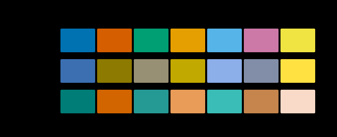
The result is more interesting than a pass. Okabe–Ito holds up well for the two common deficiencies, which is what it was designed for and what the roughly 8% of men with red-green deficiency need. Under tritanopia it is weaker.
That is a real property of the palette rather than an artefact here. Okabe and Ito optimised for the common cases, which is defensible — tritanopia is very rare — but “colourblind-safe” is usually repeated without the qualification. Stating the number is the alternative to repeating an unchecked claim, and the assertion in this site’s gate uses a lower threshold for tritanopia with the reason written down beside it.
A consequence the site had to handle
Simulating a deficiency can produce a colour the display cannot show. Projecting onto the dichromat plane moves a colour sideways in XYZ, and sideways can be outside the sRGB triangle — a saturated blue simulated as protanopia lands 0.16 outside it.
That is on-thesis rather than an inconvenience, so the simulation reports whether clamping happened rather than hiding it, and any figure showing simulated colours can mark a clipped swatch like every other unreachable colour here.
It also forced the idempotence assertion onto the projection rather than the drawable output. The sRGB path genuinely is not idempotent for those colours, because clamping moves them back off the plane, so asserting on it would have been asserting something false.
What the deficiency does to the gamut
A consequence that follows straight from the geometry and is rarely mentioned.
A dichromat’s colour space is a plane, so the set of distinguishable colours is two-dimensional rather than three. A palette spanning three dimensions for a trichromat spans only two for a dichromat, and any two colours differing only along the collapsed direction become one colour.
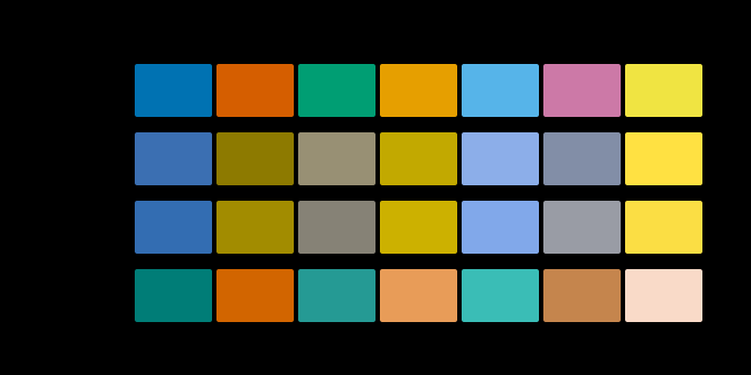
Severity is a dial rather than a switch, and most people who have one of these are somewhere along it.
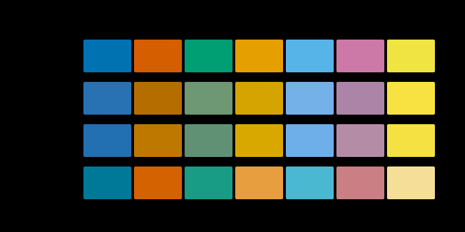
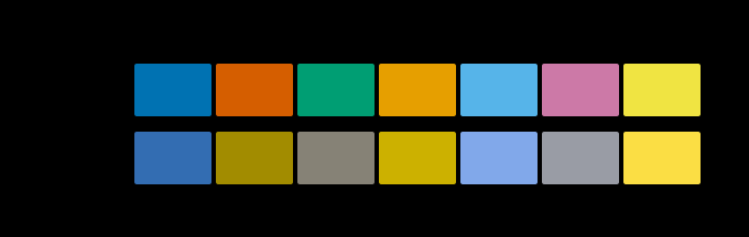
Two more readings of the same construction say which parts of it are about the arithmetic and which are about how much of a pigment somebody has.
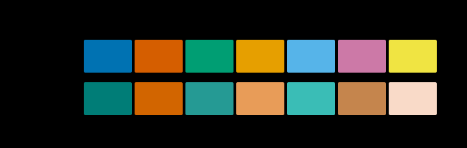
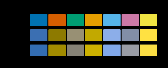
The design rule follows without hedging: vary lightness as well as hue. Lightness is the one dimension no colour vision deficiency collapses, and a palette whose members differ in lightness stays readable under all three simulations and in greyscale.
Anomalous trichromacy, which is commoner
Everything above concerns dichromacy — a cone class entirely absent. Far more common is anomalous trichromacy, where all three classes are present but one has a shifted spectral peak.
Protanomaly and deuteranomaly together account for the majority of colour vision deficiency, and their severity varies continuously from barely detectable to nearly dichromatic. An anomalous trichromat has a three-dimensional colour space that is compressed rather than collapsed, which is a different geometry from a plane.
This site models the dichromatic limit rigorously and treats intermediate severity as an interpolation toward it. That is an approximation and the figures say so — it is not the Machado model of anomalous trichromacy, which shifts a cone’s peak rather than fading its contribution, and which differs most at low severity.
Being explicit matters because “simulated at 50% severity” reads as a precise claim and is not one unless the model is named.
What was computed here
The four assertions above run on every build, and the gate additionally confirms each can still reject. The palette check is offered an impossible threshold and must refuse it; a deliberately bad palette of red, green and olive is measured and must score below the passing threshold, which it does at ΔE 0.76 under deuteranopia — three colours that are effectively one.
The Okabe–Ito values are also cross-checked against the stylesheet, so the gate cannot end up proving something about a palette the site does not actually draw with.
The central thing, stated plainly: none of these figures shows anybody’s experience. They show which discriminations are available.
Severity is another limit. The construction models dichromacy — a missing cone class. Far more common is anomalous trichromacy, where all three classes are present but one has a shifted peak, and severity varies continuously. Intermediate values on this site are an interpolation toward the dichromat limit, which is not the same as the Machado model of anomalous trichromacy, and the figures say so.
And the simulation assumes the reader has normal colour vision. For a dichromatic reader, the simulated rows will look much like the normal row, which is itself a fair demonstration and not the one the figure was designed for.
The cone matrix is Hunt–Pointer–Estévez, named in the code, and the anchors are Brettel’s published wavelengths. Both are modelling choices rather than measurements, and both are stated wherever the results are used.
What good practice looks like
The advice that follows from all of this is short and does not require any simulation to apply.
Vary lightness, not only hue. Lightness survives every deficiency and greyscale reproduction.
Avoid red against green as the sole distinction. It collapses for roughly 8% of men.
Prefer blue against orange where two categories must be distinguished by colour alone. It survives all three simulations, which is why it is the default in scientific visualisation.
Add a redundant channel. Shape, position, texture or a direct label. Colour then becomes an accelerator rather than the carrier of the information.
Check, do not assume. A palette described as colourblind-safe by its source may be safe for the common cases and weaker elsewhere, as the measurement of this site’s own palette shows.
The summary claim
A simulation shows which discriminations survive. It does not show experience, and saying otherwise would be the kind of unchecked claim this site exists to avoid.
Two dichromacies that remove different channels are the pair that shows what the construction can and cannot claim.
The same caution, applied to the model this site just built
The argument here is about colour vision deficiency, and it generalises further than is comfortable. Any model that outputs a picture of somebody else’s experience invites the reading that the picture is the experience, and the invitation does not depend on the model being about a deficiency.
The expansion phase added a colour appearance model to this site, and it has the same shape of problem. CIECAM16 returns a lightness, a chroma and a hue for a stimulus in a stated situation, and the obvious thing to do with those correlates is render them as a swatch and label it with what the colour looks like in that room.
So the appearance figures here do not do that. A patch drawn as it supposedly looks under a dark surround is not going to look that way on a page in a lit room, because the page is the surround — producing a swatch that claims to show a dark-surround appearance and then displaying it in an unknown room is a category error however good the model is.
What those figures show instead is the number, beside a stimulus drawn the same way in every panel. A reader can see that the panels are identical and read what the model says about them, which is a defensible thing to put on a page. A row of adjusted swatches would be far more persuasive and would be showing the reader something nobody has ever seen.
The rule generalises to both cases in the same words. A model can be worth having and still not license a picture of what it predicts, and the distance between the two is the distance between a number and an experience.
At a partial severity the construction is furthest from anything that could be checked against a report, which is exactly where it is most often used.
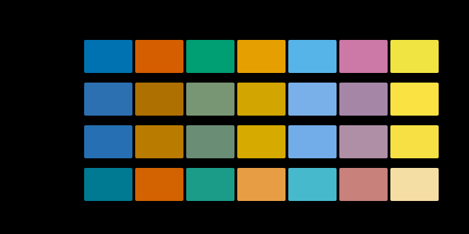
Why the checks matter more here than elsewhere
A colour-blindness simulation is unusually easy to get wrong and unusually hard to notice being wrong, which is why this module carries four assertions rather than one.
The output is a picture of colours that are supposed to look unusual. A reader with normal vision has no expectation to compare against — any plausible-looking desaturation reads as a successful simulation. Unlike a gradient or a chromaticity diagram, there is no visual signature of failure at all.
That is exactly the situation in which assertions earn their place, and it is why the sharpest check is the negative one: tritanopia must leave red-green alone. A broken implementation that desaturated everything would satisfy every intuition about what the output should look like, and fail that check immediately.
Finally, the framing matters as much as the arithmetic. Describing a dichromat as seeing “fewer colours” invites the idea of a deficit to be corrected. Describing the same fact as having more metamers is more accurate and more useful: it locates the difference in which stimuli fall together, which is exactly the quantity a designer can do something about. The advice that follows is about encoding rather than about compensation.
A closing note on vocabulary. “Colour blind” suggests an absence of colour vision, and dichromats have colour vision — a two-dimensional version of it, in which a great many distinctions remain available. The clinical terms are more precise and the distinction matters for design: the question is never whether a reader sees colour, but which specific pairs of colours become the same for them.
Who found it, and when
John Dalton described his own colour vision in 1798, the first careful account, and preserved his eyes for later examination — which was done in 1995, confirming by DNA analysis that he was a deuteranope.
The receptor account developed alongside trichromatic theory through the nineteenth century. Brettel, Viénot and Mollon published the projection construction in 1997, and Viénot simplified it for the red-green cases in 1999. Machado, Oliveira and Fernandes published a model for anomalous trichromacy in 2009.
Okabe and Ito published their palette recommendation in 2008. It is now the standard advice in scientific visualisation, and the tritanopia figure above appears to be the sort of thing that gets left out when advice is repeated.
Where this goes next
The variation between normal observers, of which this is the extreme case, is seventeen observers in 1931. The framing of deficiency as extra metamers is two spectra, one colour. And the other unknown in the chain from figure to eye is the display is an unknown.
Where this goes next
 Seventeen observers in 1931
The standard observer that governs every colour specification in industrial use is an average over seventeen young British men, measured with equipment from the 1920s. It is known to be wrong in the blue, the correction has existed since 1951, and it has never been adopted.
Seventeen observers in 1931
The standard observer that governs every colour specification in industrial use is an average over seventeen young British men, measured with equipment from the 1920s. It is known to be wrong in the blue, the correction has existed since 1951, and it has never been adopted.
 Three numbers
A spectrum has as many degrees of freedom as anyone cares to give it. The eye reports three. Everything colour science can do, and every way it fails, follows from that one collapse.
Three numbers
A spectrum has as many degrees of freedom as anyone cares to give it. The eye reports three. Everything colour science can do, and every way it fails, follows from that one collapse.
 Two spectra, one colour
Metamerism is usually described and almost never demonstrated. It does not have to be — the metameric black space is enormous, so a matching pair can be constructed to order, verified, and then made to come apart by changing the light.
Two spectra, one colour
Metamerism is usually described and almost never demonstrated. It does not have to be — the metameric black space is enormous, so a matching pair can be constructed to order, verified, and then made to come apart by changing the light.
What this makes readable
Essays that name this one as a prerequisite.
Named alongside this one
Essays reaching for the same objects. Nobody chose these; they are what the index of named objects makes visible.
- A point about the pigments that remain deuteranopia · dichromacy · protanopia · tritanopia
- A catalogue is not a vocabulary δe · lightness
- A difference is not a distance assertion · δe
- A guessed veil halves the error δe · lightness
- A lit room brings the units' medians together δe · lightness
- A name in the model's own words assertion · δe
What links here
The 8 essays that link to this one and share the most of its objects, of 17 that link here.
The objects this essay names
Each one links to every other essay that touches it.
AssertionColour vision deficiencyΔEDeuteranopiaDichromacyLightnessProtanopiaTrichromacyTritanopia