A difference has no place
Assumes A difference has no size and Colour stops at the edge of sight.
A difference has no size measured the first argument a colour tolerance leaves unstated: how large the samples are and how finely the difference is divided between them. The answer was a factor of fifteen.
This is the second, and it is a distance from the point of regard. It is worth about a factor of five, and unlike the first it does not merely shrink the difference — it rotates it.
The claim
A colour difference presented away from the fixation point is not the same difference smaller. It is a different difference.
The three channels’ thresholds rise linearly with eccentricity and their rates differ by more than a factor of three — red–green doubles at 1.2°, luminance at 2.5°, blue–yellow at 4.0°. So a difference vector has its parts divided unequally, and what is left points somewhere else.
Measured on one pair, ΔE00 21.97 at the fovea:
| eccentricity | ΔE00 left | share | hue turned by |
|---|---|---|---|
| 0° | 21.97 | 100% | — |
| 2° | 14.96 | 68% | 15.6° |
| 5° | 10.53 | 48% | 21.5° |
| 10° | 7.15 | 33% | 24.4° |
| 20° | 4.38 | 20% | 26.2° |
Two degrees out — the width of a thumbnail at arm’s length — a third of the difference is gone and its hue has moved by fifteen degrees. Ten degrees out, two thirds is gone and the hue has moved by twenty-four.
Three radii for one number
The practical form of it is a distance rather than a fraction. A stated colour difference has an outer radius: the eccentricity past which it falls below threshold and is not seen at all. There are three of them.
| difference, × its foveal threshold | red–green | luminance | blue–yellow |
|---|---|---|---|
| 2× | 1.2° | 2.5° | 4.0° |
| 4× | 3.6° | 7.5° | 12.0° |
| 8× | 8.4° | 17.5° | 28.0° |
The table is a formula, and stating it is worth more than the nine numbers. A difference times its own foveal threshold falls to threshold where the multiplier reaches , so
and every entry above is that expression with three constants and three values of . The radius is linear in how many thresholds the difference is, so doubling a mismatch roughly doubles the region in which it can be seen — which is a much more useful statement for a specification than a table with three rows in it.
And the ratio between the three radii is a constant. It is the ratio of the three E2 values, 1.2 to 2.5 to 4.0, so at every difference size the blue–yellow radius is 3.33 times the red–green one and the luminance radius 2.08 times it. A specification that wanted to state three radii instead of one would need one number and two multipliers, and the two multipliers never change.
That constant of 3.33 has already appeared on this site under another name. It is the asymptotic shear — the factor by which the red–green component is divided more than the blue–yellow one, far out in the field, which is what rotates a difference’s hue. The amount a difference turns and the ratio of how far its two chromatic parts reach are one quantity, and both are the ratio of two quoted E2 values.
The formula decays more slowly than any of its channels
One property of the share-left column is worth extracting because it runs the other way from everything else here, and it belongs to the ruler rather than to the eye.
Reading the column as though the whole difference were one channel — solving for the effective constant at each eccentricity — gives 4.25 at two degrees, 4.62 at five, 4.93 at ten and 5.00 at twenty.
Every one of those is above 4.0, which is the largest E2 of the three channels. That should not be possible for a norm of three independently divided components: such a norm’s decay is bounded between the fastest-decaying part and the slowest, so the effective constant can never exceed the largest of the three.
The candidate is the ruler. ΔE2000 divides a chroma difference by the chroma at which it was measured, and as the components shrink the pair’s chroma shrinks with them, so the divisor shrinks and gives some of the loss back. The formula partially undoes the peripheral reduction it is being used to measure — not by much, and enough to put the effective constant a quarter above the most persistent channel.
Which means the numbers in the first table are conservative in a direction nobody would guess. A difference reported as retaining a third of itself at ten degrees is retaining a third as ΔE2000 counts it, and the underlying channel signals have fallen further than that. A measure without the chroma divisor — a plain Euclidean distance, or a count of thresholds per channel — would report a steeper fall.
It also says which quantity to trust for which purpose. The radii are clean, because each is computed inside one channel with no cross-channel combination and no chroma weighting anywhere near it. The share-left column is a ΔE00 statement, and it carries the formula’s opinion about chroma into a measurement of how much of a difference survives — which is a small effect here and is the same category of contamination the essay on units is about, arriving in a place where the formula was only supposed to be doing the reporting.
A red–green mismatch four times threshold between two adjacent car panels is invisible to anybody not looking within about three and a half degrees of the join — roughly six centimetres at arm’s length. The same mismatch in the blue–yellow direction survives to twelve degrees, which is most of a hand’s width.
No specification distinguishes the two, and both are written as one number.


Why it rotates rather than fading
The rotation is the part with no precedent in anything this site had measured, and the mechanism is arithmetic rather than physiology.
A colour difference in CIELAB is a vector with three components: a lightness part, a red–green part and a blue–yellow part. The formula combines them into one number with weights, and every account of what a formula does treats that number as the quantity.
Divide the three components by three different numbers and the result is a shear rather than a scale. The vector’s length changes and so does its direction, and the direction is what a hue angle reports. At ten degrees out the red–green part has been divided by 9.3 and the blue–yellow part by 3.5, so a difference that started as a reddish-yellow departure has become a yellower one.
This has a consequence for what a peripheral colour error looks like that no amount of shrinking would produce: two samples that differ in hue at the fovea can differ in a different hue in the periphery, and a difference tuned to be small in one direction can be relatively larger in another once it is off-axis.
The condition this actually describes
The obvious objection is that nobody judges a colour without looking at it. That is right about a laboratory and wrong about almost everywhere a colour matters.
Two adjacent panels are judged at the join. The eye fixates the boundary and both samples are within a degree — the arrangement a formula was fitted to — which is why an automotive mismatch is judged so harshly, and is the arrangement a tolerance is implicitly written for.
A wall is not. A large painted surface with a batch change in it is looked at from several places, and most of the surface is peripheral at any moment. The visible defect is the one that survives at the eccentricities the room’s geometry produces, which is a computation nobody makes.
A display’s uniformity is entirely peripheral. A panel’s corner-to-corner colour variation is judged by somebody looking at the middle, so the corners are twenty or more degrees out — where a red–green error four times threshold is six times below it. Panel uniformity specifications are written in ΔE with no eccentricity in them, on a display whose own properties are already unknown to the page, and the arithmetic here says the constraint at the corners could be several times looser than the one at the centre without any visible difference.
And a print is judged both ways. A proof held next to a press sheet is a foveal comparison at the join and a peripheral one everywhere else, which is why a proof is a different object in more ways than the substrate.

The exception, and it is at the fixation point
The whole of the above is about a difference getting smaller away from the centre. There is one arrangement in which the centre is the worst place, and it is the one a reader is always in.
At the exact point of gaze there are no short-wavelength cones. A disc about a third of a degree in radius contains none, so a difference carried only by the short-wavelength cones, on a target small enough to fall inside it, collapses to nothing — while the same difference two degrees out is seen perfectly well.
So the outer radius has an inner one. For a short-wavelength difference on a small target the visible region is an annulus: nothing at the centre, a maximum a degree or two out, and a fade to nothing beyond. Every other channel’s visible region is a disc.
The practical case is a small saturated blue indicator or a fine blue line on a form, both of which are reported as hard to fixate and easy to see out of the corner of the eye — which is exactly what the shape predicts and is usually put down to focus. It is not focus; chromatic aberration does blur the blue, and this is a second, separate reason with the same symptom.
What the arithmetic says a specification could do
The gap here is unusually cheap to close, which is worth saying because most of the omissions this site finds are not.
A tolerance could carry a viewing arrangement. Two panels judged at the join is one arrangement; a wall judged from three metres is another; a display corner judged from the centre is a third. Naming which of the three a number applies to costs a phrase, and the three answers differ by more than a factor of three.
Or it could carry a radius. A difference stated as ΔE00 4 within 4° of the point of regard is a complete requirement in a way that ΔE00 4 is not, and the radius is computable from the difference and the channel it sits in. Nothing about it requires new measurement.
And a panel specification could be a function rather than a number. A display’s uniformity requirement is a single ΔE across the whole screen, judged by an observer looking at the middle. The arithmetic here says the corners could be several times looser than the centre with no visible difference — which is a specification that would cost a manufacturer nothing to meet and would stop rejecting panels nobody could fault.
The reason none of this is done is not that it is hard. It is that a tolerance is a number in a contract, and every argument above turns one number into three.
What was computed, and how
The E2 rule is the standard form and its three values are the quoted part. A threshold is multiplied by 1 + E/E2, where E2 is the eccentricity at which it has doubled. Reported values cluster around two to three degrees for luminance acuity; the ordering — red–green fastest, blue–yellow slowest — is the robust finding and is what every result here depends on.
The decomposition is in CIELAB and that is a visible seam. CIELAB’s a* and b* are not the cardinal chromatic directions of the visual system, so dividing them separately approximates dividing the cardinal channels separately. The rotation is real; its exact size inherits the approximation, and a version built on the cone-opponent axes would give a different number and the same sign.
The differences are ΔE2000 throughout, computed between the original pair and the pair with the shrunk components — so the number reported is a colour difference in the unit every tolerance is written in, rather than a receptor contrast.
And the hue turn is measured on the a*b* plane as the angle between the original difference vector and the reduced one, which is the quantity a hue-angle tolerance is written against.
Ten degrees is the edge of the ten-degree observer’s own field, so it is the eccentricity the standards themselves are about.

Where the model stops
There is no crowding. The dominant limitation on peripheral vision is not the receptors but the pooling: a target beside other targets is much harder to identify than one alone, and nothing here has a neighbour in it. Every number above is therefore an upper bound on peripheral performance.
There is no eye movement. A real observer looking at a wall fixates several places a second, so the eccentricity of any given patch is a distribution rather than a number. The eye is never still is the essay about that and it is not joined to this one.
Rods are named and not modelled. The eye that has no colour is most of the peripheral retina, and peripheral colour judgements at low light levels involve a fourth receptor that no colour-difference formula has a term for.
And the difference is still a difference between two numbers. Everything the size argument said about arrangement applies here too and multiplies with it: a patterned sample seen peripherally is subject to both reductions, and nothing here computes their product.
A difference twice threshold is the smallest one a specification would bother naming, and it is the case where the three radii are furthest apart in proportion.

The generalisation
The sentence worth carrying: a colour difference is a measurement of an arrangement, and the arrangement includes where the observer is looking.
The list of unstated arguments in a tolerance is now four items long and none of them appears on any specification in ordinary use: the angular size of the samples, the spatial structure within them, the light level, and the distance from the point of regard. Every one is measurable, every one changes the answer by a factor of several, and the number that is written down contains none of them.
The surprising connection is with the standard observer’s field size. The two standard observers exist because a colour match depends on how large the field is, and the whole discipline’s answer to where in the eye is those two disc sizes. This essay says the same question has an answer outside both discs, and that it is not a smaller version of the answer inside them: the 10° observer’s own field already spans an eccentricity range over which red–green thresholds triple, and the standard treats it as one measurement.
Who found it, and when
The E2 formulation comes from the cortical-magnification literature of the 1980s, where it was introduced to make peripheral and foveal performance comparable by scaling the stimulus — enlarging a peripheral target until it performs like a foveal one. Its use here is the reverse: holding the stimulus fixed and asking what is left.
The channel ordering — chromatic sensitivity falling faster than luminance sensitivity with eccentricity, and red–green faster than blue–yellow — has been measured repeatedly since the 1980s and is one of the more robust asymmetries in peripheral vision.
And the tolerance practice predates all of it. A numerical colour tolerance is a mid-twentieth-century instrument, written for a bipartite field of a stated size viewed foveally, and applied since to walls, panels, displays and photographs without the arrangement being restated.
What has not changed is the specification. No colour tolerance in industrial use has a field for how far from the point of regard the sample is, and the answer differs by more than a factor of three between the two chromatic directions.

What the pictures cannot show
They cannot put anything in the periphery. A figure appears wherever the reader looks, and the reader looks at the figure. Every swatch labelled 10° on this page is drawn at 0°, and it is a prediction rather than a demonstration.
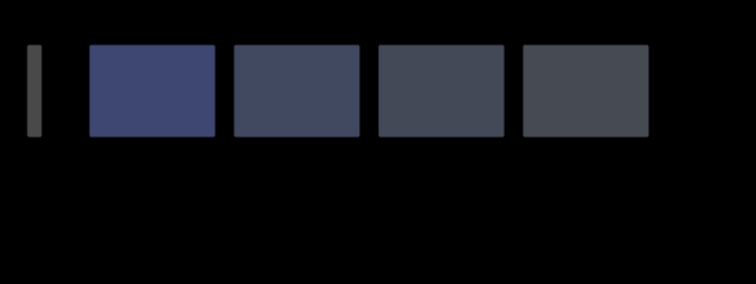
And the rotation is the hardest part to draw. What the figure shows is the predicted colour at each eccentricity, side by side at the fovea, which is exactly the comparison the claim says is not available: at the fovea the reader sees four different colours, and the claim is that they would be one colour seen four ways.
A reader can approximate the experiment by fixating one edge of the figure and attending to the other, which is difficult, unreliable, and the reason this measurement is made with an apparatus rather than a page.

Where the ladder goes next
The nearest unfinished piece is the product of the two reductions. A patterned sample seen peripherally loses contrast twice — once to the spatial filter and once to the threshold elevation — and the two are computed by different machinery on this site with nothing joining them. The joined version would say what a halftone tint looks like at the edge of a page, which is the ordinary condition of almost every printed image.
The second is crowding, which needs the plane machinery the phase’s first essay built and a pooling region. It is the effect that would turn every number here from an upper bound into an estimate.
Where this goes next
 A difference has no size
A colour difference formula answers a question about two large patches seen side by side. Applied to a pattern, it reports fourteen units where the eye is left with less than one — and the ratio depends on nothing but how finely the difference is spread.
A difference has no size
A colour difference formula answers a question about two large patches seen side by side. Applied to a pattern, it reports fourteen units where the eye is left with less than one — and the ratio depends on nothing but how finely the difference is spread.
 Colour stops at the edge of sight
Cone density falls twenty-one-fold between the centre of gaze and ten degrees out, and the three channels give out at three different rates — so a colour difference in the periphery does not merely shrink, it turns. At the exact point of fixation there are no short-wavelength cones at all.
Colour stops at the edge of sight
Cone density falls twenty-one-fold between the centre of gaze and ten degrees out, and the three channels give out at three different rates — so a colour difference in the periphery does not merely shrink, it turns. At the exact point of fixation there are no short-wavelength cones at all.
 A tolerance is a shape
A total colour difference below one, or every component within one — the two sound like the same requirement stated twice. They are different shapes, they disagree about most of what either accepts, and which one a supplier is held to is worth money.
A tolerance is a shape
A total colour difference below one, or every component within one — the two sound like the same requirement stated twice. They are different shapes, they disagree about most of what either accepts, and which one a supplier is held to is worth money.
What this makes readable
Essays that name this one as a prerequisite.
Named alongside this one
Essays reaching for the same objects. Nobody chose these; they are what the index of named objects makes visible.
- Where the formula is not smooth ciede2000 · cielab · δe · just-noticeable difference · quality control · specification · threshold · tolerance
- Three constants nobody quotes ciede2000 · δe · quality control · specification · standard observer · tolerance · viewing condition
- A difference is not a distance ciede2000 · cielab · δe · quality control · specification · tolerance
- A name is not a threshold ciede2000 · δe · just-noticeable difference · specification · threshold · tolerance
- A tolerance is a probability ciede2000 · δe · quality control · specification · standard observer · tolerance
- How many colours are there ciede2000 · cielab · δe · just-noticeable difference · threshold · tolerance
What links here
Every essay whose body links to this one.
The objects this essay names
Each one links to every other essay that touches it.
CIEDE2000CIELABΔEEccentricityJust-noticeable differenceOpponent processingQuality controlSpecificationStandard observerThresholdToleranceViewing condition