The eye that has no colour
Assumes Three numbers.
Colour science is a science of cones. Three receptors, three numbers, and everything downstream follows from the collapse.
There is a fourth receptor, it is the most numerous by a factor of twenty, and for a substantial part of every day it is the only one working.
What the rods are for
A rod contains rhodopsin, a single pigment peaking around 498 nm, and there is only one kind. That is the whole of why rod vision has no colour: distinguishing wavelength from intensity requires at least two receptor types with different spectral sensitivities, and one type has no way to tell a dim green from a bright blue.
What rods buy instead is sensitivity. A rod can respond to a single photon. Their outputs are pooled heavily before leaving the retina — many rods to one ganglion cell — which trades spatial resolution for the ability to detect very little light, and the trade is why night vision is grainy and low-resolution as well as colourless.
The distribution is the other half. Rods are absent from the fovea entirely. Rod density is zero at the centre of gaze, rises steeply, and peaks around eighteen degrees out. This is why a faint star disappears when looked at directly and reappears when looked slightly away from, and it is a fact that astronomers knew and used long before anybody counted receptors, or knew there were three kinds of the other sort.
Computing V′ rather than quoting it
The scotopic luminous efficiency function is a tabulated CIE standard. It is computed here instead, from two stated models, and the reason is the same one that applies to Planck’s law elsewhere on this site: a table is eighty-one numbers and a model is a claim with a parameter.
The first model is the Govardovskii template — a formula for the absorbance of a vitamin-A1 visual pigment given the wavelength it peaks at. Pigment absorbance curves turn out to have nearly the same shape for every pigment in the class once plotted against λmax/λ rather than against λ, and the template is that shape.
The second model is the ocular media — the lens, which absorbs increasingly toward short wavelengths and darkens throughout life.
Multiply the two and normalise, and the resulting curve peaks at 505 nm against the CIE’s tabulated 507. Nothing put it there. Rhodopsin peaks at 498; the lens absorbs more blue than green on the way in; the sensitivity measured at the cornea therefore sits at a longer wavelength than the molecule does. The displacement is a prediction, and it comes out right to within one sample of the grid.
The anatomy that got the number wrong first
The first version of this calculation put the peak at 515 nm, eight nanometres past the CIE’s value, and the error was anatomical rather than numerical.
It included the macular pigment. The macula is a carotenoid screen over the central retina, peaking near 460 nm, and it is a genuine part of the ocular media for the cone path — it is one of the largest sources of variation between observers.
It is not in the rod path, because there are no rods in the fovea. The scotopic system looks through lens but not through macular pigment, and including a filter the receptors are not behind pushed the peak too far red.
The instructive part is that the error was invisible in every other form. The curve looked like V′, it had the right shape and the right general position, and only the comparison against the tabulated peak caught it. A model with a wrong physical assumption produces a plausible curve, which is why the assertion compares against something external rather than checking the curve for reasonableness.
The Purkinje shift belongs to a pair
Everybody’s account of the Purkinje shift says the same thing: as light fades, reds darken and blues brighten. Almost no account gives a number, and the reason is that the number is not a property of the eye.

Which pair of surfaces is chosen changes the size of the effect and not its direction, and that is worth showing three times rather than asserting once.

Pushing the pair further apart pushes the effect further in the same direction, which is the check that it is the spectrum rather than the particular surfaces doing the work.
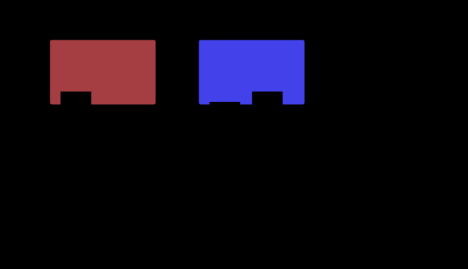
The observer is the other thing that can be changed here, and it changes only one of the two curves.


The shift is a ratio of ratios, so it depends entirely on which two surfaces. Two greys show none of it. A saturated red against a saturated blue shows a great deal. Quoting “the Purkinje shift is nine-fold” without the pair is meaningless, which is why the function here takes two stimuli and returns a comparison rather than returning a constant.
Lighting engineers have a name for the underlying quantity: the S/P ratio, the scotopic luminous flux of a source divided by its photopic. It is specified for street lighting, because a road lit to the same photopic level by a high-pressure sodium lamp and by a white LED is not lit to the same usable level at night — the LED’s shorter-wavelength output is worth considerably more to a rod system, and photopic lux does not know that.
The S/P ratio, computed
The quantity named as doing the real work is cheap to compute from the two curves above, and it is worth having rather than naming.
| source | S/P |
|---|---|
| a low-pressure sodium lamp | 0.19 |
| a high-pressure sodium lamp | 0.31 |
| illuminant A, a tungsten lamp | 1.40 |
| a phosphor-converted white LED | 1.71 |
| a triphosphor tube | 1.73 |
| a three-emitter source | 2.42 |
| D65 daylight | 2.50 |
The two published values for the standard illuminants are 2.47 for D65 and 1.41 for A. The curves here give 2.50 and 1.40 with nothing fitted to them, which is the same kind of check as the 505 against 507 above.
At equal photopic lux, a phosphor-converted white LED delivers 5.55 times the scotopic flux of a high-pressure sodium lamp, and about nine times a low-pressure one. That is the whole of the street-lighting argument in one number, and it is a factor the specification cannot see: measured by the only quantity it contains, the two lamps are equal.
The spread across that table is thirteen to one, and it is far larger than the spread in any photopic quantity lamps are usually compared on. A rendering index varies across a range of tens of per cent between ordinary sources; the S/P ratio varies across more than an order of magnitude, because the two efficiency curves peak fifty nanometres apart and a narrow source can sit on one of them and off the other.
The Purkinje factor has a maximum, and it is inside the band
That the shift belongs to a pair rather than to an eye invites the question of which pair maximises it, and the answer is not the most separated one.
Sweeping Gaussian surfaces of thirty nanometres’ width across the band, the largest factor available is 9.22, for a surface at 610 nm against one at 450. Moving the pair further apart makes it smaller: 640 against 460 gives 7.03, 700 against 420 gives 2.68, and 720 against 400 gives 1.86.
The reason is that both efficiency functions fall away to nothing at the ends of the band. A surface at 720 nm is nearly invisible to either system, so its luminance under both is dominated by whatever it reflects elsewhere, and the ratio of ratios collapses back towards one. The shift needs each surface to be strongly seen by one system and weakly by the other, and the best pair of such places sits a little inside each edge rather than at them.
At the other end the control behaves exactly. Two spectrally flat surfaces of different reflectance give a factor of 1.0000, because a flat pair scales both luminances by the same amount whichever curve is doing the weighting — which is the arithmetic behind the observation that two greys show none of it.
So the quantity runs from exactly one, for any pair of neutrals, up to about nine and a quarter for the best pair a smooth surface can make. A quoted “the Purkinje shift is nine-fold” is the top of that range, reached at one particular pair, rather than a typical value for anything.
The range that covers most of an evening
Below about 0.01 cd/m² only rods work. Above about 5, only cones. In between both systems contribute and neither standard curve applies.
That range is not a narrow corner case. A lit street at night, a restaurant, a corridor and most of a domestic evening fall inside it, and essentially every photometric calculation ever performed assumes the photopic curve — including every luminance on this site.
A screen in a dark room is the tempting example and it is the one to be careful with, because the boundary is at five candelas and a display is usually above it. A monitor set near its reference hundred, showing content at a tenth to a fifth of white, presents an adapting field of ten to twenty candelas — photopic, dark room or not. Dimmed for night use it drops below the boundary and the reader genuinely is mesopic. So the dark room is not what decides it; the screen’s own setting is, and that is a number the reader controls and nothing downstream records.
The CIE published a mesopic system in 2010 that interpolates between the two functions with a weight running from 0 to 1 across the range. The awkwardness is that the interpolation is defined in terms of the mesopic luminance, which is what is being computed, so the system is implicit and has to be iterated to a fixed point. What is used here is the explicit form — a stated weight, a stated blend — and it is stated to be that rather than the standard, because pretending a simple blend is a fixed-point calculation would be a quiet substitution of exactly the kind this site tries to avoid.
What this does to everything else on the site
Two consequences, one narrow and one broad.
The narrow one is that every luminance on this site is photopic. Y in XYZ is defined by the ȳ matching function, which is V(λ), which is the cone curve. Every ΔE, every contrast ratio, every gamut calculation inherits that. All of it is correct for a reader in a lit room and none of it is correct for a reader in a dark one, and the site has no way to know which.
The broad one is about the standard observer. The 1931 functions are an average over seventeen people in a particular state, and the state is fully light-adapted. A standard observer has no age, and it also has no adaptation level — it is permanently in a lit room. That is a reasonable idealisation for industrial colour matching, which was what it was built for, and it is a strong assumption for anything about how things look.
Pushing the two surfaces further apart in wavelength is the strongest form of the reversal this construction can draw.

Where the two systems overlap in a way that matters
Streetlighting is where the mesopic range stopped being an academic question and acquired a budget.
A road is lit to a specified level in lux, and lux is a photopic quantity: it weights the source’s spectrum by V(λ), the cone curve. At night, on a road lit to a few candelas per square metre, a driver’s visual system is running in the mesopic range where V(λ) is not the right weighting.
The consequence is that two lamps delivering identical photopic lux deliver different amounts of usable light. A high-pressure sodium lamp is almost monochromatic near 589 nm, right at the cone curve’s strength and well down the rod curve’s; a white LED has substantial short-wavelength output that the rods weight heavily. Measured photopically the two are equal. Measured mesopically the LED is worth considerably more.
That is the S/P ratio doing real work. Lighting standards have begun to specify it, decades after the physiology was settled, and the change was driven by the cost of the lamps rather than by the argument — sodium was cheaper until LEDs were not, at which point the question of whether the two were really equivalent became worth asking.
What was computed here
Three assertions, and each is written against a specific way of going wrong.
The scotopic peak. The pigment template must peak at its stated λmax, which only checks the wiring; the media-filtered curve must peak longer, which is the prediction; and it must land within a few nanometres of the CIE’s 507. The middle requirement is the one that caught the macular error, because a wrongly-filtered curve still peaks longer — just too much longer.
The Purkinje shift. A red and a blue surface must reverse their luminance ratio between the two curves by a large factor, and the direction is not free: it is the blue that gains. A sign error anywhere in the two curves would produce a shift of the right size in the wrong direction.
The mesopic blend must stay between its endpoints and reach them. A blend that overshot would put the peak outside the range the two systems bracket, which is impossible, and would make every claim about the mesopic range an artefact of the interpolation. The blend also refuses a weight outside 0 to 1 rather than clamping, because a caller asking for something outside the range has made an error that a clamp would hide.
Where the model stops
The ocular media model is an exponential absorption of stated peak and width, not a fitted table, and it carries an age parameter that is a crude proxy for a complicated process. It is enough to move the rod peak by the right amount for the right reason, and it is not a description of anybody’s lens.
The mesopic weight is a logarithmic ramp between stated endpoints rather than the CIE’s fixed-point system. The endpoints are the standard’s, the shape is not.
And rod-cone interaction is absent entirely. The two systems do not simply add: rod signals feed into the same retinal circuitry as cone signals, they influence colour appearance in the mesopic range in ways that produce measurable hue shifts, and a linear blend of two efficiency functions captures none of that. What is modelled here is luminous efficiency in the mesopic range, which is the photometric question, and not mesopic colour appearance, which is a harder one nobody has settled.
Bringing them closer together shrinks the reversal without removing it, which is what makes the effect a property of the two curves rather than of any particular pair.

What the pictures cannot show
The obvious missing figure is what a scene looks like under rod vision, and it is missing on purpose.
Every published attempt is a desaturated blue-tinted image, and the tint is an invention. Rod vision has no colour. It has no blue in it, because blue is a colour, and rendering it as blue-grey is a convention borrowed from cinema — where night scenes are shot blue because film stock and audience expectation both point that way, not because anything is blue at night.
Drawing that image here would be exactly the error made at length about colour vision deficiency simulation: rendering somebody’s experience as a picture, on a display, for a reader whose own apparatus is running a different calculation. So the figures here plot curves and luminance ratios, and the swatches in the Purkinje figure are labelled as the photopic appearance, which is the only one a display can produce.
There is also no way to demonstrate the shift on a lit page. Reading this requires enough light to be firmly photopic, so the reader is in the one state where the effect does not occur.
What a colour science of rods would look like
It is worth asking what a version of this subject that took rods seriously would contain, because the answer shows how much of the standard apparatus assumes the photopic case.
There would be no chromaticity diagram at the bottom of the range, because one receptor type gives one number and a one-dimensional space has no chromaticity. There would be no metamerism either — two spectra with the same rod response are the same stimulus to a rod, full stop, with no observer to disagree.
The interesting region is the mesopic one, and there the apparatus would need a fourth receptor in the collapse: four numbers rather than three, with the fourth weighted by an adaptation level. That is a genuinely different structure, and the reason nobody has built it into standard colorimetry is that it would make every calculation depend on a luminance nobody records.
So the field’s answer has been to define the standard observer as fully light-adapted and stop. It is a defensible boundary and it is a boundary, and a great deal of ordinary visual experience falls on the other side of it.
Who found it, and when
Jan Evangelista Purkyně noticed the shift around 1819, before dawn, watching flowers in his garden: reds that dominated by day were dark at first light while blues stood out, and the change reversed as the sun rose. The observation predates any theory of receptors by half a century and remains one of the cleanest pieces of unaided observation in the subject.
The duplicity theory — that vision has two systems with different sensitivities, resolutions and spectral responses — was assembled through the nineteenth century, largely by Schultze, from anatomy rather than psychophysics: two morphologically distinct receptor types were visible under a microscope before anybody knew what either did.
Rhodopsin was isolated in 1876 by Boll and characterised by Kühne, and its absorbance spectrum matching V′ was among the first direct confirmations that a psychophysical curve corresponds to a molecule. Govardovskii and colleagues published the pigment template in 2000, assembled from microspectrophotometry across a wide range of species, and it is what makes the calculation in this essay possible from one parameter.
Where this goes next
What the three cone signals become once they leave the receptors is three cones, two axes. The collapse that rod vision does not perform, because it has only one pigment, is three numbers. And the absolute light levels this whole essay is organised around are exactly what an HDR encoding makes explicit.
Where this goes next
 Three numbers
A spectrum has as many degrees of freedom as anyone cares to give it. The eye reports three. Everything colour science can do, and every way it fails, follows from that one collapse.
Three numbers
A spectrum has as many degrees of freedom as anyone cares to give it. The eye reports three. Everything colour science can do, and every way it fails, follows from that one collapse.
 Three cones, two axes
The retina does not send three receptor signals down the optic nerve. It sends a sum and two differences, and the reason falls out of the statistics of natural light rather than out of anything the eye intended.
Three cones, two axes
The retina does not send three receptor signals down the optic nerve. It sends a sum and two differences, and the reason falls out of the statistics of natural light rather than out of anything the eye intended.
 How bright is white
An sRGB value says a pixel is some fraction of whatever the display can manage. A PQ value says it is two hundred candelas. The change is the largest in display encoding since gamma, and what it removed was the honest admission that nobody knew.
How bright is white
An sRGB value says a pixel is some fraction of whatever the display can manage. A PQ value says it is two hundred candelas. The change is the largest in display encoding since gamma, and what it removed was the honest admission that nobody knew.
What this makes readable
Essays that name this one as a prerequisite.
Named alongside this one
Essays reaching for the same objects. Nobody chose these; they are what the index of named objects makes visible.
- The laws that make colour add up adaptation · luminance · standard observer · visual pigment
- A patch is not a scene adaptation · luminance · standard observer
- The eye has a shutter adaptation · luminance · standard observer
- The mosaic is not the observer luminance · luminous efficiency · standard observer
- The rods are a fourth curve adaptation · luminous efficiency · standard observer
- The slowest clock is chemical adaptation · luminance · visual pigment
What links here
The 8 essays that link to this one and share the most of its objects, of 16 that link here.
The objects this essay names
Each one links to every other essay that touches it.
AdaptationLuminanceLuminous efficiencyMesopicThe Purkinje shiftRodsScotopicStandard observerVisual pigment