A difference has no size
Assumes How far apart are two colours and How fine a colour edge can be.
Every colour difference on this site — every ΔE00, every tolerance, every gamut error — is computed between two numbers. Two numbers have no extent, so the answer is the same whether the two colours are cards on a table or alternate pixels of a texture.
The eye’s answer is not the same, and the gap is a factor of fifteen.
The claim
A colour-difference formula answers a question about two large uniform patches, because that is the experiment it was fitted to. Applied to a pattern it overstates the difference, and by how much depends entirely on the spatial frequency.
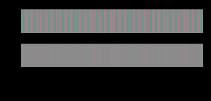
Measured on a chromatic square wave of fixed amplitude — fourteen units of a* — at a screen showing 41 pixels per degree:
| pattern period | frequency | ΔE00 as delivered | ΔE00 after the eye | ratio |
|---|---|---|---|---|
| 2 px | 20.6 c/deg | 14.22 | 0.92 | 15.5 |
| 4 px | 10.3 | 14.22 | 1.70 | 8.3 |
| 6 px | 6.9 | 14.22 | 3.71 | 3.8 |
| 8 px | 5.2 | 14.22 | 5.35 | 2.7 |
| 16 px | 2.6 | 14.22 | 8.78 | 1.6 |
| 32 px | 1.3 | 14.22 | 11.11 | 1.3 |
| one edge | — | 14.22 | 14.08 | 1.01 |
The left-hand column is constant by construction. Nothing about the colours changes down that table — only how finely they alternate — and the difference the eye is left with falls by a factor of fifteen.
And the same sweep in lightness gives 1.00 at every row. A lightness pattern at twenty cycles per degree survives the filter intact, because the luminance channel is still going strong there. The asymmetry is the entire content: it is the difference between the channels’ cutoffs, turned into colour differences.
Half of it is gone by four cycles per degree
The ratio column is the finding and the table is a coarse sampling of it, so the two frequencies worth interpolating out are the ones a person could act on.
Half the measured difference is gone by about 3.6 cycles per degree, and nine tenths of it by about 13. At the geometry the table is computed for — a reader 60 cm from a hundred-pixel-an-inch display, 41 pixels per degree — those become periods of eleven pixels and three pixels:
| what is left of the measured difference | frequency | period on that display |
|---|---|---|
| 90% | 0.8 c/deg | 50 px |
| 50% | 3.6 c/deg | 11 px |
| 10% | 13.2 c/deg | 3.1 px |
The eleven-pixel figure is the useful one, because it is small. A chromatic structure with a period finer than about a dozen pixels at an ordinary desk has already lost half of whatever a per-pixel difference reports about it — and a dozen pixels is not fine detail. It is the scale of a typeface’s stroke, a compression block, a texture in a fabric photographed at normal size, or the ringing beside a sharpened edge.
So the regime where a per-pixel ΔE is badly wrong is not an exotic one reached only by halftones and dither. It starts at a spatial scale that most photographs contain a great deal of, and by the scale a codec actually works at — an eight-pixel block is 5.1 cycles per degree here — the formula is already reporting between two and three times what a viewer is left with.
Both numbers move with the reader, in the one direction that makes it worse rather than better: everything above is quoted in cycles per degree, so a reader who sits further back loses more. At a metre the same eleven-pixel structure sits at 6.1 cycles per degree and keeps under a third.
Two numbers, one formula
The measurement is deliberately plain. Take a row of samples, take a flat row of the same mean, and compute ΔE00 between corresponding samples: that is raw. Then pass both rows through a spatial filter — the visual system’s three channels, each low-passed at its own cutoff — and compute the same formula on the filtered rows: that is seen.
Nothing about the colorimetry changes between the two. The filter has no opinion about colour difference and the formula has no opinion about space; the gap between them is what happens when the second is applied to something the first has already thrown away.
The same number, fifteen times apart
The lightness control deserves more than the sentence it gets, because it converts the result from a statement about patterns into a statement about the unit itself.
Two differences can have the same ΔE00 and be composed differently — one carried by lightness, one by chroma — and the formula is built so that they are interchangeable. That is what a colour-difference formula is: a scalar that collapses a three-dimensional displacement into one number on the promise that equal numbers look equally different.
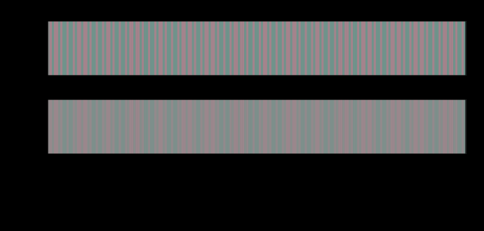
At twenty cycles per degree that promise fails by a factor of fifteen. A ΔE00 of 14.22 carried entirely in lightness is seen at 14.22, and the identical ΔE00 carried entirely in chroma is seen at 0.92. Nothing about the amplitude, the samples or the formula differs; only the direction of the displacement does, and the formula has already divided that out by construction.
So the exposure is not merely that a ΔE overstates a pattern. It is that how much it overstates depends on a property the number has deliberately discarded. A per-pixel difference map over a real image mixes lightness structure and chroma structure at every scale, so its error is not a single correction factor that could be applied afterwards — the factor is different for every pixel and depends on a decomposition the map no longer carries.
That is the reason the fix is the one Zhang and Wandell chose rather than a calibration curve. Filter first, then difference, because after the difference is taken the information needed to correct it is gone. A table of ratios like the one above can say how large the error is for a stated pattern; nothing can undo it on an image, and the temptation to try — to scale a measured ΔE by a factor read off a frequency — is the same category error one step further along.
Where this bites in practice
Halftones. A halftone is not a mixture; it is a pattern that becomes a colour at a stated distance. Measuring a printed tint with a spectrophotometer that averages over a large aperture gives the seen colour; measuring it pixel by pixel gives a set of enormous differences that nobody sees. Both are correct measurements of different objects.
Chroma subsampling. Throwing away three quarters of the colour samples produces per-pixel errors of tens of ΔE00 on a saturated edge and a barely visible picture. The industry did this by experiment in 1954 and the arithmetic here is the explanation.
Dither and noise. A dithered gradient has a large per-pixel error and a small seen one, which is most of why dithering is worth doing — although, as that essay records, this model does not reproduce the whole of the advantage.
And image quality metrics. A per-pixel mean ΔE over an image is a number with no viewing distance in it, which means it is a number about a file rather than about a picture. That is what spatially extended colour-difference metrics exist to fix, and they are exactly this construction: filter first, then difference.
The case where the ratio is one
Two arrangements survive the filter untouched, and both are worth naming because they are the arrangements colour tolerances are actually written for.
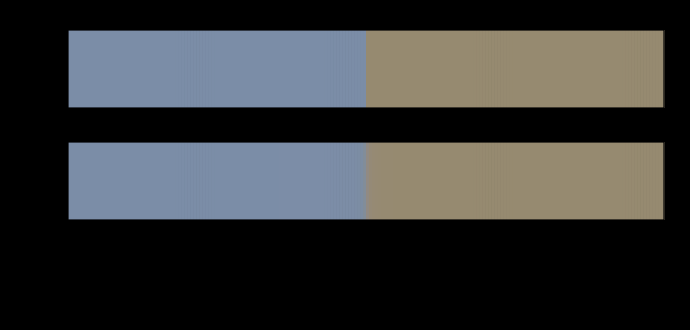
A large uniform patch. The whole of the difference is at zero spatial frequency, and every channel passes zero frequency at unit gain. A ΔE of 2 between two paint panels is a ΔE of 2 to the eye.
A single edge between two large fields. The step’s energy is spread over all frequencies, but its plateaus are far from the edge, and the filter leaves them alone. This is why a colour mismatch between two adjacent car panels is as visible as the numbers say — and why the same mismatch spread as a texture would not be.

The same filter applied to a ramp rather than to an edge is where the argument has a practical consequence, and the consequence is a bit depth.

The instrument has an aperture, and it is part of the answer
There is a hidden agreement between the two halves of colour measurement that this essay makes visible.
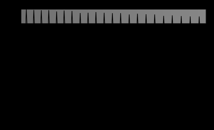
A spectrophotometer reads a sample through an aperture — commonly four or eight millimetres across — and reports the average over it. That is a spatial low-pass filter with a rectangular kernel, and it is why the instrument agrees with the eye about a halftone: both are averaging over an area large compared with the screen ruling. The agreement is a coincidence of scale rather than a design, and it fails in both directions.
It fails when the aperture is smaller than the structure. A small-aperture instrument on a coarse screen reads a dot or a gap rather than a tint, which is why measurement standards specify the aperture along with the geometry.
And it fails when the structure is coarser than the aperture and finer than the eye. A textile with a weave, a metallic paint with visible flake, a display with a visible subpixel pattern: the instrument averages, the eye does not, and the two disagree in the direction opposite to the halftone case.
The general statement is that an instrument is a spatial filter with a stated kernel and the eye is one with a measured kernel, and neither reading is the other’s. What the instrument reports has covered the spectral half of that sentence; this is the spatial half.
What a specification would have to carry
If a difference depends on the arrangement, then a tolerance that names only a number is naming half a requirement. Written out, the missing half is:
- the angular size of the samples, or their size and the viewing distance,
- the separation between them — adjacent, or with a gap, which is worth a factor of several on its own,
- the spatial structure within each sample, if any, since a textured sample and a uniform one of the same mean are different stimuli,
- and the light level, since the thresholds themselves move with it.
None of those appears on any tolerance specification in ordinary use. Two of them are already implicit in the practice of the trades that do this well — automotive colour work maintains physical master panels precisely so the arrangement is fixed by example rather than by description — and the industries that do it badly copy a number into a document and discover the mismatch through complaints.
That is the same gap this site found in a colour tolerance’s missing geometry, arriving from a different direction: there the missing argument was how enclosed the surface was, here it is how large and how finely divided it is. In both cases the specification has no field for the thing that decides the answer.
What was computed, and how
The rows are built in CIELAB at fixed L* with a square-wave modulation in one coordinate, converted to XYZ, and drawn with the site’s usual guarantee that an unreachable colour is hatched rather than clipped.
The filter decomposes each row into three channels — luminance itself, long-minus-medium, and short-minus-the-mean — low-passes each at its own cutoff, and recomposes. That first channel being Y rather than the cone sum matters and was the first version’s error: L + M is close to luminance and is not luminance, so a modulation at constant L* came out carrying a few per cent of achromatic signal that no chromatic cutoff can remove, and a fine chromatic grating filtered to nothing still reported several units of difference. The residue was a fact about the basis.
The transform is a mirrored discrete transform rather than a wrapped one, because a strip has ends and a circular convolution would fold the right-hand end onto the left.
And the frequencies are stated for a reader 60 cm from a display of about a hundred pixels to the inch, which gives 41 pixels per degree. Every ratio in the table moves if the reader moves.
Where the model stops
The maxima are less trustworthy than the means. After filtering, the largest single-sample difference sits near the ends of the strip, where the mirrored transform rings slightly; the means are stable and are what the tables quote.
One dimension. A real halftone screen is a two-dimensional pattern at an angle, and its energy sits on a ring in the frequency plane rather than at a point on an axis. The one-dimensional model gets the scale right and the orientation dependence entirely wrong.
No masking. The filter is linear, so a pattern beside another pattern is as visible as it would be alone, which is false.
And the frequency is only as good as the geometry. The figures on this page are drawn as scalable vectors: rendered wider or narrower, or read from further away, every frequency in the captions moves. The tables are computed at a stated geometry and the figures assume they are displayed at their natural width — which is a real limitation of drawing spatial-vision figures on a responsive page, and is stated rather than hidden.
The generalisation
The sentence worth carrying is: a colour difference is a measurement of an arrangement, not of two colours.
Every quantity in this field has an unstated arrangement in it. A tolerance assumes two large samples viewed adjacently — separate them and the acceptable difference grows by a factor of several. MacAdam’s ellipses were measured on a bipartite field of a stated size. CIEDE2000’s parametric factors exist precisely because the arrangement of the fitting experiment was one arrangement among many.
What this essay adds is that the arrangement can change the answer by a factor of fifteen without changing a single colour, and that the factor is computable rather than a matter of judgement.
The practical rule for anyone measuring an image: filter, then difference — and say at what distance. A per-pixel ΔE map is a diagnostic of a file. A spatially filtered one is a prediction about a viewer, and the two disagree most exactly where images have the most detail.
Who found it, and when
The spatial extension of colour difference is Zhang and Wandell’s, in 1996: filter each opponent channel of an image by its own contrast sensitivity function, then apply CIELAB per pixel. It was built for exactly the problem above — that a per-pixel colour difference misjudges halftones and dithered images — and the construction here is the same one with this site’s own machinery.
The measurements underneath are older: Mullen’s isoluminant sensitivity functions from 1985, and the observation going back to the beginnings of colour television that chroma can be carried at lower bandwidth than luminance.
What has not changed is practice. Per-pixel colour differences are still quoted routinely for images, in print, on screens, and in codec comparisons, usually without a viewing distance and often without noticing that the number is not about anything anybody could see.
What the figures cannot show
They cannot show what the reader sees. Every strip on this page is drawn to a stated geometry and displayed at whatever size the reader’s browser chooses, so the frequencies in the captions are nominal. The honest form of every claim here is conditional: at 41 pixels per degree, this pattern loses this much.
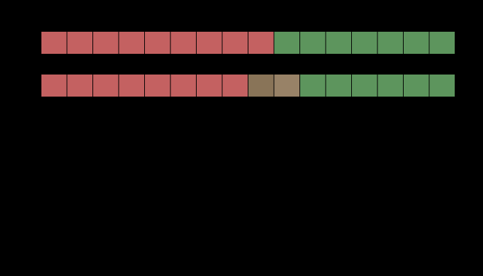
And they cannot show the difference they are measuring. The lower strip in each figure is what survives the filter — an image of a prediction, not an image of an appearance. Nobody sees the filtered version; they see the upper strip, and the model says what is left of it. Drawing the prediction is the closest a page can come, and it is not the same thing.
Where the ladder goes next
The nearest unfinished piece is two-dimensional. Everything here is a one-dimensional profile, and the two cases where that matters most — a halftone screen at an angle, and a blue-noise dither mask — are exactly the cases where the energy’s placement in the two-dimensional frequency plane is the whole point. The machinery would extend; the figures would be much heavier.
The second is the standard nobody writes. If a tolerance is a statement about an arrangement, then a tolerance specification could carry one: a size, a separation and a viewing distance, alongside the illuminant and the observer it already names. Every ingredient is measurable and none of them appears on any specification in use, which is the same gap the geometry of a corner exposed from a different direction.
Where this goes next
 How fine a colour edge can be
The eye resolves a lightness pattern to about fifty cycles per degree and a red–green one to twelve. Every colour difference here is quoted as though a patch had no size, and the same difference is plainly visible at one scale and gone at another.
How fine a colour edge can be
The eye resolves a lightness pattern to about fifty cycles per degree and a red–green one to twelve. Every colour difference here is quoted as though a patch had no size, and the same difference is plainly visible at one scale and gone at another.
 How far apart are two colours
ΔE is meant to be a distance with the property that the same number means the same perceived difference everywhere. Three successive formulae have tried, they disagree with each other by more than a just-noticeable difference, and the disagreement decides real matching questions.
How far apart are two colours
ΔE is meant to be a distance with the property that the same number means the same perceived difference everywhere. Three successive formulae have tried, they disagree with each other by more than a just-noticeable difference, and the disagreement decides real matching questions.
 Colour thrown away on purpose
Every video format in use discards three quarters of its colour information and keeps all of its luminance, because the eye resolves fine colour detail badly. On an edge that carries luminance the loss is exactly zero. On an edge of nearly equal luminance it is a colour difference of forty-three, and the two edges are the same edge to the codec.
Colour thrown away on purpose
Every video format in use discards three quarters of its colour information and keeps all of its luminance, because the eye resolves fine colour detail badly. On an edge that carries luminance the loss is exactly zero. On an edge of nearly equal luminance it is a colour difference of forty-three, and the two edges are the same edge to the codec.
What this makes readable
Essays that name this one as a prerequisite.
Named alongside this one
Essays reaching for the same objects. Nobody chose these; they are what the index of named objects makes visible.
- A mean is not a difference ciede2000 · δe · image difference · quality control · tolerance
- Measured with an aperture, seen with an eye contrast sensitivity · halftone · quality control · spatial frequency · viewing distance
- Sharpened type errs on its dark side contrast sensitivity · δe · image difference · spatial frequency · viewing distance
- The eye counts a corner's error, not its peak contrast sensitivity · δe · image difference · spatial frequency · viewing distance
- A halftone is a luminance object contrast sensitivity · halftone · spatial frequency · viewing distance
- A tolerance is a probability ciede2000 · δe · quality control · tolerance
What links here
The 8 essays that link to this one and share the most of its objects, of 25 that link here.
The objects this essay names
Each one links to every other essay that touches it.
BandingCIEDE2000Contrast sensitivityΔEDitherHalftoneImage differenceQuality controlSamplingSpatial frequencyToleranceViewing distance