Measured with an aperture, seen with an eye
Assumes A dot is larger than it was asked to be and A halftone is not a mixture.
A spectrophotometer puts an aperture several millimetres across over a halftone patch and integrates. Whatever the screen is doing inside that aperture, the instrument reports one reflectance — the area average, with the light that scattered sideways under the paper already accounted for by an exponent fitted to the substrate.
That exponent is a statement about the paper. It has been in this site’s printing model since it was built and it is measured, real, and not what this essay is about.
An eye does something structurally different, and the difference is an ordering. Its optics blur the pattern first, and the compressive nonlinearity that turns luminance into lightness acts after the blur, point by point. Those two operations do not commute.

The claim
A halftone patch looks darker than it measures, by an amount that depends on the viewing distance, and the correction a press applies for dot gain has no viewing distance in it.
- At four cycles per degree the measurement and the appearance are ΔE00 11.1 apart, with the patch looking 14.3 lightness units darker than its reflectance says.
- At thirty-five cycles per degree they are 0.6 apart. The gap is a property of how well the screen is resolved, not of the ink.
- The crossing is at about thirty cycles per degree, which at reading distance is a fine offset screen — and at arm’s length is a coarser one, because the quantity is an angle.
- And the size of it at a coarse ruling is the size of the tone value increase the press does correct: 12.4 lightness units at fifty per cent black. One of those two is on the sheet and one of them is not.
Two operations that do not commute
Lightness is a concave function of luminance — a cube root, near enough, above a small linear toe. Concavity has an immediate consequence for any average: the mean of a concave function is at most the function of the mean, with equality only when there is nothing to average.
A halftone patch is the extreme case of something to average. Half of it is solid ink at a reflectance factor of a few per cent and half is bare paper at ninety, and the difference between the lightness of the mean reflectance and the mean of the two lightnesses is large.
For a fifty per cent black screen on white paper: the mean reflectance is about 0.5, whose lightness is 76. The two lightnesses being averaged are 100 and 24, whose mean is 62. Fourteen units apart, from the ordering alone.
The two answers are not close and neither is a rounding of the other. Which of them a reader gets depends entirely on whether the blur happened first. If the screen is far too fine to resolve, the retinal image is already uniform at the mean and the eye computes the lightness of the mean: 76, and the instrument is right. If the screen is resolvable, the nonlinearity acts on a pattern that is still black and white, and whatever pooling happens afterwards is pooling lightnesses: 62, and the instrument is wrong by fourteen units.
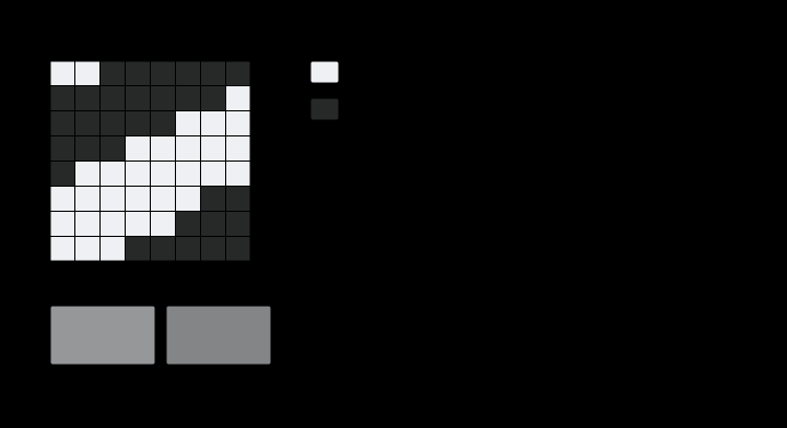
What the numbers do
The gap falls with ruling and does not fall to zero until well past where a person would guess.
At four cycles per degree — a screen-printed poster held close, or a newspaper at reading distance in the 1970s — it is ΔE00 11.1. At nine it is 6.2. At eighteen it is 2.1. At twenty-five, 1.6. At thirty-two, 0.5.
Converting a ruling in lines per inch into cycles per degree takes a viewing distance and nothing else: a degree of visual angle subtends about half a centimetre at thirty centimetres, so a screen of n lines per inch is roughly n/5 cycles per degree there. A 150-line screen at thirty centimetres is about thirty cycles per degree, which is where the crossing falls. So a fine offset print viewed at a normal distance measures very nearly what it looks like — and the same sheet held at fifteen centimetres does not, because the ruling in angular terms has halved.
A conventional way to hide that is to say the eye ‘integrates’ the patch, which is true and is the wrong verb: integration is exactly the operation whose order against the nonlinearity is in question, and saying it without saying when leaves both answers available. That is not a small caveat about proofreading habits. It is the statement that a printed patch has no single lightness: it has one at arm’s length and a different one at reading distance, and the difference between them is larger than any tolerance the sheet is being judged against.

Against the correction the press does make
A press does correct for dot gain. The plate carries an area, the sheet behaves as though it carried a larger one, and the difference — mechanical spread plus the light that scattered sideways under the paper — is measured, tabulated as a tone value increase curve, and compensated in the separation.
At fifty per cent black that correction is worth 12.4 lightness units on this site’s press model: the patch measures L* 50.1 with the gain and would measure 62.5 without it.
The perceptual gap at four cycles per degree is 14.3 units. The same order, the same direction, and one of them is corrected.
The difference between the two is where they live. Tone value increase is on the sheet: an instrument measures it, a press is calibrated against it, and two people looking at the same sheet from any distance get the same measured reflectance. The perceptual gap is not on the sheet at all — it is a property of where the reader is standing, so no press setting can compensate it without picking a viewing distance and being wrong for every other one.
The gap against ruling, in one table
| ruling, c/deg | ΔE00 gap | lightness units darker | what that is, at 30 cm |
|---|---|---|---|
| 4 | 11.13 | 14.3 | a screen-printed poster |
| 9 | 6.22 | 8.4 | a coarse newsprint screen |
| 18 | 2.10 | 2.9 | an ordinary newspaper |
| 25 | 1.64 | 2.3 | a magazine |
| 32 | 0.51 | 0.7 | fine offset |
| 40 | 0.66 | 0.9 | finer than any press runs |
The last row rises slightly, which is a discretisation artefact rather than a result — at that ruling the screen occupies a handful of samples of the grid it is rasterised on, and the answer is at the edge of what the model can carry. Nothing above thirty cycles per degree is worth quoting to two decimals.
The fourth column is the reason this matters outside a model. A newspaper column at reading distance is squarely in the range where a two-to-three unit gap exists, which is above a contract-proof tolerance and below anything anybody would notice as an error, because it is a systematic offset applied to the whole page.
The gap has a ceiling, and the coarse end is already at it
The table falls steeply and it is worth knowing what it falls from, because that end is computable in one line and bounds the whole effect.
If the screen is not blurred at all, the eye is averaging two lightnesses and the instrument is taking the lightness of two averaged reflectances — which is the arithmetic already set out above, with no filter in it. For a fifty per cent screen on this paper the two answers are 77.3 and 62.0, so the ceiling is 15.3 lightness units.
The measured gap at four cycles per degree is 14.3. Ninety-three per cent of the ceiling, already reached at the coarsest ruling in the table — so the curve is not still climbing at the left-hand end, it is flattening against a limit.
That is the useful form of the result. No screen is ever worse than the Jensen gap of its own two levels, and that number needs no filter, no viewing distance and no model of the eye: it is the lightness of the mean reflectance minus the mean of the two lightnesses, and it can be computed from a paper measurement and a solid-ink measurement in a spreadsheet. Everything the spatial model adds is how much of the ceiling a given ruling and distance actually reach.
And it is not symmetric about half coverage
The obvious reading of the two quarter-coverage figures is that they are a symmetric pair — a quarter and three quarters have equally less to average than a half, so both should be equally milder. The pattern’s variance is indeed symmetric about a half. The gap is not.
| coverage | lightness of the mean | mean of the lightnesses | ceiling |
|---|---|---|---|
| 25% | 89.9 | 81.0 | 8.9 |
| 50% | 77.3 | 62.0 | 15.3 |
| 69% | 64.9 | 47.6 | 17.3 — the maximum |
| 75% | 60.0 | 43.0 | 17.0 |
A three-quarter screen is worth nearly twice a quarter screen, and the peak is not at fifty per cent but at about sixty-nine.
The reason is the cube root’s curvature, which is not constant. Jensen’s gap goes as the second derivative of the concave function times the variance of what is being averaged; the variance peaks at a half, and rises steeply as the mean reflectance falls. The product of a symmetric factor and a monotonically rising one peaks past the middle, and it peaks where the two rates cancel.
So the effect is a shadow phenomenon rather than a midtone one, and that changes where to look for it. A three-quarter tone in a dark area of a newspaper photograph is the worst case on the page; the fifty per cent patch a press is controlled on is not, and the quarter tones — where a proofer’s eye usually goes, because that is where a face’s highlights are — carry barely half of it.
It also sharpens the comparison with the correction that is made. Tone value increase is largest in the midtones by construction, since a dot’s perimeter-to-area ratio peaks there. The perceptual gap peaks in the shadows. The two are the same size and they are not the same shape, so a tone curve fitted to compensate one of them cannot be compensating the other even at a chosen distance.
What was computed, and how
The screen is a square-dot lattice at a stated ruling, coverage and angle — a cell is inked where a spot function falls below the coverage, so the dots are pixels either on or off rather than a picture of a dot.
That field is filtered through the eye’s own low-pass envelope at a stated viewing geometry, giving a per-point ink fraction. Each point’s reflectance is the paper’s plus that fraction of the way to the solid ink’s, which is linear in radiance and is therefore the right place to mix. Each point is then converted to CIELAB and the results averaged.
The instrument’s answer is the same conversion applied once to the area-average reflectance, with the printing model’s Yule–Nielsen exponent in place — so the substrate scattering is in both numbers and cancels out of the comparison. The gap is the ordering and nothing else.
assertAScreenLooksDarkerThanItMeasures requires the direction, the size at a coarse ruling and the near-agreement at a fine one. assertTheCorrectionHasNoDistanceInIt requires the same sheet at two distances to be two different distances from its own measurement, and requires a crossing to exist.
Why this is not the same as dot gain
The two quantities are the same size and the same sign, so it is worth stating what separates them in a form that could be tested rather than only asserted.
Tone value increase is measurable with an instrument. Put a densitometer on a fifty per cent patch and it reads the reflectance of a patch behaving as though it carried more ink. Two instruments agree; two people agree; the number is a property of the sheet.
The perceptual gap is not measurable with any instrument at all. No aperture reports it, because every aperture averages before anything is compressed. It exists only in a system where a nonlinearity follows a spatial filter, which is what an eye is and what no photometer is.
The consequence is a diagnostic. If a patch is measured at two apertures — a two-millimetre and a ten — the dot gain reading is the same, because both apertures contain many cells and both average. If the same patch is viewed at two distances the perceptual answer differs, and nothing about the sheet has changed.
So a printer who suspects a tone reproduction problem has a test available that costs nothing: look at the proof from twice as far away. If the mismatch with the reference persists, it is on the sheet. If it changes, part of it never was.
Where it stops
The filter used is this site’s spatial envelope, which is a contrast sensitivity function rather than an optical modulation transfer function. Those are different objects: the first includes neural gain and the second does not, and the physically correct thing to apply before a receptor nonlinearity is the second.
Using the first is a deliberate and stated approximation, and its direction is known. A true optical transfer function falls faster at high frequencies than the sensitivity envelope does, so the real gap closes sooner than the curve here says — the crossing at thirty cycles per degree is a conservative estimate and the true one is lower.
What the approximation cannot change is the existence of the effect or its size at coarse rulings, because at four cycles per degree every candidate filter passes the screen essentially intact and the fourteen units are the concavity alone.
The pooling after the nonlinearity is a plain average, which is the simplest defensible choice and is not obviously what the visual system does. A pooling that weighted dark and light regions unequally would move the number; a pooling that happened before the nonlinearity would remove the effect entirely, and that is the hypothesis the observation contradicts.
And the whole computation is monochrome in the sense that matters: one ink on paper, so the pattern is a lightness pattern. A screen made of two inks of similar lightness presents almost nothing to compress, which is the other half of the same fact arriving from the spatial side.
Who found it, and when
The optical part of dot gain is Yule and Nielsen’s, from 1951: light entering the paper beside a dot can leave under it, so a halftone absorbs more than its area coverage predicts. Their repair is the exponent this site’s printing model carries, it is fitted per substrate, and it is one of the most durable empirical constants in the trade.
The perceptual part has a thinner history and no standard name. It appears in the literature on halftone image quality as an argument about whether to model the eye’s filter before or after the nonlinearity, and the answer — blur first, compress after — is not controversial among the people who model it. What has not happened is that answer reaching the tone reproduction curve, where the compensation is still a function of area coverage and nothing else.
There is a reason it has not. A press cannot correct for something that depends on the reader, and admitting the dependence would mean admitting that a tone curve is right at one distance. It is easier to calibrate at the distance a proofer stands at and let the rest follow, which works well and is not the same as being right.


The same generator measures a second gap of the same kind, between two rooms rather than between two instruments, and it is worth having for scale.

Where the ladder goes next
Two screens of the same measured reflectance and different geometry — an ordinary lattice against a stochastic one — should have different gaps at the same ruling, because a stochastic screen puts its energy at different frequencies and therefore leaves a different amount of structure after the blur. That is a computation this site can already do and it would predict which of the two looks darker at a stated distance, which is a real question printers argue about.
The other direction is the specification. If a printed patch’s appearance depends on viewing distance by more than a tolerance, then a print standard that states a tolerance without stating a distance is incomplete in exactly the way a viewing booth’s uniformity requirement is. The distance is already implicit in the trade’s practice — proofing is done at arm’s length by convention — and writing it down would cost nothing and would make the convention checkable.
Where this goes next
 A dot is larger than it was asked to be
Two quite different things make a printed midtone darker than its coverage says — ink spreading under pressure, and light scattering sideways inside the paper. Both bend the tone curve the same way and neither touches its ends, so the measurement every press is characterised by cannot say which happened. A patch that nobody measures can.
A dot is larger than it was asked to be
Two quite different things make a printed midtone darker than its coverage says — ink spreading under pressure, and light scattering sideways inside the paper. Both bend the tone curve the same way and neither touches its ends, so the measurement every press is characterised by cannot say which happened. A patch that nobody measures can.
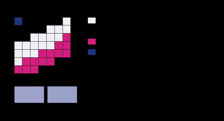 A halftone is not a mixture
Forty per cent cyan and thirty per cent magenta are not stirred together anywhere. They are laid down as dots, and the sheet is a mosaic of four fully-inked regions in proportions the two coverages fix — which is why the colour is an area average of four spectra rather than a blend of two, and why it lands nowhere near where mixing would put it.
A halftone is not a mixture
Forty per cent cyan and thirty per cent magenta are not stirred together anywhere. They are laid down as dots, and the sheet is a mosaic of four fully-inked regions in proportions the two coverages fix — which is why the colour is an area average of four spectra rather than a blend of two, and why it lands nowhere near where mixing would put it.
 What the instrument reports
A spectrophotometer sees a sample through a slit of finite width, at a finite number of wavelengths. What it writes down is the truth convolved with its own bandpass, and nothing in the file says which values were measured and which were invented.
What the instrument reports
A spectrophotometer sees a sample through a slit of finite width, at a finite number of wavelengths. What it writes down is the truth convolved with its own bandpass, and nothing in the file says which values were measured and which were invented.
Named alongside this one
Essays reaching for the same objects. Nobody chose these; they are what the index of named objects makes visible.
- A difference has no size contrast sensitivity · halftone · quality control · spatial frequency · viewing distance
- A pattern has a direction contrast sensitivity · halftone · process inks · spatial frequency · viewing distance
- A tint at the edge of a page contrast sensitivity · halftone · process inks · spatial frequency · viewing distance
- Sharpened type errs on its dark side contrast sensitivity · lightness · spatial frequency · viewing distance
- The eye counts a corner's error, not its peak contrast sensitivity · lightness · spatial frequency · viewing distance
- A brand colour for a population process inks · quality control · substrate
What links here
Every essay whose body links to this one.
The objects this essay names
Each one links to every other essay that touches it.
Contrast sensitivityHalftoneLightnessMeasuring geometryProcess inksQuality controlSpatial frequencySpectrophotometrySubstrateTone reproductionViewing distanceThe Yule–Nielsen exponent