Brightness is not luminance
Assumes Brighter looks more colourful and A viewing condition is an argument.
Luminance is additive. Two lights mixed have the sum of their luminances, exactly, for every pair of lights — which is what makes colour add up — and that is not a measurement. It is a definition: luminance is a spectrum integrated against one agreed curve, and an integral of a sum is the sum of the integrals.
Brightness, which is how bright something looks, is not additive. The two words are used interchangeably in almost every technical document that is not about colour appearance, and this essay is about the size of the gap.
The claim
A saturated colour looks brighter than a neutral of the same luminance, and this site’s appearance model does not predict it.
Two separate statements, and the second is the one worth recording carefully:
- The Helmholtz–Kohlrausch effect is measured, repeatedly, by several methods, at a size usually quoted as an equivalent luminance ratio between 1.3 and 2.
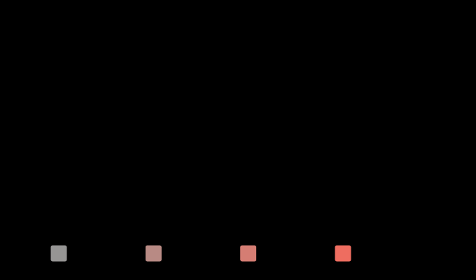
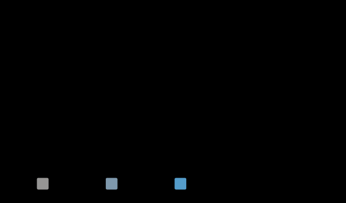
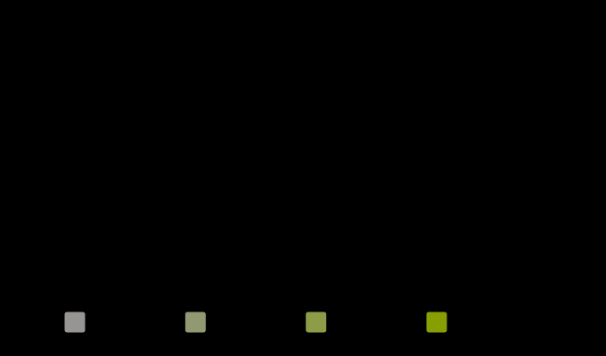
- CIECAM16’s brightness correlate , computed here at rigorously constant luminance across a chroma sweep, moves by at most 2.2 per cent — and the direction depends on the hue. At hue 25 it rises by 2.2 per cent; at hues 120 and 240 it falls by 1.1.
A model that moved the right way and too little would be a model with a weak version of the effect. A model that moves by two per cent in whichever direction the hue happens to send it has no version of the effect at all, and the two per cent is the arithmetic of its nonlinearity rather than anything about appearance.
Why the model has none
CIECAM16’s brightness is built from the achromatic response:
Chroma enters that chain only through the compressive nonlinearity applied to each adapted cone signal. A saturated stimulus has a different distribution of cone responses from a neutral of the same luminance, so the compressed sum comes out slightly different — and that residue is what the two per cent is.
Nothing in the model adds colourfulness into brightness, and the effect being described is exactly that: the chromatic channels contributing to apparent brightness — a second thing an appearance model has no slot for. The published extensions that do model it — a Helmholtz–Kohlrausch term added to CIECAM-class models — are additions rather than consequences, and no such term is in this site’s implementation.
So the absence is asserted rather than described. assertTheModelUnderpredictsHelmholtzKohlrausch sweeps four hues, requires the luminance to be held to a millionth, and requires the brightness movement to stay under five per cent. If a future revision of the appearance model starts predicting the full effect, the build stops and somebody has to say where the term came from. That is the same shape as the Stevens effect’s absence, recorded during the expansion phase for the same reason: an unexplained improvement is not good news.
What the effect actually is
The clean statement is about equivalent luminance. Set a saturated patch beside a neutral one and ask an observer to adjust the neutral until the two look equally bright. The neutral ends up at a substantially higher luminance than the coloured patch — up to about twice, depending on hue, purity and the method used.
Three things follow, and each contradicts a piece of everyday practice.
A photometer does not measure brightness. It measures luminance, which is a weighted integral with V(λ) as the weight, and V(λ) was itself established by flicker photometry — a method chosen precisely because it makes the answer additive. The 683 lm/W ceiling and every efficacy figure on this site are luminance quantities, and a lamp that scores well on them can look duller than one that does not.
Equal luminance is not equal appearance, which makes “isoluminant” a colorimetric term rather than a perceptual one. An isoluminant grating is one the luminance channel cannot see; it is not one that looks flat.
And a contrast ratio is a luminance ratio. That last one has consequences well outside this subject.
What a contrast ratio cannot see
The accessibility rule that governs text on screens is
with the relative luminance. It contains no observer state, no adapting level, no surround and no chroma, so every pair of colours with the same ratio is the same pair as far as it is concerned.
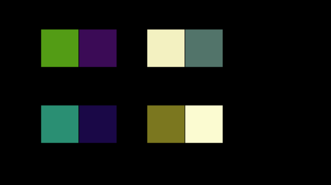
Sampling pairs at exactly that ratio and asking the appearance model what their lightness difference is:
| ratio | pairs found | smallest ΔJ | largest ΔJ | spread |
|---|---|---|---|---|
| 3.0 | 274 | 22.2 | 47.2 | 2.13× |
| 4.5 | 115 | 34.0 | 56.5 | 1.66× |
| 7.0 | 44 | 47.4 | 67.3 | 1.42× |
At the pass mark, pairs the rule cannot distinguish differ by a factor of 1.66 in what the model says about them.
And the ordering inverts. Among pairs near the mark, the least-different passing pair is 34.2 lightness units apart at a ratio of 4.54; the most-different failing pair is 58.3 units apart at 4.41. The rule accepts the first and rejects the second, and the model says the second is nearly twice as distinguishable.
The same model says a second thing about brightness that luminance has no way to say, and it says it as a colour rather than as a curve.
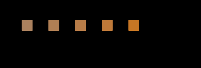

The rule’s resolving power is a factor of 2.3
The three rows of that table are three points on two straight lines, and drawing them turns “a factor of about 1.7 at the mark” into something a designer could act on.
Both bounds are linear in the logarithm of the ratio, to within a third of a lightness unit at every point:
The lower bound climbs faster than the upper one, so the spread narrows as the ratio rises — 2.13 at a ratio of 3, 1.66 at the pass mark, 1.42 at 7 — and the two lines meet at a contrast ratio of 191. Since sRGB’s own maximum is 21:1, black on white, the rule never becomes exact on any display: even at that extreme it still carries a spread of 1.17.
And the rule is worst where it is used most. The spread grows as the ratio falls, so the proxy is at its least reliable in the range between 3 and 4.5 — which is exactly the range a designer argues about, because it is the range where a choice passes or fails.
The sharper form is the resolving power. Two pairs are certainly ordered by the rule only when the weaker pair’s largest lightness difference is below the stronger pair’s smallest — and setting gives
A luminance contrast ratio cannot order two colour pairs whose ratios differ by less than a factor of 2.3. A pair at 3:1 may be more distinguishable than a pair at 6:1; only past about 7:1 is it certainly beaten.
That is a stronger statement than the inversion example the essay already gives, and it is the same fact generalised. The inversion — a passing pair at 4.54 sitting closer together than a failing one at 4.41 — looks like a boundary curiosity, something that happens only at the threshold where two verdicts meet. It is not. The bands overlap over a range of 2.3 in ratio at every point on the scale, so the ordering fails everywhere and the threshold is merely where anybody notices.
Which is a precise account of what the rule is for. It is not a ranking and it should not be read as one: two designs at 4.6 and 5.5 have not been ordered by it, whatever their numbers say. What it is is a floor, and a floor is a much weaker instrument than a scale — it says a pair below the mark is probably bad without saying that a pair above it is better than another pair above it. Every use of the rule that compares two passing designs is using it a factor of 2.3 past its resolution, and the factor is now measurable rather than a matter of opinion.
None of that makes the rule useless. It is cheap, it is computable from a hex code without any viewing information, and it correlates with legibility well enough to have improved a great deal of typography. It is a proxy, its residual error is a factor of about 1.7 at the mark and 2.3 as a resolving power, and knowing the size of the residual is what separates using a proxy from believing it.
Where the gap shows up
Signage and safety colours. A saturated red sign and a grey one of equal luminance are not equally conspicuous, and the standards that govern warning colours specify chromaticity as well as luminance for exactly that reason. The equivalent-luminance correction is one of the few places the effect is written into practice.
Displays sold on peak brightness. A panel’s headline figure is a luminance, measured on white. What a viewer notices about a highly saturated highlight is not a luminance, and a display with wider primaries can look brighter at the same measured peak — the gamut and the brightness are not independent as far as appearance is concerned, although they are entirely independent as far as photometry is concerned.
Lighting design. A lamp’s efficacy is a luminance per watt, so a source optimised for it is optimised for the additive quantity. There is a known and awkward consequence: light sources with more chromatic content can be judged brighter at equal measured output, and a design rule written in lumens cannot express that.
And the blue channel of everything. Saturated blues have very low luminance — the blue primary of a display carries about seven per cent of white’s — while looking far from dark. That mismatch is where the effect is largest, and it is why blue text on a dark ground routinely passes a luminance-based contrast check while being difficult to read, and why a blue that looks bright measures as though it were nearly black.
What the pictures cannot show
The effect itself. A figure demonstrating the Helmholtz–Kohlrausch effect would need two patches that a reader judges equally bright, and this page cannot control the reader’s adaptation, surround or display. What is drawn instead is the model’s prediction and the measured band around it, which is a picture of a gap rather than of an appearance.
And the model’s two per cent is not visible either. A change of two per cent in brightness is below any threshold a reader could apply to two patches on a page; the number is meaningful only against the thirty to hundred per cent that was measured, and the whole content of the comparison is the ratio between them.
What was computed, and how
The sweep. Seven stimuli at one hue, with chroma from 0 to 60, each solved so that its luminance is exactly 30 — by iterating CIECAM16’s inverse on lightness until lands, which is checked to a millionth on every row before anything is reported. Holding rather than is the whole experiment: a sweep at constant lightness would be answering a different question.
The brightness is CIECAM16’s under an average surround at 100 cd/m², reported as a ratio to the neutral’s at the same luminance.
The contrast pairs are random sRGB triples, filtered to those whose luminance contrast ratio lands within 0.05 of the target, with the lightness difference computed as under the same viewing conditions. Forty thousand candidates give a few hundred at any one ratio, which is why the tables report how many were found.
And the measured range is quoted, not computed. 1.3 to 2.0 is a band drawn around what the literature reports for the equivalent-luminance ratio of a saturated colour; no experiment is done here and none is claimed.
A magenta is the hue where the model’s brightness moves least, and it is the strongest form of the complaint.
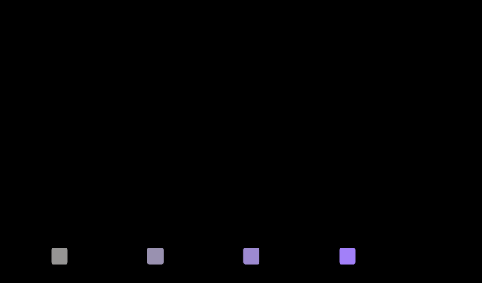
Where the model stops
The model has no Helmholtz–Kohlrausch term and this essay does not add one. Fitting one would mean inventing a constant, and the site’s whole position is that a computed number should be downstream of something stated. What is offered instead is the measured absence and a pointer to the published extensions.
The two bounds are three points each. The straight lines fitted through them reproduce all six values to within a third of a lightness unit, which is a good fit and is a fit to three points — so the meeting-point at a ratio of 191 is an extrapolation nine times past the last measurement and should be read as far outside anything a display reaches rather than as a number. The resolving power of 2.3 is an interpolation between the measured rows and is on firmer ground.
The contrast-ratio comparison uses lightness, not brightness. is the relative attribute and is the right one for text on a page, since a page has a white. Using would change the numbers and not the conclusion.
One viewing condition throughout. 100 cd/m², average surround, D65 white, twenty per cent background. Text on a phone at night is none of those, and every number would move.
And no legibility is measured. Lightness difference is not reading speed; the claim here is that the rule and the model disagree about ordering, not that the model predicts who can read what.
A seven-to-one contrast ratio is what an accessibility standard asks for at its stricter level, and the pairs that satisfy it are not equally legible.
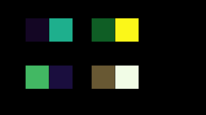
The generalisation
There is a family of quantities in this subject that are defined to be linear, and a matching family that are measured and are not, and almost every confusion in applied colour is a member of the first standing in for a member of the second.
| defined, linear | measured, not linear |
|---|---|
| luminance | brightness |
| tristimulus values | appearance |
| dominant wavelength | hue |
| purity | saturation |
| a spectral integral | a judgement |
The left column exists because somebody needed arithmetic that closes: photometry has to add, or a lighting calculation cannot be done at all. The right column is what people mean when they use the words. The two agree well enough for a great deal of engineering, and the places they part company are the places this site keeps finding its essays.
The practical rule is a question rather than a formula: is this quantity additive because it was measured to be, or because it was defined to be? For luminance the answer is the second, V(λ) was established by a method chosen to make it so, and every downstream use inherits the choice.
Who found it, and when
Helmholtz noticed it and Kohlrausch measured it, in the 1920s: a coloured light matched in luminance to a white one does not look equally bright, and the discrepancy grows with purity.
The reason it survives as a named effect rather than being absorbed into photometry is the reason above. Additivity was chosen. Flicker photometry, and heterochromatic brightness matching by other methods, give different luminous efficiency functions — and the CIE standardised the additive one, knowing it was not the brightest-looking one, because a photometry that does not add is not usable for calculation.
The modern form of the argument is in display engineering, where “equivalent luminance” corrections are applied to saturated colours in some signage and cockpit standards and to nothing else, and in accessibility, where the luminance-only contrast rule is periodically re-litigated on exactly the grounds measured above.

What the pictures cannot show
The effect, again. Every figure here draws the model or the pairs; the phenomenon itself needs a matching experiment the page cannot run. What a reader can do is the informal version: find a saturated blue and a grey that a photometer calls equal, and notice that they are not.
And the contrast pairs are drawn as adjacent patches, which is the arrangement the accessibility rule is about — text on a ground — but at a size and a spacing the rule does not specify either. A difference has no size applies to this rule as much as to any tolerance: the same pair at nine points and at ninety is two different judgements, and the ratio is the same number for both.
Where the ladder goes next
The obvious next rung is the one the model’s structure points at: the difference between the relative attributes and the absolute ones. Lightness and chroma are ratios to a white; brightness and colourfulness are not, and a stimulus with no white beside it has only the second kind. That turns out to decide which colours can exist at all — there is no brown light — and it is the same distinction as this essay’s, applied to naming rather than to matching.
The other direction is the honest repair. Adding a published Helmholtz–Kohlrausch term to the appearance model would be a real improvement and a real risk: it would have to be checked against the same published test vector the rest of the model is checked against, and against data this site does not hold. Until then the absence is asserted, which is worth more than a term nobody can test.
Where this goes next
 Brighter looks more colourful
Colourfulness rises with light level and the model predicts it. Apparent contrast is supposed to rise too, and the model does not — which turns out to be right, because the thing that actually carries contrast is the surround.
Brighter looks more colourful
Colourfulness rises with light level and the model predicts it. Apparent contrast is supposed to rise too, and the model does not — which turns out to be right, because the thing that actually carries contrast is the surround.
 What a lamp cannot give back
Six hundred and eighty-three lumens per watt is not a measurement of anything. It is the definition of the candela, it is a ceiling no white light can approach, and the distance between a lamp and that ceiling is mostly the price of being able to see what colour things are.
What a lamp cannot give back
Six hundred and eighty-three lumens per watt is not a measurement of anything. It is the definition of the candela, it is a ceiling no white light can approach, and the distance between a lamp and that ceiling is mostly the price of being able to see what colour things are.
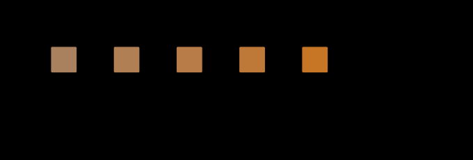 There is no brown light
Brown is dark orange, dark is a ratio to a white, and a light in a dark room has no white to be dark against. The same stimulus, unchanged in XYZ, runs from lightness 152 to lightness 16 as the surround is raised — and only the bottom of that range has a name.
There is no brown light
Brown is dark orange, dark is a ratio to a white, and a light in a dark room has no white to be dark against. The same stimulus, unchanged in XYZ, runs from lightness 152 to lightness 16 as the surround is raised — and only the bottom of that range has a name.
What this makes readable
Essays that name this one as a prerequisite.
Named alongside this one
Essays reaching for the same objects. Nobody chose these; they are what the index of named objects makes visible.
- A patch is not a scene ciecam16 · colour appearance · lightness · luminance
- The proof is a different object ciecam16 · colour appearance · colourfulness · lightness
- The reversals have a straight edge ciecam16 · colour appearance · colourfulness · lightness
- A dark background moves every difference and no match ciecam16 · colour appearance · lightness
- A display in a room is a smaller display ciecam16 · colour appearance · contrast ratio
- A model judged in another model's unit ciecam16 · colourfulness · lightness
What links here
The 8 essays that link to this one and share the most of its objects, of 10 that link here.
The objects this essay names
Each one links to every other essay that touches it.
AccessibilityBrightnessCIECAM16Colour appearanceColourfulnessContrast ratioLightnessLuminanceLuminous efficiencyPhotometry