A halftone is not a mixture
Assumes A spectrum is not a colour and Why blue and yellow make green.
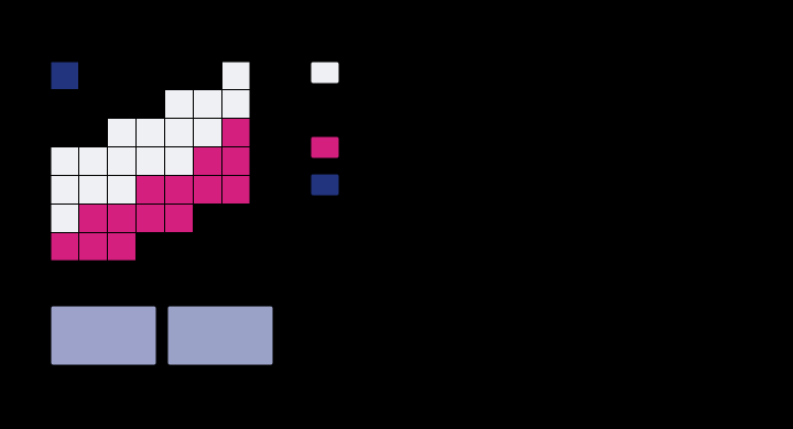
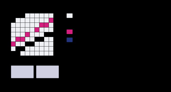
Almost every account of four-colour printing begins by saying that cyan, magenta and yellow inks mix. Under a magnifier they do no such thing. A printed tint is a mosaic of dots that sit beside one another and on top of one another, every dot a full film of ink at full strength, and the only thing that varies from a pale tint to a saturated one is how much of the paper is covered.
That single observation decides the arithmetic of the whole field, and it decides it differently from the arithmetic everybody expects.
The claim
A halftone tint is a spatial average of a small set of fully-inked patches, and the colour that results is not any kind of average of the inks themselves.
The fully-inked patches have a name — the Neugebauer primaries — and for a two-ink tint there are four of them, for three inks eight, for four inks sixteen. Each is a real thing that could be printed on its own and measured, which is what makes the model unusually honest: the only approximation in it concerns how much area each one occupies, and the colours being averaged are not approximations at all.
The consequence worth carrying out of this essay is that the model has three separate ingredients, each of which can be got wrong independently, and only one of them has anything to do with the eye.
What is in a dot
An ink film is a filter. Light passes down through it, reflects off the substrate underneath, and passes back up through it a second time, so a solid’s reflectance is the paper’s reflectance multiplied by the square of the ink’s internal transmittance.
The exponent is geometry rather than a fitted constant. Halving it — the natural mistake, since a film is one film — halves every optical density in the model and produces a set of inks that look weak rather than a set of inks that look wrong.

The bands are worth reading carefully, because the first band of each ink is what the ink is for and every band after it is what is wrong with it. A theorist’s cyan absorbs the long third of the spectrum and nothing else. A real one also absorbs a little green. Magenta is the worst offender: its unwanted band in the blue-violet reaches an optical density of 0.44 against 0.64 for the band it exists to have — 68 per cent of its own strength, absorbing exactly where a saturated blue needs light to survive.
Those unwanted absorptions are not a detail of manufacture that better chemistry will remove. They are the reason the printed gamut has a dent in the blues, the reason a fifth ink can be sold, and the reason the three-colour overprint is not black.
Where the areas come from
Two screens, one carrying cyan and one carrying magenta, are laid over the same sheet. The fraction of the sheet with cyan on it is ; the fraction with magenta is . What fraction has both?
If the screens are placed independently of one another, the answer is , and the four regions come out as
which is Demichel’s rule, and which is a product of probabilities and therefore sums to one exactly. It is the cheapest check in the model and the one that catches the most: a set of areas that does not sum to one is a sheet of the wrong size, and it produces a plausible colour rather than an error.
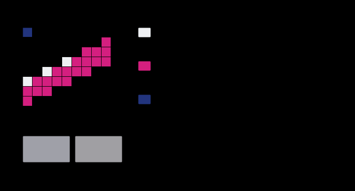
The independence assumption deserves a moment, because it is unusual. Real screens are not independent by nature; they are made independent, by rotating each ink’s screen to a different angle — conventionally thirty degrees apart, with yellow squeezed in at fifteen because it is the ink whose pattern matters least. The reason usually given is that it avoids moiré, and that is true. What is less often said is that it is also what makes Demichel’s rule hold.
An engineering practice that exists to make a model’s assumption true is a rare thing, and it is worth naming when it turns up. The usual direction of travel is the opposite one.
What was computed, and how
Every number in this essay comes from a spectral model, and the chain is short enough to state in full.
Each ink is a set of absorbance bands, so its transmittance is . Each Neugebauer primary is the paper multiplied by the squared transmittance of every ink in it, with each ink after the first attenuated by a trapping factor of 0.86, because a wet ink film is a worse surface to print on than paper and less of the second ink transfers. The areas are Demichel’s. The patch’s reflectance is the weighted average, and it is only at that last step that an observer enters at all — the reflectance is integrated against the 1931 colour-matching functions under D50, which is what the printing industry standardised on.
Whether the model is any good is a question with an answer, and it is asked against a printing condition that exists rather than against intuition:
| patch | this model | ISO 12647-2 aim | ΔE00 |
|---|---|---|---|
| paper | L* 94.8, a* −0.5, b* −1.3 | 95, 0, −2 | 0.99 |
| cyan solid | 55.6, −36.8, −47.3 | 55, −37, −50 | 0.99 |
| magenta solid | 48.2, 70.6, −5.3 | 48, 74, −3 | 1.29 |
| yellow solid | 89.4, −6.1, 90.7 | 89, −5, 93 | 0.84 |
| blue overprint | 24.0, 13.6, −44.1 | 24, 16, −46 | 0.93 |
| green overprint | 48.8, −66.1, 23.2 | 49, −66, 25 | 0.79 |
| red overprint | 46.3, 68.5, 49.2 | 47, 68, 48 | 0.83 |
| three-colour overprint | 19.6, −1.2, −0.3 | 23, 0, 0 | 2.89 |
Mean ΔE00 of 1.12 over nine patches, and the one substantial disagreement is the three-colour overprint, which the model prints too dark by three and a half lightness units. That is where a purely multiplicative arithmetic meets the fact that ink is a liquid: a third film laid on two wet ones transfers worse than the trapping factor allows for, and no amount of tidying the absorbance bands will fix it, because the missing physics is not spectral.
Half the ink is not half the effect
Here is the measurement that makes the mosaic worth insisting on. Take a cyan ramp with dot gain switched off and optical scattering switched off — the cleanest possible case, where the only thing happening is that some fraction of the sheet is covered.
Bare paper is at L* 94.8. The solid is at 55.6. A fifty per cent tint is at 79.2, and the midpoint between the two ends is at 75.2. The tint is four lightness units lighter than halfway, at ΔE00 = 6.47 from the arithmetic midpoint.
The reason is not about ink at all. The area average happens in reflectance, which is a linear quantity, and the eye’s response to it is not: lightness goes roughly as the cube root of luminance factor, so averaging the luminances of two patches and then converting gives a lighter result than averaging their lightnesses. This is exactly the fact that a midpoint in one space is not a midpoint in another, arriving in a context where money changes hands over it.
Two mechanisms push back the other way, and both are the subject of the next essay in this field.
At a Yule–Nielsen exponent of 1.8 the fifty per cent tint lands at 75.2 — which is the midpoint, to a tenth of a unit. The intuition that half the ink gives half the effect is correct for one particular combination of two mechanisms that have nothing to do with the intuition, and wrong on either side of it. That is worth more than the number: a rule of thumb that is right by coincidence is the hardest kind to dislodge, because every time it is checked on a press it appears to work.
The tint misses the midpoint in chroma more than in lightness
The fifty-per-cent result is reported as a lightness effect: the tint lands at L* 79.2 where the midpoint is 75.2, four units lighter, at ΔE00 6.47. Every one of those numbers follows exactly from the paper and solid coordinates the essay itself prints — converting both to XYZ under D50, averaging, and converting back gives 79.23, and the CIELAB midpoint is 75.20, so the model and its published inputs are closed. What the lightness framing leaves out is where most of the 6.47 actually is.
Decomposing the difference into the formula’s three terms:
| term | magnitude |
|---|---|
| lightness | 2.87 |
| chroma | 5.03 |
| hue | 2.62 |
The chroma term is nearly twice the lightness term. The area-averaged tint has a chroma of 20.5; the naive midpoint has 30.6. A reader told that a fifty per cent tint is four lightness units lighter than halfway has been told about the smallest of the three disagreements.
The more useful form for anybody printing is the one against the solid rather than against the midpoint. The cyan solid’s chroma is 59.9, and a fifty per cent tint reaches 20.5 — thirty-four per cent of it, where proportion would say fifty. A halftone at half coverage is not merely lighter than half strength; it is a third short of half the saturation, and that is the part a client sees when a tint proofs weaker than it looked on screen.
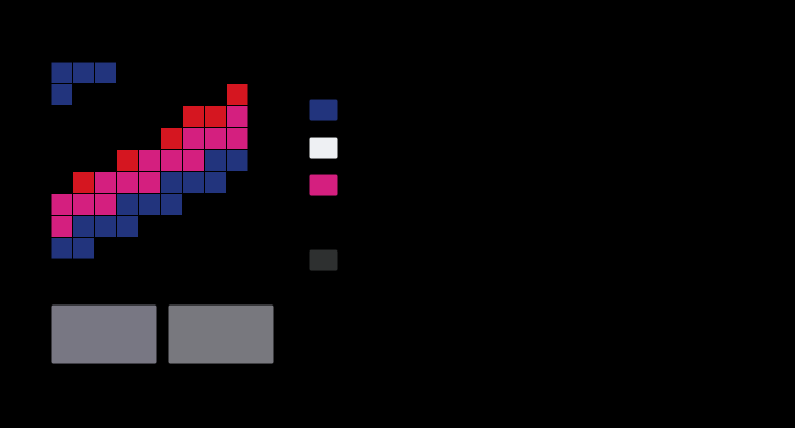
Adding a third ink takes the mosaic from four regions to eight, which is where the difference between averaging regions and averaging coordinates is largest.
Why all three terms move the same way
The three are not three effects. They are one, and the arithmetic that produces the lightness result produces the other two at the same time.
The average is taken in reflectance, which means in XYZ, and the paper is far brighter than the solid in every channel. Splitting the averaged tristimulus values by where they came from:
| channel | paper’s share of the average |
|---|---|
| X | 84% |
| Y | 79% |
| Z | 59% |
A linear average of a bright patch and a dark one is the bright patch, very nearly. The tint is 79 per cent paper by luminance, so it lands near the paper in lightness — which is the essay’s four units — and near the paper in chroma too, which is the larger effect and the one not mentioned. The essay’s cube-root explanation is right about the mechanism and is stated only for the lightness axis; the compression that makes L* nonlinear in Y is the same compression that makes a chroma nonlinear in the tristimulus values it is computed from.
The third column is why the hue moves as well. The paper’s share is not equal across the three channels — 84, 79 and 59 per cent — because the cyan solid absorbs most in X and least in Z, so the average is pulled towards the paper unevenly. The tint’s hue angle comes out at 241.5° against the solid’s 232.1°, nine degrees round towards the paper’s 249.0°, and the naive midpoint keeps the solid’s hue almost exactly because the paper’s near-zero a and b barely move an unweighted average of coordinates.
So the single sentence that covers all three is: a halftone tint sits much nearer its paper than its coverage suggests, in every perceptual coordinate at once. That is a stronger and simpler statement than the lightness one, it explains why the chroma term dominates, and it is what the mosaic picture at the top of the essay shows — at fifty per cent coverage, the sheet is half bare, and bare paper is four times as bright as the ink beside it.
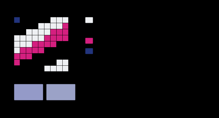
The Yule–Nielsen exponent is the term that carries the light which arrives somewhere else, so raising it is the cleanest way to see what it is worth.
The light that arrives somewhere else
The second mechanism above deserves its own sentence because it is the one that has no analogue anywhere else on this site.
Light that falls on bare paper does not necessarily leave from bare paper. Paper is a scattering medium; a photon entering it travels sideways some tens of micrometres before coming back out, and if it comes back out under a dot it is absorbed. The dot therefore catches more light than its area, without being any larger.
The standard correction is Yule and Nielsen’s, from 1951, and it is disarmingly crude: average the primaries’ reflectances raised to the power , then raise the result to the power .
At this is the plain area average, which is what geometry alone would give if no light ever crossed sideways. Larger is more scattering. The exponent is fitted to a measured ramp rather than derived, and it is properly a measurement of the paper, not of the ink and not of the press — which is why a printer changing stock has to re-characterise, and why the same plate on two papers is two different tone curves.
Where this model stops
Five things it does not contain, stated because the numbers above are only worth what the boundary is worth.
Ink trapping is a single constant here. It is really a function of ink sequence, tack, press speed and how wet the previous film is, and the three-colour overprint’s 2.89 ΔE00 is where that shows.
The screens are assumed independent. At coverages above about 70 per cent they are not — dots begin to touch and coalesce — and a rosette pattern is not a random one. Stochastic screening breaks the assumption in the other direction, deliberately.
Nothing here is about resolution. The mosaic in the plate at the top is magnified perhaps fifty times; at reading distance the eye integrates over it, and the essay’s whole claim is about that integral. Where the dots become resolvable, the picture is a texture rather than a colour and a different argument applies.
Fluorescence is excluded on purpose. Most printing papers contain optical brighteners and a fluorescent sheet has no reflectance curve at all, so putting one in this model would silently break the thing that makes it computable.
The inks are constructed rather than measured. The bands are plausible values for process inks on coated stock and they were chosen so the nine patches land near the aim values quoted above. What survives that is every statement about the shape of the problem; what does not survive it is any particular ΔE00 to two decimal places.
The generalisation
The useful form of this essay is not about printing.
Whenever a display or a sensor represents a value by covering some fraction of an area, the average that results is taken in whatever quantity is physically linear — and that is almost never the quantity a person is thinking in. A halftone averages reflectance. A dithered image averages luminance. A subpixel-rendered glyph averages the light from three emitters. A downsampled photograph averages code values, which is the case where the error is most often live: averaging gamma-encoded numbers is averaging in the wrong space, and it is why a resized image of fine detail comes out darker than the original.
The halftone case is the clean one to reason from, because the two averages can both be computed and compared. With both gain mechanisms switched off, so that the only thing happening is the area average, the 40/30 patch comes out at L* 74.0; averaging the four regions’ CIELAB coordinates instead — which is what “mixing in proportion” means to almost everybody — gives 66.9, a ΔE00 of 6.49 away.
And then the same coincidence as before arrives. At a Yule–Nielsen exponent of 1.8 the model gives 67.1, which is 0.76 from the naive average — the two answers agree, on a press with an ordinary paper, for the same reason the 50 per cent tint landed on the midpoint: a mechanism that has nothing to do with the intuition happens to cancel the intuition’s error. It is the second time in one essay, it is the same cancellation seen from a different direction, and it is why the wrong model of a halftone survives contact with real prints.
Who found it, and when
The pieces arrived in an order that is almost backwards.
Demichel published the area rule in 1924, in a French photographic journal, as a piece of probability rather than of colour science. Murray and Davies gave the single-ink case in 1936 — the plain area average, still the equation on the wall of every pressroom. Neugebauer generalised it to three inks in 1937, working in Dresden on colour photography, and produced the eight-primary form that carries his name.
Yule and Nielsen added the exponent in 1951, and their paper is worth admiring for its honesty: they do not claim the correction is physical, only that a power law fits and that its exponent measures the paper. Seventy years later it is still fitted rather than derived, and every attempt to replace it with a proper scattering calculation has produced something more accurate and less usable.
Where the ladder goes next
This is the first rung of the field that asks what it takes to hand a colour to somebody else, and everything above it depends on the mosaic being understood as a mosaic.
Directly above sit the two mechanisms that bend the ramp — a dot is larger than it was asked to be — and the shape of what the whole ink set can reach, which turns out not to be contained in a display’s gamut nor to contain it.
Further up, the sixteen primaries of a four-ink press stop being a convenience and become the field’s central surprise: sixteen patches and three numbers to match leaves a degree of freedom, so a separation is not unique, and its alternatives are metamers of one another.
Downward, the arithmetic rests on what a spectrum is and on the difference between multiplying transmittances and mixing pigments, which is why blue and yellow make green and why that essay is about a mechanism this one does not use.
Where this goes next
 Why blue and yellow make green
The oldest fact in colour, and the usual explanations are wrong. It is not because green sits between blue and yellow, and it is not a fact about the eye at all — it is that the only band both pigments return is their overlap, and the overlap of a blue and a yellow reflectance is green. Computed, the mixing path bows away from the straight line by a measurable amount.
Why blue and yellow make green
The oldest fact in colour, and the usual explanations are wrong. It is not because green sits between blue and yellow, and it is not a fact about the eye at all — it is that the only band both pigments return is their overlap, and the overlap of a blue and a yellow reflectance is green. Computed, the mixing path bows away from the straight line by a measurable amount.
 Paint is not a filter
Stacking two filters multiplies their transmittances. Stirring two pigments together does not multiply their reflectances, because a mixture is one scattering layer rather than two in series — light meets whichever particle is nearest. Treating the two as the same operation is a 15-unit error, and which way it errs turns out to depend on whether the comparison holds the amount of pigment fixed.
Paint is not a filter
Stacking two filters multiplies their transmittances. Stirring two pigments together does not multiply their reflectances, because a mixture is one scattering layer rather than two in series — light meets whichever particle is nearest. Treating the two as the same operation is a 15-unit error, and which way it errs turns out to depend on whether the comparison holds the amount of pigment fixed.
 A dot is larger than it was asked to be
Two quite different things make a printed midtone darker than its coverage says — ink spreading under pressure, and light scattering sideways inside the paper. Both bend the tone curve the same way and neither touches its ends, so the measurement every press is characterised by cannot say which happened. A patch that nobody measures can.
A dot is larger than it was asked to be
Two quite different things make a printed midtone darker than its coverage says — ink spreading under pressure, and light scattering sideways inside the paper. Both bend the tone curve the same way and neither touches its ends, so the measurement every press is characterised by cannot say which happened. A patch that nobody measures can.
What this makes readable
Essays that name this one as a prerequisite.
Named alongside this one
Essays reaching for the same objects. Nobody chose these; they are what the index of named objects makes visible.
- Printing does not change the sign halftone · reflectance · subtractive mixture
- The colour is in the thickness reflectance · subtractive mixture · transmittance
- A linear repair for a bilinear loss integration · transmittance
- A reflectance is a diagonal integration · reflectance
- A tint at the edge of a page halftone · process inks
- Dividing by the paper process inks · reflectance
What links here
The 8 essays that link to this one and share the most of its objects, of 24 that link here.
The objects this essay names
Each one links to every other essay that touches it.
Area coverageDemichel's areasHalftoneIntegrationThe Neugebauer primariesProcess inksReflectanceSubtractive mixtureTransmittanceThe Yule–Nielsen exponent