The colour is in the thickness
Assumes Paint is not a filter and A bounce is a multiplication.
A reflectance is a property of a material. That is the assumption underneath every colour specification, every fan deck and every measurement: name the material and its reflectance is determined.
For anything light passes through rather than merely off, it is not. The quantity that determines the colour includes how far the light travelled, and how far the light travelled is a property of the object’s shape.

The claim
Transmittance is , so path length enters as an exponent. Doubling the depth squares the transmittance, and squaring a spectrum is not scaling it — the bands that were weakly absorbed survive and the bands that were strongly absorbed vanish, so the surviving spectrum is narrower and its centre of mass has moved.
The consequence is that a translucent object has a colour field rather than a colour. A wine glass, a jade carving, a slab of marble, a hand held in front of a lamp: each is darker where it is thicker, and each is also a different hue where it is thicker.
Why the hue moves
The naive expectation is that a thicker sample is simply a darker version of a thinner one — same colour, less of it. That would be true if absorption were linear in depth, and it is not.
Take two bands. At one wavelength ; at another . At depth 1, the transmittances are and — a ratio of 1.49. At depth 8 they are and — a ratio of 24.5.
The ratio between two bands is itself exponential in depth. So the spectrum does not merely fall; it changes shape, progressively favouring whichever wavelength the medium absorbs least. The limit as the path grows is a spectrum concentrated entirely at the absorption minimum, which is monochromatic and maximally saturated.
Computed here through the CIE 1931 2° observer, the hue angle in CIELAB moves measurably across the depth range in the figures, and the generator asserts both halves of the claim: that the hue angle swing exceeds 3°, and that lightness falls monotonically at every step. Asserting only the second would pass on a medium whose colour merely darkened, which is the case this essay says does not happen.

Why this belongs in a field about scenes
The classification is deliberate and is the essay’s organising point.
An absorption coefficient is a property of the substance. A path length is not — it is a property of the object, the viewing direction, and where on the object the light happened to enter. So the colour of a translucent material is a joint property of the material and the geometry, in exactly the way a room’s colour is a joint property of its paint and its shape.
That is why this sits beside interreflection rather than in a field about materials. Both are cases where the standard model — a reflectance, measured once, belonging to a substance — fails because the light’s history matters and the history is geometric.
There is a practical version of the same point. A specification for a translucent plastic cannot quote a colour without quoting a thickness, and in practice they do: colour standards for plastics specify plaque thickness, and a moulded part thinner or thicker than the plaque will not match its own specification. The specification has a field for the geometry, which is more than a metameric match on a flat chart has.
A worked series
The arithmetic is worth walking once, because the numbers show how quickly the shape change dominates.
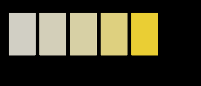
Take a medium whose absorption is weakest at 500 nm and rises away from it. At depth 0.25 the transmittance is high everywhere and the surviving spectrum is nearly the illuminant — the sample is a pale tint, close to neutral, and its chromaticity sits near the white point.
Quadruple the depth to 1. The wings have been attenuated four times as much in the exponent, so what was a mild preference for 500 nm is now a pronounced one. The chromaticity has moved a long way towards the green and the lightness has fallen.
Quadruple again to 4. The wings are down but not gone — the surviving band is still three quarters of the width it started at — and the sample is a strong green at a lightness of 71, which is lighter than a chroma of 54 would lead anyone to guess.
Quadruple once more to 16. This is the most colourful patch the medium produces, at a chroma of 87 and a lightness of 38: dark enough to read as deep and nowhere near too dark to judge. The band is now a fifth of its original width, and it is the next quadruple, to a depth of 64, that takes the lightness to 3.9 and ends the series.

Equal ratios of depth give equal changes in the exponent, and they do not give equal changes in the picture. Each quadrupling in that series is worth more than the one before it — 11.6, 19.6 and 32.8 ΔE₀₀ — because the exponent starts small and a small exponent removes almost nothing. The visible action is at the deep end of the series rather than the shallow end, which is the reverse of what a subtractive process is usually assumed to do.
That asymmetry is why translucent materials are specified at a stated thickness rather than characterised as a curve. The curve exists and most of it is unusable.
Saturation and lightness trade
The two effects run in opposite directions and that is what makes translucent materials visually distinctive.
As the path lengthens, the surviving band narrows — so the sample gets more saturated. At the same time less light gets through — so it gets darker. Both happen at once, and up to a point neither can be had without the other.
That trade is the signature of a subtractive process and it appears everywhere in this field. Mixing pigments loses light every time it is applied. Bouncing light around a coloured room narrows the spectrum and dims it. Here the same trade is parameterised by one number with a clear physical meaning, which makes it the cleanest place to look at it.
It is also why deeply saturated and light colours are hard to obtain by absorption. To be saturated the medium must absorb most of the spectrum; to be light it must not absorb much. Saturation and lightness are competing demands on the same integral, and there is a hard bound on how far they can be pushed together which no chemistry improves.
Where the trade stops being a trade
The trade holds while both quantities are still moving, and two of the four series on this page run past the point where they stop.
The weak absorber at 560 nm goes through chromas of 17.6, 32.4, 55.3, 81.9 and 96.3 across five doublings, and then at a depth of 32 it reads 75.8. The medium absorbing least in the red does the same on its own last patch: 85.9 at a depth of 8 and 83.1 at 16. Past those depths a patch is darker than its neighbour and less chromatic, so nothing at all is being bought with the light that was lost.
The reason is that chroma in CIELAB is anchored to a lightness. Black has no chroma whatever spectrum failed to arrive, so a quantity that starts near zero for a neutral and must return to zero for a black has a maximum somewhere between them. Saturation in the other sense — chroma relative to lightness — does keep rising: the ratio runs 0.18, 0.35, 0.64, 1.09, 1.60 and 1.85 across the weak absorber’s six patches, and it is monotonic in all four series here where the chroma is not.
Both statements are true and they are about different quantities, so which one is wanted depends on the question. A specification comparing two mouldings is asking about chroma, because chroma is what the difference formula it will be checked against contains. Somebody deciding how thick to pour a resin to get the strongest colour is asking where the maximum is, and there is one.
Why the maximum exists, and where
The two mechanisms have different orders, and that is the whole of it.
The surviving band narrows as a power of the depth. Measured on the 500 nm medium, the standard deviation of the transmitted spectrum across wavelength falls from 23.2 nm at a depth of 16 to 2.36 nm at a depth of 1024 — a factor of ten across a factor of sixty-four, which is an exponent of 0.55. That is the square root a Laplace expansion gives: near its minimum the absorption is a parabola, multiplying the absorption by the depth multiplies that parabola’s curvature by the depth, and a Gaussian’s width runs as the inverse square root of its curvature. So quadrupling the thickness halves the band, and quadrupling it again halves it once more.
The light that gets through falls exponentially. At the absorption minimum the coefficient is not zero — it is 8 per cent of the medium’s strength, by construction of the dip — so the entire surviving spectrum is scaled by an exponential in the depth on top of whatever the narrowing has done.
A power law against an exponential crosses once and the exponential wins afterwards. Chroma is bought by narrowing and paid for by dimming, so the purchase is profitable while the band is still wide and stops being profitable once the exponential has taken over. That is where the maximum sits, and it is why its position is a fact about the medium rather than a matter of taste: the narrowing runs out of wings to remove long before the dimming runs out of light to remove.
The collapse that follows is abrupt rather than gradual, which is the part a series of swatches hides. On the 500 nm medium the lightness runs 97.5, 90.7, 70.8 and 37.8 across four quadruplings of depth and then reads 3.9 at the fifth. Four steps of ordinary darkening and one step to black, because the exponent has finally become large and the last quadrupling of a large exponent is the one that does everything. That is the sense in which most of the depth curve is unusable — not a long fade, but one step wide.
What was computed, and how
Beer’s law, directly. evaluated on the 81-band grid. The function refuses a negative depth, because a negative path length is not a depth and returning a transmittance above 1 for one would be worse than throwing.
The absorption spectrum is a stated rule. A broad dip in centred at a named wavelength, with the depth and the centre printed in every caption. This is not a measurement of any dye.
Two assertions, and the first is the one that matters. The hue angle must swing by more than 3° across the range, and must fall at every step. The hue assertion refused a placement during this phase — a narrower depth range gave only 1.6° of swing, which is a true statement of no interest, and the figure was re-parameterised rather than the assertion loosened.
Lightness is read in CIELAB against D65. The claim that a thicker sample is darker is a claim about rather than about transmittance, because lightness is not proportional to luminance and the perceptually meaningful statement is the one in the uniform space.
The concentration–depth equivalence, and where it fails
Beer’s law is usually written with a concentration as well as a depth, , and the two enter identically. So doubling the concentration and doubling the thickness are the same operation, which is a strong and useful statement — it is why a dye can be characterised once and applied at any strength.
The equivalence fails in exactly the places worth knowing about:
- When the absorbers interact. At high concentration molecules aggregate, and an aggregate’s absorption spectrum is not its monomer’s. Then concentration and depth stop being interchangeable, because only concentration changes the chemistry.
- When there is scattering. Beer’s law is for absorption in a clear medium. Add scatterers and the path length is no longer the geometric thickness — light random-walks, so the effective path is longer and depends on the scattering strength. That is the regime Kubelka–Munk covers, and it is why milk is not a weak white dye.
- When the light is not monochromatic and the detector integrates. This is the subtle one, and it is a colour-specific failure. Beer’s law is exact per wavelength. A detector that integrates over a band sees a sum of exponentials with different rates, and a sum of exponentials is not an exponential — so apparent absorbance measured through a broad filter is not linear in concentration even when the underlying physics is perfectly Beer-like. Every figure here works per band and then integrates, which is the right order; doing it the other way round is a standard source of error in absorbance measurement.
A stronger absorber further down the spectrum turns the hue by more, which is the check that the effect follows the absorption rather than the depth alone.
Where the model stops
No interreflection inside the object. Light that reflects off the far interface and comes back has travelled twice the thickness, and the model here counts one pass. For a real slab with two air interfaces the internal reflection is a few percent per surface, so the correction is small and it is not zero — and it is the same multiplication that the first rung of this ladder is about, applied inside a solid.
No scattering, no fluorescence, no surface. A real translucent object has an interface, so a highlight carrying the lamp sits over everything computed here, and it scatters internally, which lengthens the effective path in a way this model does not track.
One depth per patch. The figures show a series of uniform slabs. A real object has a continuous distribution of path lengths across its silhouette, and what a reader sees is a gradient — which is the phenomenon and is exactly what a swatch cannot draw.
No subsurface lateral transport. In skin, marble and milk light enters at one point and leaves at another, so the colour at a point depends on the neighbourhood rather than on the local thickness. That is a genuinely different calculation and nothing here approximates it.
The band is 380–780 nm. Many dyes absorb strongly just outside it, and the model cannot see that any more than it can see the near-infrared.
And the observer is the 1931 2° set, named in every caption. The hue-angle swing is a real change in the arriving spectra and survives a change of observer; the number of degrees does not, and which set of functions is used is a choice rather than a formality.
A sixty-four-fold range of thickness is what a dye bath or a stained section actually spans, and the walk it produces is the whole argument.

What the pictures cannot show
The deep, saturated end of every series is outside the display’s gamut, and where it is the swatches are hatched rather than clipped — the marking this site uses instead of the nearest available lie. So the most saturated members of a depth series, which are the ones the argument is about, are the ones a reader can least see.
A flat patch of one colour is the wrong shape for this phenomenon. The visual signature of translucency is the gradient and the way light seems to come from inside the object, and neither survives being reduced to a rectangle. A row of rectangles reports the colours correctly and conveys almost nothing of what a translucent object looks like.
Nothing here is about appearance. Translucency is a perceptual attribute in its own right — the CIE lists it beside colour, gloss and texture — and a person judges it from cues this model does not compute. These figures are colorimetry.

The generalisation
When a parameter enters as an exponent, changing it changes shape rather than scale, and any summary statistic that assumed scaling is wrong.
That is the portable form. A quantity linear in some parameter can be summarised by one number and rescaled. A quantity exponential in it cannot: the ratio between any two components is itself exponential, so the composition drifts and no single factor describes what happened.
The failure mode is always the same and always looks like a calibration error. A measurement made at one depth, one concentration, one exposure or one duration is used at another, corrected by a scale factor, and the residual is attributed to noise or nonlinearity in the instrument. The residual is the shape change, and it is predictable rather than noisy.
Who found it, and when
Bouguer described the exponential attenuation of light in 1729, Lambert restated it in 1760, and Beer added the concentration dependence in 1852 — which is why the law carries two or three names depending on the field and the century.
The colour consequence has a much shorter history as an explicit topic, because for most of the period the interesting applications were analytical rather than visual. Absorbance spectroscopy wants the law per wavelength and does not care what the sample looks like; the question of what a thickness field does to an object’s appearance became pressing only when people started rendering translucent materials and specifying moulded plastics.
Subsurface scattering entered graphics properly with Jensen and colleagues in 2001, and the reason it took so long is the lateral transport this page excludes: a diffusion approximation was needed, and Beer’s law on its own gets skin badly wrong. Which is an honest limit on everything above — the simple case is the clear medium, and the visually interesting materials are mostly not clear.
There is one older tradition that had all of this as craft knowledge. Stained glass is a technology for controlling colour by thickness and concentration together, and the medieval glaziers’ practice of flashing — fusing a thin layer of intensely coloured glass onto clear — exists because a saturated red at full thickness is nearly black. The problem being solved is exactly the saturation-against-lightness trade above, and the solution is to move along the depth axis until the colour is where it should be and then stop. Nobody involved had Beer’s law; they had the trade, and a way round it.

Where the ladder goes next
The neighbour on this rung is the one case where there is no absorption and no pigment at all: a colour that moves with the viewer, where a thin film’s spectrum is an interference condition containing a path length and an angle, and where tilting the sample changes its colour by 40 units of .
Above them, the ceiling: no surface can be more colourful than an optimal colour, and the trade between saturation and lightness that this page parameterises turns out to have an exact boundary.
Where this goes next
 Paint is not a filter
Stacking two filters multiplies their transmittances. Stirring two pigments together does not multiply their reflectances, because a mixture is one scattering layer rather than two in series — light meets whichever particle is nearest. Treating the two as the same operation is a 15-unit error, and which way it errs turns out to depend on whether the comparison holds the amount of pigment fixed.
Paint is not a filter
Stacking two filters multiplies their transmittances. Stirring two pigments together does not multiply their reflectances, because a mixture is one scattering layer rather than two in series — light meets whichever particle is nearest. Treating the two as the same operation is a 15-unit error, and which way it errs turns out to depend on whether the comparison holds the amount of pigment fixed.
 The midpoint is not half
Code 128 sits halfway along the sRGB scale and carries about a fifth of white's luminance. Half the luminance is code 188. Almost every gradient, blur and resize on the web gets this wrong, and the errors are visible once known.
The midpoint is not half
Code 128 sits halfway along the sRGB scale and carries about a fifth of white's luminance. Half the luminance is code 188. Almost every gradient, blur and resize on the web gets this wrong, and the errors are visible once known.
 A bounce is a multiplication
Colorimetry multiplies an illuminant by a reflectance once and integrates. A surface in a room is lit by every other surface the lamp reached first, so the spectrum arriving at the eye has been multiplied several times — and the second multiplication is where the whole apparatus of matching starts to come apart.
A bounce is a multiplication
Colorimetry multiplies an illuminant by a reflectance once and integrates. A surface in a room is lit by every other surface the lamp reached first, so the spectrum arriving at the eye has been multiplied several times — and the second multiplication is where the whole apparatus of matching starts to come apart.
What this makes readable
Essays that name this one as a prerequisite.
Named alongside this one
Essays reaching for the same objects. Nobody chose these; they are what the index of named objects makes visible.
- A catalogue is not a vocabulary cielab · lightness · standard observer
- A gamut has a population chromaticity · reflectance · standard observer
- A halftone is not a mixture reflectance · subtractive mixture · transmittance
- Rendering in three numbers chromaticity · reflectance · standard observer
- What a white wall costs chromaticity · reflectance · standard observer
- A colour has a name cielab · standard observer
What links here
The 8 essays that link to this one and share the most of its objects, of 13 that link here.
The objects this essay names
Each one links to every other essay that touches it.
AbsorptionBeer lambertChromaticityCIELABLightnessReflectanceStandard observerSubtractive mixtureTranslucencyTransmittance