A colour has a name
Assumes How far apart are two colours and Colour by catalogue.
Every file on this site computes a quantity. A spectrum becomes three numbers, three numbers become a chromaticity, a chromaticity becomes a difference, and a difference becomes a tolerance. Not one of them can answer the question a reader arrives with, which is what colour a thing is — and that question has an answer, it is agreed on to a degree nobody expected before it was measured, and it does not sit where any of this site’s metrics would put it.
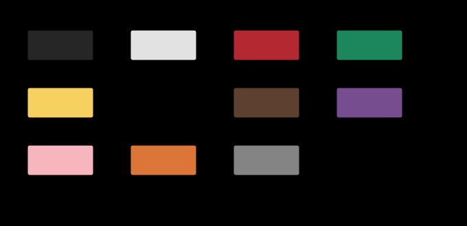
The claim
Colour has names, the names are shared, and they are not where the arithmetic would put them.
Three things follow, and each is a measurement rather than an opinion:
- The eleven territories are nothing like the same size. Assigning every displayable colour to its nearest centroid gives shares from 21.1 per cent down to 4.6 — a factor of 4.6 — and the three terms with no chroma in them at all hold a fifth of the gamut between them.
- A name is worth a different number of ΔE00 depending on which name it is. The distance from a centroid to the nearest colour that would be called something else runs from 10.5 units to 29.0, a factor of 2.8, so “can these be told apart” and “would these be called the same” have answers that are not proportional anywhere.
- And the metric explains almost none of it. Measuring the arcs of the hue circle in colour difference rather than in degrees takes their inequality from 5.3× down to 4.5×. Fifteen per cent of the unevenness is the metric. The rest is the vocabulary.
What is quoted, and how loosely
This is the one file on the site whose primary data are a measurement of people speaking, and it is worth saying immediately how coarse the quotation is.
Eleven terms, one centroid each, converted from the Munsell focal notations usually reported for English speakers, using this site’s own value function for lightness and an approximate conversion for hue and chroma — there is no Munsell renotation table here — and then rounded to five units in each CIELAB coordinate.
Five units is not a rounding, it is a confession. It is five just-noticeable differences and more than any industrial tolerance a supplier is ever held to. So every result below is re-run with the centroids displaced by exactly that much, in both directions, and assertTheFindingsSurviveTheCentroids requires the conclusions to come out the same way. A conclusion that does not survive is not reported here at all, which is why everything above is a ratio or an ordering and nothing is a value.

The model, which is a decision
A name’s territory is the set of colours whose nearest centroid it is. That is a nearest-neighbour partition and a partition needs a distance, which makes the map a statement about the metric as much as about the words. Asking the two metrics this site implements — CIEDE2000 and plain Euclidean distance in CIELAB — gives two different maps that disagree about 18.8 per cent of the displayable gamut, most often over whether something is pink or purple.
That is a large disagreement about a question that sounds like it should have nothing to do with a formula, and it is the first sign that a nearest-centroid model is a piece of arithmetic wearing a theory’s clothes.
Naming is not a partition in reality; it is a probability — which is the same move a tolerance makes when it stops being a verdict. So there is a soft version too, in which the chance of each name is a softmax over the negative distances at a stated temperature. The temperature is the file’s one free parameter, and it turns out — once the agreement between two colours is measured against a colour’s agreement with itself — to decide almost nothing: a fourfold change in how soft the boundaries are moves the naming resolution by a few per cent, because what sets that quantity is how far apart the centroids are.

The hue circle, cut up
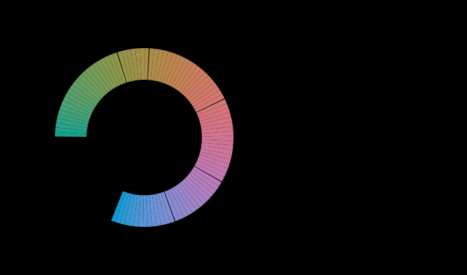
The clearest picture of the inequality is a ring of constant lightness and chroma, named all the way round.
At L* 60 and C* 40, green takes 111 degrees of the circle and yellow takes 21. Orange gets 61, blue 72, pink 56, purple 40. The widest is 5.3 times the narrowest.
The obvious objection is that degrees of hue angle are not a perceptual unit — that CIELAB’s hue angle is stretched in some places and compressed in others, and a name that looks wide might merely be sitting where the parameterisation is generous. That objection is testable, and it is the measurement this essay was written for.
Integrating ΔE00 along the ring gives the same arcs in the metric’s own units: 45.5 for green and 10.2 for yellow, a ratio of 4.5. The metric has taken 15 per cent of the inequality away and left the rest exactly where it was. Green really is four and a half times as much colour as yellow, by the site’s own distance function, and English gives them one word each.
What was computed, and how
Four measurements, and each is arithmetic on the eleven quoted points plus this site’s existing machinery.
The territories are a count. A lattice at five-unit steps through CIELAB is filtered to the points inside the sRGB gamut — 6,574 of them — and each is handed to nameOf, which returns the nearest centroid under ΔE00. The shares are the counts divided by the total. Nothing is fitted and nothing is smoothed.
The radii are a search, because the boundary of a nearest-neighbour cell under a non-Euclidean distance has no closed form. Ninety-six rays leave each centroid on a deterministic spiral over the sphere, each is walked outward in half-unit steps until the name changes, and the shortest such distance is the radius. The spiral is deterministic so the answer is reproducible rather than sampled.
The arcs are the same partition asked along a circle, and then integrated. The circle is sampled at 720 points, adjacent points with the same name are merged into arcs, and each arc’s ΔE00 length is the sum of the differences between successive points along it. Only the eight chromatic terms compete on that ring, which is a decision the essay owes an explanation for and gets one below.
And the correlation is the test of the folklore. At each hue on the ring, two numbers: how many degrees away the nearest naming boundary is, and how much ΔE00 a two-degree step in hue produces there — the metric’s local stretch. If languages cut the space where discrimination is best, the two should line up.
They do line up, moderately, and in the direction the folklore predicts: −0.42 at L* 60, −0.52 at L* 50, −0.64 at L* 70. Boundaries sit nearer the hues where a degree of hue angle buys the most colour difference.
That correlation might be an artefact of asking a metric about itself, since the partition was built with the same metric. It is not: computing the partition in the other metric and correlating it against ΔE00’s stretch gives −0.42 as well. What the relationship does not do is explain the arcs, which is the finding this essay leads with — a correlation of −0.4 accounts for under a fifth of the variance, and the arcs stay unequal by a factor of four and a half after the metric has been given every chance to account for them.

Where the model stops
The vocabulary is English. Eleven basic terms is a claim about a particular language at a particular moment, and the reason the claim is interesting at all is that a great many unrelated languages land in a similar place — but a great many do not, and the ones that do not are the interesting cases rather than the exceptions. Nothing here computes any of that. The centroids are quoted, the language is stated, and the site can go no further.
A nearest-centroid partition is not a vocabulary, and where it visibly fails is worth listing rather than hiding. A saturated cyan is called green here, which no speaker would say and which is a fact about English having no basic term in that region rather than about the model. At C* 40 an achromatic term is nearest for about four per cent of the hue circle, which is why the ring above is computed among the chromatic eight — a decision that improves the picture and is a patch on the model, not a discovery. Where those failures come from is its own essay.
And a share is a statement about a gamut. Purple’s 21 per cent is partly a fact about English and partly a fact about sRGB, whose violet corner reaches enormously further in CIELAB than its yellow one. Counted over a different set of reachable colours the ordering would move. The ratios that do not depend on the gamut — the arcs at fixed lightness and chroma, and the radii — are the ones this essay leads with, and that is why.
The generalisation
The sentence worth carrying is: a name is a region and a measurement is a point, and nothing in colorimetry converts between them.
Every specification on this site is a point with a tolerance around it — a tolerance is a shape, a difference is a distance, an acceptance is a threshold. All of that machinery answers the question “is this the same colour as that one”. None of it answers “is this red”, and the gap is not a matter of adding a table: the naming partition is coarse where the metric is fine and fine where the metric is coarse, in a pattern the correlation above says is weak.
The surprising connection is with colour order systems. A swatch book is a regular lattice by construction, because a person has to be able to find a page — and named, that lattice comes apart into piles that differ by a factor of three, with a fifth of all one-step moves crossing a boundary. The two ways of organising colour that people actually use, a lattice and a vocabulary, are not compatible, and neither of them is the metric.

Who found it, and when
The eleven-term result is Berlin and Kay’s, in 1969, and it is one of the more contested findings in the human sciences as well as one of the more replicated. The original claim had two parts: that languages draw basic colour terms from a set of eleven, and that they acquire them in a constrained order. The second part has been revised repeatedly; the first has survived in the weaker form that matters here, which is that speakers of unrelated languages asked to point at the best example of a term agree far more than they agree about where its boundaries are.
The focal colours are the part that replicates, and they are what this essay quotes. The centroids used here descend from that line of work through the Munsell notations that later naming studies report, and they are quoted to one significant figure of chroma for the reasons given above.
The World Color Survey, run through the 1970s and analysed for decades afterwards, took the question to a hundred and ten unwritten languages and produced the data that the strong version of the claim has been argued over ever since. It is the study a proper version of this essay would compute from, and this site does not have it.
And the boundaries were always the weak point. Every version of this result has found agreement about centres and disagreement about edges — which is exactly the structure a nearest-centroid model reproduces for the wrong reason, since its edges are wherever two quoted points happen to be equidistant. Agreement about the middle is a finding; agreement about the middle is also what any interpolation between quoted middles will produce.
What the pictures cannot show
They cannot show the reader’s own vocabulary. Every patch here is drawn at a centroid somebody else’s speakers pointed at. A reader who would put focal red somewhere else is not wrong, and nothing on the page can tell them so.
They cannot show the one term whose focal colour is outside the gamut. Blue’s centroid is not reachable in sRGB — it misses by a small margin, and it still misses when the centroid is moved five units either way — so the hero figure hatches it. That is not a defect in the quotation. It is the ordinary situation of this site arriving at the one place where it is most awkward: the best example of one of the eleven words English has for colour cannot be printed on the page that is discussing it.
And they cannot be read at a different lightness. The arcs are computed at one L* and one C*, and the vocabulary is three-dimensional. A ring at L* 30 would find brown taking territory that has no arc at all at L* 60, because brown is dark orange and needs a white to be dark against.

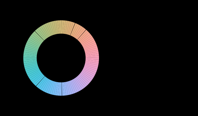
The ring has no red on it
The six arcs quoted at L* 60 and C* 40 — green 111 degrees, blue 72, orange 61, pink 56, purple 40, yellow 21 — sum to 361. A circle is 360, so within rounding those six are the whole of it, and the two chromatic terms not listed have no arc at all.
One of the two is brown, which is expected: brown is dark orange and needs a white to be dark against, so it has no territory at a lightness of 60. The other is red.
The most basic of the eleven basic terms is not the nearest centroid anywhere on that ring. It is squeezed between orange on one side and pink on the other, and at a chroma of 40 neither neighbour ever yields to it. That is a sharper statement of the nearest-centroid model’s failure than the saturated cyan the essay names, because cyan is a region English has no word for and red is the word English is most confident about.
It also says which direction the failure runs. Red’s focal colour is far more saturated than C* 40, so a ring at that chroma passes through the part of the space where orange and pink are nearer to it than it is to itself. A model whose regions are Voronoi cells around quoted focal points loses any term whose focus is far from the surface being sliced — and that is a property of the construction rather than of English.
The dismissal uses the weakest of three correlations
A correlation of −0.4 accounts for under a fifth of the variance is the essay’s reason for saying the metric explains almost none of the arcs, and three correlations were measured.
| lightness | correlation | variance accounted for |
|---|---|---|
| L* 60 | −0.42 | 18 % |
| L* 50 | −0.52 | 27 % |
| L* 70 | −0.64 | 41 % |
The sentence quotes the first row. At L* 70 the metric’s local stretch accounts for 41 per cent of where the boundaries fall, which is not almost none by any reading, and the mean across the three planes is 29 per cent.
That does not overturn the essay’s leading finding, which is about the arcs rather than about the boundaries and is measured directly: 5.3 in degrees becomes 4.5 in ΔE₀₀, so the metric removes 16 per cent of the inequality and leaves the rest. Two different quantities are being asked about and only one of them is settled by a ratio. How much of the arc inequality the metric removes is 16 per cent, and how much of the boundary placement it predicts is between 18 and 41.
The honest form is therefore split. The metric explains a sixth of why the arcs are unequal and between a fifth and two fifths of where the boundaries sit, and those are compatible: the boundaries can be well predicted by where the metric stretches while the sizes of the resulting arcs stay uneven, because a boundary’s position and an arc’s length are different things.
Four measures of unevenness, agreeing to a factor of two
The essay reports three separate inequalities and does not put them together, and they are more consistent than the different denominators suggest.
Territories: 21.1 per cent against 4.6, a factor of 4.6. Radii to the nearest other name: 29.0 units against 10.5, a factor of 2.8. Arcs in degrees: 111 against 21, a factor of 5.3. Arcs in ΔE₀₀: 45.5 against 10.2, a factor of 4.5.
Three of the four sit between 4.5 and 5.3, measured over a lattice, a hue circle in degrees and the same circle in colour difference — three quite different constructions agreeing that English’s terms differ in size by about a factor of five.
The outlier is the radii, at 2.8, and its being smaller has a cause. A radius is the distance to the nearest boundary, which is a minimum over directions, and a minimum is a much more compressed statistic than an area or an arc: a term with a huge territory in one direction and a close neighbour in another has a small radius and a large share. So the radii understate the unevenness by construction, and the factor of five is the number to carry.
That also prices the metric’s contribution once more. Of the four measures, only the arcs exist in both units, and there the metric moves 5.3 to 4.5. If the same 16 per cent applied to the territory count, a metric-corrected share ratio would be about 3.9 — still four times, still a fact about the vocabulary.
Where the ladder goes next
The nearest unfinished piece is the one the model keeps failing at: what happens at a boundary. The naming resolution mapped above says how far two colours must move to be called different things, and it says nothing about whether that move is easier to see than an equal move inside a name. That is the categorical perception claim, it has a substantial and disputed literature, and it is the next essay in this phase.
The second is the vocabulary’s own dimensionality. Three of the eleven terms lie on a line of zero chroma and hold a fifth of the gamut between them; the other eight share a plane. Whether that is a fact about English or a fact about the visual system is a question the World Color Survey data could answer and eleven quoted points cannot.
And the third is the one that would need a different kind of study altogether: the eleven centroids are an average over speakers, and this phase’s other half is about what happens when an average over people is replaced by a population. Nobody here has measured how much two speakers’ focal reds differ — but two speakers’ eyes differ by more than a ΔE00 on an ordinary pair, and the naming agreement is measured across those eyes without anybody subtracting it.
Where this goes next
 Colour by catalogue
A colour order system arranges physical samples on a regular lattice so a person can find one and name it. The space it samples is not regular, and everything interesting about such systems is what happens at that mismatch.
Colour by catalogue
A colour order system arranges physical samples on a regular lattice so a person can find one and name it. The space it samples is not regular, and everything interesting about such systems is what happens at that mismatch.
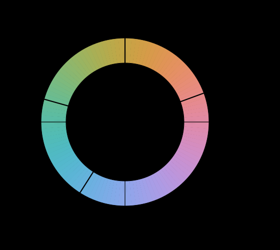 Why there are four unique hues
Observers agree that four hues are elementary and that no colour is reddish green. Nothing in the three receptors predicts either fact, and the axes of every standard colour space miss the four by tens of degrees.
Why there are four unique hues
Observers agree that four hues are elementary and that no colour is reddish green. Nothing in the three receptors predicts either fact, and the axes of every standard colour space miss the four by tens of degrees.
 How far apart are two colours
ΔE is meant to be a distance with the property that the same number means the same perceived difference everywhere. Three successive formulae have tried, they disagree with each other by more than a just-noticeable difference, and the disagreement decides real matching questions.
How far apart are two colours
ΔE is meant to be a distance with the property that the same number means the same perceived difference everywhere. Three successive formulae have tried, they disagree with each other by more than a just-noticeable difference, and the disagreement decides real matching questions.
What this makes readable
Essays that name this one as a prerequisite.
Named alongside this one
Essays reaching for the same objects. Nobody chose these; they are what the index of named objects makes visible.
- A name is not a threshold basic colour terms · categorical perception · ciede2000 · δe · individual variation · naming · perceptual uniformity · specification
- Which of two is worse ciede2000 · cielab · δe · perceptual uniformity · specification · standard observer
- A difference has no place ciede2000 · cielab · δe · specification · standard observer
- A difference is not a distance ciede2000 · cielab · δe · perceptual uniformity · specification
- A gradient is a path cielab · δe · gamut · perceptual uniformity · specification
- How many colours are there ciede2000 · cielab · δe · gamut · perceptual uniformity
What links here
Every essay whose body links to this one.
The objects this essay names
Each one links to every other essay that touches it.
Basic colour termsCategorical perceptionCIEDE2000CIELABColour order systemsΔEGamutIndividual variationNamingPerceptual uniformitySpecificationStandard observer