Why blue and yellow make green
Assumes Paint is not a filter and The room is the illuminant.
Blue and yellow make green. It is among the first facts anybody learns about colour, it is true, and the explanations usually offered for it are not.
The two commonest are that green lies between blue and yellow, so mixing lands in the middle; and that the eye somehow averages the two. The first predicts the wrong answer for lights — blue and yellow light makes something near white, not green. The second attributes to the observer a result that is entirely a property of the pigments.

The claim
The mixture is green because the only band both pigments return is the band where their reflectances overlap, and for an ordinary blue and an ordinary yellow that overlap is in the green.
Nothing about the eye is involved in getting from the two spectra to the mixture’s spectrum. The eye is involved only in the last step, in reporting that the resulting spectrum reads as green — and it would report the same spectrum as green whatever it had been made from.
Where the green comes from
Take the two spectra apart.
A blue pigment reflects at short wavelengths and absorbs at long ones. Where does it stop reflecting? Not sharply — a real blue’s reflectance falls away through the green, so it is still returning a useful amount at 500 and 520 nm.
A yellow pigment reflects at long wavelengths and absorbs at short ones. Where does it start? Again not sharply: a yellow’s reflectance is rising through the green, so it too is returning something at 500 and 520 nm.
So there is a band, roughly 490 to 540 nm, where both pigments reflect. Everywhere else, at least one of them absorbs strongly. Mix them and the bands where one absorbs are killed by that one; the band where neither absorbs survives. What survives is the overlap, and the overlap is green.

This immediately explains the case the “in between” story gets wrong. Blue light plus yellow light is a sum of the two spectra, not an intersection: every band either one supplies is present in the total, and a spectrum with power at both ends and in the middle is near white. Addition takes the union and subtraction takes the intersection, and the two operations have no reason to give the same answer.
It also predicts something the folk account does not. Change the blue for one whose reflectance cuts off before the green — a very clean, narrow blue — and the overlap with yellow shrinks towards nothing. The mixture then goes dark and nearly neutral rather than green, because there is no band both pigments return.
The path is not the chord
Plotting the whole mixing series rather than the half-and-half point makes the geometry visible, and the geometry is the difference between the two kinds of mixture.
For additive mixture, the chromaticity of a sum lies on the straight line between the chromaticities of the parts. That is a consequence of Grassmann’s laws and it is the reason the chromaticity diagram is drawn the way it is: a line segment on it means “everything obtainable by mixing these two lights”. The whole gamut triangle is that statement applied to three primaries.
For pigment mixture, nothing of the kind holds. The path computed here departs from the chord and departs towards green — the half-and-half mixture is measurably higher in than the midpoint of the straight line between the two endpoints, and the generator asserts that it is before drawing.
A chromaticity diagram is a picture of an additive geometry, and pigment mixture is not additive. Using the diagram to reason about paint is using the wrong map: the distances are meaningful, the point positions are meaningful, and the straight lines are not.

The overlap is where the paint gets dark
The overlap argument has a second half that the folk account never reaches, and it is the one that explains why mixed colours are disappointing.
The surviving band is not merely narrow — it is weakened. In the overlap, the blue is reflecting maybe 0.3 and the yellow maybe 0.4, and the mixture returns something in between rather than the sum. So the mixture’s peak reflectance is lower than either parent’s peak, and the mixture is darker than both.
That is not a defect of a particular pair. It is structural: subtractive mixture takes an intersection, and the intersection of two sets is a subset of each. Every subtractive mixture is darker and less saturated than at least one of its parents, and usually than both. There is no pair of pigments for which mixing brightens.
Which is why a painter mixing towards a specific colour reaches for the pigment nearest it rather than mixing towards it from far away, and why a large box of paints is more useful than a small box plus skill at mixing. The mixing operation loses light every time it is applied, so a colour reached in one step is brighter than the same hue reached in three.
Why “primary colours” are not primary
The overlap argument has a consequence for the traditional red-yellow-blue primary set that is worth stating, because it is the reason that set was replaced.
A subtractive primary should ideally absorb exactly one third of the spectrum and reflect the other two thirds, so that combining two of them leaves one third reflecting. That is what cyan, magenta and yellow do: cyan absorbs the red, magenta absorbs the green, yellow absorbs the blue, and any pair leaves a clean band.
Red, yellow and blue do not partition the spectrum that way. A red pigment reflects only the long end — roughly a third — so it has already discarded two thirds before anything is mixed with it. Combining red and blue leaves almost nothing, which is why the purple obtainable from RYB paints is dark and muddy while the magenta of a printer’s ink is bright.
So the RYB set is not wrong about being able to make many colours; it is wrong about how much light survives. A primary that absorbs too much has spent its light before the mixing starts, and the resulting gamut is small and dark. That is a spectral statement, not an aesthetic one, and it is why printing moved to CMY and painting did not — painters were choosing pigments for permanence, handling and cost, and mixing gamut was one criterion among several.
What was computed, and how
The mixing law is Kubelka–Munk, which is the previous rung of this ladder: formed for each pigment, summed by concentration, inverted back to reflectance. The filter model is also implemented and drawn beside it, honestly, because a comparison against a badly implemented alternative proves nothing.
The pigment spectra are stated rules. A Gaussian band for the blue and a sigmoid for the yellow, with the parameters printed in every caption. These are not measurements of any manufacturer’s pigment, and the essay makes no claim that they are — what is claimed is that any blue and yellow with overlapping tails behave this way.
The bow is asserted, not observed. The generator computes the chord between the two endpoints, computes the half-and-half mixture, and refuses to draw unless the mixture’s chromaticity exceeds the chord’s midpoint. A figure that merely looked bowed would be a drawing rather than a measurement.
The bow is quoted as a distance in chromaticity, and the figures print it. It is a small number in absolute terms — chromaticity coordinates run 0 to about 0.8 — and it is far from small compared with the distances between named colours.
The eye does enter, once
Having insisted that the eye is not the explanation, it is worth being exact about where it does come in — because it comes in at one step and that step is not optional.
The pigments determine the mixture’s spectrum. Everything above is arithmetic on spectra and would be identical for an observer with four cone types, two, or a spectroradiometer.
What the eye supplies is the verdict that the surviving band reads as green. That is a claim about the colour-matching functions, and it is where the collapse from a spectrum to three numbers happens. A band at 490–540 nm integrates against the 1931 functions to a chromaticity in the region everybody calls green, and it does so because peaks near 555 nm while and are both low in the mid-500s.
So the honest division is: the pigments decide which wavelengths survive, and the observer decides what to call them. The folk explanation collapses those two into one and attributes the first to the second, which is why it predicts the wrong answer for lights — where the pigment step is absent and only the observer step remains.
There is one place the eye genuinely does more than name the result, and it is a subtlety rather than a correction. The mid-500s are where the human visual system’s wavelength discrimination is at its worst — the region where two nearby wavelengths are hardest to tell apart. So a mixed green’s hue is less precisely determined perceptually than a mixed orange’s, which is part of why painters find greens hard to match and describe the region as slippery. That is a fact about the observer, and it is a different fact from the one the folk account offers.
The bow is a third of the chord
The bow is quoted as a distance in chromaticity and it is a small number in absolute terms is a fair description of the raw figure and understates it badly as a fraction.
Building the two pigments from the stated rules — a Gaussian blue at 470 nanometres and a sigmoid yellow turning at 510 — mixing them in Kubelka–Munk and putting both endpoints and the half-and-half mixture on the diagram:
- the two endpoints sit at (0.152, 0.184) and (0.447, 0.489), a chord of 0.424;
- the chord’s midpoint is at (0.300, 0.337);
- the half-and-half mixture is at (0.221, 0.474), which is 0.159 away.
The bow is 37 per cent of the chord, and its y component alone is +0.137 above the midpoint.
That is not a small departure from a straight line; it is a departure comparable with the distance
between the two pigments being mixed. A reader told that pigment mixture departs from the chord might
picture a gentle arc, and the arc’s sagitta is more than a third of its span.
It also puts a number on where the mixture lands. At (0.221, 0.474) the mixture sits 0.172 from D65, which is a thoroughly saturated green — so the overlap band, narrow as it is, is producing a colour with plenty of chroma in it rather than a washed-out one.
The mixture is darker than the dimmer parent by 43 per cent
Every subtractive mixture is darker and less saturated than at least one of its parents, and usually than both is stated as structural and the size is worth having.
The blue’s peak reflectance is 0.810 and the yellow’s 0.820. The half-and-half mixture’s peak is 0.466 — 43 per cent below the dimmer of the two, and below both by construction.
So the loss is not a rounding. Mixing two pigments each returning four fifths of the light in their own bands produces one returning under half in its band, and the mixture’s band is narrower as well. That is the arithmetic behind a painter reaching for the pigment nearest the target rather than mixing towards it, and it says how much each mixing step costs: something close to half the peak, every time.
How much of the bow is visible depends on how finely the ladder is stepped, and the same two pigments can be mixed at eleven concentrations as easily as at seven.

The clean-blue prediction checks
The essay makes one prediction the folk account cannot, and it can be run.
Change the blue for one whose reflectance cuts off before the green and the overlap shrinks towards nothing; the mixture then goes dark and nearly neutral rather than green. Building exactly that — a narrower blue centred at 455 nanometres against a yellow that turns at 530 — and comparing the two pairs:
| standard pair | clean blue | |
|---|---|---|
| overlap band, both above half their own peak | 510–515 nm | none |
| mixture’s peak reflectance | 0.466 | 0.215 |
| below the dimmer parent | 43 % | 71 % |
| distance from D65 | 0.172 | 0.074 |
| bow, as a share of the chord | 37 % | 20 % |
All four move the way the prediction says. The overlap disappears by the half-peak test; the mixture loses 71 per cent of the dimmer parent’s peak rather than 43; and its distance from the white point falls from 0.172 to 0.074 — less than half as saturated, which is nearly neutral made into a number.
The fifth row is the one the essay does not predict and is the most informative. The bow shrinks with the overlap, from 37 per cent of the chord to 20. So the departure from additivity is not a fixed property of subtractive mixing; it is largest exactly where the two spectra share a band, and a pair with nothing in common mixes along a path much nearer the chord — while landing, on that path, much darker and much nearer the white point.
That gives the overlap argument a second use. It explains not only why the mixture is green but how far the mixing path bends, and the two are the same quantity: the bow measures the overlap.
Where the model stops
Two pigments, opaque, diffusely lit. All of Kubelka–Munk’s assumptions apply and are listed on the rung below. The most consequential here is opacity: a thin wash of the same two pigments over white paper behaves partly as filters, and the answer moves.
Linear in concentration. Real pigments’ and are not proportional to concentration at working strengths, which is why industrial recipes are fitted from measured ladders rather than computed. The shape of the path is robust; its exact positions are not.
No surface reflection. The interface term is absent, so these swatches are body colour only — a real mixed paint has a highlight carrying the lamp rather than the pigment laid over everything here.
Nothing about how the mixture looks in context. A mixed green surrounded by its blue and yellow parents does not look like the same green in isolation. That is simultaneous contrast and it is a different field on this site.
Three mixtures is what a paint chart actually prints, and it is worth seeing what that sampling can and cannot reveal about the path.

What the pictures cannot show
The most saturated ends of the ladder are outside the display’s gamut, and where they are the figures hatch rather than clip. So a reader looking at the endpoints of the mixing path is looking at a marked absence rather than the pigment’s colour — which is the honest option and this site’s second figure rule.
A chromaticity path discards lightness entirely. The mixture is darker than either parent, substantially, and a diagram that divides luminance out cannot say so. That matters here because the reason the RYB purple is unsatisfying is largely its darkness rather than its hue, and the figure that shows the hue argument is precisely the one that cannot show the darkness. The triangle is a shadow is the general form of this complaint.
The ladder is sampled and the path is continuous. Seven or nine steps are drawn; the underlying curve is smooth. The figures redraw at different step counts to make clear that the shape is a property of the spectra and not of the sampling.
The generalisation
Two things transfer past colour.
Ask whether an operation takes the union or the intersection. Additive mixture keeps everything either component has; subtractive mixture keeps only what both have. Those are opposite operations, they are routinely both called “mixing”, and no intuition calibrated on one is safe on the other. The same ambiguity sits in the word “combine” across a great many fields.
A representation encodes the operations it was built for. The chromaticity diagram’s straight lines encode additivity, and the diagram is silently useless for reasoning about anything else. Whenever a diagram makes some geometric relation look meaningful, the question worth asking is which operation that relation was chosen to represent — and whether the process at hand is that operation.
Who found it, and when
The empirical fact is prehistoric and the explanation is recent, which is an unusually large gap.
The RYB primary triad is traceable to the seventeenth and eighteenth centuries — Waller, Le Blon, and later Harris — and Le Blon’s three-plate colour printing in the 1720s is the first systematic use of subtractive primaries. Newton had already separated the spectrum in 1666 but his colour circle is about mixing lights, and the two traditions ran in parallel for two centuries with a great deal of confusion between them.
Helmholtz and Grassmann settled the additive half in the 1850s, and Grassmann’s laws are the reason the chromaticity diagram’s lines mean what they mean. The subtractive half had to wait for Kubelka and Munk in 1931, and the practical consequence — computed rather than empirical paint formulation — for computers in the 1960s.
So the answer to a question every child asks was not available in computable form until the middle of the twentieth century, and the reason is instructive: the additive case is linear and yields to algebra, and the subtractive case is a transport problem in a scattering medium.
The confusion between the two traditions has a specific and long-lived monument. Goethe’s Farbenlehre of 1810 attacked Newton at length, and a good deal of what Goethe was actually right about concerns subtractive and perceptual phenomena that Newton’s spectral account does not address — while a good deal of what he was wrong about is the result of arguing against an additive theory using subtractive evidence. The dispute ran for a century partly because nobody involved had the vocabulary to say that the two sides were describing different operations.

Where the ladder goes next
Two neighbours on this rung deal with colour that is not in a reflectance at all. The colour is in the thickness takes a single absorbing medium and shows the hue moving with path length; a colour that moves with the viewer takes a thin film, where there is no pigment whatsoever and the spectrum is an interference condition.
Above them, the hard bound: no surface can be more colourful than an optimal colour, which sets a ceiling on what any mixture of any pigments could ever reach.
Where this goes next
 Paint is not a filter
Stacking two filters multiplies their transmittances. Stirring two pigments together does not multiply their reflectances, because a mixture is one scattering layer rather than two in series — light meets whichever particle is nearest. Treating the two as the same operation is a 15-unit error, and which way it errs turns out to depend on whether the comparison holds the amount of pigment fixed.
Paint is not a filter
Stacking two filters multiplies their transmittances. Stirring two pigments together does not multiply their reflectances, because a mixture is one scattering layer rather than two in series — light meets whichever particle is nearest. Treating the two as the same operation is a 15-unit error, and which way it errs turns out to depend on whether the comparison holds the amount of pigment fixed.
 Three numbers
A spectrum has as many degrees of freedom as anyone cares to give it. The eye reports three. Everything colour science can do, and every way it fails, follows from that one collapse.
Three numbers
A spectrum has as many degrees of freedom as anyone cares to give it. The eye reports three. Everything colour science can do, and every way it fails, follows from that one collapse.
 Why there are four unique hues
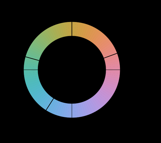
Observers agree that four hues are elementary and that no colour is reddish green. Nothing in the three receptors predicts either fact, and the axes of every standard colour space miss the four by tens of degrees.
Why there are four unique hues
Observers agree that four hues are elementary and that no colour is reddish green. Nothing in the three receptors predicts either fact, and the axes of every standard colour space miss the four by tens of degrees.
What this makes readable
Essays that name this one as a prerequisite.
Named alongside this one
Essays reaching for the same objects. Nobody chose these; they are what the index of named objects makes visible.
- Printing does not change the sign additive mixture · kubelka munk · pigment · reflectance · subtractive mixture
- Rendering in three numbers chromaticity · colour management · primaries · reflectance · standard observer
- A bounce is a multiplication chromaticity · reflectance · spectral power distribution · standard observer
- A gamut has a population chromaticity · primaries · reflectance · standard observer
- A shadow has its own illuminant chromaticity · colour management · spectral power distribution · standard observer
- A fourth primary is a design chromaticity · primaries · standard observer
What links here
Every essay whose body links to this one.
The objects this essay names
Each one links to every other essay that touches it.
Additive mixtureChromaticityColour managementKubelka munkPigmentPrimariesReflectanceSpectral power distributionStandard observerSubtractive mixture