These two patches are identical
Two grey squares, one on a dark field and one on a light field. The caption says they are the same colour. They very obviously are not the same colour, and the caption is correct.
The demonstration has two dials in it, and turning each says what the effect is a statement about.
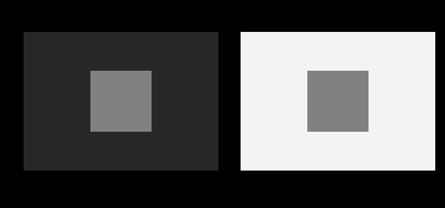
The level the two patches sit at is the other dial, and moving it says the effect is not about how much light they send.
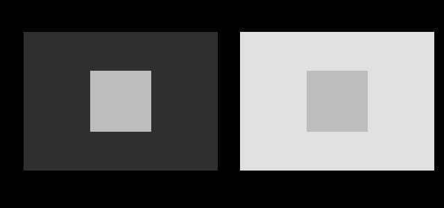
Neither dial has been driven to its end, and driving each of them further is what turns a demonstration into a measurement of what the effect actually depends on.
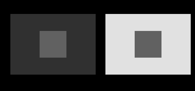
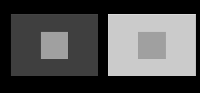
This is simultaneous contrast, it is the oldest demonstration in the subject, and the interesting thing about it is not the effect. It is the epistemology.
The claim nobody can check
The force of the figure rests entirely on the two patches being identical. If they differ even slightly, the demonstration collapses into a trivial observation that two different greys look different.
And the reader cannot verify it. Looking is precisely what fails — that is the phenomenon. A reader who wants to be sure has three options: trust the author, cut the page up and put the patches side by side, or open the image in an editor and sample the pixels. Almost nobody does any of the three.
So the standard version of this figure asks for trust in exactly the place where trust is least warranted, and the incentive runs the wrong way. An author whose effect is weak has every reason to nudge one patch a little, and no reader will catch it. There is no suggestion here that this happens often. The point is that the format makes it undetectable, and undetectable claims have a way of drifting.
What is done about it here
Every construction in this family returns a list of identity claims alongside its geometry, and a function called assertSame compares them before anything is drawn. A mismatch throws, and the build stops.
The comparison is on the emitted string, not on a value that later gets rounded — it is the string that reaches the browser, so it is the string that has to match. When the values do differ, the error message reports the per-channel difference, so a one-unit drift in red is identified as a one-unit drift in red rather than as an opaque failure.
The gate goes one step further and requires the checker to still reject. It is handed a deliberately mismatched pair, #808080 against #818080, and must throw with a message naming the channel difference. An assertion that had quietly stopped rejecting would be worse than no assertion at all, because every caption on the site is written as though it were working.
The result is that the caption states a fact about the drawing rather than a promise from the author. That is a small change and it is the one this essay exists for.
The easiest one to verify
For a reader who does want to check, one figure is much better suited than the rest.
The bar is one rectangle with one fill. There is no arrangement of the drawing that could make it otherwise, and any colour picker will confirm it in a few seconds. It is the version to reach for when the claim needs demonstrating rather than asserting.
What the effect actually is
The visual system does not report luminance. It reports something much closer to a ratio between a region and its surround, which is a sensible design given the problem it has to solve.
Illumination varies by orders of magnitude between a sunlit street and a shaded interior, and the reflectances of surfaces vary by only about thirty to one from the whitest paper to the blackest paint. A system reporting absolute luminance would spend most of its range encoding how bright the day is, which is rarely the useful information. A system reporting local ratios recovers something much closer to reflectance — the property of the object rather than of the lighting — and that is what colour constancy is for.
Simultaneous contrast is that mechanism operating where it does not help. The two patches have equal luminance and unequal surrounds, so the ratios differ, so the reported lightnesses differ. The system is doing exactly what it should and the display is presenting a situation that does not arise naturally.
Why the simple explanation is not enough
The obvious mechanism is lateral inhibition: neighbouring retinal cells suppress one another, so a region beside bright neighbours is suppressed more and reports darker. It is real, it is measured, and it accounts for the figure above.
It does not account for the next one.
Count the neighbours. The bar in the dark stripe is flanked along its long edges by black and along its short edges by white; the bar in the light stripe is the reverse. Simple contrast with the surround predicts the first should look lighter. It looks darker, and the effect is strong.
What appears to matter is not the amount of adjacent black and white but how the visual system parses the scene into surfaces — which stripe the bar is understood to belong to. That is a much later and more interpretive stage of processing than lateral inhibition, and White’s illusion is the standard evidence that brightness cannot be explained by local mechanisms alone. It is taken up separately, because the alternative account is worth its own essay.
Lightness, brightness, luminance
Three words that get used interchangeably, and the confusion is worth clearing once.
Luminance is physical: light per unit area, weighted by the eye’s spectral sensitivity. It is measurable with an instrument and has nothing to do with any observer’s state.
Brightness is how much light something appears to emit. It is perceptual and absolute-ish — a white paper in sunlight is brighter than the same paper indoors.
Lightness is how reflective something appears. It is perceptual and relative, and it is what stays roughly constant when the illumination changes. That paper is white in both places.
The patches in the hero figure have equal luminance and different lightness. That is not a contradiction and not an error in anybody’s perception. Two of the three quantities are perceptual, they answer different questions, and neither is required to track the physical one.
This is the same distinction that makes matching a different question from appearance, and it is the reason colorimetry can be exact about the first while saying nothing about the second.
The specification problem underneath
There is a practical reason the effect matters beyond the demonstration.
Any specification of the form “this element should be 60% grey” is a specification of a code value, which fixes the luminance and does not fix the appearance. Placed on a dark background it will read as considerably lighter than the same value on a light background. Interface work, print design and data visualisation all run into this, and the usual fix — checking the contrast ratio against the background — is the right instinct, since a ratio is exactly the quantity the visual system is computing.
It also means a palette cannot be evaluated as a list of colours. It has to be evaluated in the arrangement it will be used in, because moving a swatch to a different neighbour changes what it looks like without changing what it is.
Three more constructions, same discipline
The family carries five constructions and each isolates a different aspect of the same machinery.
Each caption states the shared hex code, and each is checked before the figure is drawn. The value in the caption is read from the same variable the rectangles are filled from, so there is no path by which the two could disagree.
Why the assertion is not merely tidiness
It would be reasonable to think this is over-engineering — surely an author drawing two rectangles with the same fill can be trusted to have used the same fill.
The reason it is not is drift. These figures are generated from parameters, and parameters change. A refactor that moved the patch computation into a helper, a change to how greys are specified, an adjustment to one figure’s contrast that touched shared code — any of these could separate the two values by one unit in one channel, which nobody would ever see and which would quietly falsify every caption in the family.
The same reasoning appears throughout this collection: the failures that matter have no visual signature. A picture with a wrong caption looks exactly like a picture with a right caption, which is the whole argument for computing the caption.
What was computed here
Every grey on this page is specified by relative luminance rather than by code value, and converted through the sRGB transfer function.
That distinction matters more than it sounds. Asking for “fifty per cent grey” almost always produces #808080, which carries about 21.6 per cent of white’s luminance — the transfer function is not a linear ramp. Half the luminance of white is code 188. Since these figures are about luminance relationships, specifying them in code values would have made the captions wrong in a way that no amount of visual checking would reveal.
The identity claims are asserted as described above. There are five constructions in the family and all five are checked on every build, together with a self-test requiring the checker to reject a mismatched pair.
The five constructions are checked on every build, together with a self-test requiring the checker to reject #808080 against #818080 with a message naming the channel difference. An assertion that had stopped rejecting would leave every caption in the family unsupported while the build continued to pass.
The general principle
The discipline on this page generalises past illusions, and it is the reason this site exists in the form it does.
A figure makes a claim. The reader can usually check a claim about shape by looking — a line is straight or it is not. A claim about identity of value is different: it is precisely the kind of claim that looking cannot settle, and it is also the kind that carries the entire argument in a perception figure.
Making such claims into assertions costs a few lines per figure and converts a promise into a fact about the drawing. The cost is small enough that there is no good reason not to, and the failure mode it prevents — silent drift making every caption in a family false — has no visual signature at all.
What the family costs and what it buys
Five constructions, one checker, one self-test. The whole apparatus is perhaps a hundred lines.
What it buys is that every caption in the family states a fact about the drawing. Given that the claims are exactly the kind no reader can verify, and that drift through refactoring is the realistic failure mode rather than dishonesty, that is a good trade at the price.
Why the effect is not a bug
Worth stating, because the framing matters for everything in this field.
The visual system is solving a problem with no solution: recovering surface reflectance from a signal that confounds reflectance with illumination. One measurement, two unknowns. It solves it by assumption, and the assumptions are good ones about the world — illumination varies smoothly, the brightest thing in view is usually white, sharp changes are usually surface boundaries.
A figure like this one violates those assumptions deliberately. The patches have equal luminance and unequal surrounds, which in a natural scene would mean unequal reflectance under unequal illumination. The system reports what that situation would imply, and the report is correct about the world it was built for.
Calling the result an error is a little like calling a well-designed instrument faulty for giving the wrong answer when fed an input outside its range. The design and its consequences are taken up next.
The wider application is worth stating once. Any figure whose argument rests on an equality the reader cannot see should assert that equality in code. That covers most of perception, a good deal of data visualisation, and anything where a caption says two things are the same. The cost is a few lines; the alternative is a claim that could quietly become false and that nobody would ever notice had.
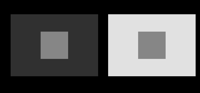
The effect is not a property of one grey, and a light patch on fields pushed almost to the ends of the display’s range is the strongest form of it this page can draw.

How different should they look?
The identity is asserted. The difference is not, and until this phase the site had nothing that could say how large it ought to be — which left the most important figures here making a claim in one direction only. They could prove the patches were the same. They could not say what “looking different” amounted to.
An appearance model can, because it takes the background as an argument. Fix the patch, vary the background, and read off the predicted lightness.
There is an obvious question about whether the reader can check this, and the answer is no, in a way worth being exact about. The assertion that the patches are identical is checkable by anyone with a colour picker, and is checked mechanically here before the figure is drawn. The prediction that they should differ by a stated amount is not checkable from the page at all, because verifying it would require knowing the reader’s adapting luminance, the ambient light, and what surrounds the figure — none of which the page has access to and one of which is the page.
So the figure now carries a proved claim and an unprovable one side by side, and the difference between them is marked rather than smoothed over. That is the honest arrangement. The alternative — printing the prediction in the same voice as the assertion — would suggest the site had measured something it has not.
How large the model says it is
The second number is named above and not given, so here it is.
A patch at a luminance factor of 0.24 has a CIELAB lightness of 56.09, and colorimetry has nothing further to say: one stimulus, one number, whatever surrounds it. Handing the same stimulus to CIECAM16 with the background as an argument:
| background | predicted lightness | brightness |
|---|---|---|
| 5 | 50.29 | 217.7 |
| 10 | 48.45 | 188.0 |
| 20 | 45.95 | 161.3 |
| 30 | 44.13 | 146.9 |
| 45 | 41.99 | 133.2 |
| 60 | 40.27 | 124.0 |
| 75 | 38.81 | 117.0 |
| 90 | 37.54 | 111.4 |
A swing of 12.76 units of lightness — a ratio of 1.34 — for one unchanged stimulus. On a scale where a hundred is white, the identical patch is predicted to look a quarter of the way up the scale on a light ground and half of the way up on a dark one.
The brightness correlate moves further still, from 111.4 to 217.7, very nearly a factor of two. That is the model saying the patch on a dark ground should look almost twice as bright, which is closer to what the demonstration actually shows than the lightness figure is.
Two things are worth noting about those numbers as evidence. They are monotone and smooth, so the model is not merely reporting that a difference exists; it gives a graded prediction across the whole range, and an experiment could test the shape rather than the direction. And the swing is larger than the assertion’s own tolerance by four orders of magnitude — the patches are identical to the last digit of an emitted string, and the model says they should look 12.76 apart.
That is the arrangement the section above describes, with its two numbers filled in: a proved identity of exactly zero, beside an unproved prediction of nearly thirteen.
And the effect survives fields that are close together, which is the setting that says whether it needs an extreme surround to appear at all.
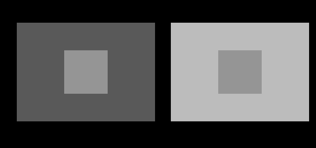
What the pictures cannot show
The strength of the effect depends on the reader’s viewing conditions — screen brightness, ambient light, viewing distance, and how large the figure renders. None of that is under the site’s control, and a reader on a dim phone in bright sunlight may see almost nothing.
More fundamentally, no figure here can show what the two patches “really” look like, because there is no such thing. Appearance is a function of the whole arrangement, and removing the surround to see the patch alone changes the thing being examined. That is not a limitation of the drawing; it is what the phenomenon is.
Who found it, and when
The effect was described systematically by Michel Eugène Chevreul, who was director of dyeing at the Gobelins tapestry works in Paris and was receiving complaints that certain dyes looked wrong. He established that the problem was not the dye but the adjacent colours, and published De la loi du contraste simultané des couleurs in 1839.
The book had an influence well outside colour science. It was read closely by Delacroix, and later by Seurat and Signac, and the pointillist technique of placing small dots of unmixed colour side by side is a direct application of it.
White’s illusion is much more recent, described by Michael White in 1979, and is still actively used to test models of brightness perception.
Where this goes next
The failure of the simple explanation leads to brightness is inferred from edges, which takes up the Cornsweet effect and the checker-shadow. The reason the visual system behaves this way at all is constancy is the default. And the general principle these figures illustrate — that a stimulus does not determine an appearance — is matching is not appearance.
Where this goes next
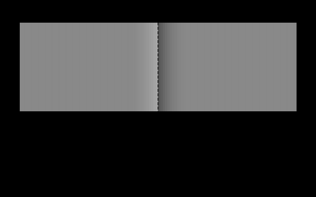 Brightness is inferred from edges
The Cornsweet effect makes two identical regions look different by altering nothing except a narrow band at the boundary between them. Cover the boundary and the difference vanishes, which says the visual system is reconstructing surfaces rather than reading off intensities.
Brightness is inferred from edges
The Cornsweet effect makes two identical regions look different by altering nothing except a narrow band at the boundary between them. Cover the boundary and the difference vanishes, which says the visual system is reconstructing surfaces rather than reading off intensities.
 Matching is not appearance
CIE XYZ predicts when two lights will look the same under identical viewing conditions. It was never a model of how anything looks, and most of the confusion in applied colour comes from using it as one.
Matching is not appearance
CIE XYZ predicts when two lights will look the same under identical viewing conditions. It was never a model of how anything looks, and most of the confusion in applied colour comes from using it as one.
 Constancy is the default
A sheet of paper looks white in daylight and white under a tungsten lamp, although the light reaching the eye differs enormously. The visual system is solving one equation with two unknowns, and it solves it by assumption.
Constancy is the default
A sheet of paper looks white in daylight and white under a tungsten lamp, although the light reaching the eye differs enormously. The visual system is solving one equation with two unknowns, and it solves it by assumption.
What this makes readable
Essays that name this one as a prerequisite.
Named alongside this one
Essays reaching for the same objects. Nobody chose these; they are what the index of named objects makes visible.
- There is no brown light colour constancy · lightness · simultaneous contrast · surround
- A dark wall pays for a finish lightness · luminance · reflectance
- A viewing condition is a moment assertion · colour constancy · surround
- The average surface does not look average colour constancy · lightness · reflectance
- The same wall applied twice assertion · colour constancy · reflectance
- What no adaptation can remove assertion · colour constancy · reflectance
What links here
The 8 essays that link to this one and share the most of its objects, of 18 that link here.
The objects this essay names
Each one links to every other essay that touches it.
AssertionColour constancyLightnessLuminanceReflectanceSimultaneous contrastSurround