Neither gamut contains the other
Assumes A halftone is not a mixture and What a gamut costs.
Every account of preparing a picture for print says the same thing: the screen’s gamut is larger, so colours must be given up. The instruction that follows is always about loss — expect the saturated blues to go flat, the greens will not hold.
It is half right, and the missing half is the interesting one.

The claim
A four-colour press and an sRGB display have gamuts that intersect. Roughly a ninth of the press’s solid is outside the display’s, and rather more than half of the display’s solid is outside the press’s.
Both halves matter and they matter differently. The second is why a picture prepared on a screen needs a decision about what to do with the colours the press cannot make. The first is why a printed piece can be a colour that no screen ever showed the person who signed it off — and why the proof of a cyan is an argument that has been had in every print shop in the world.
What was measured, and how
A gamut is a solid, so the question is a question about volume, and volumes computed by counting things are notoriously untrustworthy. The method is therefore stated in full, and it is checked against a method that has nothing in common with it.
The sample. Every combination of ink coverages on a lattice — thirteen steps per chromatic ink, nine levels of black — subject to two stated constraints: a total-area-coverage limit of 320 per cent, because a sheet carrying more than that will not dry, and the rule that no separation uses more than three chromatic inks at once. Nodes failing either are excluded rather than clamped, because a clamped node is a colour the press cannot print reported as one it can.
The estimator. Each lattice cell’s image in CIELAB is filled with sub-samples closer together than a voxel, and the occupied voxels are counted. Filling matters more than it sounds: counting only the cells the lattice points land in measures a sieve, and reports about a third of the true volume.
The extrapolation. A voxel the boundary passes through is counted whole, so the count runs high by about half the surface area times the cell edge — an error linear in the cell, with the order coming from the geometry rather than from a fit to the data. Two counts at cell sizes and therefore give the limit as .
The check. volume.js measures the sRGB solid two other ways — a tetrahedral decomposition of the cube, which tiles it exactly, and a Monte Carlo. The extrapolated cell count lands within about one per cent of the tetrahedral volume, against 10 to 20 per cent for either raw count. That is the only reason any number below is worth quoting.
The numbers

Measured in CIELAB units cubed under D50:
- the sRGB solid, adapted to D50: 826,800
- the four-colour press: 413,400 — a ratio of 0.50
- of the press’s occupied cells, 11.0 per cent are outside sRGB
- of sRGB’s occupied cells, 54.5 per cent are outside the press
The two percentages are not two views of one quantity. They are the two directions of a comparison between overlapping sets, and quoting either alone is where “the gamut is smaller” comes from.
Three numbers that check each other
Those four figures are not independent, which is worth exploiting rather than merely noting: two overlapping solids have only three degrees of freedom between them — what each contains alone and what they share — so the volume ratio is implied by the two percentages and can be compared against the one that was measured.
Both percentages are statements about the same intersection. From the press’s side it is ; from the display’s it is . The two routes agree to 2.2 per cent, which is the size of residual the estimator’s own stated bias allows and is a great deal smaller than the 10 to 20 per cent a raw cell count carries. Equivalently, the ratio the two percentages force is against the 0.50 that was measured directly — the same 2.2 per cent, arriving as a check on the volumes rather than on the overlaps.
That is the strongest evidence in this essay that the estimator is doing what it claims, and it costs nothing: it is three published numbers being asked whether they can all be true at once.
It also yields the quantity the essay has been circling and has not stated. The shared region is about 372,000 CIELAB units cubed, which is 45 per cent of the display’s solid and 90 per cent of the press’s:
| volume | as a share of sRGB | |
|---|---|---|
| shared by both | 372,000 | 45.0% |
| sRGB only | 455,000 | 55.0% |
| press only | 41,000 | 5.0% |
| either one or the other | 868,000 | 105.0% |
Nine tenths of what a press can print, a screen can already show. That is the honest form of the press’s advantage, and it is smaller than the eleven per cent headline makes it sound, because eleven per cent of a solid half the size is five per cent of the display’s. Adding a press to a screen widens the set of reachable colours by a twentieth.
And the single number that summarises an overlap without picking a side is the shared volume over the combined one: 42.9 per cent. The two devices agree about a little under half of what either of them can do. Neither “the press covers 50 per cent of sRGB” nor “the press reaches outside sRGB” is wrong, and neither is that.
Where each one wins
The interesting structure is not in the totals but in where the boundaries cross, and the crossing is systematic rather than incidental.
| lightness | hue | press | sRGB |
|---|---|---|---|
| 50 | 180° — cyan | 62 | 36 |
| 50 | 200° | 55 | 32 |
| 50 | 240° | 55 | 37 |
| 50 | 0° — red | 68 | 77 |
| 50 | 120° — green | 51 | 61 |
| 50 | 300° — violet | 35 | 90 |
| 85 | 120° | 24 | 93 |
Maximum chroma reachable at that lightness and hue. The press’s advantage is concentrated in the cyan to blue-green region, where a cyan ink is a much better spectral filter than a display’s blue and green primaries mixed; the display’s advantage is enormous in the violets and in every light colour, because at L* 85 a press has almost no ink on the sheet and therefore almost no chroma.


The light end of the range is where the comparison stops being a contest at all, and it is worth seeing before the volumes are read.
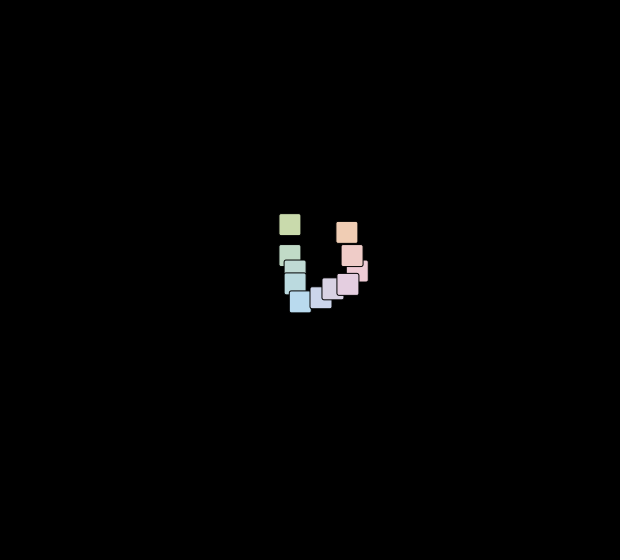
The general shape is that a press is dark and saturated where a display is light and saturated. Ink darkens as it saturates, because chroma is bought by absorbing more light; a display brightens as it saturates in some directions, because chroma is bought by turning off one emitter and leaving the others on. The two solids are different shapes for a reason that is about the mechanism rather than about quality.
The comparison that has to be refused
There is a tempting version of this comparison that is wrong, and this site has made the mistake once already and recorded it.
Comparing a display gamut with a surface gamut by drawing both on a chromaticity diagram compares a projection with a slice. The sRGB primary triangle has an area of 0.11205 and the surface bound at Y = 0.6 has an area of 0.11455 — a two per cent agreement that looks like a finding and is an artefact of comparing two different kinds of object.
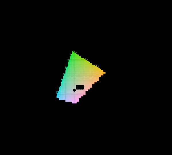
Everything in this essay is therefore in CIELAB, where both objects are solids, and both are sampled under the same illuminant with the same observer and measured by the same estimator. That is what makes the ratio 0.50 a comparison rather than a coincidence.
The white and the black
Two numbers that a chromaticity comparison never shows and that decide most of what a picture looks like.
The press’s white is the paper, at L* 94.8 rather than 100, and it is slightly blue on a coated stock and distinctly yellow on newsprint — which is a whole essay of its own. The press’s black is L* 2.4 with all four inks down, and that is the best case: under a 240 per cent ink limit it is 3.4.
So the printed lightness range runs from 94.8 to 2.4, a luminance-factor contrast of about 320:1. A display in a dark room manages a thousand to one and in a lit room manages rather less — which is the one comparison in this essay where the two media are closer than anybody expects.

This page cannot show half of what it is about
There is a difficulty in this essay that no amount of care removes, and stating it is more useful than working around it.
The press’s advantage is a set of colours this display cannot reproduce. Every figure above is being rendered on the very apparatus one of the two gamuts belongs to, so the cyan the press reaches and the screen does not can be drawn as a position on a plot and cannot be drawn as a colour. Where a swatch would have to lie about it, the swatch is hatched instead — the site’s standing rule, arriving here in the one place where the hatching is the finding rather than an admission attached to it.
The reverse is not symmetric. The display’s advantage over the press can be shown perfectly well on the display, which means a reader looking at these figures sees one side’s advantage as colour and the other side’s as absence. That asymmetry is in every discussion of print against screen ever conducted on a screen, including this one, and it is a large part of why the folk knowledge runs entirely in one direction.

What a picture actually contains
A gamut comparison is a statement about the set of possible colours, and a job is not a uniform sample of that set. It is worth separating the two, because they answer different questions.
Most pixels in most photographs are unsaturated: skin, foliage, sky, concrete, cloth. Those live near the middle of both solids and are reproduced by any sensible pipeline to well under a ΔE00 of one. The colours that fall outside the press’s gamut are concentrated in a small tail — a saturated logo, a stage light, a flower, a printed screen shot — and the tail is what generates every argument, every reprint and every rendering intent.
This is the reason the two percentages above should be read carefully. That 54.5 per cent of the sRGB solid lies outside the press does not mean half a picture will change. It means half of the space is unavailable, most of which the picture never visits, and the part it does visit is the part someone chose deliberately because it was vivid.
Where this model stops
The press is a model. Constructed inks, a stated trapping factor, a stated ink limit, a Yule–Nielsen exponent of 1.8. A real press characterised properly would give a solid of a similar shape and a somewhat different size, and the qualitative claims — the cyan advantage, the violet deficit, the collapse at high lightness — are robust to all of that because they follow from the inks’ absorption bands.
The estimator’s error is systematic and stated. The raw cell count is 10 to 20 per cent high depending on the cell; the extrapolated value is within about one per cent on the one solid that can be checked. Every ratio here is between two solids measured the same way, so most of the residual bias cancels; every absolute volume is quoted with that caveat attached.
The overlap arithmetic assumes the two solids were sampled commensurably. The intersection above is computed from two percentages of occupied cells, so it inherits whatever the voxel grid does at the boundary — and a boundary is exactly where two solids that cross spend most of their disagreement. The 2.2 per cent the two routes differ by is therefore a lower bound on that exposure rather than a measurement of it: two errors in the same direction would cancel in the check and survive in the answer.
Fluorescent papers are excluded, deliberately. Most real printing stock contains optical brighteners, which have no reflectance curve at all, and including one would silently make the paper’s white depend on the illuminant’s ultraviolet content — a real effect, and one that would make the solid non-comparable to a display’s.
Nothing here is about ink limits in the sense a printer means. The 320 per cent limit is a constraint on the sample, and its effect is smaller than anybody expects and lands entirely in the shadows.
The generalisation
Two devices with different mechanisms have gamuts that intersect rather than nest, and the language of “wider” and “narrower” is a claim about volume that hides the claim about shape.
The habit of ranking gamuts by area or volume is everywhere — a display is sold on the percentage of some standard’s volume it covers — and it is exactly as informative as ranking two countries by area when the question was whether one contains the other. A display covering 95 per cent of DCI-P3 by volume may still be missing an entire corner.
There is a cheap procedural version of that, and the section above is a worked example of it. Any two of the three quantities determine the third, so a specification quoting a single coverage percentage is withholding two numbers it necessarily already computed: which of the target’s colours are missing, which of its own are outside the target, and how much of either set is shared. A display sold as covering 95 per cent of DCI-P3 has had all three in front of it and published the one that flatters. Asking for the other direction — what does this device reach that the standard does not — costs the manufacturer nothing and is the number that says whether the missing five per cent is a corner or a rounding error.
The useful question is never how large but which colours, and it is answerable: take the set the source contains, ask which members the destination cannot make, and look at where they are. The answer for a press against a screen is the light saturated everything, and the violets; the answer for a screen against a press is the cyans.
Who found it, and when
The observation that print and display gamuts cross is old and belongs to the trade rather than to a paper: anybody who has proofed a cyan on a screen has met it.
What is comparatively recent is the ability to say it, and it arrived with the ICC profile in 1993, which for the first time made both devices’ gamuts objects a computer could hold. Before that, matching print to screen was done by adjusting until it looked right, and there was no representation in which the question “which colours can this device not make” had an answer.
The measurement methodology took longer. Gamut volume computed in CIELAB became a routine number in the 1990s; the difficulty that different methods disagree by tens of per cent on the same solid is documented and is still live, which is why this essay states its estimator and checks it.
The number that has entered general circulation — that a press covers some percentage of sRGB — is a volume ratio quoted without its direction. It is 0.50 here, and it conceals the fact that an eighth of the press’s own volume is outside the thing it is being measured against.
Where the ladder goes next
This rung sits on the halftone, because a gamut is the set of colours the mosaic can average to, and on what a gamut costs, which is the display-side version of the same question.
Directly above it is the decision that has to be made once the crossing is known: no mapping preserves everything, where each rendering intent is measured by what it moves and what it collapses.
Two rungs above, the same solid is asked what a fifth, sixth and seventh ink buy — a corner each, and less than anybody hopes.
Where this goes next
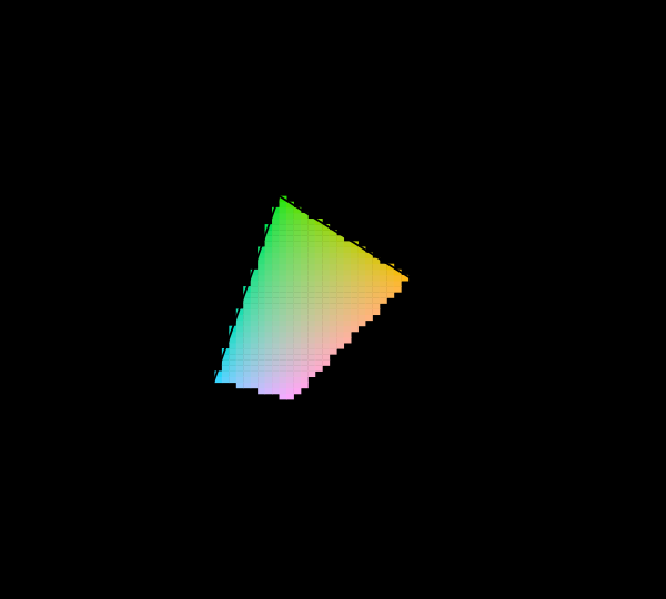 What a gamut costs
Three primaries reach a triangle and the visible region is not a triangle, so something has to give. Widening the primaries helps, has a price in precision and compatibility, and runs into a limit that is geometric rather than technological.
What a gamut costs
Three primaries reach a triangle and the visible region is not a triangle, so something has to give. Widening the primaries helps, has a price in precision and compatibility, and runs into a limit that is geometric rather than technological.
 No surface can be that colourful
There is a hard bound on object colour that no pigment will ever move, and it follows from a reflectance being at most 1. Its boundary is generated by two numbers, it shrinks by a factor of eleven from dark to light — and measured against it properly, sRGB reaches 40% of what a surface could be at mid lightness while Rec. 2020 reaches 106%.
No surface can be that colourful
There is a hard bound on object colour that no pigment will ever move, and it follows from a reflectance being at most 1. Its boundary is generated by two numbers, it shrinks by a factor of eleven from dark to light — and measured against it properly, sRGB reaches 40% of what a surface could be at mid lightness while Rec. 2020 reaches 106%.
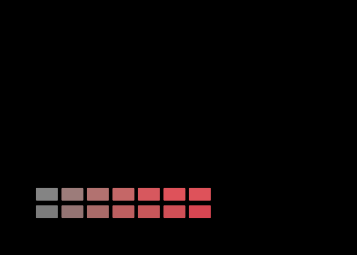 No mapping preserves everything
More than half the sRGB solid is outside a press's gamut, so something has to be done with it, and there are two things that can be done. One leaves every reproducible colour exactly where it was and delivers a gradient as a flat area. The other keeps the gradient and moves every colour that needed no help by about three.
No mapping preserves everything
More than half the sRGB solid is outside a press's gamut, so something has to be done with it, and there are two things that can be done. One leaves every reproducible colour exactly where it was and delivers a gradient as a flat area. The other keeps the gradient and moves every colour that needed no help by about three.
What this makes readable
Essays that name this one as a prerequisite.
Named alongside this one
Essays reaching for the same objects. Nobody chose these; they are what the index of named objects makes visible.
- A display in a room is a smaller display colour management · display gamut · gamut · specification
- A margin costs a press its corners cielab · gamut · gamut mapping · process inks
- A projection has no reason to detour cielab · gamut · gamut mapping · process inks
- A screen is a poor lamp colour management · display gamut · gamut · specification
- A third of the appearance box is no surface display gamut · gamut · object-colour solid · specification
- Only one of these devices adapts colour management · display gamut · process inks · specification
What links here
The 8 essays that link to this one and share the most of its objects, of 12 that link here.
The objects this essay names
Each one links to every other essay that touches it.
CIELABColour managementDisplay gamutGamutGamut mappingHalftoneObject-colour solidProcess inksQuadratureSpecification