Two thirds is not a property of the eye
Assumes The diagram has no area, Most of this diagram cannot be shown and What a gamut costs.
The first figure this site ever drew put the sRGB triangle inside the spectral locus and hatched everything outside it, under a caption saying that most of the diagram cannot be shown. The hatching is the site’s own contribution and stands. The word most is doing more work than it can carry.

The claim
“A screen can show about a third of the visible colours” is a ratio of two areas on a chosen plane, and the plane is a choice the matching data do not make. Replace the area with a count of stimuli and the question has an answer that is the same in every basis — but it is a different number, and there is more than one of it depending on which stimuli are counted.
- The census. Twelve published diagrams, one observer, one display: 8.5 per cent in sRGB’s own rgb chromaticity, 19.3 in the 1931 report’s own
r gcoordinates, 33.6 in CIE xy, 38.4 in CAT16 cone chromaticity. A factor of 4.5. - Nothing about the eye or the display differs between the rows. Each is
A x̄for a nonsingularA, and every one of them predicts identical matches. - The invariant replacement is a count. Of this collection’s constructed surfaces under D65, 92.1 per cent are inside sRGB. Of the monochromatic lights, none is.
- Both of those are the same in every basis, because gamut membership is a fact about tristimulus values rather than about a picture.
- And the two answers are not close, which is the honest finding: what fraction of colour can a screen show is two questions wearing one sentence.
What the census measures
The locus is sampled at one nanometre and closed by the line of purples; the triangle is the three sRGB primaries; both are polygons and the answer is a ratio of shoelace areas. The only thing that varies between rows is the matrix through which the tristimulus values pass before the division that makes a chromaticity.
The rows at the two ends deserve their own sentences, because both are ordinary rather than perverse.
sRGB’s own rgb chromaticity puts the display’s primaries at the corners of the unit triangle. It is used routinely in computer vision, where dividing an image’s three channels by their sum is the standard cheap route to something illumination-invariant, and every such image lives on this diagram. The triangle covers 8.5 per cent of the locus there.
CAT16 cone chromaticity is the plane of the axes an appearance model adapts in. The triangle covers 38.4 per cent there. A reader of both would come away with two impressions of the same display four and a half times apart.


Two more planes make the census wide enough to be an argument rather than an anecdote, and the second of them is a plane nobody prints.


Why the number moves so much
A factor of four and a half is larger than most readers expect from a change of coordinates, and the reason is worth setting out, because it explains which diagrams are generous and which are harsh without any computation.
A projective map has a line at infinity: the set of directions that get sent off the edge of the picture. Where that line falls relative to the locus decides everything. Push it close to the locus on one side and the region near that side stretches enormously, inflating the denominator and shrinking the triangle’s share; push it far away and the picture becomes nearly affine and the share settles near a third.
The device-primary diagrams put the line at infinity close in, because a display’s primaries are inside the locus and dividing by their sum sends the plane through them to infinity — a plane that cuts across the locus. That is exactly why the sRGB rgb picture has an enormous horseshoe and a tiny triangle. The 1931 report’s own coordinates do the same thing for the same reason, on real bench primaries rather than display ones, which is how a diagram that predates XYZ lands at 19.3 per cent.
The cone-chromaticity diagrams go the other way. Their coordinates are all non-negative on every real light and the line at infinity is well clear of the locus, so the picture is compressed rather than stretched and the triangle’s share rises.
None of that is a defect in any of the diagrams. It is the projection doing what a projection does, and the only mistake available is to read a number off one of them as though it were a number about vision. The same structure decides which claims survive at all, and area is on the wrong side of that line.
The invariant question
If the fraction moves with the diagram, the sentence has to be rebuilt rather than corrected, and the rebuild is straightforward: count things, not regions.
Whether a particular tristimulus value is inside a gamut is decided by three linear inequalities and does not depend on how it is drawn. So any question of the form how many of these stimuli can be shown has an answer that survives every change of basis. What it needs is a population — and choosing the population is now the whole of the difficulty, which is the right place for the difficulty to be.

Counting surfaces gives 92.1 per cent. This collection’s constructed reflectances under D65 are, by a large majority, inside sRGB — which is the number a photographer would recognise and is roughly why photography works at all. It is a fact about surfaces rather than about the eye, and it is exactly as sensitive to the choice of surface set as the area version is to the choice of diagram, with the difference that a surface set is a physical population and a diagram is not.
Counting monochromatic lights gives zero. Every spectral light is outside every triangle, necessarily, because the locus is convex and the primaries are inside it. That is the reason the primaries a display would need are imaginary and is not a limitation anybody can engineer around. It is also the reason narrower primaries always help and never finish: a triangle with vertices on the locus would need three lasers, and would still miss every light that is not one of those three.
Between those two extremes sit the populations that would answer other reasonable versions of the question: the object-colour solid, the set of real fluorescent surfaces, the set of lights a lamp can be made from. Each has a different answer and each is invariant.
What was computed, and how
The area census uses the polygon method described above. The one methodological decision worth stating is the sampling interval: at five nanometres the inscribed polygon understates the locus area by enough to matter at three significant figures, and at one nanometre the deficit is below a tenth of a per cent, which is two orders below the spread being reported. The interval is stated rather than tuned.
The counts use inGamut, which tests the three sRGB coordinates against zero and one with a tolerance of 10⁻⁶ and is the same routine every swatch on this site passes through. The surfaces are this collection’s own constructed set — two hundred and forty reflectances built from Gaussian bands on a pedestal — and their 92.1 per cent is therefore a property of that construction. A set of measured Munsell chips would give a different number and would be invariant in the same way.
The monochromatic count normalises each spectral stimulus by its largest tristimulus coordinate before testing, so that the test is about chromaticity rather than about brightness. Without that normalisation the answer is still zero and for a less interesting reason.
How stable the ratio actually is
Both triangles move together under a change of coordinates, so their ratio is far more stable than either share is is the essay’s defence of the one use it allows the area fraction, and it is true by an amount worth measuring, because the amount is not the same for every pair.
Running three display gamuts through six of the planes:
| plane | sRGB | P3 | Rec. 2020 | P3 / sRGB | 2020 / sRGB |
|---|---|---|---|---|---|
| CIE xy | 33.6 % | 45.6 % | 63.6 % | 1.357 | 1.891 |
| CAT16 cone | 38.4 % | 50.6 % | 67.1 % | 1.319 | 1.747 |
| Hunt–Pointer–Estévez cone | 38.5 % | 50.9 % | 67.4 % | 1.321 | 1.750 |
| Rec. 2020 rgb | 33.3 % | 43.5 % | 61.0 % | 1.306 | 1.828 |
| Display P3 rgb | 23.7 % | 31.9 % | 49.3 % | 1.345 | 2.083 |
| sRGB rgb | 8.5 % | 12.5 % | 24.5 % | 1.475 | 2.883 |
The three values this essay already quotes reproduce exactly — 33.6 on CIE xy, 38.4 on CAT16 cone chromaticity, 8.5 on sRGB’s own rgb — and the sRGB share spans a factor of 4.53 across the six, which is the essay’s stated 4.5.
The ratio is much steadier, and only for the pair that hardly differ. P3 against sRGB runs 1.306 to 1.475, a spread of 1.13; Rec. 2020 against sRGB runs 1.747 to 2.883, a spread of 1.65. In excess over unity — the quantity a reader of how much better is this panel is actually after — the share moves by 3.53 and the P3 ratio by 0.13, a stabilisation of twenty-seven times, while the Rec. 2020 ratio moves by 0.65 and is stabilised only five.
The reason is the one the essay gives for the shares, applied one level up. A projective distortion affects two nearby triangles almost identically and two distant ones differently, so the ratio is robust in proportion to how similar the two gamuts are — which is precisely the comparison worth least. A reviewer comparing two panels that barely differ gets a number two diagrams will agree about; one comparing a wide-gamut panel against a legacy one, which is the comparison anybody makes, can publish 2.9 times sRGB or 1.7 times sRGB and be quoting the same two triangles off two published diagrams.
Two things the table says that the twelve-row census does not
The cone planes are a single answer, not two. CAT16 gives 38.4 per cent and Hunt–Pointer–Estévez 38.5, a tenth of a point apart, while both sit five points from CIE xy. So the spread the census reports is not a smear over twelve equally scattered diagrams; it is a cluster of cone-like planes at the top, CIE xy and Rec. 2020’s rgb near a third, and the narrow device planes strung out below. Choosing which cone basis makes no difference at all, which is what the account of the line at infinity predicts and the census’s range does not show.
And a device plane’s harshness tracks its own gamut. sRGB’s rgb plane reports 8.5 per cent for sRGB; Display P3’s reports 23.7 for the same display; Rec. 2020’s reports 33.3, within three tenths of a point of CIE xy. The wider the primaries a plane is built on, the further its line at infinity sits from the locus and the less the picture is stretched — so Rec. 2020’s own rgb diagram is very nearly CIE xy for this purpose, and a device diagram is only distorting when the device is small.
That is a more useful rule than device planes are harsh. It says which published diagrams a reader can treat as interchangeable — the cone family with itself, and CIE xy with a wide-gamut rgb plane — and which one is the outlier: sRGB’s own chromaticity, the plane most image-processing code inadvertently works in, at a quarter of what CIE xy reports.
Where the model stops
Nothing here says the diagram fraction is useless. It is the right number for a specific and common purpose: comparing two displays on a stated diagram, where the diagram is held fixed and only the primaries move. That comparison is invariant to nothing, and it does not need to be, because both terms move together.
The counts are also silent about how the colours are distributed. Ninety-two per cent of a surface set being reachable says nothing about whether the eight per cent that is not is the part anybody cares about — and it usually is. The unreachable surfaces are the saturated ones: a printed spot colour, a saturated dye, a fluorescent sheet. A count treats them as one each, and a designer treats them as the whole problem. A count is invariant and unweighted, and unweighted is a decision.
And a count needs a population that somebody will accept. The area version’s appeal is that it appears to need nothing but the observer, and its failure is that this appearance is false. The count version wears its assumption on the outside. That is an improvement in honesty and not a reduction in arbitrariness — the population is a choice, and the right response is to state it, in the same way a whiteness figure needs its measurement condition beside it.
The whole exercise is also two-dimensional, and a gamut is a solid. The triangle is a shadow of a three-dimensional object, two displays with identical triangles can differ in volume, and none of that is repaired by fixing the projection. The area census and the count census are both answers to a question about chromaticity.
Who found it, and when
The area fraction seems to have no single origin, which is itself informative — it is folklore rather than a result. It appears in display marketing as a percentage of a named diagram’s area, in which form it is at least honest, and it propagates into teaching without the name.
The invariant alternatives are older than the folklore. MacAdam’s 1935 limits are the boundary of the object-colour solid and are exactly a statement about which stimuli a reflecting surface can produce; Pointer’s 1980 survey of real surface colours is a measured population of the kind a count needs. Both were available for decades before the diagrams that the fraction is quoted on were drawn, and neither is what gets quoted, because a percentage of a picture is easier to obtain than a census of surfaces.
The generalisation
The pattern is a fraction whose denominator is a picture.
It recurs wherever a quantity is defined as the proportion of a space, because a space has to be drawn or parametrised before a proportion exists, and the drawing is almost never the thing under study. The diagnostic is to ask what the denominator would be if nobody had chosen a picture, and if there is no answer, the fraction was about the picture.
The repair is nearly always the same and is nearly always available: replace the measure with a count over a stated population. It costs the appearance of universality and it buys a number that means the same thing to two people who drew different diagrams.
This collection has now hit the same shape twice from opposite directions and the pair is worth holding together. A whiteness figure is a measurement of a sheet and a lamp jointly, quoted as though it were a property of the sheet; a diagram fraction is a property of a gamut and a projection jointly, quoted as though it were a property of the gamut. In both cases the missing term is invisible because it is held constant across every comparison anybody makes — every laboratory used a similar lamp, every textbook drew the same diagram — and in both cases the number is fine for comparing two things and useless as an absolute statement.
What this site will say instead
The hatching stays, because it is a statement about cells and not about area: each cell is tested and marked or not, and which cells are marked is invariant. What changes is the sentence beside it.
The honest form has three parts and none of them is long. Name the diagram whenever an area is quoted, exactly as this site’s first figure rule requires a figure to name its observer. Give a count as well, over a population that is stated. And say which question is being answered, because a screen cannot show two thirds of the diagram, a screen can show ninety-two per cent of ordinary surfaces and a screen can show none of the spectral lights are all true at once and produce three different impressions.
That is more words than the folklore version and it is the same amount of work, since the count is one pass over a set the site already has.
The version a specification could use
A display specification has a real question behind it — how much better is this panel than that one — and the area fraction is a bad answer to a good question.
The good answer is a count over a stated population, and the populations are already standardised. Pointer’s set of measured surface colours exists precisely to say what a reproduction system has to reach; the object-colour solid says what any reflecting surface could be; a set of measured inks says what a print run will contain. Any of them gives a number that two people with different diagrams will agree about.
The count is also more informative about the thing anybody cares about, because a gamut’s failures are not spread evenly. Two panels with the same area fraction can differ by a factor in how many saturated reds they reach, and a count over a real population registers that where an area ratio averages it away.
What a count cannot do is produce a single flattering number without naming its population, which is presumably why the area fraction survives. It is the only version of the answer that appears to need no assumptions, and that appearance is the whole of the problem.
Where the ladder goes next
The next question a reader will ask is whether some diagram is nonetheless the right one — and the strongest version of that question is metric rather than areal: which projective picture comes closest to making equal distances mean equal differences. There is a best one, and its residual failure is a fact about the eye, which is the only invariant conclusion in this whole family.
Where this goes next
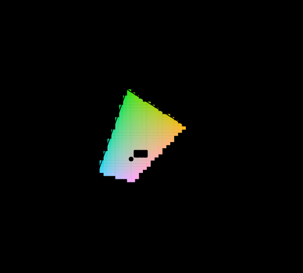 Most of this diagram cannot be shown
The chromaticity horseshoe is the canonical illustration of colour science, and nearly every printed copy is filled edge to edge with colours the page cannot produce. The honest version marks them, and the marking covers most of the picture.
Most of this diagram cannot be shown
The chromaticity horseshoe is the canonical illustration of colour science, and nearly every printed copy is filled edge to edge with colours the page cannot produce. The honest version marks them, and the marking covers most of the picture.
 The diagram has no area
A chromaticity diagram is a projective picture of a three-dimensional space, and the freedom colour matching leaves in the observer acts on it as a projective map. Straight lines and mixture ratios survive that; area, distance and angle do not — so half of what the diagram is used to say is a statement about the paper.
The diagram has no area
A chromaticity diagram is a projective picture of a three-dimensional space, and the freedom colour matching leaves in the observer acts on it as a projective map. Straight lines and mixture ratios survive that; area, distance and angle do not — so half of what the diagram is used to say is a statement about the paper.
 The triangle is a shadow
A display's gamut is drawn as a triangle on the chromaticity diagram, and coverage is quoted as a percentage of that triangle's area. Chromaticity has luminance divided out, so the triangle is a projection along the axis the eye cares most about — and the ratios computed on the solid are not the ratios computed on its shadow.
The triangle is a shadow
A display's gamut is drawn as a triangle on the chromaticity diagram, and coverage is quoted as a percentage of that triangle's area. Chromaticity has luminance divided out, so the triangle is a projection along the axis the eye cares most about — and the ratios computed on the solid are not the ratios computed on its shadow.
Named alongside this one
Essays reaching for the same objects. Nobody chose these; they are what the index of named objects makes visible.
- A third of the appearance box is no surface display gamut · gamut · macadam limits · object-colour solid · optimal colours
- A white that is not a reflectance gamut · macadam limits · object-colour solid · optimal colours
- The limits assume a pigment that switches instantly gamut · macadam limits · object-colour solid · optimal colours
- A limit written in energy charges the reds macadam limits · object-colour solid · optimal colours
- Neither gamut contains the other display gamut · gamut · object-colour solid
- One wavelength is everyone's colour display gamut · invariance · spectral locus
What links here
The 8 essays that link to this one and share the most of its objects, of 12 that link here.
The objects this essay names
Each one links to every other essay that touches it.
Chromaticity planeDiagram conventionsDisplay gamutGamutIdentifiabilityInvarianceMacadam limitsObject-colour solidOptimal coloursProjective transformationSpectral locus