Diagram conventions — where it appears
Named by 4 essays across 2 fields — each of them below, with the objects they name alongside it.
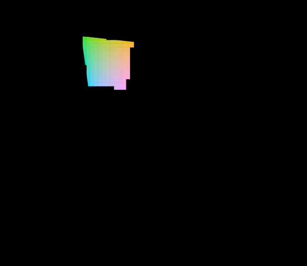
The diagram was replaced in 1976
The CIE knew the 1931 diagram was badly distorted and published a better one. Half a century later almost every chromaticity plot in print is still the old one, and both are still printed filled edge to edge with colours no display can show.

The diagram has no area
A chromaticity diagram is a projective picture of a three-dimensional space, and the freedom colour matching leaves in the observer acts on it as a projective map. Straight lines and mixture ratios survive that; area, distance and angle do not — so half of what the diagram is used to say is a statement about the paper.

Two thirds is not a property of the eye
It has been said from the beginning here that about two thirds of the chromaticity diagram cannot be shown on a screen. The figure is right, on the diagram it was measured on, and across twelve published diagrams the same triangle covers anything from 8.5 to 38.4 per cent of the same locus. Counting stimuli instead gives an answer that does not move.

Which of these is a convention
Nine ordinary sentences from this collection, put through one test — do they mean the same thing after the observer's three curves are replaced by a nonsingular combination of themselves? Five survive and four do not, and none of the four is wrong, because each is a statement about a set of coordinates being read as a statement about an eye.
Named alongside it
The objects these essays reach for when they reach for this one.
GamutProjective transformationChromaticity planeIdentifiabilityInvarianceChromaticityCIELABSpectral locusUniform chromaticity scaleAdditive mixtureAssertionColour vision deficiency