Theme

The thread: Outside the gamut — page 2

Most colours a human can see cannot be shown on this page. The usual response is to clip them silently and print the picture anyway. The response here is to mark them and say how far out they are.
What a proof on an unbrightened sheet cannot reach. The paper white of a heavily brightened stock beside the paper white of an unbrightened one, both under an ultraviolet-included instrument. They are ΔE00 9.8 apart and 10.3 of that is in the blue-yellow axis. A proofing system on the unbrightened sheet can print towards the brightened one only by adding ink, which makes the paper darker rather than bluer; it cannot add light at 435 nanometres because it has no brightener and its own lamp is the one in the room. This is why a soft proof and a hard proof of the same job disagree about the white, and why the disagreement is in one direction. What it takes to deliver it

A proof cannot glow

A proof is a different sheet of paper pretending to be the production one, and the pretence works by adding ink until the two agree. It cannot work for a brightened stock, because the direction the proof has to travel is towards more blue at the same lightness and every ink a proofer owns moves it towards less light instead.

Outside the set of colours a reflecting surface can be. How far each stock sits from the boundary of the object-colour solid, as a fraction of the bound. The line at zero is the boundary: a perfect diffuser sits exactly on it, and every reflectance ever made sits to its left. The pale marker is the sheet measured with the ultraviolet excluded and the dark one with it included. Two of the six cross the line — they are brighter, in a direction that can be written down, than any reflecting surface of their colour could be. This is a proof rather than a hull: for each sample a direction is found in which the largest value any reflectance can reach is computed exactly, and the sample exceeds it. Where the model breaks

A white that is not a reflectance

The object-colour solid is the hardest boundary in colorimetry — the set of tristimulus values any reflecting surface can produce, with no assumption about pigments in it at all. A coated press stock under a measurement standard's own lamp sits 1.5 per cent outside it, and a heavily brightened one 4.0, and with the ultraviolet removed both come back inside.

The locus and the triangle, drawn on one of the diagrams. The spectral locus and the sRGB triangle in CIE xy (1931) — the default of the discipline, and the default used here. The triangle covers 33.6% of the enclosed area here. Nothing about the observer or the display has changed between this picture and any other in the family; the coordinates have, and the coordinates are what an area is measured in. Matching and measuring

The diagram has no area

A chromaticity diagram is a projective picture of a three-dimensional space, and the freedom colour matching leaves in the observer acts on it as a projective map. Straight lines and mixture ratios survive that; area, distance and angle do not — so half of what the diagram is used to say is a statement about the paper.

What share of the diagram the sRGB triangle covers, in twelve published coordinate systems. Each row is a chromaticity diagram somebody has printed, and each bar is the fraction of the enclosed visible area that the sRGB triangle covers in it. Every row describes exactly the same observer and exactly the same gamut. The answer runs from 8.5% to 38.4%, a factor of 4.52, because area is not preserved by the projective maps that carry one of these diagrams to another. The familiar "about a third" is a fact about CIE xy. Matching and measuring

Two thirds is not a property of the eye

It has been said from the beginning here that about two thirds of the chromaticity diagram cannot be shown on a screen. The figure is right, on the diagram it was measured on, and across twelve published diagrams the same triangle covers anything from 8.5 to 38.4 per cent of the same locus. Counting stimuli instead gives an answer that does not move.

Three published primary sets, and a fourth chosen for how it adapts. The spectral locus with four triangles inside it. sRGB covers 33.5% of the diagram and leaves an adapted observer 2.36 ΔE00; Display P3 covers 45.4% at 1.22; Rec. 2020 covers 63.3% at 1.09. The fourth triangle is the best adaptation basis available to a display asked to cover 63.5% of the diagram, at 1.02 — and it is a different triangle from Rec. 2020's rather than a smaller one. The largest triangle that fits at all covers 73.9%, which is where the axis of this argument ends. What it takes to deliver it

Primaries chosen for their inverse

Moving a display's white point is a gain on its R, G and B, so a display adapts in the inverse of its own primary matrix — a basis chosen by committees for gamut coverage and phosphor availability. Pose the design problem properly and the answer costs one per cent of the gamut argument and reaches within two per cent of the best basis there is.

A display's primaries, scored as the adaptation basis they are. Four primary sets ranked by the mean ΔE00 an adapted observer is left with when the white point moves — which for a display is a gain on R, G and B, and so a von Kries adaptation in the inverse of its own primary matrix. sRGB leaves 2.36, as much as scaling XYZ directly and therefore as much as having no cone basis at all. Rec. 2020 leaves 1.09, better than every published adaptation transform fitted to corresponding-colour data. Nobody chose that: it is what wanting a wider gamut does to a primary's spectral selectivity. Matching and measuring

The gamut race chose the basis

Twenty years of arguing about how much of the diagram a display should cover has produced primaries whose inverse is a better adaptation basis than any transform ever fitted to corresponding-colour data. On the invariant count of what those displays can actually show, the same twenty years produced nothing at all.

What a constraint costs is how far it pushes, in the directions that are seen. A scatter of every constraint imposed here on the nine free numbers. The horizontal axis is the length of the displacement from the optimum measured only in the six directions the objective can see; the vertical, on a logarithmic scale, is the excess cost that displacement actually carries. Requiring the basis to be the inverse of three realisable display primaries sits at the bottom left, at 0.068 and 0.022 ΔE00 — it removes three degrees of freedom and moves the answer almost nowhere. Requiring it to hit the three dichromat confusion points removes six and pushes 13 times as far, for 0.68. The vertical spread at similar horizontal positions is the part a count of parameters cannot predict. Where the model breaks

A constraint is a direction and a distance

Four restrictions on the same nine numbers cost nothing, nothing, two per cent and seventy. How many parameters each removes predicts none of it. What does is the quadratic form evaluated along the displacement — and showing that it does means walking in towards the optimum rather than arguing at the edge, because at the edge the prediction is out by a factor of three.

The worst case is wherever the box stops. Four horizontal tracks, one per parameter of a painted wall. Each track spans the range an ordinary paint is allowed to occupy, with a second, wider range drawn behind it, and two markers show where the search for the worst change of light came to rest under each. Under the narrower box the answer sits on the wall in centre and width; under the wider one, in centre, width, base. The residual rises monotonically towards a narrower notch at a shorter wavelength on a darker wall, so there is no interior maximum to find. The worst change of light is 21.3 ΔE00 under one box and 28.4 under the other, and the census's own worst row is 3.37. What a scene does

The worst case is where the box stops

The worst change of light this collection quotes is two bounces off a green wall, and it is the worst of fourteen changes somebody wrote down. Searching the family those fourteen were drawn from reaches six times further — and does not stop, because the residual rises monotonically towards a narrower notch on a darker wall. There is no worst case in this family, and the number anybody quotes for one is a number about their own constraint.

A primary's tolerance is a shape, and part of it is unreachable. The CIE chromaticity diagram with the spectral locus drawn, and three closed regions marking where each primary of a display designed for its own inverse can sit while the adaptation cost stays within 1 per cent of its best. None of them is round: the widest runs 15.1 times further one way than another, so a single tolerance figure for a primary is the average of a shape the shape never takes. 47 of the 144 boundary directions leave the region a real primary can occupy, which is a second constraint the objective knows nothing about — the cost does not rise there, and the primary cannot go there. What it takes to deliver it

A tolerance is a region

How far a display's red primary can move before its adaptation behaviour costs anything is not a distance. It is a closed region on the chromaticity diagram, fifteen times longer one way than another, and about half of it lies outside the area a real primary can occupy — where the objective does not rise and the primary cannot go.

The family does have a worst case, at a band no pigment can cut. The worst change of light a painted wall can produce, at each band width, with the wall's centre wavelength, depth and base optimised at every point. The horizontal axis is logarithmic in the width. The curve rises as the band narrows, turns over at about 6.02 nanometres, and falls again — a band that narrow returns too little light to move the white much. The previous round's search reported no worst case because its box stopped at ten nanometres, marked, which is on the wrong side of the turn. The peak is 28.54 ΔE00 against 28.38 at that floor, which is 0.6 per cent higher: wrong in principle, right in practice to a fraction of a per cent. What light is

A notch a pigment cannot cut

The worst change of light a painted room can produce has no maximum inside the box the search was given, which the previous round reported as a family with no worst case. Bounded by what a molecule can actually do, it has one — at a band six nanometres wide, narrower than any pigment and narrower than the box.

What a camera's dye 1 is allowed to be, under four requirements. The plane a colour-filter dye is designed in: its centre wavelength across, its bandwidth up, both in nanometres, so the two axes are comparable and the shapes mean something. Four outlines, one per requirement, each the set of dyes within five per cent of the designed one on that requirement; the shaded region is where all four hold. Two of the four — throughput and the colour matrix's noise gain — reach the edge of the search in every direction and are invisible as boundaries. The intersection is ±6.8 nanometres of centre and ±13.3 of width, against the adaptation objective's own ±20.6 in width alone. What a camera does

Two tolerances do not meet in a tolerance

A specification lists requirements separately and a manufacturer has to satisfy them together. Where two long thin regions cross at an angle, what is left is much smaller than either, its longest direction is neither of theirs, and no list of tolerances describes it.

A room applies its wall a different number of times at each wavelength. The mean number of bounces the surviving light has made, wavelength by wavelength, in a closed room whose walls are the green paint the adaptation census uses. It runs from 0.33 in the band the wall absorbs to 5.67 in the band it reflects — a factor of 17.00 — because the light that survives many bounces is the light the wall was reflecting all along. The census has one bounce and two bounces as separate rows and a search treats the count as a free integer; a room has neither, and what it has is bounded by the walls reflecting less than everything. What a scene does

A room bounds its own bounces

The adaptation census has one bounce and two bounces as separate rows, and a search over the family treats the count as a free integer it always takes to the largest value offered. A room offers no integer at all — it applies a geometric mixture of every number of bounces, and that mixture is bounded by the walls reflecting less than everything.

The three worst walls, drawn as the reflectances they are. Three reflectance curves, one per bound: the wall each search settled on. All three are dark over most of the spectrum with a single band near the short-wavelength end — the arithmetic bound's is 10 nanometres wide, the physical one's 40, and a paint somebody sells the same. None of them is a saturated colour: their excitation purities are 0.18, 0.52, 0.52 against a ceiling of 0.6, which is why the purity constraint never bites. What breaks an adapted observer is a wall that takes most of the light away, not one that is a strong colour. What a scene does

The darkest wall anybody sells

Asked which property of a paint decides the worst change of light a room can produce, anybody would answer how saturated it is allowed to be. A ceiling on saturation never comes near binding, because the worst wall is dark rather than colourful — and the constraint that does bind is one nobody would nominate.

What a display's red primary is allowed to be, under four requirements at once. A close view of the chromaticity plane around one designed primary, 0.101 units across. Four outlines: the set of positions the primary can take before each of four requirements gets one per cent worse — how well a gain in the display's own basis undoes a change of light, how much of the diagram the three primaries enclose, how many real surfaces fall inside them, and whether a light of that colour exists at all. The shaded region is where all four hold. It is 5% of the smallest outline's area, because the outlines are long and thin and cross at an angle rather than nesting. adaptation holds 42% of its boundary, gamut holds 10% of its boundary, realisable holds 48% of its boundary. Matching and measuring

A primary is chosen for four things

A display's primaries have to adapt well, cover the diagram, hold the surfaces anybody photographs, and be colours a light can actually have. Drawing all four tolerance regions around one primary shows that no single requirement decides where it can go, and that one of the four never decides anything.

The same tolerance, in the two numbers somebody actually sets. The plane a maker of a single-peak emitter works in: peak wavelength across, full width at half maximum up. Each marker is a candidate emitter whose chromaticity falls inside the colorimetric tolerance drawn for this display's green primary. They occupy a narrow band — peaks from 528 to 535 nanometres, a span of 7, against widths from 25 to 45 — so a tolerance stated as a region in chromaticity becomes ±3.5 nanometres of peak and a great deal of latitude in width. 2.0% of the 2501 candidates land inside at all: most of a region drawn in chromaticity is a colour no single-peak emitter makes. Matching and measuring

A tolerance in the wrong coordinates

A display primary's tolerance is written as a region in chromaticity, because that is where the colorimetry lives. Nobody has a knob for chromaticity. What a maker of an emitter sets is a peak wavelength and a bandwidth, and the map between the two is so anisotropic that on the red primary its condition number is over eleven thousand.

A published residual is a mean, and the worst object in the room costs twice it. Three bars for each of the 14 changes of light in the adaptation census, ordered by how uneven the change is across surfaces. The first bar is the published mean residual. The second is the worst single surface in the audit's published test set. The third is the worst surface anywhere in the region that set is drawn from, found by search rather than by reading a maximum off a lattice. The mean-to-worst ratio runs from 1.90 to 4.02 and averages 2.43, so every published adaptation number has a worst case about twice it that no essay had ever quoted. The gap between the second and third bars is the other finding: a maximum over 125 sampled points understates the region's own maximum by up to 34 per cent. Where the model breaks

A mean is not a worst case

Every adaptation number this collection publishes is an average over objects, and the reader asking whether adaptation will fail them is asking about the object it fails on. That object costs between 1.9 and 4.0 times the published figure, and how uneven a change of light is across objects turns out to be a property of the change rather than a constant.

A published residual is a mean, and the worst object in the room costs twice it. Three bars for each of the 14 changes of light in the adaptation census, ordered by how uneven the change is across surfaces. The first bar is the published mean residual. The second is the worst single surface in the audit's published test set. The third is the worst surface anywhere in the region that set is drawn from, found by search rather than by reading a maximum off a lattice. The mean-to-worst ratio runs from 1.90 to 4.02 and averages 2.43, so every published adaptation number has a worst case about twice it that no essay had ever quoted. The gap between the second and third bars is the other finding: a maximum over 125 sampled points understates the region's own maximum by up to 34 per cent. Matching and measuring

An extremum is still not a sample

Two rounds ago three measurements turned up that took a maximum over a sample of a set and were short by up to a factor of two. The same error was live in a fourth place the whole time, on the set of surfaces every adaptation number is averaged over, and it is short by up to a third.

Every worst surface sits on a number somebody typed. The region the test surfaces are drawn from, in its own two modulation coordinates: a square of allowed depths with a diamond inscribed in it, the diamond being the requirement that the two depths sum to no more than 0.7. The 14 marked points are the worst surface for each change of light in the adaptation census, found by search over the whole region. Every one of them lies exactly on the diamond, and every one is also at the brightest level the region allows — both declared constraints active, on all 14 rows, with no interior maximum anywhere. That is the opposite of what bounding the wall gave: there the worst case turned over at a band width of six nanometres because a narrow band returns too little light, which is physics. Here the worst case is a reading of two numbers. The one constraint that is about the world — a paint's excitation purity may not exceed 0.6 — is slack everywhere: the most saturated surface the region admits reaches 0.459. What a scene does

Every worst surface sits on a declaration

Bounding the wall in a painted room produced a real worst case — the residual turns over at a band six nanometres wide because a narrower band returns too little light. Bounding the surfaces the residual is averaged over produces nothing of the kind, because all fourteen answers sit exactly on two numbers somebody typed and the one constraint that comes from the world never binds at all.
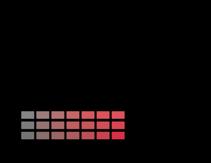
A gradient of one hue, mapped into a press's gamut 3 ways. Chroma asked for along the bottom, chroma delivered up the side, for a ramp at lightness 55 and hue angle 25°. A colorimetric intent follows the diagonal until the press runs out and is flat afterwards — the flat part is a gradient arriving as a single colour. The perceptual intent is under the diagonal from the start, which is the price of never going flat. What it takes to deliver it

A budget drawn through one hue

The three-stage error budget this collection publishes for a colour-management chain is computed over twenty-four colours of a single hue at a single lightness. The quantity that actually varies with hue — how many distinguishable colours a rendering intent destroys — runs from nothing at all to more than a third, and the hue the budget uses is near the bottom of that range.

MacAdam's twenty-five ellipses, measured in each unit. The uniformity instrument used here, applied to units rather than to spaces. The upper bar is anisotropy — the mean over the twenty-five of the largest radius divided by the smallest, where 1 would be a circle. The lower is spread — the largest mean radius divided by the smallest across all twenty-five, which asks whether a step of the same size means the same thing in different parts of the diagram. Reading down the three CIELAB-based formulae in the order they were published, the anisotropy falls 3.42 → 2.89 → 2.74 and the spread rises 3.24 → 3.59 → 4.12: the weighting divides a difference by the chroma it was measured at, which equalises directions at a point and unequalises magnitudes between points. Neither number is scaled, so no calibration is applied here. CAM16-UCS is ahead on both. Matching and measuring

A unit rests on a space that was ranked

This collection ranks three colour spaces by how nearly they make MacAdam's ellipses circles, and CIELAB comes last. It then publishes every difference it computes in a formula built on CIELAB. Turning the same instrument on the formulae rather than the spaces shows the repair works — and that it buys roundness by paying in evenness.

What this collection's grid does to its own observer audit. Two bars per light: the mean departure of the observer computed on this collection's five-nanometre grid, and the same computation on a quarter-nanometre one. For five of the six lights the two agree to two decimal places, which is what a well-sampled spectrum looks like. For the laser projector the coarse answer is exactly zero and the fine one is 2.34 — the largest in the table. On a five-nanometre grid a three-line spectrum with lines at 465, 532 and 638 nanometres is a one-line spectrum, and a single wavelength is a stimulus every observer agrees about to the last bit. The two departures do not compound here; the first conceals the second. Where the model breaks

The grid hid the observer

On this collection's five-nanometre grid a three-laser projector's observer disagreement is exactly zero. On a quarter-nanometre grid it is 2.34 ΔE₀₀ and the largest in the table. The two audits of this round meet here, and the first one does not compound with the second — it removes it.

What this collection's grid does to its own observer audit. Two bars per light: the mean departure of the observer computed on this collection's five-nanometre grid, and the same computation on a quarter-nanometre one. For five of the six lights the two agree to two decimal places, which is what a well-sampled spectrum looks like. For the laser projector the coarse answer is exactly zero and the fine one is 1.80 — the largest in the table. On a five-nanometre grid a three-line spectrum with lines at 465, 532 and 638 nanometres is a one-line spectrum, and a single wavelength is a stimulus every observer agrees about to the last bit. The two departures do not compound here; the first conceals the second. Matching and measuring

One wavelength is everyone's colour

A stimulus with a single wavelength in it produces the same relative cone excitations for every observer, exactly, whatever their age or field size. A display made of three such stimuli is where observers disagree most. Both statements are consequences of the same algebra, and the second is why laser projection has an observer problem.

The three cone absorptances at two settings of the pigment peaks. Solid and dashed are the same construction at the two ends of two standard deviations, and the L/M polymorphism on top. The curves are built from one pigment template through its ocular media, which is the same model its population of two hundred eyes is drawn from. The largest difference between the two sets is 8.9 per cent of the peak, and where it sits along the wavelength axis is what decides which stimuli the two observers disagree about — a departure concentrated in the blue is invisible on a sample with no blue in it. What the eye does

The peaks move the flanks

Shifting a cone's peak wavelength by three nanometres changes its sensitivity at its own maximum by almost nothing and on its flanks by several per cent, because a maximum is flat and a flank is steep. Every display primary sits on a flank, which is why a pigment polymorphism is worth 3.60 ΔE₀₀ under a laser projector.

The same white, matched at six primary widths. At every width the three primaries are solved to match D65 exactly for the reference member; the bands are what the population sees. A broad primary integrates the observer differences over a band and averages them away; a narrow one samples them at a point and passes them straight through. From 40 nm to 2 the ninety-fifth percentile rises from 11.3 to 17.9 ΔE00, monotonically, and the technology has been moving from left to right for thirty years. Matching and measuring

A narrow primary buys a disagreement

The observer audit decomposes what a display costs a population. Narrowing the primaries raises the pigment-peak departure monotonically, moving one raises or lowers the macular departure, and the two respond to different design variables — so a wide gamut and an observer-robust display are bought with the same money.

55 essays on this thread, page 2 of 3 · all threads · all essays