White drains the blue last in every model
Assumes White turns a hue, and the models part at blue, What an adapted viewer loses is set by the wall and Brighter looks more colourful.
What an adapted viewer loses is set by the wall found that a viewer standing in a glossy room loses 1.4 to 2.4 times as much of its colour as the room’s light does, and that the wall’s colour decides the multiplier. It traced the whole effect to one property of CIECAM16: add a small fixed dab of the lamp’s white to a bare wall and the model says a deep red wall gives up 25.6 per cent of its colour and a dark blue wall 6.7. Nearly four times as much.
That essay was careful to say this was the model’s claim rather than a finding about people, and it named the experiment that would test it. Saturated patches at six hues, each shown pure and with white added, observers judging colourfulness against a reference: “if people’s judgements fall with added white in the model’s hue order — red fastest, blue slowest — then the rooms’ multipliers follow.” It noted that the literature on colours diluted with white studied how their hue moves rather than how fast their colourfulness falls — white turns a hue, and the models part at blue is that first table — and asked for the second.
Here it is. It shows that the experiment as proposed would confirm all three models at once.
The order is shared and the spread is not
At equal luminance and equal doses of white, CIECAM16, CIELAB and Oklab order twenty-four display hues by how fast they lose colour at rank correlations of 0.92 to 0.99. All three drain an orange fastest and a blue slowest. They disagree on how much slower the blue is: CIECAM16 has its fastest hue losing sixteen to twenty-one times as much as its slowest, CIELAB and Oklab four and a half to five and a half. The whole disagreement is at the blue end.
- At a quarter of a patch’s luminance in added white, CIECAM16 says the orange loses 27 per cent of its colourfulness and the blue 1.7 per cent. CIELAB says 28 and 6.3; Oklab 21 and 4.6.
- The fastest hue is an orange between 45 and 60 degrees of display hue in every measure, and the slowest a blue between 240 and 255.
- The ratio does not depend on how bright the patch is: at a quarter of the luminance, every measure’s fastest and slowest hues are the same and CIECAM16’s ratio moves by under a fifth.
- The walls understated the model’s own hue effect. The dark blue wall received a dose of white three quarters of its own luminance — the largest of the six — and CIECAM16 still had it losing only 6.7 per cent.
- The quantity an experiment must measure is the blue’s loss over the orange’s: 0.06 in CIECAM16, 0.22 in CIELAB, 0.26 in Oklab, at a quarter dose.
Holding the dose equal
The walls in the rooms essay were six paints under daylight, and they differed in luminance by a factor of seven: the green wall returned 42 per cent of the light and the blue one 6.7. The one-patch test added the same five units of white to each. For the green wall that is a dose of an eighth of its own luminance; for the blue, three quarters. A fixed dab of white is a large dose to a dark wall and a small one to a pale wall, so the walls’ losses mixed two things — each hue’s response to white, and how much white each received in proportion.
The table here separates them. The twenty-four most saturated colours an sRGB display makes, one every fifteen degrees of HSV hue, are each scaled to a luminance of 20 and given white of a stated fraction of that luminance. Every patch receives the same proportional dose, so any difference in what it loses is the model’s response to its hue. The loss is measured four ways: as CIECAM16 colourfulness, as the compressed colourfulness of CAM16-UCS, as CIELAB chroma and as Oklab chroma, each with the display’s white as the reference.
Every model drains the same hues first
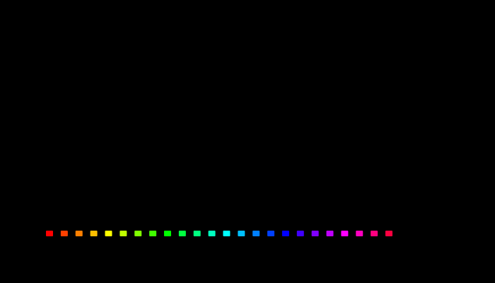
The figure is the table at a quarter dose — white a quarter as bright as the patch.
The three curves have the same shape. They rise from the reds to a peak at the oranges and yellows, fall through the greens and cyans to a trough at the blues, and climb again through the violets and magentas. CIECAM16’s orange loses 27 per cent of its colourfulness, CIELAB’s 28 per cent of its chroma and Oklab’s 21 per cent. Their blues lose 1.7, 6.3 and 4.6.
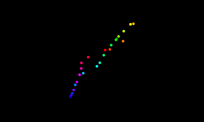
Hue by hue, the measures agree about the order almost perfectly. CIECAM16 against CIELAB is a rank correlation of 0.99; CIECAM16 against Oklab 0.92; CIELAB against Oklab 0.92. In the scatter, the dots rise together from the blues at the bottom to the oranges at the top — but they do not lie on the diagonal. At the top, the two measures are within a few per cent of each other. At the bottom, CIECAM16’s losses are a quarter of CIELAB’s.
This is the result that reframes the experiment. An experiment that asks whether people lose colour in the model’s hue order — red fastest, blue slowest — would find that they do, if any of these models is right about them, and it would not have tested which. The hue order is common ground.
The spread is not
What the models disagree about is how different the fastest and slowest hues are.

CIECAM16 puts its fastest hue at 21 times its slowest at a tenth of a dose and 16 times at a quarter. CAM16-UCS, which compresses CIECAM16’s colourfulness logarithmically to make its distances uniform, spreads them further, 28 and 22 times. CIELAB puts the same ratio at 5.6 and 4.5, Oklab at 5.0 and 4.5. The two families of measure differ by a factor of three to six in how differently they treat the hues, and they do so consistently at both doses.
That is a large difference to find between models that agree so closely on the order. It means the rooms essay’s claim — that a deep red room’s viewer loses twice what a green room’s does — depends on the model it was computed in, not in its direction but in its size. The direction is safe. The size is CIECAM16’s.
The disagreement is all at blue
The scatter already shows where the ratio comes from: the models agree at the top and part at the bottom. The dose curves make it plain.

For the orange, the three measures’ curves run together at every dose: 8, 8 and 5 per cent at a twentieth, 55, 56 and 45 at a full dose of white as bright as the patch. For the blue they part at once. With white as bright as the blue patch itself added — half of what the viewer sees is then white — CIECAM16 says the blue has lost 7 per cent of its colourfulness, CIELAB 19 per cent and Oklab 15.
CIECAM16 treats a saturated blue as almost impervious to added white. Nothing in this computation says why; the model’s colourfulness passes through a cone-like transform, a compressive response, a normalisation by a quantity that grows with all three cone signals, and a hue-dependent eccentricity factor, and any of them could make a blue resist dilution. What it establishes is that the resistance is specific to CIECAM16’s construction and to the blue end: neither of the other measures shows it, and at every other hue CIECAM16 behaves much as they do.
That is the same place white turns a hue, and the models part at blue found the models disagreeing about hue — Oklab turning a diluted blue sixteen degrees, CIECAM16 four and CIELAB nine the other way. The two tables have their disagreement in the same corner of the colour space.
What the walls were measuring
The rooms essay’s walls mixed hue with dose, and the mixing ran against the model’s effect rather than with it.

The blue wall, at 450 nanometres, received a dose of 0.75 — three quarters of its own luminance in white. No other wall received more than half, and the green and yellow walls received about an eighth. With that largest dose, CIECAM16 had the blue wall losing 6.7 per cent and CIELAB 16.5. The deep red wall, at 650 nanometres, received half its luminance and lost 25.6 per cent in CIECAM16 and 21.5 in CIELAB.
So the four-to-one ratio between red and blue that the rooms rested on was the model’s hue effect compressed by the blue wall’s larger dose. At equal doses, CIECAM16’s red loses about ten times what its blue does, not four. The rooms essay’s multipliers are, if anything, conservative about how much CIECAM16 distinguishes the hues — and correspondingly more exposed if CIECAM16 is wrong about blue.
The experiment that would separate them
The experiment the rooms essay proposed is still the right apparatus: saturated patches, white added in measured doses, observers matching colourfulness. What it has to measure is not the order but a ratio.

Every measure predicts the blue losing less than the orange at every dose — the ratio is below one throughout — so an observer who confirms that has confirmed all four. The measures part in how far below one. At a quarter dose, CIECAM16 predicts the blue losing 0.06 of what the orange loses, CAM16-UCS 0.05, CIELAB 0.22 and Oklab 0.26. At a full dose the gap narrows but persists: 0.13 and 0.09 against 0.35 and 0.34.
An experiment that resolves that ratio to within a tenth at a quarter dose separates CIECAM16 from the other two. It is a modest precision for a colourfulness matching task: an observer adjusts the chroma of an undiluted blue until it looks as colourful as the diluted one, and the same for the orange, and the ratio of the two adjustments is the quantity. The prediction worth writing down is that people will land nearer CIELAB and Oklab than CIECAM16, because CIECAM16’s treatment of a diluted blue has already parted from the constant-hue judgements Oklab encodes once, on hue — but that is a prediction, and it is the experiment’s job to settle it.
What depends on the answer
If observers land near CIECAM16, the rooms essay’s multipliers stand, and they understate how differently dark blue and deep red rooms are experienced. A specifier choosing a gloss finish for a deep red room should expect the viewer to lose much more of the room’s colour than the light measurement says, and for a dark blue room barely more.
If observers land near CIELAB or Oklab, the rooms’ multipliers flatten: the viewer’s extra loss is still real, since all three measures agree that added white costs a saturated colour most at orange and least at blue, but the blue room’s protection shrinks from near-total to about a quarter of the red room’s loss. A patch is not a scene is the general warning about which of these to trust for rooms at all: every number here is for a patch on a grey surround, and a room is a scene.
And either way, the hue order is not in question. Whatever a specifier does about gloss finishes on saturated walls should treat orange, yellow and red rooms as the ones that lose most of their colour to white, and blue rooms as the ones that lose least. Brighter looks more colourful is the neighbouring caution in the other direction: CIECAM16’s colourfulness rises with luminance for every hue, and a finish that brightens a room while diluting it moves colourfulness both ways at once.
The same question in print and on screens
Rooms are where the question was first asked, but they are not where colours are most often diluted with white. A halftone tint is a colour diluted with the paper’s white by area, a pale tint on a screen is a primary diluted with the display’s white, and a gradient to white is a sequence of dilutions. Every one of these is judged by a reader, and every tool that builds or maps them carries a model of how colourful the result will look.
A tint in paint turns the other way found that a tint mixed as light — which is what a halftone and a screen tint mostly are — keeps less of its colour than a tint mixed as paint, at every pigment; the table here says how much less, hue by hue, and that the answer depends on the model most at blue. A gamut-mapping step working in CIECAM16’s terms would treat a pale blue tint as holding nearly all of its colourfulness, and a step working in CIELAB’s would treat it as having given up a quarter of what a pale orange gives up. Pale blues are where the two would make different decisions: whether a pale blue that falls outside a printer’s gamut needs its chroma protected, or can afford to lose some.
That makes the observer experiment above useful well beyond rooms. A gloss room looks less colourful than it measures was the first place the model’s handling of added white changed a practical answer; the pale tints of every blue logo and every sky gradient are the most common. And the rooms essay’s own chain — the finish adds the room’s own colour, then the adapted viewer — ends at the same ratio as a printer’s tint does: how much colour a blue keeps when white is added to it.
How the table was computed
The display colours are the twenty-four most saturated colours of an sRGB display at HSV hues from 0 to 345 degrees, converted to XYZ with the display’s white at a luminance of 100 and each scaled to a luminance of 20. White of the display’s chromaticity and a stated fraction of the patch’s luminance is added in XYZ. CIECAM16 is evaluated with the display’s white adopted, an adapting luminance of 100, a background of 20 and an average surround; its colourfulness M, and CAM16-UCS’s M′ = ln(1 + 0.0228 M)/0.0228. CIELAB chroma is against the display’s white, and Oklab chroma is from XYZ scaled to a white of one.
The loss is one minus the diluted patch’s measure over the pure patch’s. The walls are the six paints of the rooms essay under daylight, with the five units of white its one-patch test added.
What this leaves out
Display colours are not paints. The most saturated sRGB colours are more saturated than the paints the rooms used, and a model’s response to dilution can depend on how saturated a colour is to start with. The walls’ own numbers, which are paints, agree in direction with the display colours’ and differ in the dose each received, which is accounted for above; a paint census at equal doses would close the gap.
Colourfulness and chroma are not the same judgement, and the four measures here are not all measuring the same attribute: CIECAM16’s M is colourfulness, CIELAB’s and Oklab’s are chroma-like distances from the neutral axis. At a fixed luminance the distinction matters little, and every patch here is at a fixed luminance before the white is added; but the added white raises luminance, and a model with a luminance-dependent colourfulness responds to that as well as to the dilution.
And nothing here is an observer. The three measures are models of observers, and the essay’s claim is about what they predict and where they disagree.
Still open: whether the blue’s resistance is CIECAM16’s hue factor
CIECAM16’s colourfulness depends on hue through an eccentricity factor, a smooth function of hue angle fitted to make equally colourful stimuli of different hues come out equal, and it is the most obvious place for a hue-specific response to dilution to come from. It may not be the source: the eccentricity multiplies both the pure and the diluted patch’s colourfulness, so it should cancel in a ratio of the two.
The prediction, then, is that the resistance comes from the normalisation — CIECAM16 divides its opponent signals by a sum of cone signals, and a saturated blue is the stimulus whose cone signals are most unequal, so added white changes the denominator least for it. The computation is CIECAM16 with its eccentricity factor held constant and, separately, with its normalising sum replaced by luminance alone, the blue’s loss recomputed in each. If the resistance survives the first and vanishes in the second, it is a property of how the model normalises, and a candidate for correction on the evidence of the experiment above.
Agreement on the order is not agreement
The habit is about which prediction an experiment actually tests.
The rooms essay’s model made a claim with two parts — which hues lose colour to white fastest, and how much faster — and the experiment proposed to test it asked about the first. The first part turns out to be shared by every model in reach, so confirming it would have been taken as support for the model that made the claim and would have been equally good support for its rivals. The part only one model makes is the size, and it lives at one end of the hue circle.
The failure mode is to test a model on the prediction it shares. Before designing an experiment around a model’s claim, the move is to compute the same claim in the model’s competitors and find where they part, because the experiment is only informative there. Here that moved the test from “does blue lose least” to “how much less,” and from six hues to two.
Where this goes next
 White turns a hue, and the models part at blue
Mix a saturated light with white and its hue changes as well as its saturation — the Abney effect, and the reason lines of constant perceived hue curve in a chromaticity diagram. Asked what adding white does to the twenty-four most saturated colours a display makes, CIECAM16, CIELAB and Oklab all turn the hue. About reds they agree: CIECAM16 turns within a degree of Oklab, whose hue was fitted to observers' constant-hue judgements. About the display's blue they do not: Oklab turns sixteen degrees, CIECAM16 four, and CIELAB nine the other way.
White turns a hue, and the models part at blue
Mix a saturated light with white and its hue changes as well as its saturation — the Abney effect, and the reason lines of constant perceived hue curve in a chromaticity diagram. Asked what adding white does to the twenty-four most saturated colours a display makes, CIECAM16, CIELAB and Oklab all turn the hue. About reds they agree: CIECAM16 turns within a degree of Oklab, whose hue was fitted to observers' constant-hue judgements. About the display's blue they do not: Oklab turns sixteen degrees, CIECAM16 four, and CIELAB nine the other way.
 What an adapted viewer loses is set by the wall
A satin finish takes about a tenth of a room's colour, measured on the room's light against its lamp's white. Read through an appearance model by a viewer adapted to the room, the same thirty-six rooms lose between 12.8 and 30.9 per cent — 1.4 to 2.4 times as much — and the wall colour decides the multiplier: a deep red room loses twice what a green one does, under every lamp. A test on the bare wall predicts it. Add a little of the lamp's white to the wall's own colour and ask the model what that costs: the answer orders the thirty-six multipliers at 0.95.
What an adapted viewer loses is set by the wall
A satin finish takes about a tenth of a room's colour, measured on the room's light against its lamp's white. Read through an appearance model by a viewer adapted to the room, the same thirty-six rooms lose between 12.8 and 30.9 per cent — 1.4 to 2.4 times as much — and the wall colour decides the multiplier: a deep red room loses twice what a green one does, under every lamp. A test on the bare wall predicts it. Add a little of the lamp's white to the wall's own colour and ask the model what that costs: the answer orders the thirty-six multipliers at 0.95.
 Brighter looks more colourful
Colourfulness rises with light level and the model predicts it. Apparent contrast is supposed to rise too, and the model does not — which turns out to be right, because the thing that actually carries contrast is the surround.
Brighter looks more colourful
Colourfulness rises with light level and the model predicts it. Apparent contrast is supposed to rise too, and the model does not — which turns out to be right, because the thing that actually carries contrast is the surround.
Named alongside this one
Essays reaching for the same objects. Nobody chose these; they are what the index of named objects makes visible.
- A difference needs a basis too ciecam16 · cielab · oklab
- A model judged in another model's unit appearance model · ciecam16 · colourfulness
- A third space breaks the tie only once cielab · hue · oklab
- A tolerance has no light level appearance model · chroma · ciecam16
- Newsprint turns a tint with its colour, not its gain additive mixture · hue · oklab
- Printing does not change the sign additive mixture · hue · oklab
The objects this essay names
Each one links to every other essay that touches it.
Abney effectAdditive mixtureAppearance modelChromaCIECAM16CIELABColourfulnessHueOklabPrediction