Theme

The thread: Computed, not quoted — page 4
Every swatch begins as a spectral power distribution and is carried through the colour-matching functions as it is drawn. None is a hex code recalled from a table.
Two mechanisms, one ramp, and the patch that separates them. A cyan ramp printed by a press with 10 per cent mechanical gain and a Yule–Nielsen exponent of 2.4. Fitting a mechanical gain at n = 1.0 gives 23 per cent and fitting one at n = 2.4 gives 10 per cent; both reproduce the ramp to under 0.66 of a lightness unit, and the curves lie on top of one another. The two-ink overprint below was in neither fit, and there they are ΔE00 = 3.20 apart. What it takes to deliver it

A dot is larger than it was asked to be

Two quite different things make a printed midtone darker than its coverage says — ink spreading under pressure, and light scattering sideways inside the paper. Both bend the tone curve the same way and neither touches its ends, so the measurement every press is characterised by cannot say which happened. A patch that nobody measures can.

What a press and a display can reach at L* = 50. A slice through both solids at lightness 50, with the press dashed and the display solid. The boundaries cross: the press reaches past sRGB in 15 of 48 directions and falls inside it in 31. That is the shape of every conversion between them — colours are lost in one direction and gained in the other, and the picture cannot show the gained ones, because it is being displayed on the gamut that cannot reach them. Those are hatched. What it takes to deliver it

Neither gamut contains the other

Converting a picture to CMYK is described everywhere as a reduction, as though the press were a smaller version of the screen. Measured as solids, the press reaches eleven per cent of its volume outside sRGB while sRGB reaches fifty-four per cent of its volume outside the press — and in the cyans the press wins by seventy per cent of chroma.

How wrong a profile is between its entries. A device profile is a lattice of measured patches and an interpolation. At every node of every grid drawn here the error is exactly zero, which is why a profile checked at its own patches always looks perfect. Sampled between the nodes, a 3-step grid is worst by ΔE00 = 2.93 and a 17-step grid by 0.30. Both are honest tables of the same press. What it takes to deliver it

A profile is a table

An ICC profile does not contain a model of the device it describes. It contains a lattice of patches that were printed and measured, and everything between them is interpolation — which is exactly zero at every patch, so a profile checked against its own target reports perfection for ever.

The process inks as reflectance. Each ink is a sum of Gaussian absorbance bands with stated centres, widths and peak densities, and the reflectance shown is the substrate's times the square of the ink's transmittance, because light crosses the film going down and coming back. The first band of each ink is what it is for; the rest are what is wrong with it. Magenta's unwanted absorption in the blue-violet reaches an optical density of 0.46 against 0.95 for the band it exists to have — 48 per cent of its own strength, absorbing exactly where a saturated blue needs light to survive. What it takes to deliver it

The paper is the white point

A printed colour is reported against the sheet it sits on rather than against the light in the room, and the choice is a switch in every colour engine. Flipped one way, the same separation on coated stock and on newsprint is a 3.04 colour difference; flipped the other, it is 0.13 — and the two answers are about different questions.

The solids, by volume. CIELAB volume, all measured by the same cell count with the same extrapolation, and quoted against sRGB because that is the comparison the estimator supports. The four-colour press reaches 49 per cent of the sRGB solid's volume — and contains colours sRGB does not, which is why "half the gamut" is the wrong summary of a ratio of one half. What it takes to deliver it

The fourth ink is not for colour

Black is in every process set and it extends the gamut by more than a third — and at every lightness above about forty it extends the chroma boundary by exactly nothing. What it buys is depth at the bottom, a neutral that holds its hue when the press drifts, and a way to put a full-strength dark on a sheet that could not carry three inks' worth of it.

What happens to a tone the destination cannot print. Source lightness along the bottom, destination lightness up the side, for a print whose black is L* = 8. Clipping is the flat segment on the left — 4 of 10 levels in the bottom twenty points of the scale arrive as the same number, and nothing downstream can recover them. Black point compensation is the straight line: all 10 levels survive as different numbers, and every tone in the picture has moved to pay for it. What it takes to deliver it

A black that is not black

The deepest colour a four-colour press can make is L* 2.4, and against its own paper that is a contrast of about 320 to 1 — less than a cheap display manages in a dark room. Everything a printed picture does in the shadows is done inside that range, and the two ways of fitting a picture into it destroy different things.
What separates the separations, and under which light. 11 separations of a single colour, differing only in how much of it is carried by black rather than by the three chromatic inks. Under D50 they agree to ΔE00 = 0.00 — the solver was asked for that and delivered it. Under illuminant A they spread to 6.75. They are metamers of one another, and the whole family is invisible to any instrument reading a single illuminant. What it takes to deliver it

The separation is not unique

A four-ink press has one more control than a colour has numbers, so most colours can be printed several ways. The alternatives agree to a hundredth of a colour difference under the light the match was made in — and they are metamers of one another, so under a tungsten lamp the same eleven separations of one colour spread by nearly seven.
A gradient of one hue, mapped into a press's gamut 2 ways. Chroma asked for along the bottom, chroma delivered up the side, for a ramp at lightness 55 and hue angle 25°. A colorimetric intent follows the diagonal until the press runs out and is flat afterwards — the flat part is a gradient arriving as a single colour. The perceptual intent is under the diagonal from the start, which is the price of never going flat. What it takes to deliver it

No mapping preserves everything

More than half the sRGB solid is outside a press's gamut, so something has to be done with it, and there are two things that can be done. One leaves every reproducible colour exactly where it was and delivers a gradient as a flat area. The other keeps the gradient and moves every colour that needed no help by about three.

What separates the separations, and under which light. 11 separations of a single colour, differing only in how much of it is carried by black rather than by the three chromatic inks. Under D50 they agree to ΔE00 = 0.00 — the solver was asked for that and delivered it. Under illuminant A they spread to 6.75. They are metamers of one another, and the whole family is invisible to any instrument reading a single illuminant. What it takes to deliver it

The lamp in the shop decides

Two packages printed to the same specification, verified under the same standard illuminant and passed, can differ by nearly seven colour differences on a shelf under a tungsten lamp. Nothing went wrong at either press. The specification named one light, the separations that satisfy it are metamers of one another, and the shop chose the second light.

A named ink, and the closest four-colour build of it. The ink is one pigment chosen for its own spectrum; the four-colour build is three chosen for everything. The four-colour build reaches it to ΔE00 = 0.37 under D50 and drifts to 4.46 under a tungsten lamp, because the match is metameric — the two curves cross 4 times rather than coinciding anywhere. What it takes to deliver it

A brand colour is an ink

A named colour is a jar of pigment with a spectrum, and a four-colour build of it is three inks arranged to integrate to the same three numbers. Of 156 constructed single-pigment inks, 15 can be matched at all — and those fifteen drift by a median of 3.8 colour differences under a tungsten lamp, because the match was never a match.

The solids, by volume. CIELAB volume, all measured by the same cell count with the same extrapolation, and quoted against sRGB because that is the comparison the estimator supports. The four-colour press reaches 49 per cent of the sRGB solid's volume — and contains colours sRGB does not, which is why "half the gamut" is the wrong summary of a ratio of one half. What it takes to deliver it

The fifth ink buys a corner

Orange, green and violet are sold as the answer to a four-colour press's gamut, and each one adds seven to nine per cent of volume. All three together add 23 per cent — almost exactly the sum, with no interaction — and every bit of it lands in the region of the ink that was added, at lightnesses where that ink is dark.
Lightness against colourfulness, in a booth and on a screen. Each arrow is one colour, from what the model predicts under a print in a 2000 lux booth to what it predicts under a display in a dim room. Every arrow points the same way, which is the content: a dimmer surround lowers predicted lightness and colourfulness together, so a proof does not merely differ from the print, it differs in a direction — and that is why proofing standards specify the room and not only the numbers. What it takes to deliver it

The proof is a different object

A soft proof can be made colorimetrically exact and still not match the print, because the print is in a booth at two thousand lux with an average surround and the screen is in a dim room at a fifth of the luminance. The appearance model puts four CAM16-UCS units between them, with no change of stimulus anywhere — larger than the error any rendering intent is arguing about.

The tone scale of one display, in four rooms. Code value along the bottom, the lightness it comes out at up the side. The curves are the same display: what changes is the light falling on the screen, which adds a fixed luminance to every pixel. The signal value that means black arrives at L* = 11.7 at 600 lux, against 0.9 in the dark — the lightness of a dark grey card, from a pixel that is switched off. What it takes to deliver it

The screen is not the room

A thousand-to-one display in an ordinary office is a hundred-and-thirty-seven-to-one display, and the signal value that means black comes out at the lightness of a dark grey card. Nothing is wrong with the panel. Light falls on the screen and comes back off it, and the two per cent it returns is added to every pixel — most of all to the ones with nothing else in them.
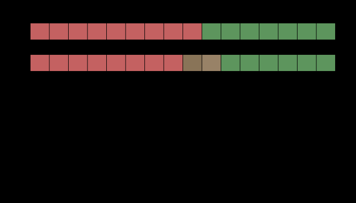
An edge at 4:2:2, and the colour it arrives as. Above, the row as it was sent and as it arrives after the two chroma planes are averaged 2 samples at a time. Below, the colour difference at each sample. The worst is ΔE00 = 25.88, at a luma step of 0.058 across the edge — an edge of nearly equal luminance. Nothing is wrong with the codec: it discards the differences the eye resolves worst, and this edge is made of nothing else. What it takes to deliver it

Colour thrown away on purpose

Every video format in use discards three quarters of its colour information and keeps all of its luminance, because the eye resolves fine colour detail badly. On an edge that carries luminance the loss is exactly zero. On an edge of nearly equal luminance it is a colour difference of forty-three, and the two edges are the same edge to the codec.

Mixtures of 2700 K and 6500 K, on the diagram colour temperature is defined on. Both sources are Planckian radiators, so both sit exactly on the locus. Every mixture of them lies on the straight line between them, because mixing is addition and chromaticity is a projection of it — and the locus is curved, so the line is a chord. The equal mixture sits -0.0064 off the locus at a correlated colour temperature of 3953 K: a light that is measurably pink, specified by a number that says nothing about it. What light is

Two lamps do not average

Light adds, band by band, and every number a lamp is sold by is a projection of the sum rather than a sum of the projections. Two radiators sitting exactly on the Planckian locus mix into a light that is measurably pink; two poor lamps mix into a better one than either.

D65, and a source built to have its chromaticity and nothing else. The smooth curve is the CIE's daylight reconstruction at 6504 K. The other is five Gaussian emission bands whose weights were solved so that the two agree in chromaticity to 8.5e-10 — closer than any instrument could tell them apart when looking at the lamps. Three numbers were matched and seventy-eight were not, and everything either source falls on will report the difference. What light is

There is no D65 lamp

D65 is standardised by three numbers, and three numbers do not pin a spectrum. A source built to hit them exactly — matched to a part in a billion, with a third of the visible band nearly empty — separates pairs that D65 says are identical by up to eight and a half units of colour difference.

Contrast sensitivity, three channels, normalised to each channel's peak. Spatial frequency in cycles per degree against relative sensitivity. The luminance channel runs to 50 cycles per degree, red–green to 12 and blue–yellow to 8, each by the same criterion of 5 per cent of that channel's own peak. Only the luminance channel dips at low frequency; the two chromatic ones are low-pass, so a chromatic edge of any size at all is seen at its full contrast. What the eye does

How fine a colour edge can be

The eye resolves a lightness pattern to about fifty cycles per degree and a red–green one to twelve. Every colour difference here is quoted as though a patch had no size, and the same difference is plainly visible at one scale and gone at another.

The L cone's sensitivity at three axial pigment densities. Each curve is normalised to its own peak, so the only difference visible is shape. Raising the density from 0.1 to 0.9 widens the curve from 113.6 to 145.9 nm at half height while the peak stays within 5 nm of where it was. That is Beer–Lambert saturating: at the peak the pigment already absorbs nearly everything, so more of it can only catch more light in the wings. What the eye does

A cone absorbs its own light

A photopigment's absorbance is a property of a molecule; a cone's sensitivity is that molecule stacked in a column deep enough to absorb most of what arrives. The stacking broadens the curve by thirty-five nanometres, and two observers differing in nothing else disagree about a match that is exact for one of them.

Photons caught by one cone in one integration time, under D65. Each curve is one cone class, counting isomerisations during a 0.1 s integration through a pupil that closes as the light rises. At 1000 cd/m² a long-wavelength cone catches about 11522 and at 0.001 it catches 0.12 — which is where the square root of the count stops being a small correction and starts being the signal. The rate works out at 30 isomerisations per second per troland, inside the published band of 5–50. What the eye does

Colour goes first in the dark

A cone reports a count, and a count carries the square root of itself as noise. Counting the photons says where colour vision stops — a chromatic difference runs out four hundred times sooner than a lightness difference of the same size — and says just as clearly that in daylight the eye is nowhere near that limit.

What a coarse wavelength grid costs, by source. Colour error against grid size, for four sources through one reflectance. Daylight survives every grid tested: 0.67 ΔE00 even at 40 nm. A source with lines in it does not — the narrowband source reaches 16.2. The grid is not a property of the arithmetic; it is a claim about what the light has in it. Matching and measuring

Five nanometres is a choice

Every integral here is taken in five-nanometre steps, and the interval has never had to be defended. Coarsening it to twenty costs daylight two hundredths of a colour difference and a fluorescent tube six and a half — and which way of coarsening is used decides a further factor of six.
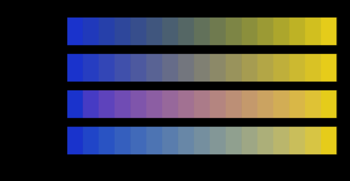
One pair of colours, blended in four spaces. Every row starts and ends at the same two colours and visits different ones in between. The chroma of the middle falls furthest in linear light, by 83 units below the straight line between the endpoints' chromas — the grey dead zone that every blue-to-yellow gradient has and that no endpoint mentions. Any colour a route visits that this display cannot show is hatched rather than clipped. Matching and measuring

A gradient is a path

Two colours fix the ends of a blend and nothing else. The middle is decided by the space the interpolation happens in, and four spaces in daily use put the halfway point of one ordinary gradient as much as thirty-seven units of colour difference apart.
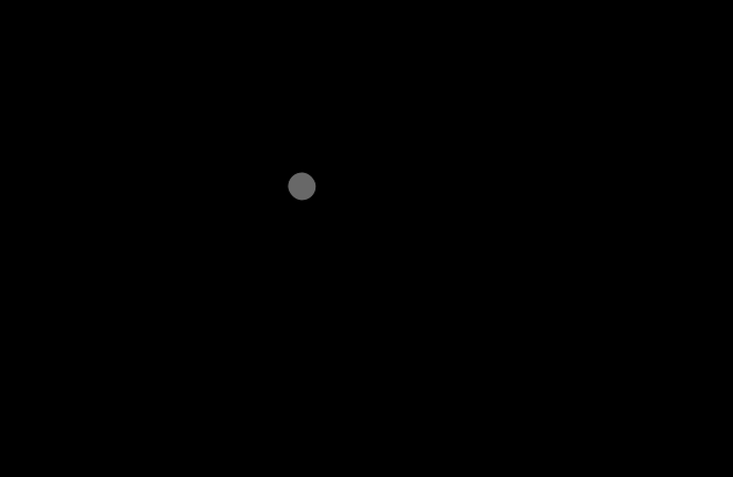
The worst triple found, under ΔE2000. Three colours, plotted on the a–b plane of CIELAB. Going from a to c directly is 123.645; going via b is 60.528, which is 51.0 per cent shorter. A distance cannot behave that way, and this one is the formula every colour tolerance in industry is written in. The colours are far apart, which is where the violation is largest; the same search confined to tolerance scale finds a smaller one that has not gone away. Difference and uniformity

A difference is not a distance

Two earlier essays here said that CIEDE2000 violates the triangle inequality and left it at that. Searching for the violation finds a detour half the length of the direct route, a smaller one inside a five-unit ball, and a second defect nobody mentions — ΔE94 is not even symmetric.
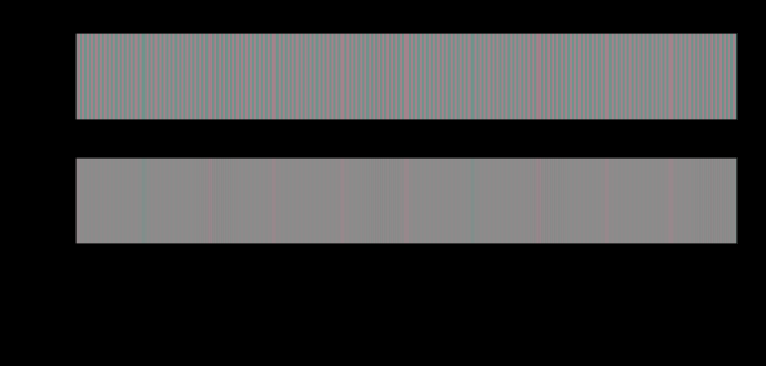
A chromatic line screen at 10.0 cycles per degree. The upper strip is the pattern as delivered and the lower one is the same pattern after each opponent channel has been low-passed at its own cutoff. Against a flat field of the same mean, the delivered pattern differs by up to ΔE00 14.22 and the filtered one by 7.77 — a ratio of 1.8. Every number quoted elsewhere for a difference of this kind is the first one. Difference and uniformity

A difference has no size

A colour difference formula answers a question about two large patches seen side by side. Applied to a pattern, it reports fourteen units where the eye is left with less than one — and the ratio depends on nothing but how finely the difference is spread.
Brightness against chroma, at exactly constant luminance. Seven stimuli of identical luminance and rising chroma at hue 25. The model's brightness moves by 2.2 per cent across the whole sweep, and at some hues it moves the other way. The Helmholtz–Kohlrausch effect — measured repeatedly, by several methods — is that a saturated colour looks as bright as a neutral of 1.3 to 2 times its luminance, shown as the band. The gap is the model's, and nothing here closes it: the term that would is not in CIECAM16 and is not invented for the occasion. What the brain does

Brightness is not luminance

Photometry is additive because the CIE defined it that way. Brightness is not, and a saturated colour looks as bright as a neutral of one and a half times its luminance — an effect this site's appearance model moves by two per cent, in a direction that depends on the hue.

463 essays on this thread, page 4 of 20 · all threads · all essays