The collection

Every essay — page 5

Page 5 of 40, continuing through the fields in the same order.

What light is What the eye does Matching and measuring Difference and uniformity What the brain does What a scene does What a camera does Where the model breaks What it takes to deliver it

SeriesObserversNamed objectsRefutationsSearch

What the brain does

Constancy, adaptation and simultaneous contrast — the reasons a patch of known radiance still has no determined appearance.

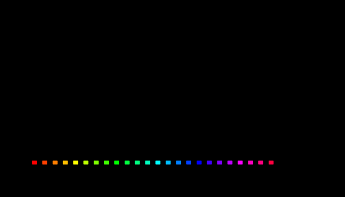
How far each model turns a display colour's hue as white is added. The twenty-four most saturated colours an sRGB display makes, one every 15° of HSV hue across, each mixed with the display's white at the same luminance down to a fifth of its purity. Up, how far that mixture's hue angle turns in CIECAM16, CIELAB and Oklab. From red to a fifth of its purity CIECAM16 turns −9.4° and Oklab −10.2°; CIELAB −18.1°. From the display's blue, Oklab turns +16.3°, CIECAM16 +3.6° and CIELAB −8.9°.

White turns a hue, and the models part at blue

Mix a saturated light with white and its hue changes as well as its saturation — the Abney effect, and the reason lines of constant perceived hue curve in a chromaticity diagram. Asked what adding white does to the twenty-four most saturated colours a display makes, CIECAM16, CIELAB and Oklab all turn the hue. About reds they agree: CIECAM16 turns within a degree of Oklab, whose hue was fitted to observers' constant-hue judgements. About the display's blue they do not: Oklab turns sixteen degrees, CIECAM16 four, and CIELAB nine the other way.

6 figures
Which way a tint turns a pigment's hue, made in paint and made in light. For eight pigments tinted nineteen parts white to one of colour, the Oklab hue turn from the pure pigment: of the tint made in paint (upper bar) and of the additive mixture with white at the same luminance (lower bar). For seven of the eight the two point in opposite directions. The orange turns +13.5° in paint and −13.9° in light.

A tint in paint turns the other way

A pale colour can be made two ways: by stirring white pigment into a coloured one, or by adding white light to it — which is what a halftone on white paper and a display both do. At the same luminance the two tints are not the same colour. For seven of eight pigments they turn the hue in opposite directions, an orange by +13.5 degrees in paint and −13.9 in light, and the paint tint is the more colourful of the two every time. The cause is in the reflectance: diluting a pigment moves its absorption edge, and adding light does not.

6 figures
A halftone tint, between the two ideals and nearer one of them. For each pigment, how far the hue turns when it is tinted to the same lightness three ways: mixed with white pigment, mixed with white light, and printed as a halftone at a Yule–Nielsen factor of two. Right is towards a longer wavelength. 7 of the eight pigments' two ideals turn the hue opposite ways. The halftone mark sits between them at every pigment and between 26 and 44 per cent of the way from the light ideal to the paint one — so it keeps the additive tint's direction and loses about a third of its size.

Printing does not change the sign

A tint mixed in paint and a tint mixed in light turn seven of eight pigments' hues opposite ways. A halftone sits between the two because light entering the paper between dots emerges under a dot, and the question was where. At the optical gain a coated sheet is fitted at, a halftone has travelled between 26 and 44 per cent of the way from the light ideal to the paint one — the same fraction for every ink — and only one pigment in eight changes direction.

5 figures
An orange ink's tints on three papers: which way the hue turns. The hue of each tint of an orange ink, from the solid to a tenth coverage, against the solid on the same paper, in degrees of Oklab hue: on a coated sheet, an unbrightened uncoated sheet and a newsprint. Solid lines are read against daylight's white, as an instrument reads them; dashed lines against the paper's own white, as a reader adapted to the page. At a tenth coverage, read against daylight, the coated sheet's tint has turned -8.7 degrees and the newsprint's 21.8; read against each paper's white, -8.7 and -1.1.

Newsprint turns a tint with its colour, not its gain

A halftone tint turns its hue the way a mixture of light does, by less, because optical dot gain carries it part of the way towards a paint tint. The straight line through a coated sheet's gain predicted that an uncoated sheet's larger gain would carry the orange past the crossing at a factor of 3.2, so that the same ink would turn opposite ways on two papers. It does turn opposite ways — on newsprint the orange's pale tints swing 13 degrees one way where a coated sheet's swing 8 the other. But the gain is not what does it. The road towards paint bends and stops at 60 to 70 per cent of the way, the orange needs a factor of 5.4 to cross, and newsprint's reversal comes almost entirely from the paper being yellow. Read against the paper's own white, as a reader looking at the page is adapted, it goes away.
6 figures
The share of its colour each display hue loses to a quarter of its luminance in white. The twenty-four most saturated colours of an sRGB display, one every fifteen degrees of HSV hue, each scaled to a luminance of 20 and given white of a quarter that luminance: the share of its colourfulness lost, in CIECAM16, CIELAB and Oklab. All three put the fastest loss at an orange and the slowest at a blue. At the orange end they are close — CIECAM16 27 per cent, CIELAB 28 per cent, Oklab 21 per cent — and at the blue end CIECAM16's 1.7 per cent is a quarter of the others'.

White drains the blue last in every model

CIECAM16 says a dab of white costs a deep red wall four times the colour it costs a dark blue one, and the experiment proposed to test it asked whether observers lose colour in that hue order. Held at equal luminance and given equal doses of white, twenty-four display hues are ordered alike by CIECAM16, CIELAB and Oklab — an orange loses fastest and a blue slowest in all three. So the order cannot tell the models apart. What does is how much slower the blue is: CIECAM16 has it losing a sixteenth of what the orange loses, CIELAB and Oklab about a quarter. That ratio is the number an observer study has to measure.

6 figures

Difference and uniformity

How far apart two colours are, whether the space you measured in was uniform, and how MacAdam's ellipses settle the question by measurement.

Three colour-difference formulae, disagreeing. ΔE76, ΔE94 and ΔE2000 for the same 9 pairs of colours. The largest disagreement between ΔE76 and ΔE2000 here is 26.6 units — larger than the threshold usually quoted for a just-noticeable difference, so the choice of formula can decide whether two colours count as matching.

How far apart are two colours

ΔE is meant to be a distance with the property that the same number means the same perceived difference everywhere. Three successive formulae have tried, they disagree with each other by more than a just-noticeable difference, and the disagreement decides real matching questions.

6 figures
MacAdam's discrimination ellipses, drawn 10 times actual size. Twenty-five ellipses of colours indistinguishable from their centres. They are drawn at 10× because at true scale most are thinner than a line. Their areas vary by a factor of 74, which is the whole result: a step of the same size in xy means very different things in different places.

MacAdam measured it

In a perceptually uniform space the just-noticeable-difference contours would be circles of equal size. MacAdam's ellipses are neither, by a factor of eighty — and transforming them into each candidate space settles which spaces improved matters and by how much.

7 figures
The sRGB transfer function, and the gamma 2.2 curve it is not. Code value against relative luminance. The sRGB function is piecewise — a short linear segment near black, then a 2.4 power law with an offset — and it is close to but not the same as a plain 2.2 power law. Half-way along the axis of stored values sits at 21 per cent luminance, and half the luminance of white is at code 188.

The midpoint is not half

Code 128 sits halfway along the sRGB scale and carries about a fifth of white's luminance. Half the luminance is code 188. Almost every gradient, blur and resize on the web gets this wrong, and the errors are visible once known.

8 figures
Threshold and suprathreshold contours, normalised to the same size. At five of MacAdam's centres: the measured just-noticeable-difference ellipse in grey and the ΔE2000 = 1 contour in gold, each scaled to the same mean radius so that only shape and orientation are being compared. A scale change preserves orientation exactly, so any rotation between the pair settles the question. They differ by 24° on average and by 70° at worst, and the ratio between their sizes varies 4.8-fold across the diagram — so no single factor turns one into the other.

A threshold is not a unit

MacAdam measured the smallest difference anyone could detect. ΔE2000 was fitted to how far apart plainly different colours look. The two are quoted interchangeably, and the contours they produce are not even the same shape.

5 figures
A box tolerance and a ΔE tolerance around the same colour. A slice through CIELAB at L* 50, with the ΔE2000 = 1 contour traced point by point and a ±1 component box drawn over it. The contour is 2.1 times longer in one direction than the other, and the box is square. Of every sample either rule accepts, the two disagree about 74% — accepted by one specification and rejected by the other, on the same measurement.

A tolerance is a shape

A total colour difference below one, or every component within one — the two sound like the same requirement stated twice. They are different shapes, they disagree about most of what either accepts, and which one a supplier is held to is worth money.

10 figures
Distinguishable colours in sRGB, counted under two difference formulae. The gamut volume divided by the volume of a ΔE = 1 ellipsoid, integrated over the solid because that ellipsoid changes size and orientation from place to place. Under the 1976 formula the answer is 195,720; under ΔE2000 it is 41,819 — 4.68 times fewer, from the same solid and the same lattice. Both assume perfect packing, which nothing achieves, so each is an upper bound rather than a count of anything. The gap between them is the result: "how many colours are there" is a question about a metric before it is a question about vision.

How many colours are there

Sixteen point seven million counts code values in a file format. Ten million distinguishable colours is a volume divided by the size of a just-noticeable difference — and the two difference formulae this site implements disagree about that size by a factor of nearly five.

9 figures
The ΔE = 1 contour at points across the L* = 55 plane, magnified 14×. Each closed curve is the set of colours exactly one unit of difference from the dot at its centre, traced by bisection along 30 directions and drawn 14 times life size. Under ΔE2000 the contours run from 0.68 to 5.07 CIELAB units across this slice — a ratio of 7.44 — and they are not circles and not aligned with each other. A formula whose contours were circles of one radius everywhere would be claiming that CIELAB is uniform, which is what the 1976 formula claims and what the measurements refuse.

Where the formula is not smooth

A colour difference formula is a distance, and a distance ought to vary gently. CIEDE2000's does not everywhere — it carries a hue-rotation term with a hard edge in it, and the discontinuity sits where a great many industrial samples live.

7 figures